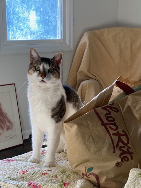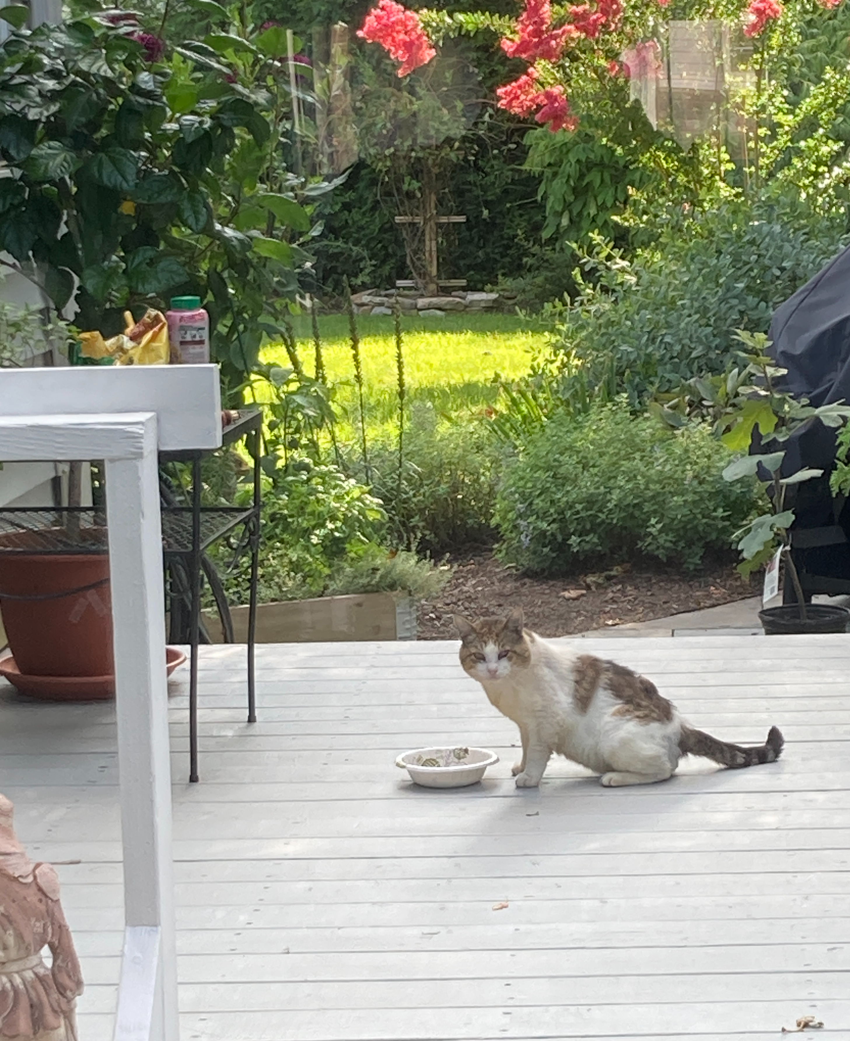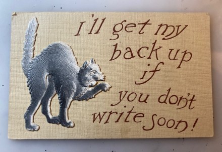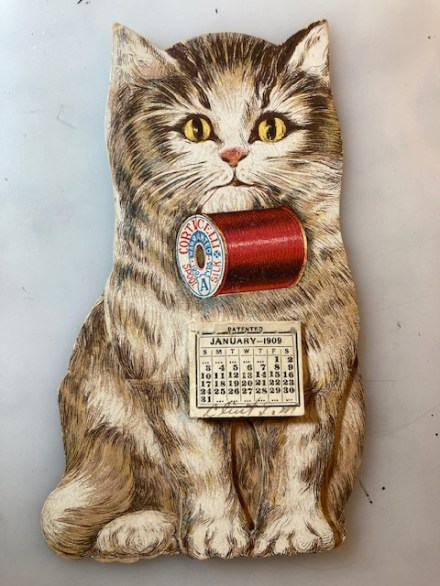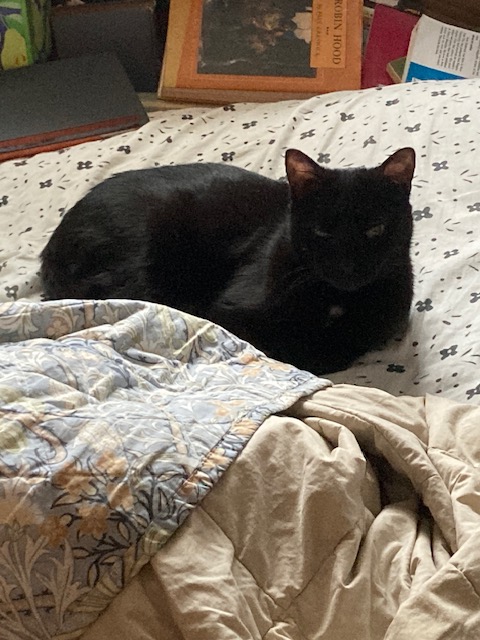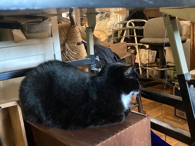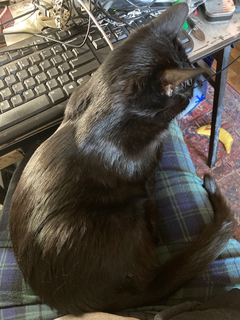
Pam’s Pictorama Post: Like most New Yorkers I awoke to a much cooler day today after several days or grueling and punishing heat. And this fellow was looking up at me on my desk when I got here this morning. (Envision my desk, an old drawing table someone gave me, as a living, roiling, mass of things which occasionally coughs up something from a lower stratum. One morning last week it was freakishly an early family photo of Kim’s. I don’t remember having seen it before and have absolutely no idea how that ended up in the mix.)
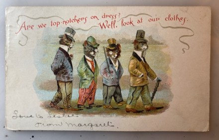
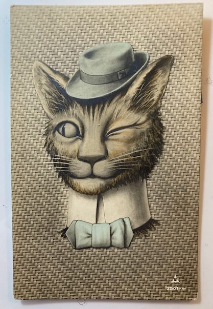
I purchased this card at the most recent edition of the postcard sale. You would think that it might be embossed with the very textured, woven look of the background (like the surface of an old suitcase), but it is not. This very sporty cat however, who has a hat, high (detachable?) collar and bow tie all of his day. That chapeau (more or less the same blue as his natty bowtie), is at an especially jaunty angle and sized just right for between his pointed ears.
As cat coloring goes, he is a bit nondescript. His hair is sort of a brown mix but without a distinct stripe like a tabby. He’s got a saucy look with his gaze directed, not at us, but toward someone or something to the viewer’s left. While it isn’t all the way to thuggish, his wink isn’t one of affection and I would say he’s a tough guy. (Cats blink and wink with affection and sometimes of course as they get sleepy – which being cats is much of the time.)
This card was mailed from Rotterdam on April 3, 1917 (I needed Google’s help with that) and addressed in a purpleish ink to Mej. W. H. van Etten, Oudshofstraat, Steenbergen. In the same ink and hand on the left, it appears to say something like, Jac. Pat.
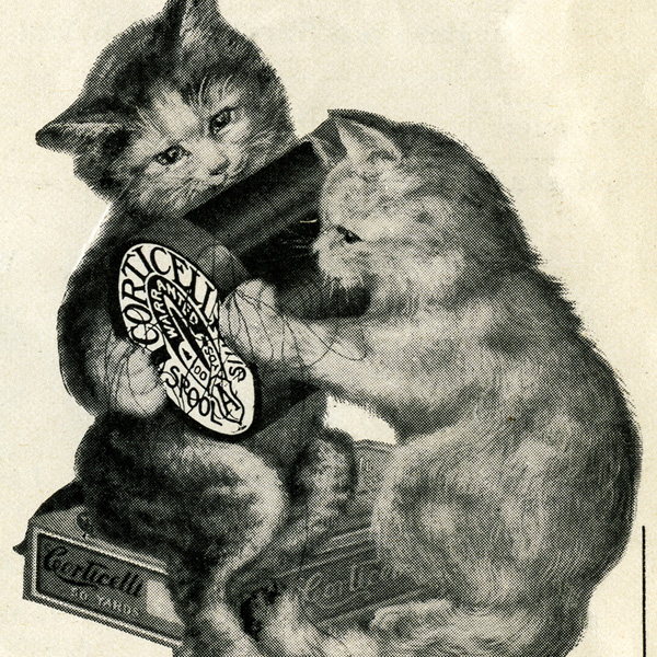
So this uncredited artist could be the Netherlands answer to Louis Wain. He looks like he is up for some trouble – I can see him shooting craps or pulling a minor heist. While Wain’s cats can have that quality there is something always a bit scattered about them and there is usually a sly joke somewhere.
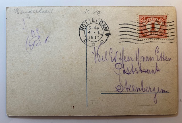
The only identifying mark on the card is a stylized PN and the number 2501-4 on the front. While an internet search shows Postcard News as utilizing these initials, they appear to be a later, American card company.
As a kid I had a remarkable tortie named Winkie. I have probably written about her before although not that I can think of at any great length. She was my first cat soulmate, was extremely smart (arguably too smart for her own good), and had several extra toes on each front paw as well as an extra joint somehow which made her look like she was on her tip toes.
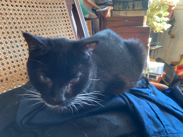
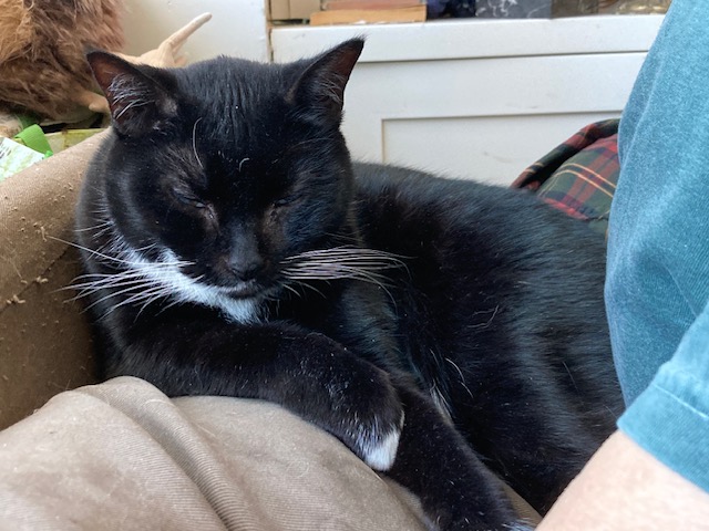
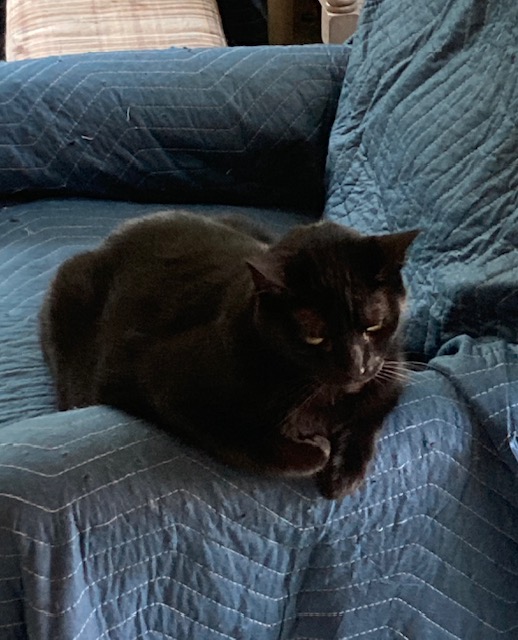
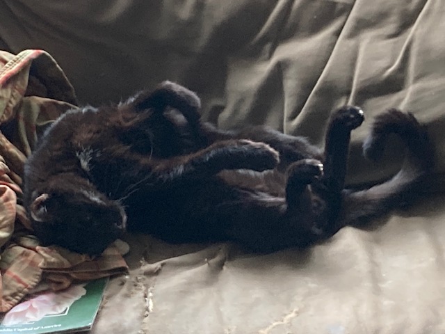
She and my cat Otto have left me with the impression that the girl cats are smarter than the boys, although the fellows are more likely to be very affectionate. This plays out a bit with Cookie and Blackie. However, it must be said that lately Cookie has become assertively in need of attention and leaps onto the bed nightly (dramatically jumping over Kim’s pillowed head and mine), lands next to me and begins loud meowing for pets. She has always been the more vocal, chattier of the two cats and now the vocalizations are long, loud and drawn out conversations and I suppose recriminations. Cookie (aka Cookie Monster), the tuxie of the two, is quite a card.