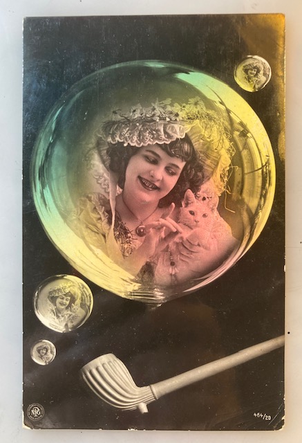
Scratch That

Pam’s Pictorama Photo Post: At the heart of my collecting are odd bit postcards and photos that just appeal to me and today it is one. It has been a little while since I have featured a real one-of-a-kind photo postcard that was made of someone’s pet – my indulgences at the postcard show have turned up more illustrated cards and professional photo postcards. However, in some ways these one-offs epitomize something about why I collect cat photos.

Photos are usually tributes to the puss in question, many mice caught, had kittens and the like, today’s is a different sort of good kitty notice. It took me a bit to realize that this missive declares that this Miss Cat (I believe kitty to be a girl), sweet little thing we see in the sun here, has not scratched our sender.

Beauregard is a very thoughtful cat and was always extra careful around mom.

Now, I am the first to say when you live with a kitten, you generally walking around like the bleeding wounded on some horror film set, arms and hands particularly mangled, until you convince them that there are things for scratching (and biting for that matter) and slowly it ceases.

It must be said that an odd flaw in my beloved Blackie is he never learned to use a scratching post or box. His sister Cookie is happy to tear furiously into one, as are the Jersey Five. I have set scratching boxes up in strategic places and they are used not only for scratching but Peaches in particular likes to sleep on them, as if on a little cardboard throne, as well as tear them to bits.

Mr. Blackie without a care in the world, showing his tummy recently.

As a result, we occasionally get a negligent scratch from Blackie’s nails, although he hasn’t actively scratched either of us since kittenhood. I used to worry about those kinds of unconscious scratches with my mom and her cats. At the end of her life her skin was very thin and as a diabetic, scratches could be a problem. However, her cat favorite lap cat Beau always seemed to be extra careful and we rarely if ever had a problem. In an adult cat clearly scratching is a clearly a sign of unhappiness – Back off buddy! You’ve crossed a line.

The cat in the photo reminds me of Peaches. She’s a terror and to my knowledge no one has actually ever touched her. She will get within two feet of me when I am putting out food and that’s it.

Our kitty here has been captured in a benign mood, although something has caught her attention out the window. She appears to be white with some stripe-y patches on the bottom half of her and some of the same color up around her head and ears. She’s not a kitten but does appear to be a fairly young cat. We see just the tip of her curled tail, mirrored by her shadow on this small table – she is barely staying still enough for this photo to be taken. She’s a sprightly cute little thing – clearly a scratcher though!

There is a cannister, such as would hold something like flour, behind her. (Dollars to donuts that got knocked over eventually if this was her favorite viewing table.) Puss is a little sassy, you can tell that from this pic. All this is captured in this circle printed at the top of the card.

Cookie likes to curl up under my desk. This was her during a zoom call last week.

Under it, the fellow in question has written, “Hasn’t scratched yrs” Yours Samuel Jackson. It was mailed from Schenectady on June 11 at 11:30 (maybe 12:30, hard to see), 1906. It is addressed (to the best of my decoding ability) to Miss Emma Crisppen, Coxsackie, N.Y. It arrived in Coxsackie at 4:00 PM of the same day. A miracle by today’s standards we cannot imagine. (Not that they could imagine sending an email or this blog post in all fairness.)

So there we have it, our slice of time out of 1906, very close to exactly 120 years ago today.

Commuter Cats

Pam’s Pictorama Post: There are a few rather interesting things about today’s card – an image I have never seen before but cracked me up. It posits six cats in a flying machine that is both futuristic while still being of its early 20th century time – a nice commute indeed for these workaday kits, I must say. I want to say the flying machine is one part kite on the top and this wing advertises, Why trouble to drive? Aerobus Trips in the Sky. It has, oddly enough, skis as well as wheels. I assume that although no snow currently threatens the bucolic green town below, one has to be prepared for all eventualities and seasons. (Wain is a Pictorama favorite and if you are new to the fold you can find more past Wain posts here, here and here for starters.)

On the side of the aeobus there is a partially obscured inscription, Catlands Branch…and then what likely is Service. The plane appears to be made of something reminiscent of balsa wood, but we will hope for their sake that it is something a bit more substantial. A little put-put propeller seems to be the force behind flight, perhaps helped along with the kite-like design. Just behind the propeller and hard to read is the name of the vehicle, evidently christened Mouse No. 15.

It is a tabby filled load, heavy on the oranges (orange tabbies seem to be a favorite of Wain’s, perhaps their natural tendency toward trouble making), although there are a variety of shades within that, light and dark, and one black and whiter for good measure. A jolly fat fellow is steering, wheel and stick I notice. He sports a cap in case we doubt his official role. The other cats seem to be enjoying themselves, looking at the view. I’m surprised no one is reading the newspaper or coming home with bags and boxes from a shopping trip in town – it could use a middle-aged female cat.

The town below sports a church and a single, very large home, a bridge in the distance and tended fields awaiting crops. There seems to be a sea which drifts almost invisibly into the sky.

Notably, in case you did not know, this card is a contemporary reproduction which was advertised as such online. I was curious and not unsatisfied with the results. After all, the “real” postcards have wide variation from multiple printings as well and what is real when it comes to postcards. The image is sharp and not dupe-y which is what I was most curious and concerned about. There is a somewhat undefinable not oldness about it. There is no manufacturer’s info on the back. It would have originally likely been the product of Raphael Tuck and Sons Ltd.

I have been unable to find versions of the original card online which lead to an interesting thought – what if this isn’t really a Louis Wain but instead a very crafty modern mix up and reassembly of existing and new parts? I don’t really think this card is, but it begs the question about our new world in the not too distant future will be we be parsing real versus actual reinvention?

To me it is also interesting that it is my inclination that I would mail this postcard and I never mail my old ones – too expensive and too fragile. If I give one it is generally framed. At $5 this was about the price of an average greeting card these days, although maybe a bit more with postage. I guess we will just have to wait and see if “new” Louis Wain’s start to appear and then we can judge them on their own merits. However, modern reproduction does bring the possibility of bringing them back into play so to speak and using them again for their original intention. (Does anyone actually even know what a postcard costs to send in the US today?)

****

For those of you who are wondering, Paw Day was a huge success yesterday at the Second Avenue Street Fair here. While the block long Japanese food fiesta might have topped our block marginally, we were packed with interested parties and lots and lots of dogs (and a few adventurous cats) and curiosity. Many existing clients visited with us and our docs but also lots of people with puppies and new pets who were curious. It was fast paced and exhausting but great fun.

A brave cat visitor to our table yesterday and Blackie exacting a lap toll this morning (slowing me down some) for yesterday being mostly a day out of the apartment.

Small Felix Treat

Pam’s Pictorama Photo Post: Today’s card, like yesterday’s, was a recent eBay buy. Although this is a reasonably cute little nipper, clad in his silk best and ruffles, it is his rare Felix toy that I have my eye on here. Junior has a hold on that toy which I assume it is a prop for the photo. It was taken in a photo studio (look at the background), and this grand toy is just a pleasant distraction for the photo. I always wonder about the screaming and fighting when they then try to disengage the child from the toy. Photographers needed to be made of stern stuff – or resign themselves to a well-stocked toy cupboard.

Back in May of ’22 I purchased this toy and posted about it. (That post can be found here.) I stated that I paid a fortune for him on eBay and I believe that knowing me and this toy which seems to be very rare. I did not find another online to share. I show my rather ratty, hard won and much beloved version here below. I will note that he and his post did not show up on my search which may mean maybe I just didn’t search as well as I should have. In part I forgot that he is a friction walker, not a wind-up. (Sadly, mine does not work.) Somewhere I seem to have gotten the information that he is German made. I assume the ball moved up and down as he walked! Mighty fine.

Pams-Pictorama.com Collection.

Like most of these photo postcards that are portraits this one was never mailed. There are no notations on the back. The best way to date this photo is of course the outfit on the child and the Felix which I would say places this in the mid-1920’s. (I can’t quite determine if his shoes are button or early lace-ups.) The postcard is in pretty pristine shape for its age (kicking around for 100 years) and my guess is it may have been framed or was placed in an album without glue or tape.

Although this toy has a simple mechanism as a friction walker, the silk outfit Felix sports and even his head which looks a bit breakable, must have meant that these just didn’t survive hard play and the very nature of how you played with it (grasping it and wearing down the suit, lots of falling over as you experimented with different inclines to make it walk) probably meant heavy wear and tear.

Postscript: Kim and I are off shortly for day two at the L’Alliance Comics Fest. I am hoping the rain will clear as promised and we can get some walking in for Kim (who is recovering quickly but doesn’t always get his walking practice in as he’d rather be working on his next book!), who hopes to progress to a cane in the next week or so. We saw Charles Burns and Peter Cooper yesterday. Catch up with the photos on Instagram or come and see us at lunchtime today.

Hanging the Moon

Pam’s Pictorama Post: We are mooning around today here at Pictorama and of course Deitch Studio is a good place for it as no one does it better than Kim in my opinion. That old man on the moon – Kim makes him toothy and gives him carbuncles and craters for an extra moon-y surface to his bald head. There was a time when I might have said that the Man on the Moon best defined Kim’s work – along with the time clock with a face standing over him for starters. And I generally ask Kim for a moon face (and snow) in our holiday cards.

A good ‘ole Kim Deitch moon in this eye popping pic of a cartoon mural!

Postcards, photography, cartoons – all in love with the man on the moon and hanging with him. My collection has a few choice photo postcards of people sitting on the moon (I’d have more if they weren’t so expensive!) and of course even just a few posts back there were kittens in a balloon flying toward the moon. A few images from my collection are below. (The post about the photo of Kim and Simon shown below can be found here.)

Pams-Pictorama.com Collection.

(The card above was from a previous postcard sale and was in a January post which can be found here.)

As much as we crave sunlight there is something about being out under the rays of a bright full or roaring orange harvest moon that makes us kick up our heels in a totally different way – not to mention the romantic interludes it inspires. I remember reading a passage in a novel about roaming through backyards and streets in the suburbs late at night under a bright full moon. Having grown up in suburbia it brought such a specific image to my mind that stayed with me. And where I grew up it would have also been the moon on the water too, always reflected on the river in our backyard. Stephen Millhauser writes very compellingly about having a different life by night – I may be thinking of him. (His novella, Enchanted Night is a good place to start with his books.)

Available in paperback in a number of places online.

I fell hard for this postcard immediately. I found it last weekend at the postcard show and the dealer told me it is a part of a series. Although I found another copy of this card in a collection online, I was unable to find others from a series. I will be keeping a sharp eye out however.

An early Deitch Studio holiday card production with moon, stars instead of snow. I like those too.

It would appear that these youngsters are constructing this natty moon fellow, placing his hat, glasses (those are a nice touch!), giving him a pipe, and one doing something with his mustache – applying it? There is a tiny paint can next to him. Obviously a ladder is necessary to do this work. The boys are all wearing overalls in different colors and reach sports red shoes.

The thing about this image is this amazing flying contraption the boys are in. When you look carefully it is a flying boat – something akin to a rowboat with wings, a kite-tail and strange wheels – for use on land? Another look and you realize that there is something coming off the flying machine to the back of the moon – it appears it is actually propping it up in the softly star studded sky. The painting boy, tucked in the seat of this machine, has a tiny ship’s wheel in front of him to steer. How all three would fit is also a further question for our imagination.

Kim and Simon posing for a moon seat photo as tiny tots!

Lastly this machine hangs over the endless sea – like it is taking place somewhere at the ends of the world, which is likely is. Waves appear to gently lap but of course space and scale are left entirely to our imagination. I must say the artist had a wonderful vision and got to run with it on this one.

This card was never mailed although the back has indications that it was pasted into something. The maker’s mark is postcard druik u. Verlag von B. Dondort, G m.b.H. Frankfurt a/m which doesn’t seem to lead to much of anything.

It is seldom that an image makes me as dreamy as this one does. It gives a new visual to the idea of thinking that your loved one has indeed hung the moon for you. A cheerful thought on a rainy Sunday here in New York City and at Deitch Studio.

Beauty

Pam’s Pictorama Post: Yesterday’s postcard show did not disappoint, and Kim and I wiled away an hour or two perusing the wares. This is a single day show and therefore a bit smaller and folks say they don’t bring as much stock but we made out just fine. We will wait for Friday and Saturday, June 5 and 6 for that. Meanwhile I present one of my purchases which caught my eye, however it is more fun now that I have transcribed the message on the back. The message is for a new kitty, named Beauty, that has clearly joined the family.

It would appear that these cats are ice skating – and this Mom (?) cat is putting a skate on the young cat (boy? it has a blue bow) although there is only one, which she has just placed on his foot. (Where is the other skate?) The chair is somewhat mysteriously placed out on the ice, another cat skating with what appears to be a cane in the background. In the foreground there is a black kitty, who looks like my Blackie with just some white on his neck, also standing with a cane. (Do cats need canes to stand like humans? Is this something we should know if we want them to become bipeds?)

Youngster looks like the one I am calling Mom and has a matching tabby stripe to his fur. The skater in the background also appears to have stripes but is at a distance and somewhat indistinct. The weird sea green ice (which makes them appear to be actually standing and seated on water) goes to an only slightly lighter background. Dad pokes out of the frame and Mom perches right on it.

Back of card – very embossed indeed! Makes it a bit hard to read at first.

This card is embossed, creating a very three-dimensional effect, and around the edge is some snow decoration, also embossed. The postcard was made in Germany, however no artist is identified with it. Youngster is eager to get skating I’d say.

We stopped for lunch at a place called Bagel Pub.

I didn’t understand the message at first as it took some decoding. Despite the neat script the back of the card is pitted with the embossing making it hard to read. Anyway, it reads as follows, October 2d 1910. Well, my one eared Beauty how are you? Snoozing in your mother’s big chair I presume. Be good to little Georgie and never scratch him. Hope you will live many years. Auntie B. It was mailed to, Beauty Dunham, 782 Commercial S, East Weymouth, Mass. and just in case below that, To Georgie Dunham. It’s nice that she dated it because the postmark does not show the year, although October 3 and 6 AM show, as does New Jersey, but only Brio…? shows on the postmark for location which I cannot figure out. And gosh, what happened to one of Beauty’s ears?

Spotted this interesting building – the old bit in front seems to have actual gas lamps. The ancient building on the other side is interesting too. This is 13th Street, I think between 7th and 6th, southside of the street.

Meanwhile, Kim had his maiden voyage on the subway, his first long trip out since surgery. I think a change of scenery swept away any cabin fever he had, although admittedly he has been deep into his work so I am not sure how much he was suffering from his time at home as a result. However, all is onward and upward here at Deitch Studio.

Way Up!

Pam’s Pictorama Photo Post: Today is Metropolitan Postcard Club Show Day! Yay for new postcards for Pictorama! We herald that event with a postcard from the last show, purchased for it’s kitten collage-ness.

Photos of kittens floating in balloons is a sort of sub-genre of early 20th century photography and this is a late example – almost a tribute to those. This card was mailed from Kingston, New York on July 27, 1944. (As an aside, I had cousins who lived near Kingston, New York and was probably visiting them thirty years later.) So it is later than most of my collection but is reminiscent of those earlier cards. (You can check out some of those posts here and here.)

In the Kills refers to the upstate area full of small water bodies (kille is Dutch for waterway) and those areas such as Fishkill, Peekskill and Catakill (the last being where those cousins resided) named thusly.

Pams-Pictorama.com collection.

These cats are a further play on words with the broader Catskill area. The postcard play on words was popular and I have future posts devoted to more of these as of course cat cards are like nip to me. We have two fluffy kits in a basket with a “balloon” that looks like maybe it is a fishnet stocking or real fish netting around a ball, which is probably then held by a string of fishline we cannot see. An ever so slightly cross-eyed moon face looks on – the yellow is a nice contrast in this otherwise almost dark and stormy card. I gather these kits are making their journey at night.

Pams-Pictorama.com collection – very similar!

The back of this card is printed in an unusually legible hand. It says, Dear Very Dear Elinor Hello; Sweetness. How be you, and the partner – O.K. I hope – the same here – in this grand restful place – I am getting along famously – take a walk most every day – and am receiving excellent care – in the intervals – lots of love from your old man – brother. AL. It is addressed to, Mrs. R.H. Robinson, 155 Clymer Street, Brooklyn, 11, New York.

The ingenuity of cards like this interest me. I am always looking at them and thinking about which two of the seven I could convince to sit in a basket (none) and tie a little ball to it, etc. I am sure it was a day’s work that was harder than it may look. Meanwhile, this one has these collage elements of the moon and background layered in. It is though, remarkably similar to the earlier one I show here.

Back of card.

Meanwhile, Kim and I are off to the West Village soon to see what irresistible cat cards are in store for me today. Wish me happy collecting! It is bright and sunny here in New York and having a spring swing back toward warm today. Kim is braving downtown for the first time since his back surgery – getting a bit of cabin fever I think doing nothing these days really but working on hard his next book. We’ll get him some air and a change of scenery. More to come!

Easter Egg

Pam’s Pictorama Post: This year it is a foggy, rainy Easter morning here in New York City. Hardly the harbinger of spring that you want it to be, however I am celebrating with this somewhat whacky card. I bought many months ago at the postcard sale and I bought it for the sheer, delightful, oddness of it.

Just noting that I have an odd fondness for these chocolate Easter eggs from childhood and still grab one or two annually.

The card is heavily embossed with thick looking gold highlights. A careful look tells that it appears to take place in a dark forest, if you peer behind the large egg house the trees almost bend around it. Easter Greetings is engraved with gold highlights, nestled among the trees. Meanwhile, a pretty little decorative, curtained window on the second floor of this egg house reveals a rooster portrayed in dignified profile. Below him is a sweet little green door complete with a mail slot and a red portico (you want to get into the house in the rain comfortably, after all), and even a little pull chain for a doorbell. There are a few front steps to complete the image.

Below, running wildly are two little chicks – I say little although somehow they are much larger than the rooster – who I grant you is at a bit of a distance up in his window, but still! They are in a race with each other on a grassy turf; the light one has a worm the one with brown feathers wants to share. Is there a cryptic and symbolic meaning in this? The artist was very conscious of shadow, bottom of the egg, under the chicks, under even the tiny window ledge, giving the card a three dimensional appeal.

The border of the card is a colorful riot of flowers, leaves and (pink!) eggs on a gold background. The eggs are dispersed in odd groupings of single, three and two, again not sure if there is some symbolism I am missing.

Back of card.

Like many lately, I find that this card was addressed on the back but never stamped and postmarked so therefore not mailed and no date for us. I show the back above, the sloping child’s hand going off the card and barely crams in the address. It appears to read, Miss Eleanor Bigwood, 928 Helamont Avenue, Schenectady, NY. Upside down on the other half, in the same hand but very hard to read is, Myra and Victor – presumably the senders. I will assume that this precious missive was ultimately put directly in Miss Bigwood’s hands.

With today’s weather we can only cheer ourselves with the old adage, April showers bring May flowers. And it is true! The pansies, tulips, magnolias and cherry trees are in bloom after a long winter’s nap. New York City is shaking off its long-held mantle of winter at last this year and it is all we can do from burying our heads in the flower filled tree wells lining the blocks here.

Meanwhile, we had a gorgeous spring day yesterday. Kim and I endeavored to undertake his first long walk since his surgery, about a mile round trip to Orwashers bakery and back. This weekly walk to get a nice loaf of bread for the week has become somewhat of a ritual and during the hospital stay and the MoCCA convention last weekend, it has been interrupted. However, the walk was much longer than anything he has done since the surgery, although still using a walker now and for the coming month. He did it like a champ though which makes us feel he is well on the way on the, albeit long, road of recovery from his back surgery.

Homemade matzoh making a holiday appearance at Orwashers this weekend.

Although Orwasher’s was all sold out of their as advertised, yummy-looking hot cross buns when we got there (oh my!) a small amount of homemade matzohs were still available. Although not our mission for the day (we stuck to our loaf of sourdough and a bonus olive stick), it was a reminder of the dual holidays, Passover and Easter, which signify this season of renewal and regeneration.

Pictorama readers may remember that with a Jewish father and a mother who was raised in a Catholic/Episcopalian household, I grew up recognizing both holidays, admittedly in a secular and food related way. I can remember Easter weekends with matzoh brie (my mom had mastered that) followed by an Easter Sunday family brunch at my maternal grandmother’s of ham and homemade Easter bread. We dyed Easter eggs but also, at least roughly, knew the rituals of a Passover seder. It all means the return of spring to me now – tied to the blooming of the magnolia in my front yard in New Jersey and streets filled with masses of blooming cherry trees.

A day or so in the ER and even a short stay in the hospital will always remind you of your blessings – other people’s problems are indeed frequently worse than your own, and we have seen that recently. For now, I remain grateful to say spring is arriving, Kim’s recovery and walking improving apace, and there are many signs for a significant growth and blooming in the next part of this year.

All Wet

Pam’s Pictorama Post: This March Sunday, a much yearned for spring thaw let alone summer, seems quite far away still. This Manhattan morning can’t quite make up its mind if it is going to be gray all day or not, but the temperatures will hover in the low forties – not unreasonable for March but we can’t help but yearn for the halcyon promise of summer. So for my part it seems that the least I can do is immerse us in a swimming cat card today.

It appears to me that in the early days of the 20th century, the Tuck company put all their eggs in the cat card basket it would seem – and emerged victorious. Churning out first Louis Wain cards, then these Boulanger ones and eventually making their way to Felix ones a few years later. (Examples from prior posts and a bit about Tuck can be found in posts here and one of the Felix Christmas cards here.) Clearly cats helped build the Tuck empire. By the time Felix rolled around they were card publishers to the King and Queen and I can’t help but wonder if that means that maybe George V was mailing Felix holiday cards?

This card is credited to Maurice Boulanger – the not-quite-Wain – whose cat antics are of a slightly less sardonic variety than those by Mr. Wain. (Albeit he is usually less pointedly ironic, this card as below which I posted about recently where Mr. Cat is preparing a rat feast!)

Pams-Pictorama.com Collection. A post a few weeks ago.

Today’s card is from the earlier days of Raphael Tuck, before royal recognition it would seem. It was sent in 1908 with a sloppy postmark (marring the front a bit) on September 5 from Marblehead, Massachusetts – a lovely beachy place. (I have visited a childhood friend there and it is a wonderful seaside area not far from Boston.) This card was mailed to Winthrop Stacey and then simply Orne St. Town. On the message side it says simply, H.T.S. R.F.N. W.P.S. Don’t stay in too long. E.

This is sort of a pitch perfect message to go with this image of happily splashing cats, adult and two kits. (Splashing is printed at the top with lovely little flowering plants winding through it and a nice decorative frame top and bottom.)

The execution of the splashing cracks me up, a bit primitive but gets the idea across. The kittens are splashing dad (or is it mom?) and little white caps indicate some movement in the water. Two seagulls wheel in the sky above them unnoticed. Their catness does not extend to that at the moment – they pay them no mind. And of course traditionally cats eschew water so in that regard these are anthropomorphic kits too.

View coming into the Sandy Hook Bay recently on the ferry.

A lighthouse is perched on land in the distance – it reminds me of the Sandy Hook bay where I land when I take the ferry to New Jersey. (And really quite near where I myself learned to swim as a tiny tot.) As mentioned above, an errant postmark registration lightly mars the front of this image over the grown up cat on the left but doesn’t take away from the overall card. The yellow in the sky indicates either sunrise or sunset – I vote for the latter – and of course picks up at the top of the card.

Summer will arrive here as suddenly as winter did I suspect. The Farmer’s Almanac says that it will be a hot spring season and while I am not a fan of heat and humidity I look very much forward to evenings on our deck under twinkle lights and the hummingbirds and bees feasting on the dahlias and strawberry plants. Here’s for contemplating summer days!

Easter Greetings, 1908

Pam’s Pictorama Photo Post: As we head toward the Easter season, this is one of a few seasonally appropriate items I have. The odd image doesn’t necessarily scream Easter, but there it is at the bottom of the card, Easter Greetings 1908 and the photographer’s name front and center although barely legible, G. Butney. It also says, Novato.

It would seem that Mr. Butney was a well-known (in the day) photographer in the early days of the 20th century, evidently headquartered in Novato, California. In July 1908, presumably several months after this card was created, he took a series of photos of a train wreck in Novato and turned them into photo postcards which he became best known for. (If, like me, you aren’t familiar with Novato, it is north of San Francisco.) It seems somewhat odd that photo postcards of a train wreck would be so popular.

For all of his sort of ten minutes of fame with this series of photos, there isn’t much left about Mr. Butney – no biography available, nor is his first name even evident.

Wreck on N.W.P. at Novato July 3 ’08. From the train wreck series that brought G. Butney brief local fame. Image via University of California.

It is a bit hard to see the connection between the train wreck photo and mine, but there you are. I assume mine was made as some sort of advertisement for his services and distributed earlier that same year. As an advertisement the difficulty reading his name at the bottom probably did not work in his favor – however, this very clever and eye-catching photo probably did. There is nothing on the back and it was never sent.

On close examination, it appears that each of these children really did pose with their head poking through this large homemade flower sort of collar. At first I thought it was photos collaged into the flowers, but I think not. It would appear that each flower is a separate photo or more likely negative, printed together into this image. It is quite a funny design and had to be more than a little work to execute. A careful examination shows some slight differences in exposure and printing – further contributing to my idea that they were each shot and printed individually.

There is an array of boys and girls, some smiling, others not – especially among the boys, although really, frowning might be evenly distributed. There is a range of age as well from toddler to a woman just to the right of Novato who appears to be an adult – his wife I wonder? Did he have a studio where he collected these over time as he took photos (Oh and just one more thing before you and Junior go…) or was there just a day or two of madness when he had a pile of kids come in? There are 26 (I think) separate images.

My other Easter treats are a bit less unique however I thought I’d share this one today, a tribute to the Ides of March and the spring season to come.

Kitten Card

Pam’s Pictorama Photo Post: Today I have plucked this hand-colored card out of the pile. It was used as a birthday card and it certainly is cheerful enough to make a good one. Kitten pictures are like dopamine hits and during stressful times if I can, I find watching videos of them or looking at pictures of them very soothing. Given the feline nature of Pictorama this is probably not surprising.

Meanwhile, I have seven cats, no shortage here, and yet looking at more cats still appeals to me, although I do recognize that I do not need to acquire any at the moment. (I’m not sure I documented the sudden acquisition of five cats when my mother died, although longstanding readers probably figured it out. For new readers, that is how I went from always having two to having seven more or less overnight. It’s a lot of cats.) All that to say I am cheerfully contributing to your dopamine acquisition online today, a bit of cat fluff to cheer your weekend, (another) rainy one if you are in Manhattan. (Not to mention to help get with the time change – that certainly snuck up on me.)

This young woman might be from the early 1920’s to as late as the 1930’s when we take her clothes and hair (careful marcel wave) into account. She holds two very likely little suspects, a tabby (always a good look on those) with his small paws wrapped around her arm, and fluffy white one with spots, the true color of which is hard to peg.

The kittens are small enough to be easily subdued by the young woman holding them. Her dress has a wild print and has been painted in this interesting orange, red stripe running down the front and a sort of Keith Haring-esque pattern. She sports a bracelet which appears to be silver and has a charm hanging off of it. Her ruffled cuffs and collar have been left a bright white. There are some sort of illegible decorations down the front of her dress and artificial looking ropes of flowers are color sketched in behind her. If she wasn’t such a pretty woman, she would recede behind all this visual noise, however she holds her own.

Inked on the back in neat script is says, Dear Kathie, Wishing you many happy returns of the day. From Lily & John. However, there is no postmark, it must have been handed to her or on gift perhaps.

Given my affection for such antique missives, it probably isn’t surprising that I am still a sender of cards. Although the circle is smaller than it used to be, physical cards still go out for birthdays and for some, Valentines, Easter and for a large group (as you have seen) Christmas. Are the best of my cards being saved to turn up in the future? It’s hard to say, but I believe the folks I send them to seem to appreciate the physical reminder that I am thinking of them and have chosen a card for them. (And who doesn’t love a bit of unexpected mail that isn’t a bill?) However, it is undeniably an anachronism, albeit one I hold dear. So this is a cat card for all of you today – I will say that personally I needed a cat pic today and this one has done just fine.