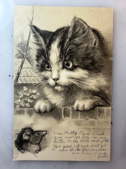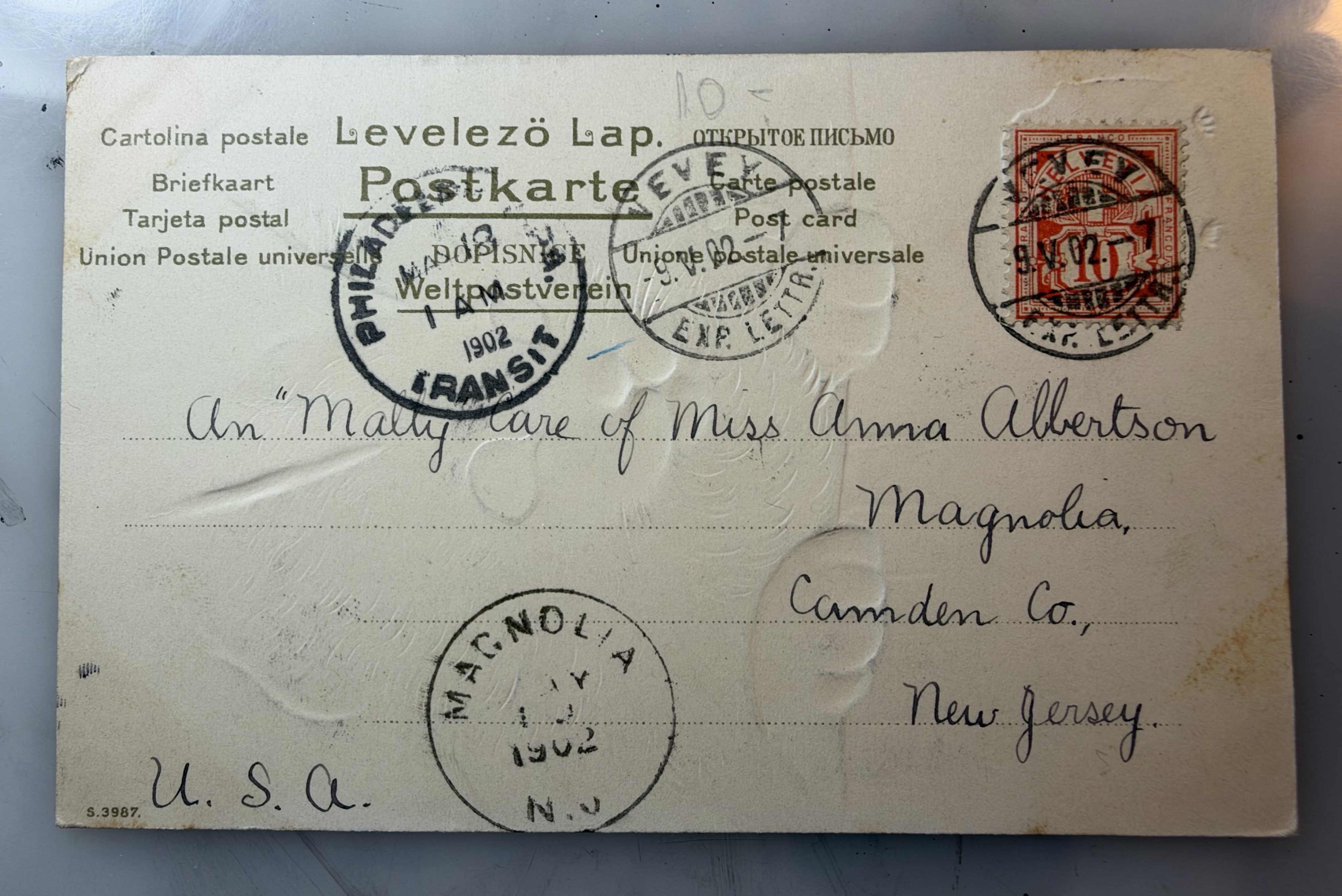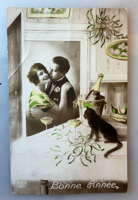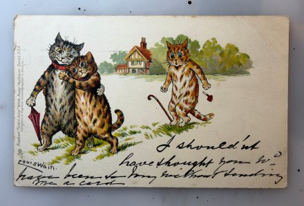
Pam’s Pictorama Post: Today is a cuddling a cat card. It isn’t really quite typical of one I would purchase (verging on the saccharin) but there was something about the atmosphere of it that made me pick it up. I am a bit of a sucker for that dramatic look I think. In studying it a bit this morning and reading the note on the back, I like to think that it was perhaps a father picking out a card to send to his wife and daughters, maybe thinking about what they would like. I sometimes wonder about this period, one so popular for sending postcards, multiple deliveries a day and often for something as small as to set a date or announce an arrival. Where were the cards purchased and was the sender considering the recipient when choosing?
Certainly cards were frequently sent from a holiday – or in this case to family members probably on holiday. But I wonder, did dad grab one from a pile of postcards at home to use? In general was there a stash of postcards for general household use the way I keep a cache of birthday and get well cards even now? Or did dad wander off and find one, perhaps at the news agent when purchasing some magazines or a paper? Did he see it and think of them? In this case I think he might have – other times where there seems to be a complete disconnect between card and subject, I think it is less likely.
This young girl and her fluffy white cat are on a velvety dark background, emerging out of it and bottom lit. There are sparkling bits on her dress made with shiny dots which are layered on (casting tiny shadows and gleaming) and the effect pops dramatically. Her curly hair is caught up in a faded red velvet ribbon (the red color picked up in the flowers on her dress), the texture of it and the shiny (but not quite garish), fabric of her green dress make her emerge out of the soft, dark space, her expression a bit beguiling. The card was made in Prussia but there is no other publication information, just a serial number on the lower left.
The cat, a fluffy white long-hair, allows her to cuddle it close while looking at the viewer – his or her eyes dotted with tiny bits of green, the same as her dress. A practiced cat holder, she has the cat’s front paws caught up in her hands though – it’s not getting away. She sports a gold bracelet and a ring on the hand we can see and she has been gently colored in with flesh tone, rosy cheeks and lips.
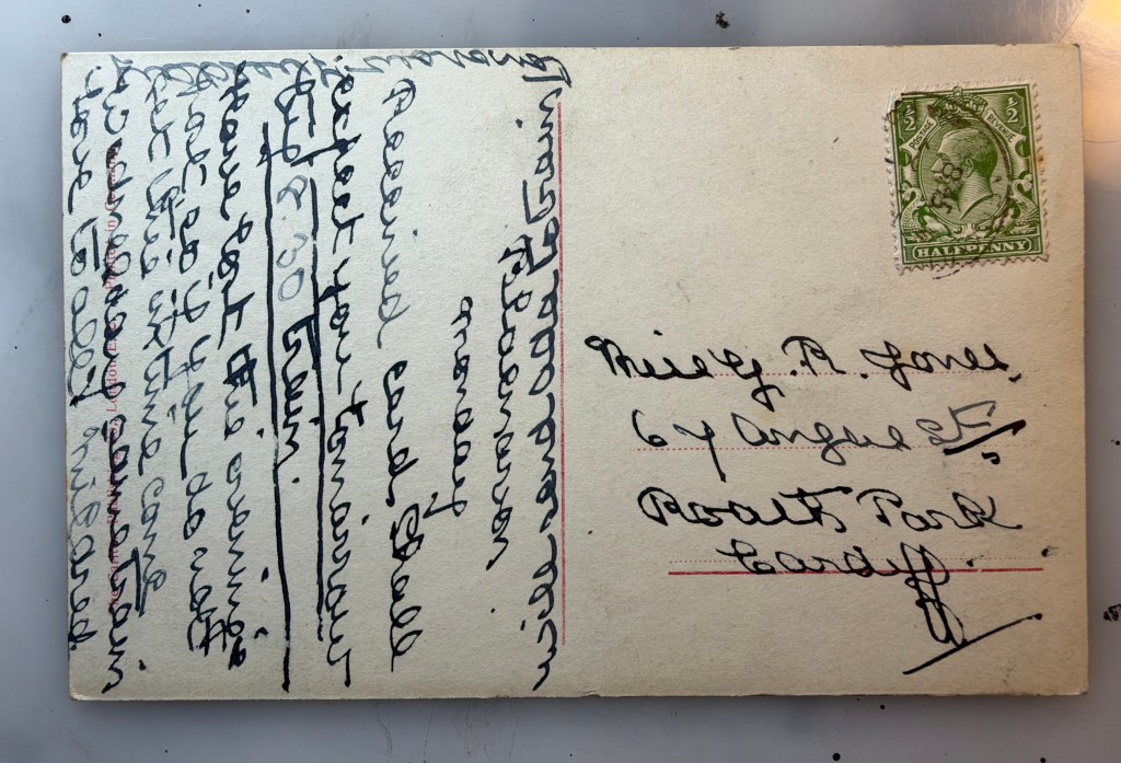
This card was sent to The Misses Speedays. I cannot read the name of who it was sent care of, however it went to Bleucathra Street, Keswick. It was mailed on June 20, 1912. The message reads, I am enjoying myself very much, I don’t think I will come home when you come back. Peter. A careful look at the cancellation shows it was mailed from Sunderland. Not knowing where that is, I had a quick look and it is way up in the north, just southeast of Edinburgh.
I like to think he picked the card out for them – although I am mulling that he signs Peter and not dad making me second guess my storyline. Still, perhaps his cat loving Misses Speedays have left him home with puss and perhaps other pets while they enjoy their early summer vacation, to the south of their home near the North Sea. And we can indeed imagine their pleasure in receiving it.
Pam’s Pictorama Post: I have a philosophy about summer weather in the greater New York area. It is my belief that July is always worse weather than August and therefore I generally push my vacation to August because otherwise it is spent inside clinging to air conditioning and I might as well be in the office. (Furthermore, I would say that June is just too early in the summer for vacation and too busy at this particular job as well – although the June weather was lousy this year as well.) However, during the long beachy summers of my childhood the hot, sunny days of July were a feature event, better than the cooling days of August. It was prime summer. However, every single day that it rained did seem like a crime against my vacation.
I think for the most part we on the East Coast of the United States can agree however, that thus far this year the weather has been extreme and really a bit wretched. In addition to many days of heat over 100 degrees, we are now dealing with an air inversion, a heat dome trapping the smoke from wildfires in the north and turning our days tea-colored with a vague sense of the End Days hanging about them. Meanwhile, Kim and I need to make a trip downtown and both today and tomorrow threaten additionally with downpours.
British beach holidays have long been fraught with the likelihood of rain and the population intrepid about them in spite of that. I am guessing this one, from August of 1927 was no exception. Bonzo and his pale Ooloo, huddled companionably under an umbrella. Bonzo looks like his toy counterpart a bit more than his illustration and comics self and the black cat is a bit more generic than Ooloo. (For two Ooloo posts have a look here and here.) Although I will say, I have never been sure that Ooloo had a very decided design.
Here he (she? never sure) sports a big read bow that matches the umbrella and they look at each other fondly. No one is actually holding up said umbrella – a careful look just sort of shows it floats over them. Bonzo has a paw stuck out as if checking to see if it is still raining, although it is teeming down. Little drips come off the edges of the umbrella as if to assure the viewer that it is indeed keeping them dry despite the rain pattern across the image.
Above them it says, The weather, old friend, doesn’t matter a jot; But a card for Remembrance just matters a lot. (Jot isn’t a word you see a lot, right?) It should also be noted that there is no copyright or publication information on this card, helping to confirm my suspicion that it is a total swipe.
Blackpool evidently just had this flat Felix instead of a stuffed one. Pams-Pictorama.com collection.
On the back, in pencil and as best I can tell it says, Blackpool Hello Dear, I am enjoying the last of my holidays and around Blackpool but tomorrow I leave for Liverpool and from…I’m…you. And in the top right corner, Love from P. Limson. It is addressed to Miss L. M. Horsepoof, Gedling, Nottingham. It is dated, as noted above, with a cancellation from Blackpool on August, 24, 1927 at 10:15 AM.
Pictorama readers well know that in my mind Blackpool holidays at the beach in the 1920’s were best known for having your photo taken with an over-sized Felix. (A post with a number of photos from Blackpool can be found here.) This would of course be reason enough alone for me to opt for a summer holiday there, weather notwithstanding. Instead, next weekend we decamp for our New Jersey shore digs. A few posts between now and then but we are starting to get ourselves ready.
Pam’s Pictorama Post: I tossed this into a purchase pile recently as clearly somehow these are Wain or Wain-ish cats; however I would bet dollars to donuts that Louis never saw a payday for this one. However, having said that, I cannot easily locate another version of this image online, only one other copy of this card itself.
A few posts back I discussed the history of New York postcard producer Franz Huld and much to my surprise this morning, his credit runs along the side of the front of this card, Huld’s Correspondence Series No. 23 Franz Huld, Publisher, New York. (That post of an entertaining card about the Catskills, Hanging on the Moon, can be found here.)
Meanwhile, just yesterday Pictorama had a post about another innovative early postcard maker but in Germany. I think of that one as more of a high end (photomontages and trick photography) and our US friend Huld as sort of creatively low end if you will. (I am only on my first cup of coffee today so stay with me a bit.) Huld had a much briefer run in the business and never on a huge scale of production and maybe wasn’t above a bit of image thievery. Just a thought anyway because this card looks distinctly culled from something else and does not bear the Louis Wain signature nor credit however those are Wain cats.
This card was mailed but the postmark has been torn off therefore I cannot accurate date it. If I put it roughly at 1910, Huld is coming toward the end of his several years of production but still active and in upstate New York. However, the real smoking gun is that Wain was living and working in New York from 1907-1910, but only doing newspaper work. He was producing two newspaper strips, Cats About Town and Graymalkin. There is evidently no record of him producing postcards here. So my guess is that Huld lifted this image somehow from a newspaper illustration and craftily “repurposed” it.
One of the few images I could definitely tie out to this period of New York newspaper work. I do think there is some under-valued and interesting Wain work published in newspapers. While much of it was repurposed and collected, I have definitely seen work, mostly for sale as tear sheets, that I have not seen elsewhere.
On the card we have two grainy Wain cats, one yellow fellow attacking a meal of fish – his mouth in an “O” of expectation. I like the way his paws manage to hold the implements in a logical way which I would personally find challenging if I was drawing this. The orange, grumpy, cat looks on in expectation holding a three-prong fork and knife up like he might bang on the table with them. Next to them in script it reads in neat script, This is no Fish Story. Again, while maybe in the quirky style of Wain somehow perhaps misses the mark?
Detail of a Christmas page done by Wain that I purchased and wrote about last December.
The sender of the card has underlined the above and written, No-sir-ee – Dearest Ross; How are you enjoying your vacation. I am having a fine time. Love to all, Bradley. It was mailed to Master Ross W. Guernsey, Schoharie, Scho, Co. New York. As I mentioned before, the stamp and cancellation has been torn off so no date and no point of origin for the card. (In sorting out the address a bit the internet told me that Ross W. Guernsey was a life-long resident of Schoharie, New York. I have no way of knowing if that seems true or AI just sort of winding me up.)
Our friend Mr. Huld was sadly certainly not the only one taking advantage of Louis Wain and liberating his work for his own purposes. This is perhaps though the most egregious and evident example I have run across. Still, I remain grateful for a snippet of Louis Wain I wouldn’t have seen otherwise. I intend to continue to sniff out some of this newspaper work in its original form.
Pam’s Pictorama Photo Post: This is a sort of genre of Pictorama cards – beautiful woman in a photo collage or otherwise manipulated, sometimes on the moon, but today is bubbles being blown and bubbling up from a clay pipe. (It’s a loose category but have a look here, here and here for a few others to get the idea.)
This one has the added appeal of a pampered looking kitten being held by the woman who is looking at it adoringly. (Likely a studio puss who earned his daily keep but has a natural look of feline entitlement.) She is in an absurdly befrilled hat, dripping in ribbons, lace and feathers. (One can only imagine how long before kitty wanted a go at the feathers; you’ll notice she is holding onto his paws.) She sports a gold necklace, rings and a bracelet. Even her dress seems to have feathers at the neck. Her make-up is evident, heavy lipstick and eye make-up which probably was considered a bit tarty for the day.
Somehow the illusion has been created that she is in a bubble – in fact her image in the bubble is repeated in the different size ones to make four on the card creating the illusion of bubbles floating out of the pipe. If I were to guess I would say maybe they started with a photo of a reflecting ball like you might have in a garden. (Or the witches balls I have discovered more recently that hang from the ceiling, usually in a window – to show that witch already lives there so that witches just move along – or so I am told.)
The photo is hand painted with a swath of pink on her and green and yellow around her. The smaller bubbles just get a dollop of yellow, the smallest remains in just black and white. The pipe is in black and white. It appears to be a clay pipe and I don’t know much about them. I wonder about what appears to be a hole in the bottom and how that worked with bubbles or even to smoke – but maybe it created a better flow of air somehow.
The postcard maker has a very tiny emblem in a circle also, in the lower left corner and a serial number (464/20) on the right. It is a stylized NPG which seems to stand for Neue Photographische Gesellschaft, an earlier German maker of photo postcards. Arthur Schwarz founded the company in 1894 and helped create the photo postcard boom of the 1900’s. The company was interested in technical advancements, color photos and without knowing more than this, I would say this is a good example.
Pams-Pictorama.com Collection. Well, actually Deitch Studio Collection.
Without noting the maker when I posted about this, today I discover that this postcard I gave Kim for his birthday a few years ago is made by this company as well. I show it above and the post about it can be found here.
This postcard was mailed and it is postmarked April 6, 1909 from Jacksonville, Florida and mailed to a Miss Ora F. Wagner, Noblesville, Ind 170 S9h. I can’t quite read the top of her message – it might read, Peeps and then says, This is a dark and gloomy day so I am sending you a “smiling” card. Yours HOH.
Back of card.
I like the sentiment and being a bit out of sorts after a long week at work it seems appropriate and like a good shot in the arm early this Saturday morning, many decades later.
Pam’s Pictorama Post: Like most New Yorkers I awoke to a much cooler day today after several days or grueling and punishing heat. And this fellow was looking up at me on my desk when I got here this morning. (Envision my desk, an old drawing table someone gave me, as a living, roiling, mass of things which occasionally coughs up something from a lower stratum. One morning last week it was freakishly an early family photo of Kim’s. I don’t remember having seen it before and have absolutely no idea how that ended up in the mix.)
I purchased this card at the most recent edition of the postcard sale. You would think that it might be embossed with the very textured, woven look of the background (like the surface of an old suitcase), but it is not. This very sporty cat however, who has a hat, high (detachable?) collar and bow tie all of his day. That chapeau (more or less the same blue as his natty bowtie), is at an especially jaunty angle and sized just right for between his pointed ears.
As cat coloring goes, he is a bit nondescript. His hair is sort of a brown mix but without a distinct stripe like a tabby. He’s got a saucy look with his gaze directed, not at us, but toward someone or something to the viewer’s left. While it isn’t all the way to thuggish, his wink isn’t one of affection and I would say he’s a tough guy. (Cats blink and wink with affection and sometimes of course as they get sleepy – which being cats is much of the time.)
This card was mailed from Rotterdam on April 3, 1917 (I needed Google’s help with that) and addressed in a purpleish ink to Mej. W. H. van Etten, Oudshofstraat, Steenbergen. In the same ink and hand on the left, it appears to say something like, Jac. Pat.
So this uncredited artist could be the Netherlands answer to Louis Wain. He looks like he is up for some trouble – I can see him shooting craps or pulling a minor heist. While Wain’s cats can have that quality there is something always a bit scattered about them and there is usually a sly joke somewhere.
Back of the card.
The only identifying mark on the card is a stylized PN and the number 2501-4 on the front. While an internet search shows Postcard News as utilizing these initials, they appear to be a later, American card company.
As a kid I had a remarkable tortie named Winkie. I have probably written about her before although not that I can think of at any great length. She was my first cat soulmate, was extremely smart (arguably too smart for her own good), and had several extra toes on each front paw as well as an extra joint somehow which made her look like she was on her tip toes.
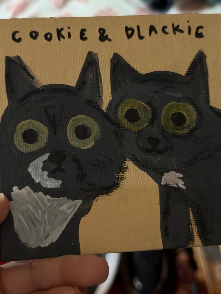
I’m sorry not to have a photo of Winkie available, but here is Cookie Fussbudget Butler.
She and my cat Otto have left me with the impression that the girl cats are smarter than the boys, although the fellows are more likely to be very affectionate. This plays out a bit with Cookie and Blackie. However, it must be said that lately Cookie has become assertively in need of attention and leaps onto the bed nightly (dramatically jumping over Kim’s pillowed head and mine), lands next to me and begins loud meowing for pets. She has always been the more vocal, chattier of the two cats and now the vocalizations are long, loud and drawn out conversations and I suppose recriminations. Cookie (aka Cookie Monster), the tuxie of the two, is quite a card.
Pam’s Pictorama Post: although this is clearly a photo collage of sorts somehow on the fence about calling it a photo post today; nor is it a cat card. However, it is one of many made to entice people to the Catskills on holiday with current revelers sending word home on them. (With their funny cat images my collection of them is burgeoning. Recent posts with Catskill cat cards can be found here and here.) This is a nod to those folks who are commencing their holiday and vacation travel on this July 4 weekend. Let the summer begin!
This card was both written on and addressed but not stamped, so unclear if and how it got to its destination. At the bottom is says, Dear Ethel how is this. Iva Ott November 4, 1907. It is addressed, in a more adult hand, to Miss Ethel Sanford Kelly Coss Del Co, N.Y.
It’s a nifty card and kudos to the person who put it together. The bottom is a landscape photo of the mountains the area is known for, dotted with houses and farms. A space of white has been left and then the sky. The couple are originally from a photo although how the sky and the moon were actually made is lost to me. There is a sort of deckle edge at the bottom of this portion like it was actually carefully torn by hand for the effect wanted.
Appropriate for today! An Uncle Sam puzzle card by Huld I found online.
The couple sit close to each other, hanging off the moon, with a very long spyglass, evidently peering down at the people and places below. It is held by the woman while the man is pointing to something (or someone) specific in the landscape below. Printed at the bottom it says, Viewing Fleischmann’s, Catskill Mountains, N.Y. They seem quite jolly and content with their perch in a cat bird seat, high above the valley.
A close examination of the surface shows sort of half tone dots which means the images came from something already printed. This really is a collage of probably three images.
One section of a Puzzle card also found online.
Along one side there is the publisher’s copyright. It says No. 4003. Copyrighted 1906 by Franz Huld, Publisher, New York. An interesting article on Huld that the internet spit out can be found here. (Someone named George Miller is the author and he has done some extensive research in order to write it.) Some highlights from the article are as follow below.
His first business address appears at 170 Fifth Avenue in Manhattan in a 1900-1901 era directory and is among the first listings for postcard publishing. The author of the article describes his wares as occasionally ugly, without gilt trim or compelling pictures of children or animals. However, he was creative (as evidenced by this card) and according to the article, primarily Huld published commemorative issues, views, comics (especially “write- aways”), collector’s issues, and novelties. That makes a lot of sense skill and sensibility-wise when we consider the construction of this particular card.
The only feline postcard I found among his images.
Huld’s New York listing remains only until 1910 with a filing for bankruptcy in 1914. It is believed that Huld died in October of 1928 at age 67. The man liked a good novelty card (including some puzzle ones that were mailed in an envelope), and I recommend the article above for more information and some additional images. Clearly he was an early player in the business of postcards and a somewhat formative one.
With our temperatures still hovering around 90 after days over 100 here in New York City, we do not have any travel on our agenda here at Deitch Studio. We will be staying here in the city with air conditioning (we hope), cats and ice cream to keep us company on the country’s 250th birthday weekend.
Pam’s Pictorama Post: I bought this clutch of postcards for a few dollars at the recent postcard extravaganza. They all depict the early days of the shore area where I grew up and now have my mom’s house. Like most areas it has largely been built up and built over, but some of the buildings remain or did during my childhood. All of these postcards appear to be from approximately the same period. Only the one from Rumson at the bottom was mailed and that is dated 1910.
If I had my way we would have spent a lot more time in Asbury Park when I was a kid. It was on hard times in the ’60’s and early 70’s and generally we migrated to things north of us rather than south of us in Monmouth County. This pier, as above, remained and even back then I was fascinated by it. It was somewhat derelict although still in use. There was a carousel in another building that I never got to ride. To my knowledge that remains – it was used in the recent Bruce Springsteen bio pic (which for a Jersey girl like myself was a wonderful compendium of places I grew up hanging out at) so I assume it is in reasonable repair.
The boardwalk is in all its glory here with women in long white cotton dresses of a turn of the century or early ‘teens summer. Parasols and hats abound. The amusements are largely hidden although there is a place for your photo to be taken and where film is sold. (Sadly absolutely no evidence that you could have your photo taken with a giant Felix doll. It just doesn’t seem to have been a thing in the US.)
The North End Hotel is the large building in front of us and below it is identified as Boardwalk and North End Hotel. Asbury Park, N.J. North End Hotel or not, I’m pretty sure the lower pier is what goes out toward the water, the boardwalk above and the sand leading to the water to our right below. I assume some of the long building was bath house space where you could rent a locker for the day, change and leave your things. Although the pier in Long Branch existed into my young adulthood (it was eventually consumed by a fire), it is the only one of the long piers into the water I remember – although maybe Asbury did or does still have one. I am scheming to get there for an ephemera sale this summer if possible and to spend the day checking it out.
Boardwalk at New Point Comfort Beach, Keansburg, NJ. Fronting the three largest hotels.
Keansburg was north of us, however I was (sadly) never taken to the beachside amusement pier there. It too still exists in some form. (There used to be ads for it on local television – Keansburg Amusement Park.) I don’t think any of these beachside hotels still exist however. To my knowledge only the tinier waterside homes still stand in that area. I have to admit I have never been on their boardwalk, although I spent much time in neighboring Highlands and even Matawan where my sister lived for several years.
This is what the towns of Long Branch and Sea Bright would have also looked like, the shore dotted with large hotels and rooming houses on the water which largely no longer exist. The trip down Ocean Avenue between Sea Bright and Monmouth Beach and then to Long Branch is still lined with some of the old single-family mansions overlooking the ocean and somehow surviving both tides and progress, mixed with new construction and the occasional beach club.
Until just a few years ago, the highway referred to in this photo of a swath of Atlantic Highlands would have been the very same one which people routinely walked over in order to go to and from Sandy Hook state park and connecting to Sea Bright. A new much higher and larger highway was installed to much construction mess, expense and fanfare. I guess you can still walk (and bike) across the new one, but it is vastly larger for more cars and most importantly, more boats below it. (It is no longer a drawbridge.)
Scene from the scenic highway highest point on the Atlantic Coast Highlands, N.J.
While likely more crammed and with contemporary stores and some more modern homes, my guess is that this view has remained somewhat the same with small cottages dotting the shore. This would have the Shrewsbury River just in view to the left with the bay to the ocean (and New York City in the distance) behind the viewer. The ocean is just on the other side of the tiny spit of land that is Sandy Hook and Sea Bright and the photographer, standing on the highway, could easily have seen all these things by turning around.
There was a time when this was a major stop on passenger pleasure cruises heading south and I assume for day trippers, even as it is by ferry in the summer today. (I could take the ferry today but beach traffic will snare on the weekend so instead I will take the train which will leave me closer to the house.) One of my ancient novels had a stop there on a cruise which I enjoyed finding immensely.
Finally, I get to my hometown of Rumson. There was a time when I knew the length of Rumson Road like the back of my hand from years of being a passenger traveling up and down it. A major artery running not just through the town but connecting the beach communities with the rest of the area, it is fairly long and famously heavily trafficked. (The Sea Bright bridge at one end was also a drawbridge and traffic during the summer would back up for miles for boat traffic. That bridge has also been replaced recently, leaving only the Rumson bridge in a state of sad decay and planned replacement.) Having said that I am puzzled by this view. While small water tributaries create a number of manmade and natural ponds and streams throughout the area, I am stumped by one of this size. (I wrote about a photo of a small pond near my house in the town of Fair Haven here.)
Glimpse of Rumson Road Lake on the Rumson Road, N.J.
I am wondering if this was ultimately filled in to make the golf course or country club. I will ask some of the folks who have lived there longer than I have. For all of that I like this card because it captures the feel of Rumson and Rumson Road. In the fall it is the most beautiful drive lined with old trees, leaves turned. It has always been a sort of millionaires’ row of mansions, old and new, despite being a few blocks in from the river which you would think would be more prime real estate. Perhaps the flooding discouraged the largest homes perching there and I grew up on an inlet of the river, a block off this road. If I calculate correctly though I lived much further east, where Rumson Road begins at the Sea Bright bridge. This would be on the western part as you head into the town of Little Silver, my current home in Fair Haven where these three towns connect.
As noted above, this card was mailed. On the back it says (in one run-on sentence), suppose you have been after chestnuts before this wish I was there to go along Harold. It was mailed to Miss Mary Crawford, Pine Bush, Orange Co, NY. It was mailed from Sea Bright, NJ on October 13, 1910. (Until a few years ago the post office in Sea Bright would have been this one. Sadly a larger and more modern building replaced it too.)
As I head out today I am tucking these in my bag to take with me. I will round up some frames for them and put them up at the house where both local images, beaches and piers in general and wider New Jersey images rule. (Some of those posts can be seen here and here – I have a passion for panorama photos but they are hard to document!) Keep an eye on Instagram for some garden pics. My project for the weekend is to acquire and plant some tomatoes.
Pam’s Pictorama Photo Post: I am heading to New Jersey tomorrow for a few days and this card has me in a pleasant mind of backyard time I hope to enjoy. My roses are in bloom and the gorgeous purple-blue hydrangea, both front yard and back, is starting its ascension into its first flowers of the season. The herbs are well on their way and I understand my grapes have finally come back with a will. Strawberries have already made an appearance and the dahlias are shooting up en force!
I will, of course, be greeted to varying degrees by the resident cats there. Beauregard will claim as much lap time as possible while Milty and Gus will shove in where they can. Stormy and Peaches, my girl cats, are my scaredy cats and although they may (or may not – thinking of you Peaches!) be glad to see me.
The grapevine has returned with a vengeance I am glad to see. All the garden photos are via my friend Winsome.
If you pay attention to all things cats on the internet, you know that catios are all the rage and you can purchase them pre-made (think screened tent for your cats) and less expensive, or you can build a more elaborate version. Ideally the cats have free passage from house to safe outdoor harbor in the catio, but there are an increasing number where the expectation is that you will plop them in and take them back out yourself. Of course, I have considered these but I am not carrying my precious pusses outside to put them in a flimsy screened enclosure. No, I would have to be one of those folks who built something solid and give them cat door access to it.
Although I grew up with cats that roamed free in the yard and divided their time in and out of the house as a matter of course, this is no longer the way in the area where I grew up and where we now have a house. At some point, keeping your cat inside, or with a collar for brief outside turns, became the way of things. Cats are chipped now in case they are lost, although something about putting that in her cats always made my mother nervous. Although all these cats came from living on the streets, none of them has set a paw outside since.
The aforementioned Peaches.
There is something wonderful however about my childhood memories of cats wandering in and out, more or less at will, without thinking about it. They enjoyed it so much and all the better if we were outside with them. As I kid I would sit outside and play with them for hours. I actually haven’t thought about it for years.
Like this photo we might have had a light indoor chair outside, although it would likely be alongside a bunch of lawn chairs. (My father eventually bought heavy outdoor chairs and tables at garage sales, but I was older by then.) If we were outside at least a few of the cats and the dog would be out with us although, maybe someone was sleepy inside too. There were no particular rules. We just never thought about it. Everyone pretty much came in at night unless for some reason they had a mysterious kitty rendezvous and were off on a toot for the evening. Noted but not a cause for alarm.
The dahlias are showing early promise.
Looking at these folks and their cats in their backyard in the dabbled sunlight it makes me think about it. The women are in their long dresses of the day but summer versions and the man, seated behind them, is in a suit with a tie. (One could say he is sort of not quite fully participating.) Those summer cottons which while beautiful must have required difficult laundry and endless patient ironing. Hard to see but the woman in white is leaning on a bit of a chicken wire enclosure behind her. When we look closely there are beds of plants, something leafy and green climbing up an arbor to the viewers left and behind them.
It was clearly a bit of an occasion. Girl kitty (my assumption) is wearing a big bow and looks a tad unhappy about it although not in full on revolt. She perches in a timid way on the chair with a cushion. She is a light-colored tabby-ish kitty, orange most likely? The other looks like a tom and he is in a loving if tightly gripped hold for the photo. Look at the stripes on his legs! Those black bands! Both have white faces and front paws. Handsome fellow!
Backyard is blooming!
The yard has a high fence around it as far as we can see, although technically not one that would keep an interested (let alone determined) cat in or out. My backyard is also fenced, but given small spaces as entry points near the ground I have found all sorts of animals back there including a fox who got in and admittedly didn’t seem to know how to get out. (I opened the gate and invited him to take his time leaving.) Cats do come by occasionally – that is how Stormy and Gus came to live with mom. Some of you might remember the stray tom I christened Hobo who we fed on and off for several years.
Hobo back in 2023.
This photo was never sent and nothing was written on the back. On the back there is a very faded company logo for Central Studio, and an address, 103 College Street, Burlington, VT. It is easy to imagine that this was taken in Vermont, a singular photo postcard and the cats were clearly rallied for the photo opp. It is a wonderfully distilled moment from a long ago summer.
Meanwhile, on my way to the Jersey shore so a Jersey summer specific card to come tomorrow!
Pam’s Pictorama Post: Wowza. It has been a busy few months here at Deitch Studio and since we are getting ready to hit the pause button for the summer, I thought I would do a bit of a round up on things here. As Pictorama readers probably know, as Kim’s book How I Make Comics emerged into the world, he was barely a week out from back surgery and that complicated things a might. (A post on some of that can be found here and here.) Nevertheless, we hit the ground running and book promotion continued apace and grown like topsy.
I am not sure of the difference, but somehow when Reincarnation Stories came out it seemed to be less. Kim’s last event, at Columbia University, was just a week or so before the world shut down for Covid – seriously just under the wire. There were events and reviews but somehow there just seems to be so much more this time, maybe Covid just obscures the memory of it. (Full disclosure, I just asked Kim and he remembers Reincarnation Stories as more so this is just one woman’s opinion – or I just don’t remember it all. I did of course write a very biased review of Reincarnation Stories when it came out which can be read here.)
Reincarnation Stories has also been reprinted in paperback. It’s nice to see this old friend while out on the promotion trail!
There have been three podcasts and all are available now. The first was with Amusing Jews (here) and then one with some interesting questions from Robin McConnell on Inkstuds. Robin has interviewed Kim before and this was a good discussion. His new podcast can be heard here. Most recently Harry Siegel came and taped one right here at Deitch Studio for Lit NYC. (I got to chime in for this one!) It is the longest and most in depth of the three and just went live yesterday. It can be heard here. So much for my idea of doing a podcast with just Kim and I – at best it will wait for a quieter time!
Yesterday we were in Philadelphia for a reading at Partners and Son bookstore. We hopped on the Amtrak and got in early enough to stop at a few used bookstores nearby I found online. We paused however to admire the sculpture in the station. Check out the wild relief, Spirit of Transportation, below.
Meanwhile the first shop was called Mostly Books and as Kim said, was the sort of rabbit warren of a space that you could spend hours and hours in and keep finding things. Obviously, we could only give it a superficial once over but came away with several books each. (Nothing like starting an afternoon of walking by buying some books to carry!) There was a floor and a half of bookcase after bookcase of books, dvd’s and cd’s. Prices were very good. I think if we lived there we would go frequently.
Inside Mostly Books!And the outside.
Then, after trying to follow the little blue dot on the map on my phone which tends to be a bit tedious and instead asking a local walking down the street, we found Brickbat Books. This is a lovely little store and to its credit it was full to the gills with folks. It is a mix of old and new books. We found How I Make Comics on a shelf in the back – our first sighting of it in the wild. (I took a quick pic which is up at the top of the post.) By that time, already laden with books, Kim acquired one more and signed their copy of his book at their request. (They spied his Mineshaft t-shirt and I was wearing a new Waldo one – see below and at the bottom for order link!)
Dunnyzine t-shirtAnd a whopping big mug!
Partners and Son is a lovely shop, all comics, graphic novels and related items. The proprietors, Tom Marquet and Gina Dawson, were so welcoming and organized. We dropped our bags there and went across the street to a French influenced bar-restaurant, Side Eye, for a quick bite. We immediately encountered the woman who had given us directions who asked if we’d found the store. Kim had an enormous burger and I had a polite (but very good) salad as it turned out to be a not very vegetarian friendly menu.
The assembled group at Partners & Son.
The crowd already had assembled when we got back to the store and it was a very nice audience. Kim read The Two Marie’s (my favorite story from the new book) and then answered questions which were many and varied, although mostly about his process.
Meanwhile, as I mentioned, I was sporting the new Waldo t-shirt which John Kelly over @dummyzine made from a new design by Kim. A rather splendid mug with the image (nice and big, the way I like ’em) and some other Kim related merchandise are available here.
So we head into summer with a strong wind behind us promotion-wise. I think we are both looking forward to summer and catching up before Kim hits it again in the fall. Meanwhile, I offer that Kim is already about one third of the way into his next book, Living the Dream!
Pam’s Pictorama Post: Ah, what is the well dressed cat wearing these days? At work I saw a few sporting Knick’s attire (dogs wear it better I am afraid), some need newborn baby style onesies to keep them from a surgical site (kinder than the cone of shame if it works), and there is this strange meme on the internet to put them in yoga pants, which turns out to be a stunningly bizarre look. I may have mentioned that we have a policy against dressing the cats here at Deitch Studio and they seem to be grateful for it. Once again, this seems to be a fundamental difference between cats and dogs. I have handed over many a branded bandana to a pup at work and most seem to embrace it.
This off IG. Oh my…
The imaginary sartorial bliss of these well drawn felines from 1908 certainly provides a counterpart in the space of time and imagination. I’m hazarding a guess to say this artist (it is unsigned) is an early US pretender to the Louis Wain throne.
These four gentleman cats all duff hats, jackets – three have monocles, two have walking sticks – one sort of shillelagh-esque on the end. Each kitty has a different model hat, but each one is stylish in keeping with the period. I was actually in New York City’s oldest hat store yesterday, JJ Hats, founded in 1911. It was doing a fairly booming business, and I admit I made a not insubstantial contribution to their income for the day. (Maybe some hat related posts in the near future. I stocked up.) It was there, several decades ago, that I purchased the black Stetson cowboy hat Kim wears as one of his first birthday gifts from me.
It’s actually currently under scaffolding but it looks like this!Hats of all kinds on display.
These kitties have a variety of top hats, a stove pipe and a sort of bowler/deer slayer model. They wear fancy pointed shoes and dressy sort of smoking jacket style coats – one with a boutonniere. Their trousers, some cuffed and others not, all have a decoration down the leg I associate with tuxedo pants. (I just looked this up, the stripe down the side of tuxedo trousers is to hide the seam and give them a more cohesive look. Who knew?)
Tempted to buy Kim a new straw hat…these can survive a rain storm.
Even their collars represent a variety of styles of the day, mostly the high, white stiff ones that would have been attached by a few buttons, although our fellow in blue with the top hat seems to be wearing a different, long flat one. We have a few different cat kinds here too – from stripe-y short hair to a fluffy Persian look. Hands (paws) are mostly conveniently tucked in jacket pockets, with the exception of one gloved one holding a walking stick on the end.
The top of the card poses the question, Are we top-notchers on dress? Well, look at our clothes. This seems to arise with a bit of smoking detail around it. Behind the gentleman cats a vague landscape of mountains and perhaps water and grassy fields is sketched in. I would have thought these natty kitties belonged in a more urban setting.
Hats purchased.
Someone has written, Love to Leslie From Margaret at the bottom. It is addressed to Master Leslie H. Stauffer, 5314 Addison Street, West Philadelphia, PA. It was mailed from Braddock PA on February 5 1908 at 9 AM. I always think about these lucky children getting these fun cards in the mail at the turn of the century.
Cookie is, of course, always in formal dress, even when napping behind Kim on the couch.
As it happens, Kim and I head off to Philadelphia shortly. He will be reading at Partners & Son bookstore tonight. I hope to report on that and a whole bunch of other Deitch Studio activity around Kim’s book, How I Make Comics tomorrow so stay tuned.