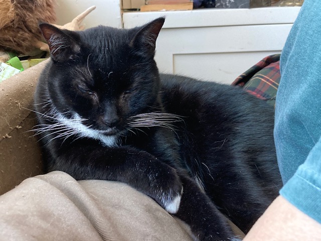
Pam’s Pictorama Post: Like most New Yorkers I awoke to a much cooler day today after several days or grueling and punishing heat. And this fellow was looking up at me on my desk when I got here this morning. (Envision my desk, an old drawing table someone gave me, as a living, roiling, mass of things which occasionally coughs up something from a lower stratum. One morning last week it was freakishly an early family photo of Kim’s. I don’t remember having seen it before and have absolutely no idea how that ended up in the mix.)
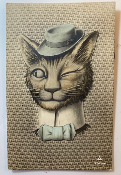
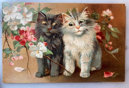
I purchased this card at the most recent edition of the postcard sale. You would think that it might be embossed with the very textured, woven look of the background (like the surface of an old suitcase), but it is not. This very sporty cat however, who has a hat, high (detachable?) collar and bow tie all of his day. That chapeau (more or less the same blue as his natty bowtie), is at an especially jaunty angle and sized just right for between his pointed ears.
As cat coloring goes, he is a bit nondescript. His hair is sort of a brown mix but without a distinct stripe like a tabby. He’s got a saucy look with his gaze directed, not at us, but toward someone or something to the viewer’s left. While it isn’t all the way to thuggish, his wink isn’t one of affection and I would say he’s a tough guy. (Cats blink and wink with affection and sometimes of course as they get sleepy – which being cats is much of the time.)
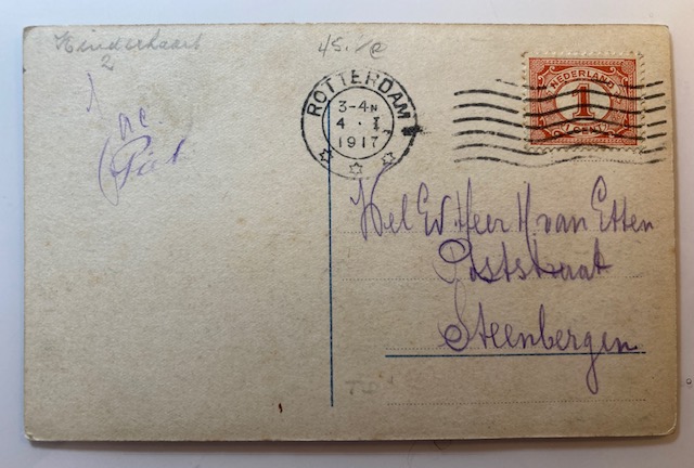
This card was mailed from Rotterdam on April 3, 1917 (I needed Google’s help with that) and addressed in a purpleish ink to Mej. W. H. van Etten, Oudshofstraat, Steenbergen. In the same ink and hand on the left, it appears to say something like, Jac. Pat.
So this uncredited artist could be the Netherlands answer to Louis Wain. He looks like he is up for some trouble – I can see him shooting craps or pulling a minor heist. While Wain’s cats can have that quality there is something always a bit scattered about them and there is usually a sly joke somewhere.
Back of the card.
The only identifying mark on the card is a stylized PN and the number 2501-4 on the front. While an internet search shows Postcard News as utilizing these initials, they appear to be a later, American card company.
As a kid I had a remarkable tortie named Winkie. I have probably written about her before although not that I can think of at any great length. She was my first cat soulmate, was extremely smart (arguably too smart for her own good), and had several extra toes on each front paw as well as an extra joint somehow which made her look like she was on her tip toes.
I’m sorry not to have a photo of Winkie available, but here is Cookie Fussbudget Butler.
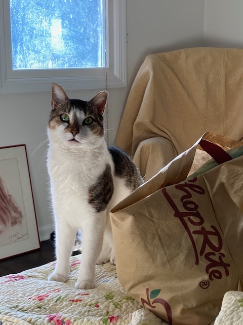
She and my cat Otto have left me with the impression that the girl cats are smarter than the boys, although the fellows are more likely to be very affectionate. This plays out a bit with Cookie and Blackie. However, it must be said that lately Cookie has become assertively in need of attention and leaps onto the bed nightly (dramatically jumping over Kim’s pillowed head and mine), lands next to me and begins loud meowing for pets. She has always been the more vocal, chattier of the two cats and now the vocalizations are long, loud and drawn out conversations and I suppose recriminations. Cookie (aka Cookie Monster), the tuxie of the two, is quite a card.
Pam’s Pictorama Post: I bought this clutch of postcards for a few dollars at the recent postcard extravaganza. They all depict the early days of the shore area where I grew up and now have my mom’s house. Like most areas it has largely been built up and built over, but some of the buildings remain or did during my childhood. All of these postcards appear to be from approximately the same period. Only the one from Rumson at the bottom was mailed and that is dated 1910.
If I had my way we would have spent a lot more time in Asbury Park when I was a kid. It was on hard times in the ’60’s and early 70’s and generally we migrated to things north of us rather than south of us in Monmouth County. This pier, as above, remained and even back then I was fascinated by it. It was somewhat derelict although still in use. There was a carousel in another building that I never got to ride. To my knowledge that remains – it was used in the recent Bruce Springsteen bio pic (which for a Jersey girl like myself was a wonderful compendium of places I grew up hanging out at) so I assume it is in reasonable repair.
The boardwalk is in all its glory here with women in long white cotton dresses of a turn of the century or early ‘teens summer. Parasols and hats abound. The amusements are largely hidden although there is a place for your photo to be taken and where film is sold. (Sadly absolutely no evidence that you could have your photo taken with a giant Felix doll. It just doesn’t seem to have been a thing in the US.)
The North End Hotel is the large building in front of us and below it is identified as Boardwalk and North End Hotel. Asbury Park, N.J. North End Hotel or not, I’m pretty sure the lower pier is what goes out toward the water, the boardwalk above and the sand leading to the water to our right below. I assume some of the long building was bath house space where you could rent a locker for the day, change and leave your things. Although the pier in Long Branch existed into my young adulthood (it was eventually consumed by a fire), it is the only one of the long piers into the water I remember – although maybe Asbury did or does still have one. I am scheming to get there for an ephemera sale this summer if possible and to spend the day checking it out.
Boardwalk at New Point Comfort Beach, Keansburg, NJ. Fronting the three largest hotels.
Keansburg was north of us, however I was (sadly) never taken to the beachside amusement pier there. It too still exists in some form. (There used to be ads for it on local television – Keansburg Amusement Park.) I don’t think any of these beachside hotels still exist however. To my knowledge only the tinier waterside homes still stand in that area. I have to admit I have never been on their boardwalk, although I spent much time in neighboring Highlands and even Matawan where my sister lived for several years.
This is what the towns of Long Branch and Sea Bright would have also looked like, the shore dotted with large hotels and rooming houses on the water which largely no longer exist. The trip down Ocean Avenue between Sea Bright and Monmouth Beach and then to Long Branch is still lined with some of the old single-family mansions overlooking the ocean and somehow surviving both tides and progress, mixed with new construction and the occasional beach club.
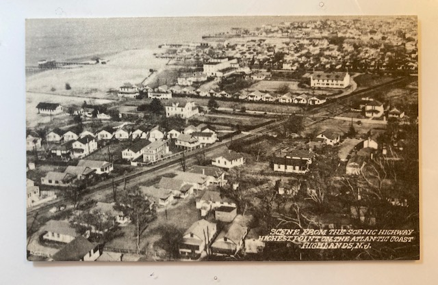
Until just a few years ago, the highway referred to in this photo of a swath of Atlantic Highlands would have been the very same one which people routinely walked over in order to go to and from Sandy Hook state park and connecting to Sea Bright. A new much higher and larger highway was installed to much construction mess, expense and fanfare. I guess you can still walk (and bike) across the new one, but it is vastly larger for more cars and most importantly, more boats below it. (It is no longer a drawbridge.)
Scene from the scenic highway highest point on the Atlantic Coast Highlands, N.J.
While likely more crammed and with contemporary stores and some more modern homes, my guess is that this view has remained somewhat the same with small cottages dotting the shore. This would have the Shrewsbury River just in view to the left with the bay to the ocean (and New York City in the distance) behind the viewer. The ocean is just on the other side of the tiny spit of land that is Sandy Hook and Sea Bright and the photographer, standing on the highway, could easily have seen all these things by turning around.
There was a time when this was a major stop on passenger pleasure cruises heading south and I assume for day trippers, even as it is by ferry in the summer today. (I could take the ferry today but beach traffic will snare on the weekend so instead I will take the train which will leave me closer to the house.) One of my ancient novels had a stop there on a cruise which I enjoyed finding immensely.
Finally, I get to my hometown of Rumson. There was a time when I knew the length of Rumson Road like the back of my hand from years of being a passenger traveling up and down it. A major artery running not just through the town but connecting the beach communities with the rest of the area, it is fairly long and famously heavily trafficked. (The Sea Bright bridge at one end was also a drawbridge and traffic during the summer would back up for miles for boat traffic. That bridge has also been replaced recently, leaving only the Rumson bridge in a state of sad decay and planned replacement.) Having said that I am puzzled by this view. While small water tributaries create a number of manmade and natural ponds and streams throughout the area, I am stumped by one of this size. (I wrote about a photo of a small pond near my house in the town of Fair Haven here.)
Glimpse of Rumson Road Lake on the Rumson Road, N.J.
I am wondering if this was ultimately filled in to make the golf course or country club. I will ask some of the folks who have lived there longer than I have. For all of that I like this card because it captures the feel of Rumson and Rumson Road. In the fall it is the most beautiful drive lined with old trees, leaves turned. It has always been a sort of millionaires’ row of mansions, old and new, despite being a few blocks in from the river which you would think would be more prime real estate. Perhaps the flooding discouraged the largest homes perching there and I grew up on an inlet of the river, a block off this road. If I calculate correctly though I lived much further east, where Rumson Road begins at the Sea Bright bridge. This would be on the western part as you head into the town of Little Silver, my current home in Fair Haven where these three towns connect.
As noted above, this card was mailed. On the back it says (in one run-on sentence), suppose you have been after chestnuts before this wish I was there to go along Harold. It was mailed to Miss Mary Crawford, Pine Bush, Orange Co, NY. It was mailed from Sea Bright, NJ on October 13, 1910. (Until a few years ago the post office in Sea Bright would have been this one. Sadly a larger and more modern building replaced it too.)
As I head out today I am tucking these in my bag to take with me. I will round up some frames for them and put them up at the house where both local images, beaches and piers in general and wider New Jersey images rule. (Some of those posts can be seen here and here – I have a passion for panorama photos but they are hard to document!) Keep an eye on Instagram for some garden pics. My project for the weekend is to acquire and plant some tomatoes.
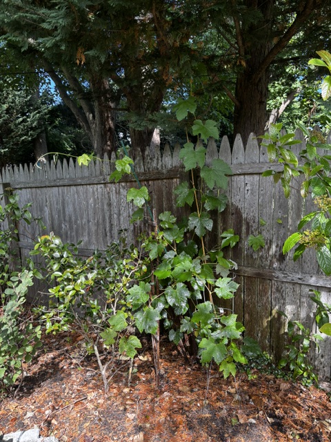
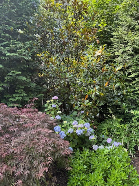
Pam’s Pictorama Photo Post: I am heading to New Jersey tomorrow for a few days and this card has me in a pleasant mind of backyard time I hope to enjoy. My roses are in bloom and the gorgeous purple-blue hydrangea, both front yard and back, is starting its ascension into its first flowers of the season. The herbs are well on their way and I understand my grapes have finally come back with a will. Strawberries have already made an appearance and the dahlias are shooting up en force!
I will, of course, be greeted to varying degrees by the resident cats there. Beauregard will claim as much lap time as possible while Milty and Gus will shove in where they can. Stormy and Peaches, my girl cats, are my scaredy cats and although they may (or may not – thinking of you Peaches!) be glad to see me.
The grapevine has returned with a vengeance I am glad to see. All the garden photos are via my friend Winsome.
If you pay attention to all things cats on the internet, you know that catios are all the rage and you can purchase them pre-made (think screened tent for your cats) and less expensive, or you can build a more elaborate version. Ideally the cats have free passage from house to safe outdoor harbor in the catio, but there are an increasing number where the expectation is that you will plop them in and take them back out yourself. Of course, I have considered these but I am not carrying my precious pusses outside to put them in a flimsy screened enclosure. No, I would have to be one of those folks who built something solid and give them cat door access to it.
Although I grew up with cats that roamed free in the yard and divided their time in and out of the house as a matter of course, this is no longer the way in the area where I grew up and where we now have a house. At some point, keeping your cat inside, or with a collar for brief outside turns, became the way of things. Cats are chipped now in case they are lost, although something about putting that in her cats always made my mother nervous. Although all these cats came from living on the streets, none of them has set a paw outside since.
The aforementioned Peaches.
There is something wonderful however about my childhood memories of cats wandering in and out, more or less at will, without thinking about it. They enjoyed it so much and all the better if we were outside with them. As I kid I would sit outside and play with them for hours. I actually haven’t thought about it for years.
Like this photo we might have had a light indoor chair outside, although it would likely be alongside a bunch of lawn chairs. (My father eventually bought heavy outdoor chairs and tables at garage sales, but I was older by then.) If we were outside at least a few of the cats and the dog would be out with us although, maybe someone was sleepy inside too. There were no particular rules. We just never thought about it. Everyone pretty much came in at night unless for some reason they had a mysterious kitty rendezvous and were off on a toot for the evening. Noted but not a cause for alarm.
The dahlias are showing early promise.
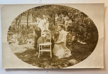
Looking at these folks and their cats in their backyard in the dabbled sunlight it makes me think about it. The women are in their long dresses of the day but summer versions and the man, seated behind them, is in a suit with a tie. (One could say he is sort of not quite fully participating.) Those summer cottons which while beautiful must have required difficult laundry and endless patient ironing. Hard to see but the woman in white is leaning on a bit of a chicken wire enclosure behind her. When we look closely there are beds of plants, something leafy and green climbing up an arbor to the viewers left and behind them.
It was clearly a bit of an occasion. Girl kitty (my assumption) is wearing a big bow and looks a tad unhappy about it although not in full on revolt. She perches in a timid way on the chair with a cushion. She is a light-colored tabby-ish kitty, orange most likely? The other looks like a tom and he is in a loving if tightly gripped hold for the photo. Look at the stripes on his legs! Those black bands! Both have white faces and front paws. Handsome fellow!
Backyard is blooming!
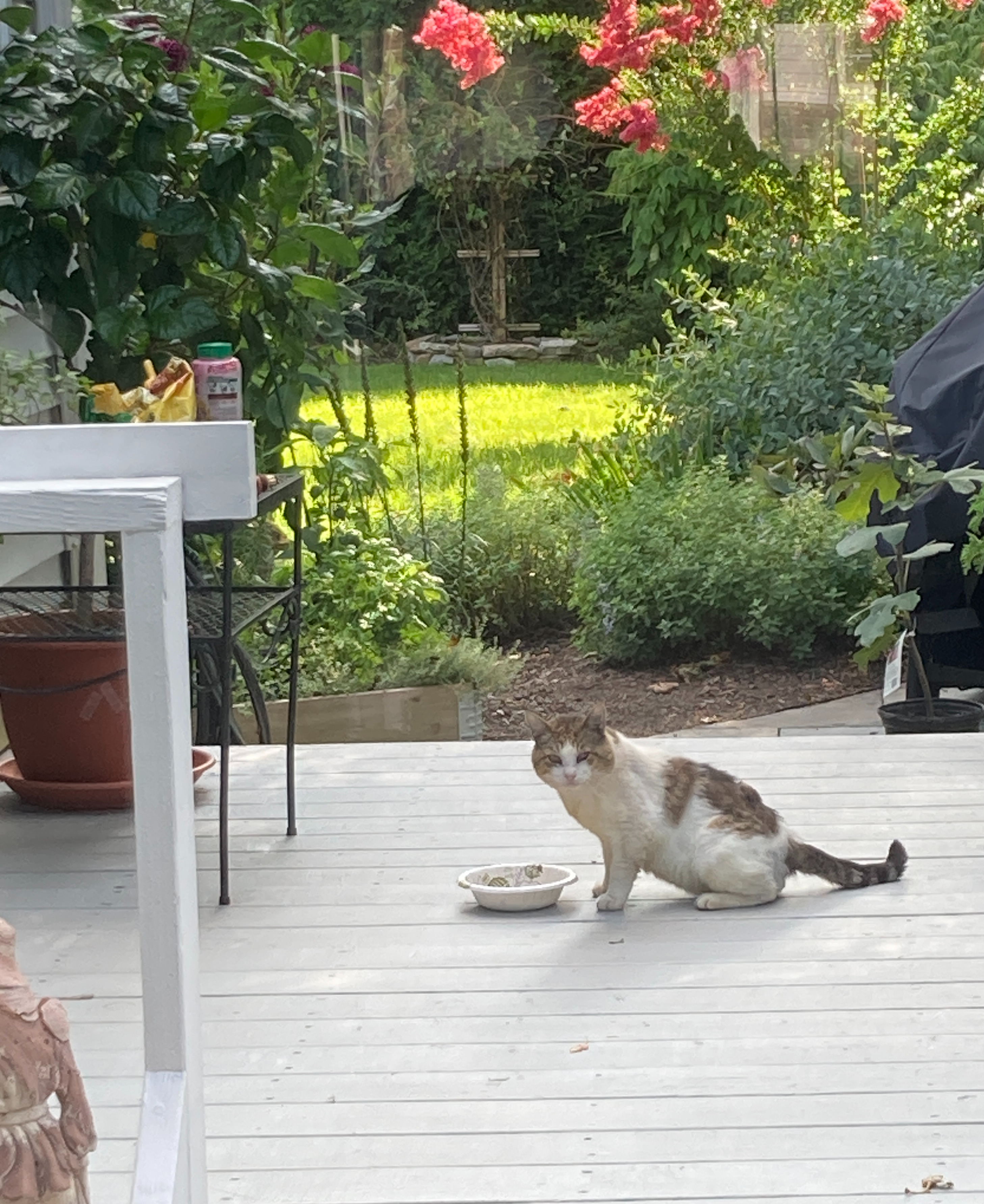
The yard has a high fence around it as far as we can see, although technically not one that would keep an interested (let alone determined) cat in or out. My backyard is also fenced, but given small spaces as entry points near the ground I have found all sorts of animals back there including a fox who got in and admittedly didn’t seem to know how to get out. (I opened the gate and invited him to take his time leaving.) Cats do come by occasionally – that is how Stormy and Gus came to live with mom. Some of you might remember the stray tom I christened Hobo who we fed on and off for several years.
Hobo back in 2023.
This photo was never sent and nothing was written on the back. On the back there is a very faded company logo for Central Studio, and an address, 103 College Street, Burlington, VT. It is easy to imagine that this was taken in Vermont, a singular photo postcard and the cats were clearly rallied for the photo opp. It is a wonderfully distilled moment from a long ago summer.
Meanwhile, on my way to the Jersey shore so a Jersey summer specific card to come tomorrow!
Pam’s Pictorama Post: Wowza. It has been a busy few months here at Deitch Studio and since we are getting ready to hit the pause button for the summer, I thought I would do a bit of a round up on things here. As Pictorama readers probably know, as Kim’s book How I Make Comics emerged into the world, he was barely a week out from back surgery and that complicated things a might. (A post on some of that can be found here and here.) Nevertheless, we hit the ground running and book promotion continued apace and grown like topsy.
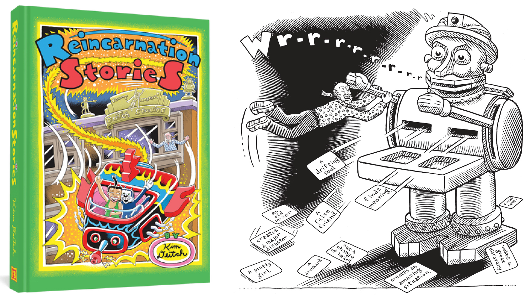
I am not sure of the difference, but somehow when Reincarnation Stories came out it seemed to be less. Kim’s last event, at Columbia University, was just a week or so before the world shut down for Covid – seriously just under the wire. There were events and reviews but somehow there just seems to be so much more this time, maybe Covid just obscures the memory of it. (Full disclosure, I just asked Kim and he remembers Reincarnation Stories as more so this is just one woman’s opinion – or I just don’t remember it all. I did of course write a very biased review of Reincarnation Stories when it came out which can be read here.)
Reincarnation Stories has also been reprinted in paperback. It’s nice to see this old friend while out on the promotion trail!
There have been three podcasts and all are available now. The first was with Amusing Jews (here) and then one with some interesting questions from Robin McConnell on Inkstuds. Robin has interviewed Kim before and this was a good discussion. His new podcast can be heard here. Most recently Harry Siegel came and taped one right here at Deitch Studio for Lit NYC. (I got to chime in for this one!) It is the longest and most in depth of the three and just went live yesterday. It can be heard here. So much for my idea of doing a podcast with just Kim and I – at best it will wait for a quieter time!
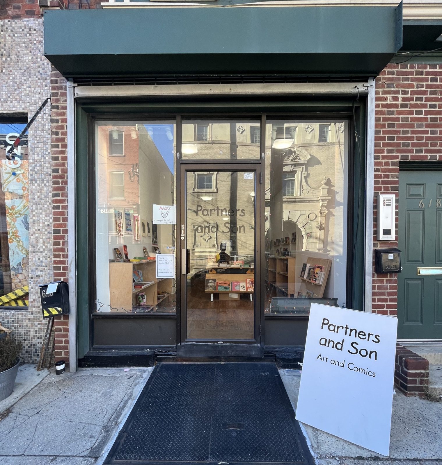
Yesterday we were in Philadelphia for a reading at Partners and Son bookstore. We hopped on the Amtrak and got in early enough to stop at a few used bookstores nearby I found online. We paused however to admire the sculpture in the station. Check out the wild relief, Spirit of Transportation, below.
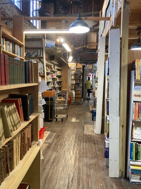
Meanwhile the first shop was called Mostly Books and as Kim said, was the sort of rabbit warren of a space that you could spend hours and hours in and keep finding things. Obviously, we could only give it a superficial once over but came away with several books each. (Nothing like starting an afternoon of walking by buying some books to carry!) There was a floor and a half of bookcase after bookcase of books, dvd’s and cd’s. Prices were very good. I think if we lived there we would go frequently.
Inside Mostly Books!And the outside.
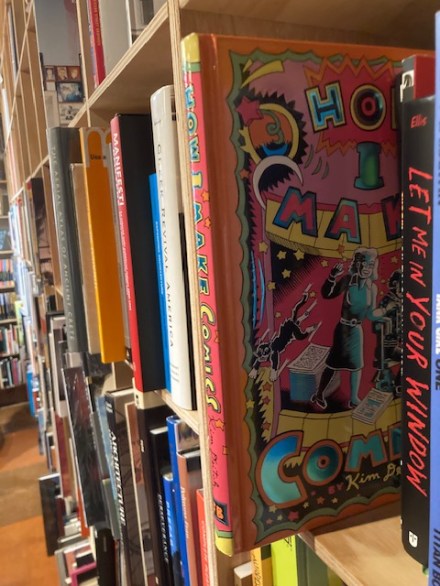
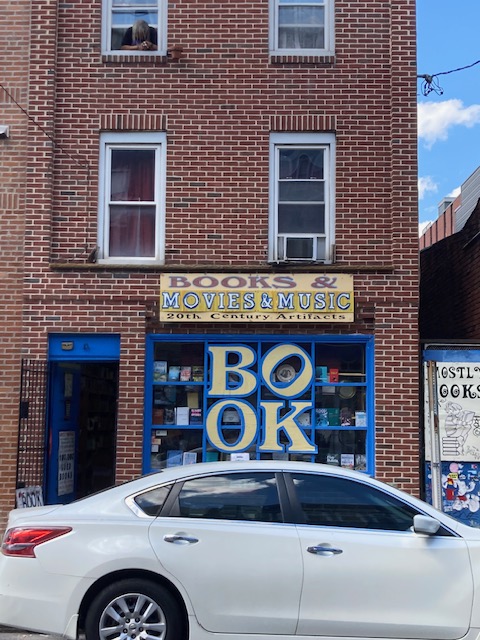
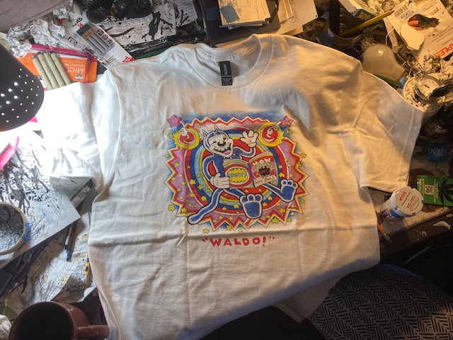
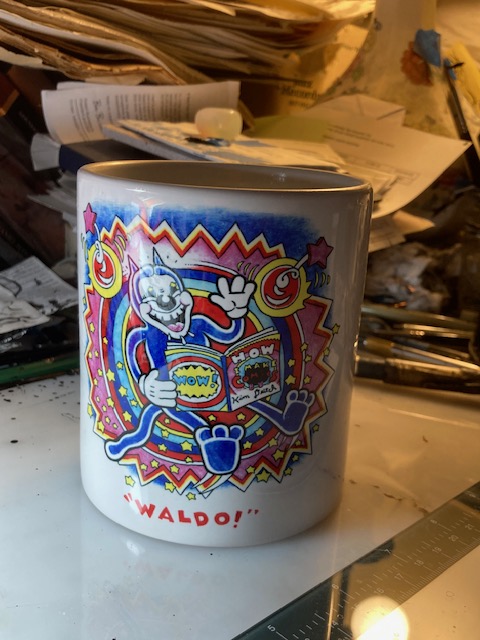
Then, after trying to follow the little blue dot on the map on my phone which tends to be a bit tedious and instead asking a local walking down the street, we found Brickbat Books. This is a lovely little store and to its credit it was full to the gills with folks. It is a mix of old and new books. We found How I Make Comics on a shelf in the back – our first sighting of it in the wild. (I took a quick pic which is up at the top of the post.) By that time, already laden with books, Kim acquired one more and signed their copy of his book at their request. (They spied his Mineshaft t-shirt and I was wearing a new Waldo one – see below and at the bottom for order link!)
Dunnyzine t-shirtAnd a whopping big mug!
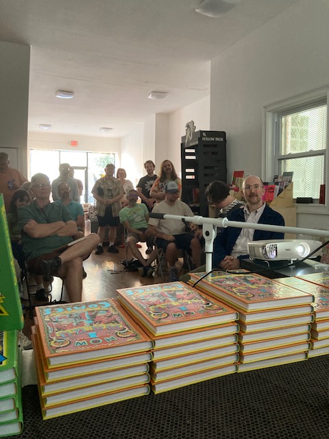
Partners and Son is a lovely shop, all comics, graphic novels and related items. The proprietors, Tom Marquet and Gina Dawson, were so welcoming and organized. We dropped our bags there and went across the street to a French influenced bar-restaurant, Side Eye, for a quick bite. We immediately encountered the woman who had given us directions who asked if we’d found the store. Kim had an enormous burger and I had a polite (but very good) salad as it turned out to be a not very vegetarian friendly menu.
The assembled group at Partners & Son.
The crowd already had assembled when we got back to the store and it was a very nice audience. Kim read The Two Marie’s (my favorite story from the new book) and then answered questions which were many and varied, although mostly about his process.
Meanwhile, as I mentioned, I was sporting the new Waldo t-shirt which John Kelly over @dummyzine made from a new design by Kim. A rather splendid mug with the image (nice and big, the way I like ’em) and some other Kim related merchandise are available here.
So we head into summer with a strong wind behind us promotion-wise. I think we are both looking forward to summer and catching up before Kim hits it again in the fall. Meanwhile, I offer that Kim is already about one third of the way into his next book, Living the Dream!
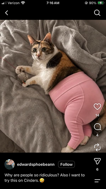
Pam’s Pictorama Post: Ah, what is the well dressed cat wearing these days? At work I saw a few sporting Knick’s attire (dogs wear it better I am afraid), some need newborn baby style onesies to keep them from a surgical site (kinder than the cone of shame if it works), and there is this strange meme on the internet to put them in yoga pants, which turns out to be a stunningly bizarre look. I may have mentioned that we have a policy against dressing the cats here at Deitch Studio and they seem to be grateful for it. Once again, this seems to be a fundamental difference between cats and dogs. I have handed over many a branded bandana to a pup at work and most seem to embrace it.
This off IG. Oh my…
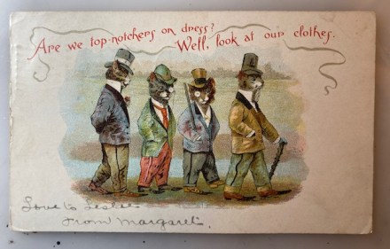
The imaginary sartorial bliss of these well drawn felines from 1908 certainly provides a counterpart in the space of time and imagination. I’m hazarding a guess to say this artist (it is unsigned) is an early US pretender to the Louis Wain throne.
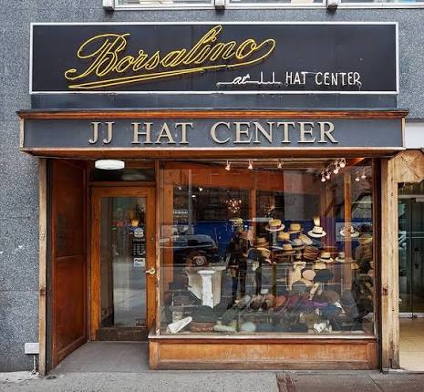
These four gentleman cats all duff hats, jackets – three have monocles, two have walking sticks – one sort of shillelagh-esque on the end. Each kitty has a different model hat, but each one is stylish in keeping with the period. I was actually in New York City’s oldest hat store yesterday, JJ Hats, founded in 1911. It was doing a fairly booming business, and I admit I made a not insubstantial contribution to their income for the day. (Maybe some hat related posts in the near future. I stocked up.) It was there, several decades ago, that I purchased the black Stetson cowboy hat Kim wears as one of his first birthday gifts from me.
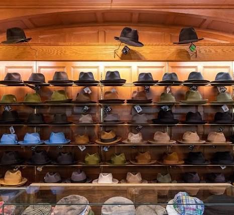
It’s actually currently under scaffolding but it looks like this!Hats of all kinds on display.
These kitties have a variety of top hats, a stove pipe and a sort of bowler/deer slayer model. They wear fancy pointed shoes and dressy sort of smoking jacket style coats – one with a boutonniere. Their trousers, some cuffed and others not, all have a decoration down the leg I associate with tuxedo pants. (I just looked this up, the stripe down the side of tuxedo trousers is to hide the seam and give them a more cohesive look. Who knew?)
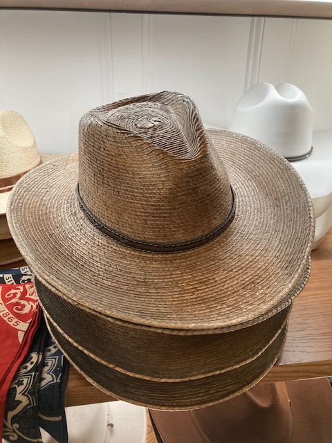
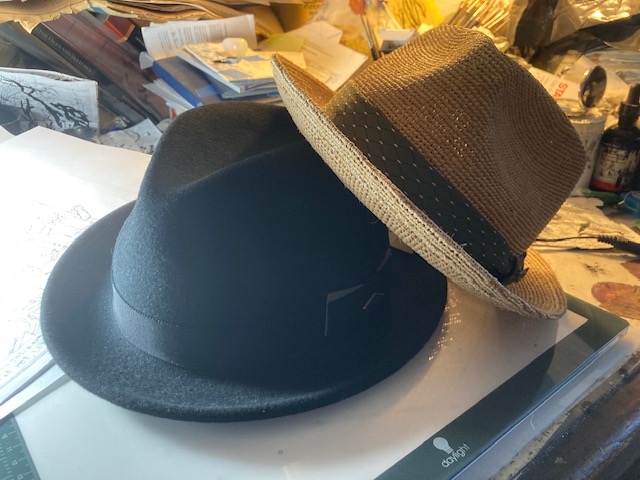
Tempted to buy Kim a new straw hat…these can survive a rain storm.
Even their collars represent a variety of styles of the day, mostly the high, white stiff ones that would have been attached by a few buttons, although our fellow in blue with the top hat seems to be wearing a different, long flat one. We have a few different cat kinds here too – from stripe-y short hair to a fluffy Persian look. Hands (paws) are mostly conveniently tucked in jacket pockets, with the exception of one gloved one holding a walking stick on the end.
The top of the card poses the question, Are we top-notchers on dress? Well, look at our clothes. This seems to arise with a bit of smoking detail around it. Behind the gentleman cats a vague landscape of mountains and perhaps water and grassy fields is sketched in. I would have thought these natty kitties belonged in a more urban setting.
Hats purchased.
Someone has written, Love to Leslie From Margaret at the bottom. It is addressed to Master Leslie H. Stauffer, 5314 Addison Street, West Philadelphia, PA. It was mailed from Braddock PA on February 5 1908 at 9 AM. I always think about these lucky children getting these fun cards in the mail at the turn of the century.
Cookie is, of course, always in formal dress, even when napping behind Kim on the couch.
As it happens, Kim and I head off to Philadelphia shortly. He will be reading at Partners & Son bookstore tonight. I hope to report on that and a whole bunch of other Deitch Studio activity around Kim’s book, How I Make Comics tomorrow so stay tuned.
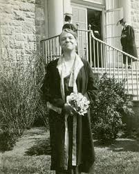
Pam’s Pictorama Photo Post: At work we have graduation for our interns and residents at the end of the month, but I think folks have already mostly packed up their kids at school and have started the summer. I have vague memories of each of my dorm rooms although I never went in for decorating them much. (Yes, given my post-college attachment to stuff that seems surprising, yes?) As I remember the dorm rooms were designed to be impervious to hanging things on the wall. Early on I attempted a poster or two which promptly peeled from the wall and I gave up. I was an art major however so it isn’t like there was stuff around.
Two out of the three dorm rooms I had in college (one year I lived in London) were in the original or at least early buildings of the college. Connecticut College has these beautiful, old stone buildings and at least one of my rooms had original leaded glass windowpanes – I was on the ground floor and folks would occasionally take a short cut in via the window. I don’t pine for my college experience a lot, but this photograph does make me think about it. I always enjoyed the history of the college when I was there. It had been more than a decade co-ed at that point, but the ghosts of industrious, smart women past always seemed to lurk pleasantly around.
Katherine Blunt, first woman President of the college and the dorm named for her. We just called it KB.
I had a hot pot but wasn’t one of those people driven to attempt to cook a lot in my dorm room. I had a dark pink comforter on the bed (it came to NYC with me and stayed with me until it was in shreds a number of years later) and not much else in the line of decor. I have two coffee mugs from those days and quite unconsciously I happen to be drinking from one right now, also a dark pink. The other is a heavy old fashioned white stoneware one that I nicked from the dining hall. (Kim was just drinking out of it the other day and complaining that it doesn’t hold enough coffee which is a fair criticism.)
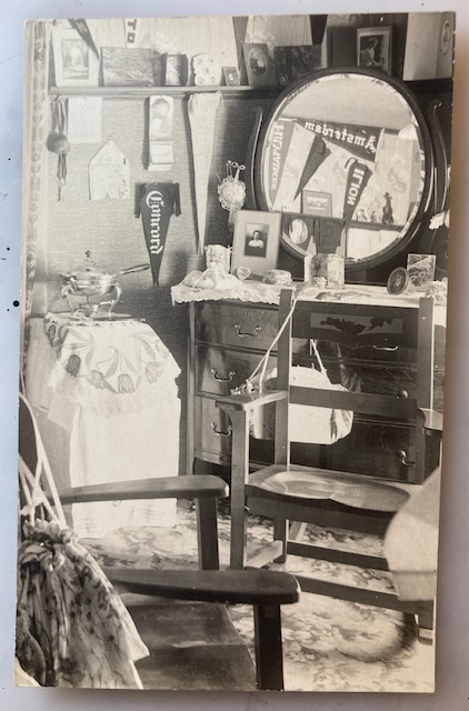
I purchased this photocard from a woman who said she collected this very thing (early dorm room photos) and if she was letting this one go, I do wonder what her collection looks like! It is an interesting genre – clearly the urge to document an early experiment of living on your own as a young person was strong. There is nothing that dates this postcard – it was never used so no postmark. It could in fact easily be Connecticut College, which was founded as a women’s only college in 1911.
A careful look quickly reveals that this is a woman’s room, purse hanging from the chair was the first clue, although it is overall quite feminine really – the chafing dish (the early 20th century equivalent of a hot pot – kids probably are allowed microwaves now!) which sits nicely on a side table complete with a flower cloth is another significant indicator. The carpet is flowered as well, and the dresser has a lacey doily. It is covered with photographs, as are the shelves above and we can even see a few more in the mirror.
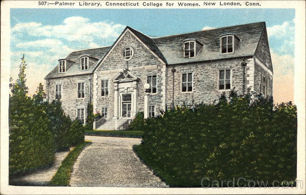
Palmer Library, Connecticut College for Women New London. This was turned into classrooms I think when a new library was builtwell before my time there.
Pennants hang all over – one in the mirror says Amsterdam, but the others are for schools or places I don’t recognize and since I can’t have both a mirror and magnifier I have trouble reading. A pincushion, a calendar (which I cannot read the year or the month on) and a few other baubles decorate the walls and an envelope is also pinned to the board next to the calendar on a sort of pinboard there.
There are two chairs and I wonder if this room was shared and we are only being shown one person’s half. At Connecticut College the majority of the original dorms has single rooms with only a few suites of shared rooms. (Newer dorms introduced in the 1960’s had more double rooms.) However, this could also be a guest chair.
The seller had several other versions of dorm photos for sale (presumably rejects from her collection) – all great although the others appeared to all be men’s dorms, often with them in the photo. I would have purchased more, but they were relatively expensive and I was already loaded up with cat cards. I assume, as there were fewer woman’s colleges, that there are fewer photos of their rooms so I like that aspect of this one. You get the feeling that it was a moment when after much hard work it was just right and she had to take a picture.
Pam’s Pictorama Post: Saturday is dawning very bright and hot again today, although it promises to be a bit better than the last few days which have felt much July than June. We shall see. There could be ice cream in my future.
We here at Deitch Studio are regrouping after a long week of work including some promotion for Kim’s,How I Make Comics. Kim taped a podcast yesterday with Harry Siegel (I even got to chime in), and that will be showing up on Lit NYC in about a week we are told. (Kim has done two others, one with Amusing Jews which can be found here and another with Robin McConnell on Inkstuds, which has not come out yet.) Next week we head to Philadelphia for Kim to do a talk at Partners and Sons bookshop and then things seem to calm down a bit as we drift to New Jersey for the summer in about a month. We will have the summer to recoup.
I try to take my part-time job as the in-house promoter for Deitch Studio seriously. Yesterday the interviewer asked if I was going to pursue doing a podcast with Kim. (I ventured some speculation on that in a post here.) I answered honestly that maybe after all the initial promotion for the book is over. Right now we are pretty deep in it without starting anything new – yikes!
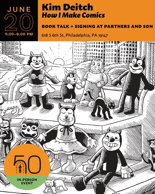
Artwork advertising for the gig next week. I love seeing a selection of my toys in this one!
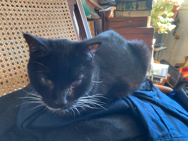
As I sit here, Kim is writing a letter to his friend Zach Sally about Zach’s book, Folrath, which he sent to Kim via a friend at MoCCA recently. Cookie is enjoying the approximately 30 minutes of sun she gets on a certain chair each morning this time of year. Blackie though is having an off morning not eating his food and I am eyeing some meds I might need to put in him to help.
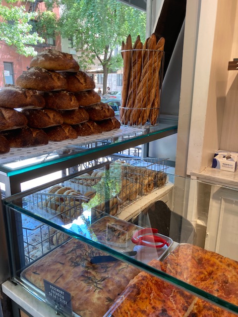
The coffee is on, the smell wafting into the living room, (the end of a loaf of Orwashers excellent sourdough bread awaits us as toast) and I realize I truly digress, but it has been on one those weeks and Saturday morning finds us a bit exhausted. Fresh Direct will be dropping off some groceries soon, however other than maybe making a quick soup I would say this weekend is all about collapsing a bit and resting up.
Orwashers last weekend. It is always so cheerful and jolly that I find myself taking pics while waiting in the line that generally goes out the door.
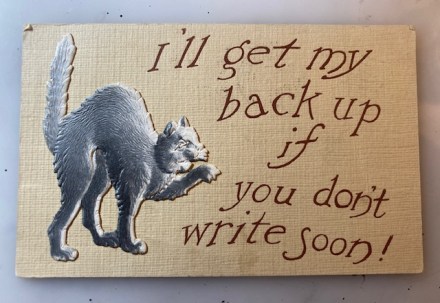
Meanwhile, for the main event today (if a bit belatedly and far down in this post) I share an embossed, die-cut style cat card purchased last weekend. A scaredy cat threatens I’ll get my back up if you don’t write soon! The cat has a deep 3-D quality and highlights (you can see he even casts a small shadow), which make him stand out further on this paper which has a faux linen quality and tooth to it. He is a true miniature version of a German embossed Halloween decoration. There is no copyright or publisher’s information on the card.
On the back there is a postmark of Janesville, Wisconsin, with a June or July date I cannot read, 1908. Rather plaintively it says, Why don’t you ever write to – Lucy. And it is addressed to Mrs. M. C. Vosburg, Ft. Atkinson, Wis. R.F. D. No. 3. Poor Lucy. So I guess this card was chosen to the point here. I do hope Mrs. Vosburg wrote to Lucy eventually.
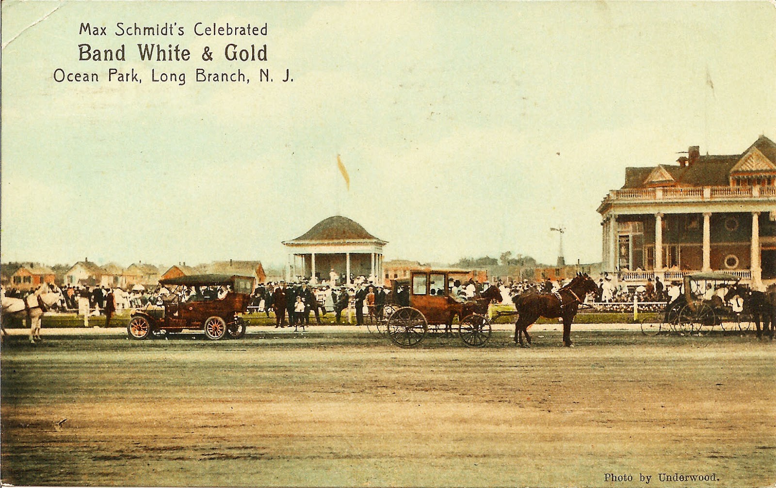
Pam’s Pictorama Post: With Memorial Day behind us, and despite the fall-like weather this Saturday as I write, I thought I would pull out this postcard purchase. It both celebrates the summer season ahead and the town where my mother grew up, Long Branch, New Jersey. I snatched it up at a sale recently and will take it to the house in New Jersey where, among the images of cats, are a number of early local Jersey shore photos and postcards, an homage to my family’s history in the area and my own.
I find that Max Schmidt (1850-1951) was a violinist who immigrated to the United States in 1886 from Germany. He lived and worked primarily in New York City, even reportedly with the Met Opera at times, so this summer gig for his 24-piece orchestra was a short hop away and his orchestra enjoying some limited fame of the time.
Not in my collection.
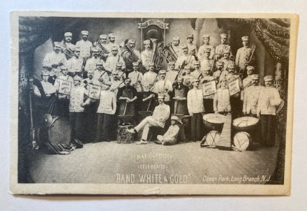
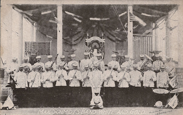
Here is the Band White and Gold in all their 1909 glory on today’s card. Although it is somewhat standard of all the musicians with their instruments in hand, there are a few interesting elements. I like that the trumpets all have flags (pennants?) advertising the band hanging from them – three tubas, two more tuba-like things and so many drums! Behind the musicians is a sign that says Band White and Gold and a sort of gong hanging below it. At the bottom (a bit hard to read) it declares, Max Schmidt Celebrated Band White & Gold Ocean Park, Long Branch, NJ.
They appear here to be on a stage set of some kind and a careful look to the back reveals a painted column and some foliage. As best I can tell the area around them on the outside of the stage looks like a cave entrance. Most intriguing however are the three men, just behind the fellow I assume is Max himself (small child seated on the floor next to him), and they appear to stand behind wood stumps with anvils, hammers in their hands. I assume this is part of the opera music they were known to play. Tucked away, all the way on the left side and hard to see, is a harp.
This card was mailed on August 23, 1909 from Long Branch. It only says, Love from, Minnie. It was mailed to, Miss Amelia Freuzel, Sayreville, N.J. The card, produce by The Rotograph Co. NY, City was printed in Germany.
Another not in my collection.
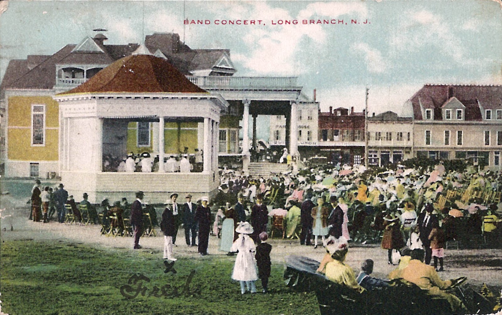
Meanwhile, this was the heyday of the band concert and his sported striking white and gold uniforms. They were hired in the summer of 1909 to play outdoor concerts in Ocean Park. (If I understand it, Ocean Park was subsumed by what is now known as Seven President’s Park – if wrong Jersey folks let me know.) Their repertoire would have been popular band music, evidently combined with excerpts from operas. At the time Long Branch was the summer haven for the very wealthy and even Presidents. (The most outstanding remaining example is Wilson’s summer home which now forms the core of what became Monmouth University’s campus. I understand that there is a building which will house Bruce Springsteen’s papers quite nearby.)
The fortunes of the town, like many, have waxed and waned over the decades. Despite my grandmother living in a residential area on the outskirts in the house my mom grew up in (I wrote about that house in a previous post here), the downtown area and even the waterfront was largely down at the heels during my childhood. The shopping district was usurped by an enormous mall (which in turn was ultimately killed by online shopping and an outdoor shopping center) and only a few essential stores hung on. There was a Foodtown supermarket by the train station (which I shopped in a few times when my sister was in the hospital across the street), a paint store called Siperstein’s, which mom frequented. (A quick look online and it appears to still be there, selling wallpaper and blinds now as well. It may be a chain.)
Another from the internet not in my collection.
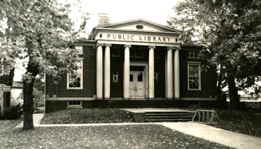
There was also a library which for some reason I found more interesting than both the tiny one in Rumson (the Oceanic Library – I must write about it one day), and the much larger and more modern one known as the Monmouth County Library. (It is out by Trader Joe’s so I have seen it and it has been expanded further since my childhood.) We didn’t go to the library in Long Branch often as it was a bit more out of the way, but we’d stop in occasionally and there was just something especially warm and inviting about the children’s section. I wish I could remember what books I found there, I was already reading chapter books, but it would likely be a false memory. I want to say the later Alcott children’s books like Jo’s Boys. Below is what the library would have looked like in my childhood (albeit more beat up) although it is a much more contemporary and entirely different building today.
Undated photo of the Long Branch public library via the internet.
In addition, there was another smaller commercial area closer to my grandmother, where my great-grandparents once had their bar and restaurant. (I wrote about the blue willow ware plates – the blue plate special plates – which I inherited and use. The post is here.) My vivid memories of that area from childhood were a Dunkin’ Donuts we frequented and the rarified early McDonalds. My parent’s accountant was also there – may still be for all I know but I doubt it. (Sadly, later in life, it is also where the funeral home the family used is and that is what I associate with it now.) There was a laundromat (strange word now that I look at it) nearby we sometimes used in the years before getting a washing machine although there was one closer to home, in Sea Bright, that I remember best. Mom may have been doing laundry for my grandmother.
And so the march to summer at the shore begins again today, even if I am drinking hot coffee and eyeing a sweater for my trip downtown in a bit. However, I’m sure there will be more shore and vacation posts coming soon.
Pam’s Pictorama Post: Today I have cat tales. Cats are of course the foundational interest of Pam’s Pictorama although we do stray – Kim’s comics, the occasional dog. We are All Pam, all the Time, but albeit not quite cats all the time but much of the time.
Today’s card came as a purchase from the most recent incarnation of the postcard show and we have the Boulanger card with crying kitties to consider. I’m not exactly sure what in particular Maurice was thinking about. We have a dark gray and white matched pair of kittens who are looking at each other with tears running down their faces. The white one is a bit pudgier and a smidge bigger than the gray one, one with yellow eyes and the other a very light green.
In my opinion Boulanger (b. 1910, d.o.d. unknown) was something of a pretending to the Louis Wain (b. 1860, d.o.d. 1939) throne so to speak, as there are a few decades of overlap between them. I reckon there was more than enough demand for the images produced by two cat artists. (Some prior posts for Boulanger can be found here and here. Louis Wain Pictorama posts abound but a few are here and here.)
This image is evidently called, Tendrement (Tenderly) and on some versions evidently in German it is also written, Apfelblüte. Daut un daut lüschen Hoffen –Apple Blossom. That sweet, soft glimmer of hope. I did wonder about the image of weeping pusses. It does raise the issue of who you might have sent this card to and what their reaction might have been. Mine was not sent and does not have any useful information on the back.
Yesterday was a major cat event here as Blackie has been doing sort of poorly with a lack of appetite. Ahead of the holiday weekend I managed to get him into his local vet in the late afternoon. Have I ever mentioned that Blackie seems to have an uncanny need to go to the ER on a holiday weekend or otherwise inconvenient (reads as more expensive too) times? He does. Long story short, no sooner had we gotten home than the vet called to tell me that after looking at his tests (a small amount of ketones in his urine) he needed to go to the ER.
The little man, feeling more himself, today.
Of course, these days the kitty emergency room is at the hospital where I work. So yes, on what should have been an afternoon off I was hopping in a cab and rushing Blackie down there. (Kim, still recovering from back surgery did the first vet trip but we decided he should stay home for the second.)
I took him fully expecting that he would need to stay overnight. A young resident saw him and ran some more tests. Blackie hates going to my place of employment, but this time I had reason to bless working there. He enjoys a low-key celebrity status as an employee kitty (people came and visited with us and even with him in the back, reporting out to me) and despite it being the Friday night before the long weekend, one of the senior docs who has seen him before came by to have a look at him.
She mentioned as had the other two vets, that he had a lot of bowel not moving in his intestines – kitty constipation. The difference was she gave me instructions for giving him a tiny kitty dose of Miralax. Since eating and resolving constipation were the main issues we decided I would bring him home – he has an appetite enhancer and an anti-nausea drug. Even when we came home last night, he was ready to eat! That combined with the Miralax appears to have set him absolutely right today. I woke to a hungry boy cat and a rather impressively full litterbox. Yesterday reminded me of why I love the hospital where I work. Yay for Blackie!
Pam’s Pictorama Post: It is threatening to be a hot summer’s day in May today – we are having now you see it, now you don’t warm weather here in Manhattan this spring. We whiplash between our light down filled jackets and sleeveless dresses, and I gather today will be the latter. I am heading to New Jersey to get the dahlias in for the year. They sit out the winter in the garage, tucked in paper bags, but for all the fickleness of the weather I think we are past frost here and I want them to have maximum time to bloom.
After yesterday’s excitement of reviewing Kim’s new book, I am afraid I have created a hard act to follow. I hope this Wain card from the recent postcard show does the trick – a palate cleanser of cat images to get back to the general business of Pictorama.
Upon reflection I realize I was slow to cede to Wain adoration – I resisted for quite a long time (overpriced postcards I remember thinking), but when I fell, I fell hard. I am a Wain addict. Few things dependably make me chuckle than a Wain image even if I have seen them many times before. A few of my past tributes can be found here and here but there are many!
His cat postcard parade is an almost endless variation playing on human foibles and attitudes – sardonic, malevolent, self-satisfied, mystified, distracted for starters. There are types too, fat, thin, businessman, solid citizen, and of course troublemakers galore. For types he is partial to tabbies – those nice decorative stripes I suppose. They can be a variety of shades. Today we have a gray tuxie which seems a bit exotic for him.
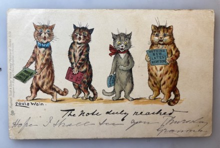
Today we have a Raphael Tuck & Sons card with four choral kitties – a cat quartet. Each holds a score which is inscribed, Nothing New Latest New Songs. Starting on the end with our pudgy, contented (self-satisfied?) fellow, gripping his book with both paws. He’s a fat cat in the best sense. (Somehow, we know these are all boy cats, yes?) Next to him is a small and skinny gray tuxedo, sporting a red bow looking a tad waifish, paw on tummy to help him emote. The two on the end are sort of a matched set of two colors of tabby, one has a blue bow for good measure and the music books they hold are a variety of green, red and blue. Each has a singing pose all his own showing his enthusiasm for his chorale endeavors.
When we look closely there is eye color variation and I assume Wain figured he could goose that a bit without anyone noticing – these cats have eyes of yellow, green and blue! They all are looking in different directions too which packs a smidge of action into this small image – and each singing with a different level of enthusiasm. Tails are curled in a variety of ways and directions, whiskers as well as eyebrows help complete the expressions. All these details are what Wain swaps out within his mental inventory of images he uses again and again. Finally, he supplies a sketched in shadow on the ground and nothing else aside from his signature which is sort of a visual element anchoring that side of the card, fat cat tail on the opposite side.
The title below is, The note duly reached in what I assume is Wain’s hand. Below that, in remarkably similar but lighter script someone has written, Hope I shall see you Thursday, Grannie. It was addressed to, Master C. T. Travers, Woolfanger, Warlingham, Surrey. The cancellation year is hard to read but appears to be August 13, 1905. Can I just say, how much fun must it have been to get a postcard like this when you were a kid? Yay for Grannie! Clearly enough that this card has survived more than 120 years.
So I leave you to revel in this smidge of Wain while I pack up my gardening togs and head out shortly. Look for some New Jersey pics on Instagram later.