Treats

Pam’s Pictorama Post: Today Kim and I are venturing off to the fall edition of the vintage postcard show down in the West Village so I hope to have a new stock of interesting bits to share. I hope to stop at the spice store I highlighted on a trip earlier this year (in a post about Washington Square Park here). If I make it there today my goal would be to buy some curry and related spices.

I have a whim to explore more entirely vegetarian recipes (less fish) and am curious to see what I can add to my arsenal. For those of you who follow that particular line of thought here at Pictorama I hope to share some recipes in the future. Tomorrow’s cooking adventure will be root vegetable stew topped with Bisquick dumplings. Last week was a pretty fair chickpea stew. It was filling but I suspect that the root veggies plus dumplings will be more so.

However, today’s topic is treats and while I will get to today’s tin in a moment, treats were just a topic in the apartment earlier. Yesterday I was lucky to have a chance to see Temple Grandin give a talk at work. (For those who don’t know her, she is a remarkable animal behaviorist who is also significantly autistic. She has written about both, but was addressing some of our vet techs at a conference I got to sneak into.)

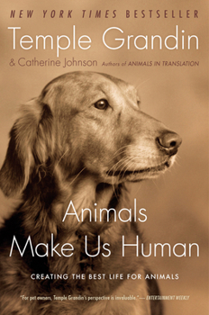
Temple shared many thoughts about living with animals, largely focused on training them (both domestic and farm animals) to be less fearful. Much of the root of that seems to be treats! Associate new things with something good like treats – when introducing a new place or person, teaching them to be handled, etc. So today I am eyeing the cats and the Churu and wondering what inroads in behavior we might make.

Found this online and wish it wasn’t cut off but who could resist, Hail to the Toffee King?

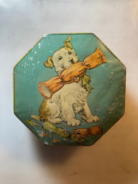
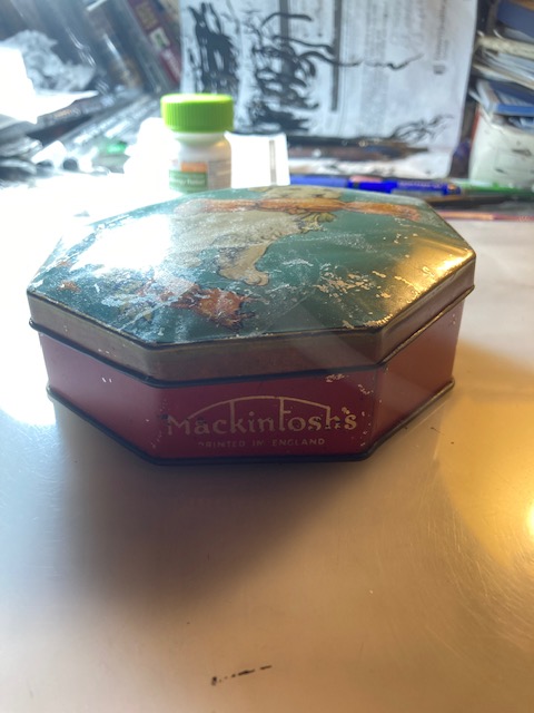
Back to today’s tin which came to me in a big haul in NJ this past summer. It held Mackintosh’s British candy. Their candy appears to have been toffee. I have a big soft spot for toffee – not a huge dessert eater but when I see salted toffee something I lose all control and quite simply must have it. I like it on its own too, although not sure my dentist would be pleased to know this and luckily it doesn’t get put to the test that often.

This for sale on eBay at the time of publication. Clearly from a period when they were producing toffee in New York.

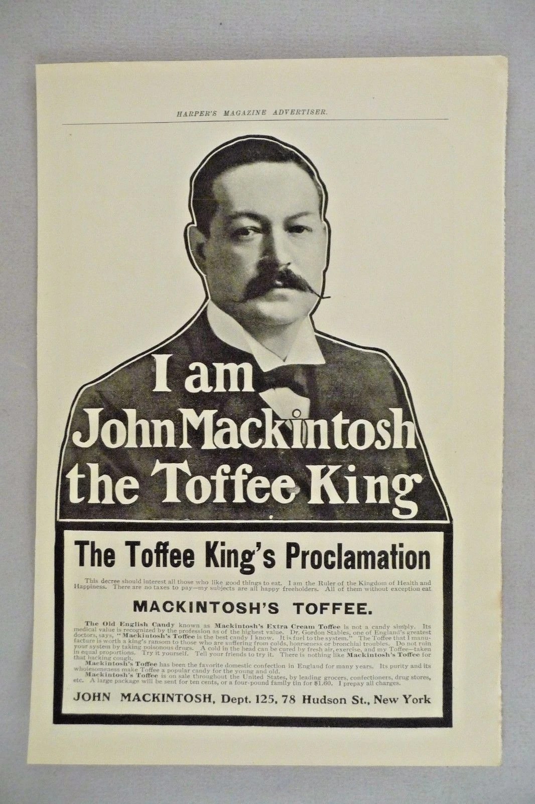
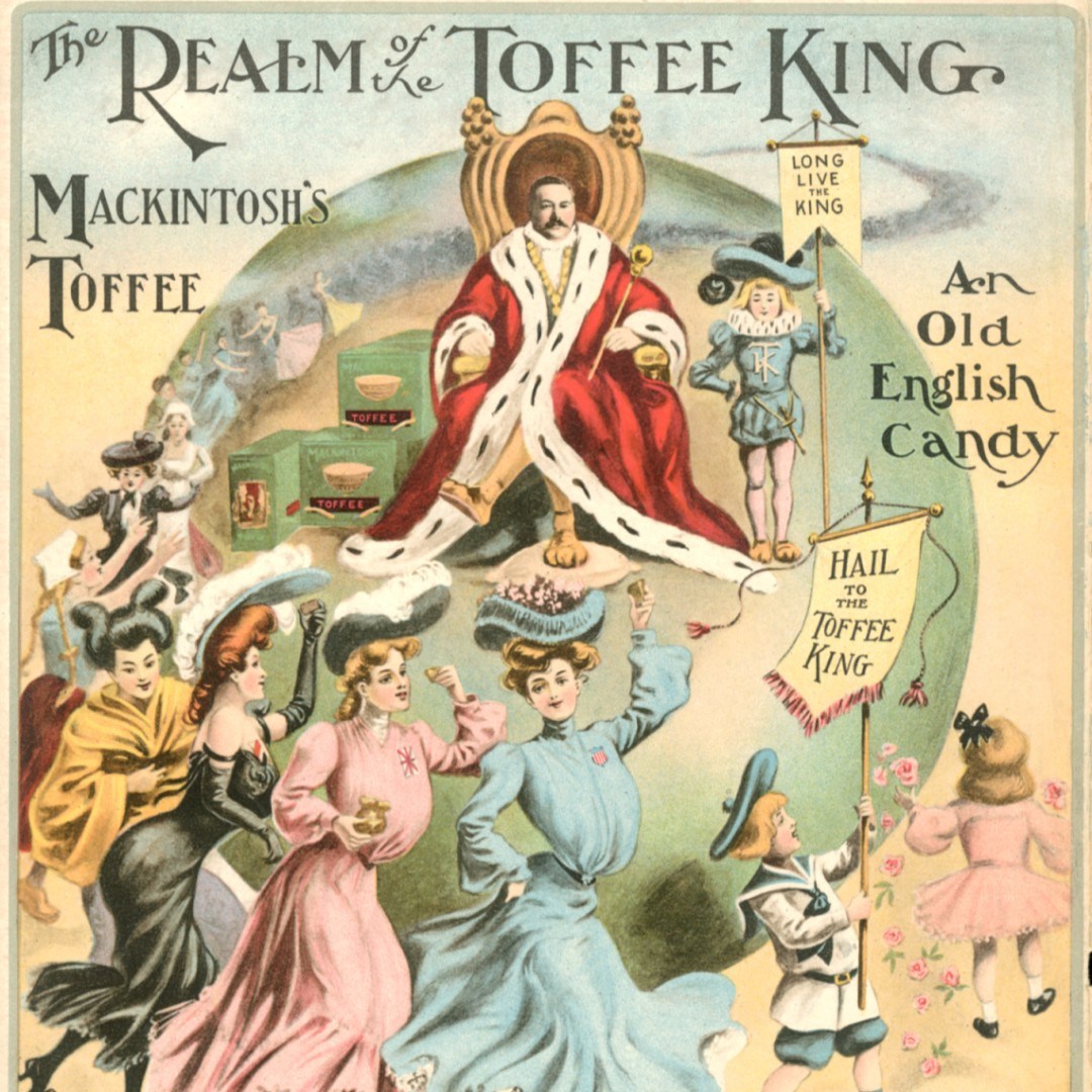
Mackintosh candy was founded by a husband and wife team in Yorkshire, England. They established it the year they married and while he continued to work a factory job she ran the shop. Violet, who had worked for a confectioner previously, must have done a good job because it grew like topsy. In fact, it was their product which changed the toffee from a generic for sweet to the chewy delight we think of today. John set out with an advertising campaign declaring himself, The King of All Toffee.

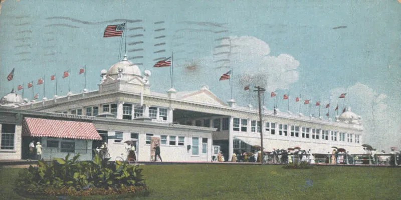
Expansion took place over time, first a warehouse and then a larger one. However, notably, in 1909 they opened their first overseas factory in Asbury Park, New Jersey of all places. It must have seemed like a good bet with the amusement pier there. (Is my tin one that kicked around from that nascent New Jersey period? It says Made in England so likely not.) Sadly the venture failed however. Not that this kept them down for long and the company continued to grow (with setback during World Wars, fires, etc.) and eventually merged with Rowntree in 1969 and exists in that form today.

The Asbury Park of the day they would have emerged into.

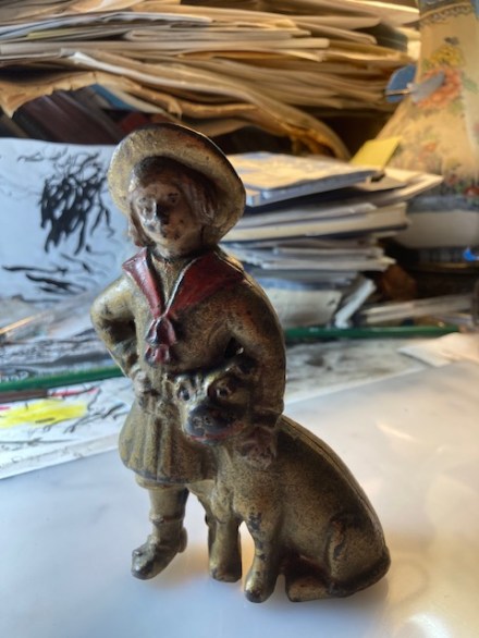
Meanwhile their tins proliferated and many are available. A quick search doesn’t turn up this particular one, but dogs were frequently on the tins which as useful items were saved. (This seemed to be part of their advertising strategy overall.) I purchased this one for the cheerful dog because readers know that I lead a pretty doggy existence for someone who is mom to seven cats! My thought is to take this fellow to work and keep some of the errant bits and pieces on my desk in it.

According to a Wikipedia entry about the candy today: The toffee is now sold in bags containing a random assortment of individual wrapped flavoured toffees. The flavours are (followed by wrapping colour): Malt (Blue), Harrogate (Yellow), Mint (Green), Egg & Cream (Orange), Coconut (Pink), and Toffee (Maroon). The maroon-wrapped toffees do not display a flavour on the wrapper. The product’s subtitle is “Toffee De Luxe” and its motto is “a tradition worth sharing” Egg & Cream?

Hopefully more tomorrow from the postcard show. Wish me luck!

Townsend & Co., Newcastle

Pam’s Pictorama Post: This was part of a much anticipated Instagram online auction that occurred last weekend. It was via a British dealer, @oldstockantiques, who had recently purchased a collection of cat related items belonging to a woman in her 90’s. (It wasn’t clear if this was an estate sale or just her divesting.)

So, after calculating the time difference, I set myself up with multiple devices for bidding. The terms of the auction required that you message the dealer for each item as it went up and this meant that I spent about an hour and 45 minutes to get through the listing of a dozen items or less. Even with my multiple devices and refreshing my feed constantly I have to report that I lost many more times than won. I can’t figure out if somehow my internet connection to England took longer or if my internet in general a tad slower than someone else’s because I will moving as fast as I could. (I’m sure you can imagine, knowing of my profound dedication to the Pictorama collection, my extraordinary frustration. However, @oldstockantiques remained patient with me and a shout out to him!)

Nonetheless, I purchased one item (future post) and then at the end of the auction asked if there was anything unsold and I threw this lovely green cat pin dish in for good measure. Above I have shared a Victorian cat mirror that got away – alas! My bank account is happy but I am very sad.

Perhaps this little fellow didn’t sell because he has a large repair down his middle. There is nothing further to identify or edify on the back, although there are three small feet to secure it on a surface. The repair does not especially bother me and the green color is absolutely seductive. However, one of the most interesting things is that I posted about very similar dishes, cast in metal, in one of my nascent blog posts back in 2014 which can be found here. Those were purchased for a freakishly minimal amount on eBay while wandering through cat advertising items and reside on my dresser, bulging with rings, today.

Identified on the back as Corbin Lock Company, Canada. Pams-Pictorama.com collection.

While the metal duo are advertising Canadian Corbin Locks (the name is on the back), this little fellow belongs on the other side of the ocean where he boasted the virtue of Townsend & Co., New Castle. It took me a bit of time to sort through a number of companies and options before landing on Townsend & Co. Newcastle-on-Tyne, makers of fine china at the end of the 19th and into the early 20th century. (While references to it abound around items being sold, no history of the company is readily available.) I cannot be sure and I do not find another dish like this one, at least not attributable to them. (I haven’t found one advertising for anything of this vintage or precise style.) Feel free to poke holes in my theory!

Townsend & Co. did make advertising pin dishes like this one and Google tells me notably made them for a 1929 North East Coast Industries Exhibition in conjunction with a company called Mailing. The trail goes a bit cold at that point.

On sale at Etsy at the time of posting. This one has rhinestone eyes!

Meanwhile, there is now a fascination for me in the question of this mold. In casting around on the internet I saw it referred to as an old French mold, although I have yet to see specific evidence of that myself. I have seen the old metal ones both with other advertising and without any advertising – sometimes billed as ashtrays like the one on Etsy here. They are not identical – there is a slight morph – but surprisingly similar.

Below is an example of a similar mold in use by a Japanese ceramist currently. The persistence of the image is amazing across probably at least 100 years.

Contemporary, Japanese made version.

I believe this one is heading to New Jersey where it will likely reside in the bedroom or bathroom there. It’s cheerful green color and timeless kitty face will fit right in. And who knows where this cat will turn up next.

Buster Brown Bank

Pam’s Pictorama Post: I realize that there has been no reason to visit the history of Buster Brown in this blog. Today I will try to do him justice via this bank I purchased recently from my Texan friends, @curiositiesantique via Instagram.

For those of you too young to have owned these shoes (I barely slip into that category with a dim memory of the advertising at the shoe store when I was a tiny tot) the brief history goes pretty much as follows. Back in 1904 in an early advertising coup the nascent Buster Brown shoe company purchased the rights to an existing comic strip character created by Richard Outcault of Yellow Kid fame. Outcault was on the market selling the character and pressed them to additionally purchase the rights to the Buster’s girlfriend which they did – more about her in a minute.

From a Heritage Auction. Not in Pictorama collection.

Interesting to me that Outcault sold the rights to 200 companies at the Louisiana Exposition which is where the shoe company picked it up. Therefore, presumably, there are Buster Brown items or more likely advertising that does not belong to the shoe company. Clearly however the shoe company made the most of their acquisition and a long history of Buster Brown shelling for shoes begins and runs well into the middle of the 20th century and Buster Brown is virtually synonymous with shoes now.

Meanwhile, it should be noted that the cartoonist Outcault was quite the business man when it came to licensing and in 1904 was making $75,000 a year on licenses and employed a small staff to manage them. (If Google is telling me the truth this means he was a millionaire in his day.)

Speciman 1908 hand colored Outcault Buster Brown strip.

However, let’s get back to the shoes. The shoes were so popular that generically a kids shoes might be referred to as their Buster Browns. In addition to items like this bank there was reams of print advertising and purchase point items for stores. Midgets were employed to play Buster, in his unfortunate garb, with cheerful pit bulls enrolled to play his dog Tige. The merchandising for toys was glorious and I spied at least one stuffed Tige online that I covet already. By the time I wandered onto the shoe wearing scene in the 1960’s the merchandising boiled down to some balloons. (There is a vague memory that maybe there was something else, maybe a comic long reprinted but I don’t really remember.)

Buster Brown and Tige in front of a shoe store. The copy of this photo is credited to Mel Birnkrant’s collection although a few exist online.

The shoes had Buster and Tige inside, under your heel and I remember the jingle from early tv in a high pitched voice, I’m Buster Brown and I live in a shoe, that’s my dog Tige and he lives there too.

Buster Brown Shoes sign located in Thomasville, Georgia. It can be found on North Broad Street.

So to my surprise, I learned today that as above Buster Brown had a girlfriend (huh), and her name was Mary Jane – and that is how women’s shoes with the single strap were named Mary Janes and are still known by that term today.

Real Buster Brown Mary Janes. Can be yours on Etsy at the time of publication.

As for this bank, it stands at five or six inches. A trace of paint remains on the face and hands while the red tie remains fairly vivid. This seems to be the most common form of this bank although online I found versions in an overall green and one in red which I can’t decide if it is original or not. The face was the first to go and I can’t say I found it pristine on any of this design. Buster’s hair was painted a light brown and Tige’s mouth was also the vivid red and there were red circles around his eyes.

Back of the bank.

It is a simple bank with a screw in the bottom you would use to retrieve your saved coins. It is small so not like you were keeping a fortune in there. Kim starts to ruminate on restoring it as soon as he looks at it. Evidently it makes him itch to paint it although we know that he won’t – nor should he devote time to such projects when more creative work awaits him. (Although Kim’s next book is scheduled for release early next year he’s already deep into the one after it.)

So now that we have a first Buster Brown item we’ll see how long it is before the next wanders in the door. I am going to be looking sharp for that stuffed Tige.

Bunz, a Neighborhood Kitty

Pam’s Pictorama Post: Since cats, both real and cartoon, are more or less my gig I’m surprised that I am only now learning about Bunz, the hardware store tabby, who rules the roost a few blocks away here in our Yorkville neighborhood at a place simply called New York Paint and Hardware. However, it turns out that Bunz is quite the neighborhood celebrity and somehow I have missed him entirely. Kim has had a nodding acquaintance with him on his morning walks, but says that to date, Bunz is usually being petted while getting his morning air so Kim has not actually met to pet him either. Although this establishment is within my territory, I tend to walk by in the evening or run in late in the afternoon of a weekend, I have not seen him. I feel remiss.

The hardware store in question – there is a mural devoted to NYC on the side which is hard to see – more sincere than good. I do wonder if it is the same guy.

There is a strange quality about living in New York which we all accept, but rarely discuss and that is one generally has a set path from your apartment out into the world – an unofficial number of blocks where you shop and eat locally and often you are more devoted to one direction than the other. When running I would hit the tip of the eastern point of the neighborhood and then down the south side which I got to know and because of work, I spend a lot of time walking south on York and First and know it well, but we mostly don’t go south to eat, get take out or shop. (Having previously worked at the Metropolitan Museum I also know the path west intimately but oddly this is a north south thing, not an east west thing.) I speak to people who live on 85th and typically never go north of 86th and I don’t find that unusual.

I have on occasion documented aspects of Friday night take out stroll here at Deitch Studio. (See my pre-pandemic post which was an ode to local take out and a Mexican place we were fond of. Read it here.) This is our walk north most Fridays, often veering west to Second Avenue after a stroll up First. On First I generally like to stop and look in the window of the junk store there. (Some excellent finds from this store have been documented and can be found here and here.) Kim peers a bit at a newish thrift store nearby too. Sometimes the kitties need some food from the pet store on that block and we’ll pick it up on the way.

Me as model – thank you Kim for the pic!

We tend to fiercely embrace our corner of this Yorkville neighborhood. We mourn the tearing down of a brownstone building resulting in the loss of a nice plant store on the corner, the demise of a take out place. The pandemic made us hyper aware of our neighborhood since we rarely left it for a year, but since then and with the effects of the Q line which opened in 2017, the neighborhood has become more popular and shifted. However, generally speaking it is a good corner of the universe, these few blocks of Manhattan all the way over by the river.

Window of the nearby junk store from a prior post.

And, since cats are my thing, I like to think I know a bit about where they reside in the nabe – those who sit in apartment windows daily on my path (I’m talking about you Mr. Tuxedo on the first floor of this building), and a smattering of those felines we think of as bodega cats, the working kitties of the area. Interesting to note that, to my knowledge, the few I am thinking of are all tabbies. Perhaps the tiger stripe of cats is the unofficial mascot of the Yorkville working puss? The only one of the three I have met is a charming youngster on York Avenue who lives in a Deli. I’m not sure that his name is known but I did just find him on a Google search while looking for the cat who evidently patrols the Gristedes on York nightly. His pleasure includes a tree outside the deli where pigeons occasionally perch to tempt him.

I only know of the Gristedes cat because someone I used to work with walks his young lab pup there nightly and the dog became fascinated with the cat in the window after hours on late night strolls. They have a joyous spitty, barking, hissy moment nightly. Mark looked into it and evidently found evidence that the cat is identified as an employee on some paperwork he stumble across in a professional capacity (yes, odd, I agree), although when asked his existence is routinely denied. He is a mouser incognito if extraordinaire as technically he is not allowed to live there.

I came home to this corner on First and 86 being torn down a few months ago.

This past Friday night on our way to pick up dinner (from a new place with an extraordinarily large and diverse menu called Soup and Burger on Second), I noticed this t-shirt in the window of the hardware and paint store on the corner of 87th and First. I pointed it out to Kim and we agreed it is well done.

To backtrack a bit, I have lived in Yorkville long enough that I remember a few decades back (30 years evidently) when this store was the new kid on the block. Ostensibly a paint store with a bit of hardware it did not seem especially useful and I ignored it for a long time. It replaced, to my vague memory, an electronics store which repaired televisions and VCR’s and I had utilized that service. (Yep, seriously dating myself here although we actually still own a VCR/DVD player or two, or three.)

View of First Avenue from inside Taco Today, taken waiting for our Friday night order back in ’19.

Anyway, I don’t know that I darkened their door for years. Slowly however, the hardware aspect took over and it developed a less chain oriented more neighborhood vibe. They are now depended upon for our general local hardware needs (they are the last of several standing) and a look at their website earlier today reveals that I can get my knives sharpened there and I think I will pay them a visit for that. It is funny though how even a chain store can evolve into a neighborhood joint.

So evidently Bunz, this sprightly tabby, rules the roost over there. I suspect that hardware stores must keep some mouse friendly stock which requires the services of such a kitty – planting soil and whatnot. I know of a few Lowe’s and Home Depots that sport Instagram accounts for their flagship cat employees. (Notably there is Leo, another tabby, in a Home Depot in Mt. Laurel, NJ and Francine, a calico mix at a Lowe’s in North Carolina.) Garden supplies and a very old building in the case of our neighborhood store which probably makes it a mousy delight.

We didn’t stop on Friday night but I made a mental note to come back on the weekend so we went on Saturday and yes – they were selling the t-shirts and I realized that there was a big stack, organized by size, on a rack by the window. The Bunz tee cost $20 (Kim paid – thank you Kim!) and I got a large but they run a tad small. I asked about the artist and the young man waiting on me just said Shawn which makes me think maybe it is someone else who works there, a nascent illustrator.

It’s a bold design and has hardware cattitude going for it. Bunz sports workman’s overalls, hightops and shades – a cool cat. Both his overalls and his top (striped like him) have his name. Paws in pockets – he is all business. He appears to have a can of paint and brush in front of him and the sign for the store behind him – a decent rendition of the window looking in. Kim says he would personally have made more of the second color and I tend to agree, but these are artistic choices, right? I hoped that maybe their website or account would have his origin story and perhaps where his name came from but alas, currently not.

So finally I share photos of the real Bunz. He’s clearly a beloved member of the team there and what he might lack in a typical home life seems to be largely made up for by being a working cat with an appreciative following here in Yorkville. Long may he remain at the helm of New York Paint and Hardware.

Julian: Marvelous Cat Impersonator

Pam’s Pictorama Photo Post: One of the occupational hazards of being Pam of Pictorama fame is that researching a post occasionally leads you directly to purchasing something else and today’s card came into my possession while researching last week’s cat impersonators.

Like those two cards acquired from a single seller (those posts can be read here and here) today’s impersonator also hails from Great Britain. I don’t know if it is that animal impersonation as entertainment was better or more robust in England, but it did at a minimum produce more visual evidence which is jolly detritus for us to pick through a hundred or more years later.

Another fluffy version of kitty from a post last week. Pams-Pictorama.com Collection.

Sadly there are no easily found tracks about Julian and his cat act. As Kim pointed out and I must agree, there is something still very much of him even when he dons his cat costume. I find that he includes a photo of himself sort of interesting and he’s a rather intense looking young man here. Under his picture it says, Marvelous Cat Impersonator and Anatomical Puzzle. I really do wonder about the anatomical puzzle part – what could that mean? Was he able to execute uniquely cat like motions and poses? Amazing dislocation of joints? Did he perhaps sport a tail? (Now that would be something!)

Julian is a very long haired cat (impersonators seem to lean to the Persian type), and he sports a big bow. As I noted above, while his mask certainly covers his entire face there remains something of his affect even with it on. His cat eyes are set a bit close and I can’t say there is anything endearing about his cat. No wish to cuddle this puss – or even meet him really. Still, it might have been a very good show.

The back of the card reveals that this was actually a Christmas greeting and (in red) reads as follows: Christmas and New Year 1913-14/Wishing You The Compliments of the Season. from “Julian” Panto, 1913-14. The Grand Theater, Byker, Newcastle-onTyne. The card was never used and there is nothing written on it.

There is nary a snippet to be located about Julian and his cat act – not even the sort of listing in an old theatrical newspaper like sometimes turns up in my research. He has left no tracks. However, the Grand Theater has a traceable history. It was built in 1896 and closed its doors in 1954. The building remained standing if derelict until a fire in April of 1964 when it was then demolished. (I would share a photo of it, but none of the sites wish to let me today.)

In 1913 it seems it got its film license was just starting to commit to showing films in advance of the live shows, as many theaters were. 1913 and ’14 would have been rollicking years with numerous large theaters in this downtown area of Byker, an eastern district of Newcastle-on-Tyne. The Grand originally seated over 2,200 people, a number of seats which was reduced by more than 400 when the equipment for showing film was installed.

Let the Cat Impersonators Cont. Part 2

Pam’s Pictorama Photo Post: Day two of cat impersonator photo postcards! Unfortunately as over exposed as the last one was, this one is equal parts too dark. Both yesterday and today’s cards hail from a dealer in England and were purchased at the same time but separately.

Today we have a rather doggy cat in a more elaborate costume – I could go either way on this. One can imagine that this one might have had devices to make a tail twitch or a jaw open and close. He is more furry than yesterday’s model and if I had to guess I might say that yesterday’s was earlier and more primitive but of course it could have just been a cheaper production. The face seems to be a two part affairs with the snout separate.

Like yesterday’s card this one was never sent and has a layer of dirt helping to attest to age which is unknown. I am not quite sure I can guess why kitty is backed into a corner behind a chair for this photo – we will assume that it was part of the plot perhaps?

While yesterday’s card screamed vaudeville act this one might make us think about film as well. I am reminded of my photo still of Nana from Peter Pan, one of my favorite examples of an animal impersonator although a dog of course. (That post can be found here.) Still, practically speaking, likely this was some sort of a stage act as well.

Nana from Peter Pan. Pams-Pictorama.com Collection.

The range of design and assembly in these costumes fascinates me. This one, to the extent we can see it, appears to be professionally (very skillfully) made. Still, there’s often some thing a bit indeterminant about the precise species of animal in question on these images. Feline dogs, canine cats and a range of sort of bear like critters. Of course we don’t see them fully inhabited and in motion – their animation may have further described and defined them.

I believe I have commented before on the sheer annoyance of my cats when I plop a pair of cat ears on my head for Halloween. They all but shake their heads in disappointment and distress – like the kitty equivalent of a racist joke. One can only imagine their response to a furry full body costume! (As for fur, on the one occasion I remember an elderly friend wearing a mink in my apartment – my then cat Miss Otto Dix – a feral female feline – went nuts at the sight of it. She and the coat had to be separated by a closed bedroom door.)

*****

As I write this it is Saturday evening and I am in New Jersey with the five Butler cats. They are pleased with the attention of my being here and they have piled all their toys in the living room for a kitty party. These guys are gearing up for an all-night romp which I will be privy to through my bedroom door.

IV Miles to London: Cat Impersonator Part One

Pam’s Pictorama Photo Post: It’s a one two photo post punch today and tomorrow with two cards I acquired from Great Britain recently. Animal impersonators, fancy for folks dressed up to perform in animal costumes, are a Pictorama passion and are hard to pass up. (An impressive previous specimen post can be found here and a slightly more oddball one here.)

Today’s kit appears to portray Dick Whittington’s cat – an old wheeze based on the historic Richard Whittington who lore has it owned a very talented and scheming puss who helped him achieve significantly in life. The kit and the story are evidently apocryphal, as talking and elaborately world dominating cats tend to be.

To be honest, the purchase of these two cards was pretty marginal purchases based on their evident lousy quality (which was even worse in their listing), but in the end their rarified-ness won me. They are a bit better in person. However, this one in particular suffers from being some sort of wretched form of duped reproduction, but it would appear one at least roughly from the period. The card shows signs of real age.

This photo postcard was never mailed and there is nothing written on it. This is a pretty basic (if effective) cat costume. He represents a nice tabby, black and white stripes on his arm-legs. His mask looks sturdy to the point of discomfort and his chin sports some stripes below as well. Bristling whiskers jut out and one ear stands at attention while the other is folded over. The top of his costume ends in a sort of neckerchief as a transition (to hide his human neck) and I am sorry we don’t really see his tail. A good tail is everything in a cat costume.

There’s something a little scary about this kitty effigy – not sure how I would feel about taking advice from him. He perches on a mileage sign for IV Miles to London.

The woman leans on his shoulder. She looks like an acrobat or circus performer, curly hair with a large bow atop, slippered feet. Almost entirely faded from sight is a short pearl necklace, one earring exposed. She does not appear to be Mr. Whittington so not sure what role she played in the drama.

Hard to say how much we might have enjoyed this play as it unfolded. Based on this photo my guess is I would have at least wanted to give it a shot though.

This post a bit short and sweet today as I head to New Jersey early for the funeral for the mother of my friend, Winsome. As I get ready to post this (a largely pre-written post!) I will hop on a train shortly. Another interesting if poorly developed photo postcard – another on its way to me. It’s all about animal impersonators for now!

A Mr. Peanuts for Pam

Pam’s Pictorama Toy Post: This just in – my first ever Mr. Peanut! He comes via an auction house that sends me endless listings and from which I rarely win anything. (The first item I ever won from them were these nice metal dogs featured in a post here.) On the rare occasion that I do win something, it was because no one else wanted it or was looking at the moment I think and therefore I got it for a good price. I do believe that part of the method of buying from these folks is to actually participate in the live auction but I am almost never able to do that and so, mostly I lose.

I had spotted this fellow in a listing along with a bunch of jointed Felix toys and admired him. Never seen the likes of him. I put a watch on it but expected that like many things (I keep trying to get a deal on cat andirons for the fireplace in New Jersey) it would go high and slip away. In fact, I never got around to putting a bid on it.

However, I was at loose ends the other day and a reminder that the he was going live in the auction. I believe I was feeling a bit burned by something I had just lost on eBay and I thought what the heck and put a live bid in just as the bidding was closing. Low and behold – I won Mr. Peanut!

Nothing much unexpected on his back side. Schoenhut has no markings on these toys but they are very distinctive.

He is an early product of the Schoenhut Toy Company, circa the 1930’s. He is of course, an early example of an advertising to toy crossover. My fellow is missing his cane which would have stuck in one hand. And yes, if I was about 100% handier I could replace it easily! I especially like his blue hat with Mr. Peanut boldly printed! (Was his hat always blue? I think not.) When you look closely at his peanut body you see small black spots to create the peanut shell surface of his body.

Insert jaunty cane here.

What I never knew is that Mr. Peanut was originally conceived of by a 14 year old boy, Antonio Gentile, who won a contest to design a mascot for the company back in 1916. The charming monocle, top hat and spats were added subsequently by commercial artist Andrew S. Wallach. (Fascinating that spats manage to carryover on him – common in 1916 but unheard of now, of course he just appears to be wearing socks.)

To jump down a tributary – it turns out that although Antonio Gentile only won $5 for the contest, it was his lifelong friendship with the founder of the company that was significant. Amedeo Obici befriended the boy and helped put him through medical school. He pursued a life of service as a doctor and surgeon. A moving quote from an article in Smithsonian Magazine, evidently published in a newspaper as part of an obituary article (sadly Dr. Gentile died quite young, only a year after getting married) and is summed up below:

For Dr. Antonio Gentile, skilled physician and surgeon, loved by a paying clientele who admired his ability and his personality, was perhaps held dearer to those who were not a paying clientele, whose money was gratitude only but whom he served as freely, as fully and as willingly as though they had been able to return wealth for service. (The full and rather touching article can be found here.) The Smithsonian owns the original drawings and the dapper cast iron version below.

You may be saying to yourself, what’s up with Mr. Peanut and why, given how much stuff I have found over the years, have I long neglected this particular desire. I asked myself that as well, I admit. My interest in Mr. Peanut advertising predates my current collecting passions. The first time I remember seeing an early bit of Mr. Peanut advertising was on a trip to Paris in my 20’s. I saw a nice early metal one and was entranced but it was too dear for my extremely limited budget, but it stayed with me.

Of course I have encountered this and that small item over time but none really spoke to me. I do remember that on American Pickers once they found the giant Mr. Peanut peanut butter producing machine! Oh my goodness, I was in love! I gather one like it was in use and on display in Atlantic City. Shown below, this one hails from a Peanut Shop in Columbus, Ohio. Their site can be found here and it would be absolutely top of my list if visiting Columbus.

From The Peanut Shop in Columbus Ohio.

In looking online at Mr. Peanut items I am reminded that even as a child I very much wanted the Mr. Peanut hand crank peanut butter maker. Alas, this was not the kind of toy that made its way into the Butler house (I can see my mom thinking, complicated and very messy) and I don’t believe I ever had the pleasure of acquainting myself with one via a friend in those formative years.

I believe it was a less impressive version of this figure that made me salivate in Paris those many years ago.

However, if there is a Mr. Peanut item I still long for, it would be that long ago cast iron one in Paris. I found it online and actually, it would appear that it is indeed quite rarified and remains too expensive for me to acquire – certainly in this pristine condition.

Meanwhile, I intend to bring my Mr. Peanut to New Jersey where the heat in the house is less dry than here at Deitch Studio. This in the hopes of keeping his stringing in order. Somehow now that I have acquired him I think more Mr. Peanut may be forthcoming – increasing rather than sated my appetite for this natty fellow.

Trucking

Pam’s Pictorama Photo Post: This photo came to me via the antiques mall in New Jersey, purchased shortly before Christmas this year, among my minor holiday decoration purchases. It is a bit faded and the mat it is attached to is a bit stained and tatty. It caught my eye however and overall it is sort of wonderful.

I brought the photo back to New York where I have been looking at it under a loupe and I have managed to read the very faded and overexposed writing on the side of the truck. I have deduced that this truck was decorated for a company picnic and outing. After cleaning I can just about read the writing on the side of the truck despite it being very over-exposed and faded, Annual Outing and Picnic for Employees Pulaski Trucking Corporation. Sadly, if there was a date I can no longer decode it. (These days I can find a Pulaski Heavy Hauling company in New York – hard to know if this is this company is the ancestor or not.)

This fits neatly into my collection of yard long photos of outings and employee picnics which decorate the walls of the house in New Jersey. (Posts about those can be found here and here.) I will most likely bring it back there to live, although if I could find a spot for it here in New York I would enjoy that too. There is something endlessly appealing about people in their best bib and tucker posing on a special outing. It is in some ways the essence and premise of much of my collection.

These yard long photos are hard to film (but worth it) so you’ll have to go to the post above to really see it!

It is a deeply male enterprise and picnic or not, these fellows mostly dressed for the occasion. (I’ll assume the wives and girlfriends and children are nearby but elsewhere.) Understanding that it is a picnic it is surprising that so many are in suits or wearing ties. Some wear hats and others took their off for the photo. There are two men in dark suits on the end, one holds a newspaper in his hands while the other has a black mourning band on his arm and smokes a cigarette.

The fellow on the very end is the jauntiest, leaning on one arm, straw hat and all attitude. Next to him, almost ghost-like due to movement during the exposure, being over-exposed and fading, is a small child in shorts, lumpy high socks (bad idea!) bunching down his legs. He is the only kid to sneak into this otherwise all adult photo.

The Tydol sign, hanging off the side of the garage, indicates that this photo was probably taken in front of the garage. There’s no way to know where this was taken. The three and four story buildings in the background make the setting at least a bit urban, but could easily be small town urban. Although found in NJ there is of course no guarantee that this was taken there and as these were truckers, we assume the fellows in the photo roamed a bit afield.

The photo is evidently glued into a pressed paper decorative mat. It was super grimy and it appears to have become one with the pressed paper mat. The back is cardboard and some torn brown paper, but with a wire that seems serviceable and ready to hang so I will be looking for exactly the right spot to install it.

Dustless

Pam’s Pictorama Post: I find it very hard to resist a good vintage tin box; I just cannot. They immediately stir my imagination and I am sure I have a million uses for them. Generally this is true as well, although occasionally one doesn’t take for some reason. I purchased this one at the antiques mall in NJ thinking it would go to my new office and it may still, although as I settle into that space I am still figuring out surface area and needs.

I have another, much larger, version of this tin which is kept in the bedroom in NJ, also pristine, long and narrow, housing night table odds and ends and keeping them away from prying pussycat paws – who would take great joy in gently knocking each thing onto the floor while I try to sleep. Maybe a future post on that tin, but it does make me reflect on the pristine condition of these crayon boxes in particular. Perhaps the dustless as advertised meant nice clean tins.

View from the new office.

I wonder if this tin contained crayons such as the much beloved Crayolas of my childhood or if this was a tin for something more like pastels or chalk. An-du-septic makes me think more like pastels or chalks. This was a term coined by Binney & Smith, the forefathers of Crayola in about 1902. It seems to sort of mean sort of anti-dust and clean.

The tin boasts, Gold Medal Crayons for Every Use as part of its trademark on the top. They liked their patent and trade mark info at Crayola and the side is devoted to it further with a Patent notice and Where color is required use a gold medal product.

In addition to identifying Binney & Smith Co. New York and it says one gross which seems like a heck of a lot as this box only measures about 3″x5″and 4″ deep.

I am a child of the large yellow and green Crayola era, the one with the built in sharpener. Despite a world of color choices there were always the ones the wore down quickest and those which sat largely little used. Not all crayons applied to paper equally well and even as a kid you also figure those things out. The sort of neon colors intrigued but could best only be used for highlighting. Gold and silver fascinated as well, but were only somewhat useful. I am having trouble remembering all the colors I thought were troublesome, but things like red and hot pink wore down quickly. Always very fond of a sort of aqua blue and was pretty popular.

This seems like the large flat box I received at one point.

As I write this Kim is at his desk, hard at work on my Valentine’s Day picture. (Prior Kim Valentine’s Day works can be found featured in posts here, here and here. It is an annual tradition that goes back many years to when we first started dating. Watch for that reveal in February!) He is using colored pencil and somewhat coincidentally, was talking about how much he disliked crayons even as a child because they never went on with any consistency. Even as a tiny tot this irritated the nascent Kim Deitch as artist! I know what he means though – you could layer on to get some consistency. (In the photos above taken on his desk you can see the colored pencils in use ready and waiting.)

For all of that, my research pretty much confirms that this box housed chalk sticks and that this particular box probably dates from about 1935.

At some point in my childhood someone gave me a much larger flat box of crayons which I have not seen before or since, about the size of a gameboard. It had more crayons and a sharpener within. I don’t believe it caught on however. I was fascinated to find the box, above, online when I looked.

The very traditional box of which I had many.

Meanwhile, Cray-pas were another whole kettle of fish and were almost too juicy to control. And I didn’t have the kind of childhood where there were opportunities to use chalk on a sidewalk or other pavement. I have documented some of the chalk drawings I used to encounter in the park running and so we know that chalk use is alive and well today by kids.

Where this tin ends up and what it holds remains to be seen. If you just have to have one you easily can – they are very available, many quite clean like this one, on various sites including eBay. I think I am still feeling it for my desk at work. Enjoy it for what it is – a pristine reminder of a beloved childhood favorite.