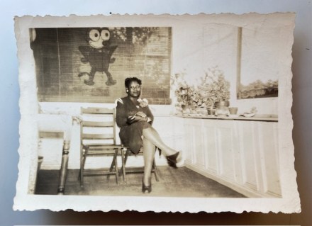
Pam’s Pictorama Photo Post: I am giving Pictorama readers a brief break from postcards today. I feel like it has been a long time since I have posted a snapshot. It isn’t because I don’t look for them, but photos that wander into the Pictorama realm are a bit more rarified it seems. This one was found and quickly purchased on eBay recently as someone was smart and noted that a nice Felix lurks on the window shade.
The picture is undated however her clothing and this nice deckled edge on the print puts me in mind of the early fifties. (I recently saw an early deckle edge photo trimmer online. It appeared to be one for home use. I gather Kodak sold printing paper with the deckle edge for a couple of decades – both things interested me because I always thought it was only evident in commercially processed photos.)
It is a small photo, only two and a half by three and a half inches. This woman sits center stage is all dressed to the nines with a corsage on her shoulder, earrings, stockings and heels. However the setting is more seemingly casual with wooden folding chairs. There are plants on the window and a fence with trees beyond it. A bit more of the outside might be a clue to where she is (at best I just see some leafy treetops) although it is an event or a visit somewhere special clearly.
Of course I purchased it because of the somewhat off-model and presumably homemade Felix on the shade behind her. Felix stands hands (paws?) on hips, elbows out. He’s a very angular Felix, with an oversized head and a smile. His tail appears sort of mid-leg at an odd angle, although for cat-a-tude they seem to have gotten him right.
Felix’s image is surprisingly enduring. Consider that the height of his popularity was in the 1920’s to find folks still painting his image on some blinds somewhere in the world of the 1950’s is sort of an odd and interesting thought. Like his competition Mickey Mouse the grip of his image has held fast for many subsequent decades. Leaves me wondering what has been produced subsequently that will have legs as long, hard to beat the famous cat and mouse.
***
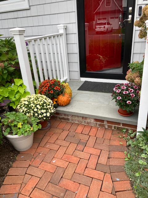
As you read this I will be off to New Jersey for a few days of winterizing chores for the house there. My dahlias are still blooming so I won’t be taking them in yet, but the heat filters will be changed and the irrigation system turned off. Pumpkins and mums are already out on the steps but I intend to enjoy my fall garden for a few days.(Tune into Instagram for dahlia update!) See you next week!
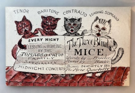
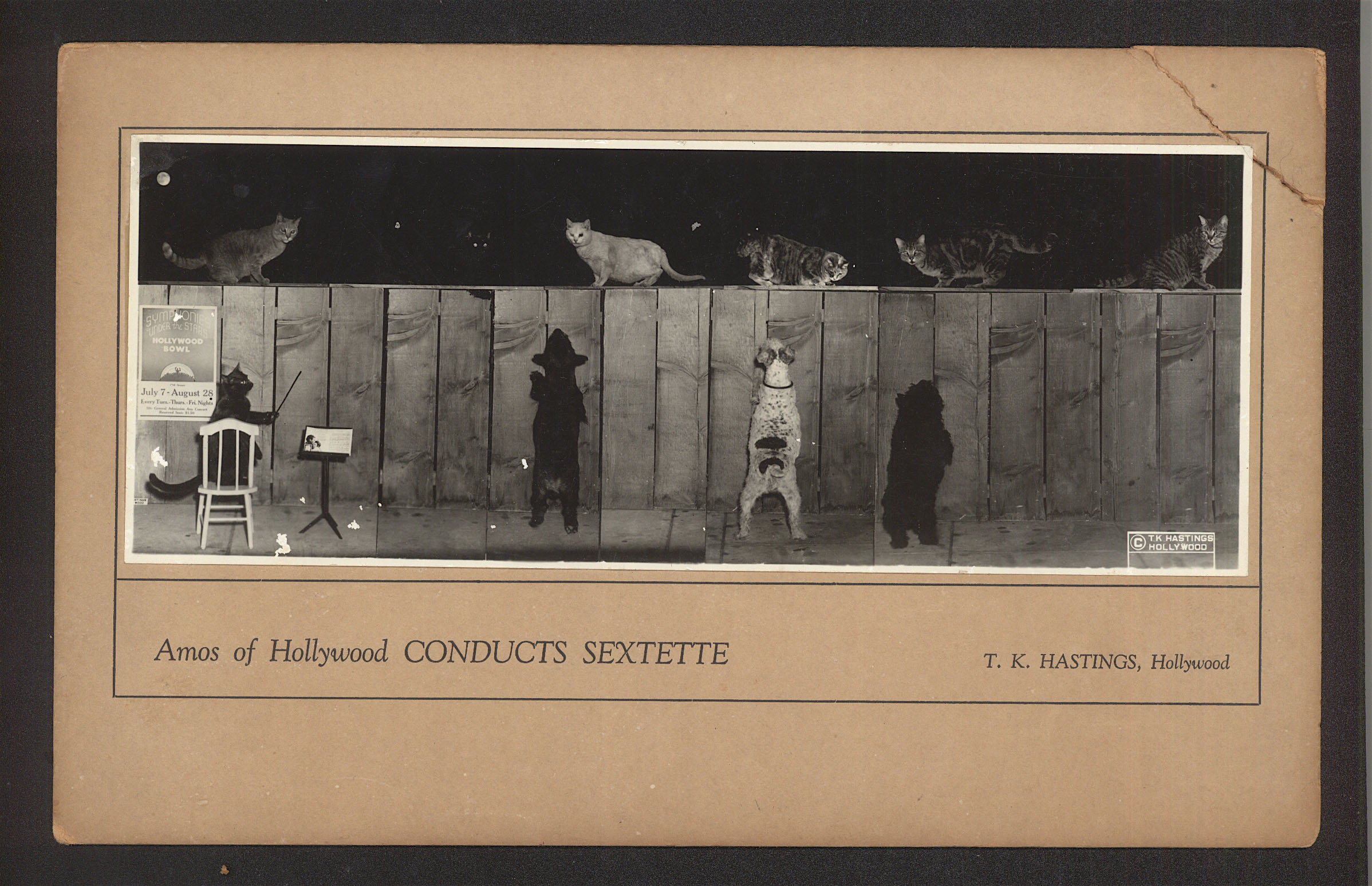
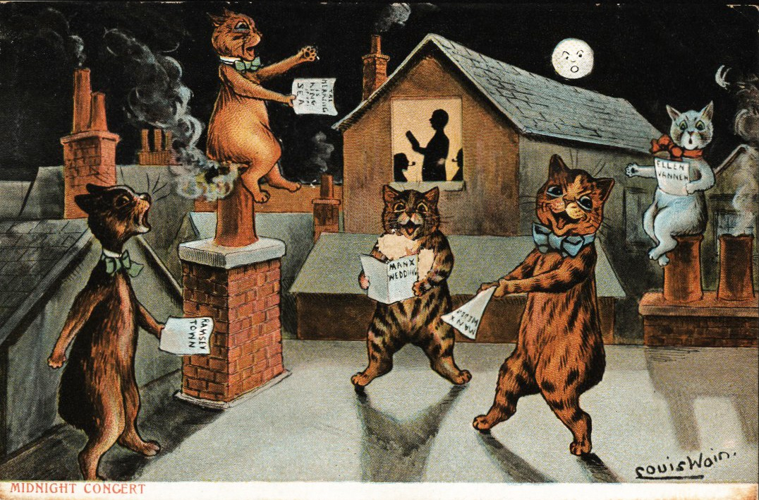
Pam’s :Pictorama Post: Today’s post is an oddball card I picked up at the postcard sale recently. It portrays the never ending saga of cats atop a roof, singing their nightly woes and joyous howls. I have numerous entries in this bonanza of images although a favorite is an unusual panorama photo of cats on a fence (and dogs) shown below for a post that can be found here.
Pams-Pictorama.com collection
This is another of those postcards which is address and date by the sender but no evidence of mailing. On the back it says, For Beatie From Dad. Ramsgate. 24/3/07. Therefore this card is a bit older than maybe I would have guessed.
Cats on rooftops though is also a thing and I wonder about this. Blissfully, I have never found one of my cats, or a stray for that matter, on my roof. That might be because I lived in a very high two story house growing up, but even our more compact house in Jersey does not have rooftop kitties. I assume it is more of a function of houses and row or townhouses close together? How do they get up there and down again? Attics maybe? It must have been a thing because you see them portrayed on roofs as much as fences. Here it is a red tile roof, but definitely a roof nonetheless.
The artist has provided us with some cat diversity in this quartet, two marmalades, a dark gray and a white-ish tabby. Tails stick out handily for the composition on either side and peek up on either side of the Baritone and the Contralto, arguably somewhat strangely placed for the Baritone, sort of in front of him.
These musical felines clutch an advertisement sheet, with claw paws, that looks like it doubles for their music. It promises, Every Night Lessons in Howling by the Tomasso Catto Family Speciality Midnight Concerts/ Three Blind Mice Words by – Prowler Music by – Howler: Sung Nightly by the Mew Quartette. Their fluffy feet peer out below the paper. The orange on the end, Tenor, seems to look the most like a participant in and old-fashioned barbershop quartet. Meow!
(The post for this particularly good Louis Wain image below can be found here.)
Pams-Pictorama.com collection.
I don’t know about my Pictorama readers but I could never rest easy at night if I heard cat fights or howls in my yard. Although I know enough about cats to know the ruckus that can be raised, I admit to being glad that our colonies of strays is largely reduced enough that this is no longer a routine event here in Yorkville or in Fair Haven. A cat meowing outside will drive me nuts looking for it. Far from tossing a shoe at them I would of course be worrying about it. My mother was the same – hence the admission of Stormy and Gus into our family over time. They arrived at the back door with all paws on the ground however.
There were some good times for cats, even domestic ones, that managed to spend the occasional evening out with the fellas or gals as it may be. I have written out our cat Zipper who used to through parties in our garage for the local bunch after raiding a neighbor’s eel pail kept for chum. The price of domestication as I pointed out in a post last week where guest speaker Temple Grandin talked about a dog at the hospital that had eaten and entire shoe. For a quick look at that interesting talk see below. Our town in New Jersey seems to want to strictly restrict cat residents outdoors and the Jersey Five are all indoor cats. Needless to say, up on the 16th floor in Manhattan, so are Cookie and Blackie!
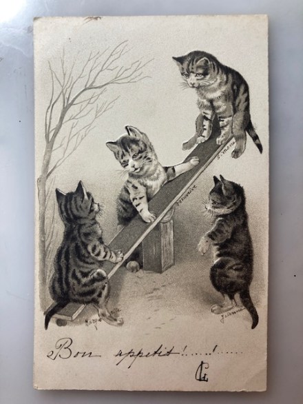
Pam’s Pictorama Post: Four little tabby kittens are playing on this sort of jerry-rigged see saw here. The see saw always seemed a bit fraught with discomfort. You generally ended up falling abruptly to the ground at some point. Ouch! You were somewhat at the mercy of the other person too. Can’t say I have overly fond memories of them as playground equipment goes.
We won’t examine the mechanics of this one too much – it doesn’t withstand study, just a plank on another it would appear. The cat who is high up has that slightly both excited and queasy look that one got suddenly being bounced up that high. Oh my!
The kit in the down position has his back to us, note his tail going off the page, and then we have the two in the middle, one who seems to be officiating in some role. I love that all four cats are tabbies here – it would feel very different if the artist had chosen several different kinds of cats. There is a leafless tree on the left making it feel wintery.
Back of the card – addressed but devoid of postage.You can see it is embossed here.
It is hard to see but the image on this card is embossed which makes it more dimensional. It was produced in Germany, but the writing on it, front and back, is French. I think it is worth noting that although the back is fully addressed there is no stamp – I am seeing this in my current pile of cards. I wonder if these were hand delivered or put in envelopes or what.
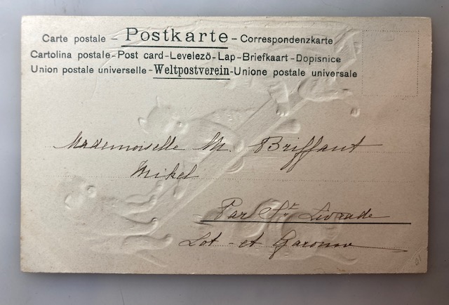
It took some careful study, but all of the writing on the front of this card was added by the sender. I scratched my head over Bon appetit! Are we munching on kittens? It is hard to see but each of the kittens has been named as well, Jeanne is the one on the right, standing on hind legs; Marguerite sits on the lower end with her back to us; Genevieve negotiates the middle space and Simone is up top! This writing is so very neat and printed so small! There is something in the lower right which I think was also applied by hand and it is debatable what it says, maybe CLts?
It was sent to Mademoiselle M. Briffant Mikel at an address I cannot make out – without postage as aforementioned. So perhaps this was sent to a young girl and the names are of sisters? Real cats? Wish I knew but it is charming.
From a recent post where the commentary and notes help make the image.
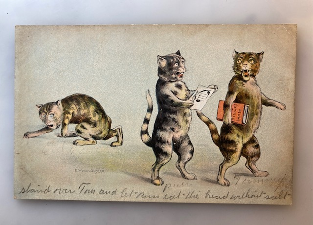
In collecting postcards I have come to realize that the writing on the front often significantly enhances the visual of the card. This is very often true especially on Louis Wain cards I have found where people are alluding to the action in the drawing. (See an example in the post here. Although Wain also tended to add notes in his own hand too. The post for the non-Wain one above can be found here.) Sometimes it is so spot on and seamless that, like this card, it is hard to tell that it wasn’t done by the artist.
Card Kim recently purchased at the Metropolitan Postcard Club show. It’s all about the writing!
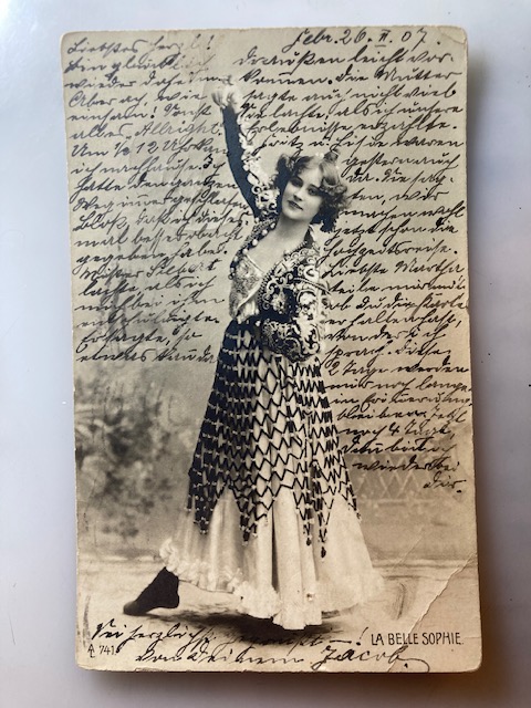
There is another, not insignificant, bunch of cards from this period where the entire contents are written on the front and then maybe just addressed on the back. Kim bought this card below for that very reason the other day. (Yes, while I was buying the place out of cat cards he made a few discerning purchases as well. You’ll likely see them over time.) The dealer told him that she has one person who collects these but only when written in a certain language. I am unsure what language this one is in, although it is dated February 26, 1907 on the front (postmarked the 27th on the back) and it was sent here in New York State to Miss Maurtha Schwabe, c/o E. Rumert, Green-Ridge, Haaten-Toland, N.Y.
It is not intuitive but the writing on these cards, sometimes intentionally altering the image and other times just looking for space, enhances rather than devalues them – at least for some of us collectors.
Pam’s Pictorama Photo Post: As some readers know, last week was a satisfying visit to the Metropolitan Postcard Club show where I loaded up on a wide variety of postcards which I plan to revel in for a long time to come. However, having said that, the show seemed to be notably low on photo postcards in the categories I perused. Today’s card however was one of those photo postcards I did purchase. (And you can see I eventually wander into silent film territory today!)
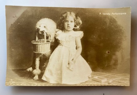
This card makes me laugh. It is hard to imagine what on earth a performance of these two, given the visible implements, might have put together – clearly you had to be there. Meanwhile, I had a moment of thinking that the bubble pipe had been applied after the fact but a close look under magnification shows that she was indeed holding it in her teeth. It is my assumption however that the bubble itself was a bit of photo magic, a bit too perfect and visible.
This little girl is well appointed in her dress, with her hair curled nicely and she holds what appears to me to be a handkerchief in her hand. (Her other hand, unseen, is probably resting on the dog.) It requires some imagination to envision any configuration of an act. There is, additionally, a box on the ground near her where there is also an additional pipe like the one in her mouth. Huh.
Kim especially recommends this Louis Feuillade film outside of Judex.
The much gussied up poodle holds a basket and it is my guess she knows a few tricks too. While I am not entirely a fan of the extreme, if classic, haircut she sports it fits the circus dog implications. They are both seated on some sort of print tile floor and best I can tell the dark background was smudged in manually in the making of the image. In the upper right corner in small type it says, A Variety Performance.
This card was never used or mailed and the only information on the back is for the company which appears to be called Aristophot Co. London. This company seems to have been active in the very early years of the 20th century, was sold and appears to have ceased to exist by 1909. However, it left many and a wide variety of postcards in its wake.
All 12 chapters and a prologue are available here at the the time of publication.
This card especially appealed to me this morning because last night I was catching up to where Kim is in a serial called Judex from 1916. A beautifully restored version done in 2020 is available on Youtube. Kim was turned onto it last week while we were watching the Pordenone silent film festival and in particular a series of shorts by Louis Feuillade which made Kim have a look around and another look at the director.
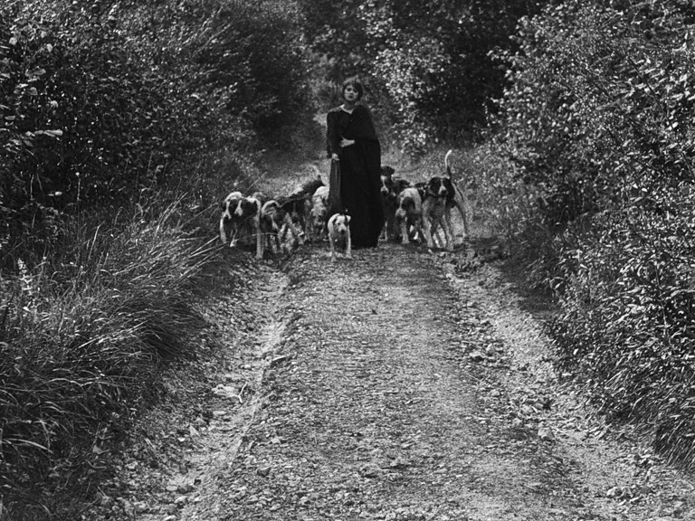
A great shot of the pack of dogs from Judex.
You may ask still, why might this postcard remind me of that? Well, without giving any of the plot away (because if you have any interest you really should watch it) one of the aspects of the film is that the protagonist, the mysterious Judex, travels with an enormous pack of trained dogs! Many hounds, one huge black dog with long flowing hair, and a well trained poodle trimmed up just like this one. Great shots of them all flying around the countryside abound.
Among the wilder looking pack of dogs this very perfectly clipped poodle emerging as one of several performing pups really helps lift this early series up into our Best Of Serial category even though we are only on the fourth installment. More to come there!
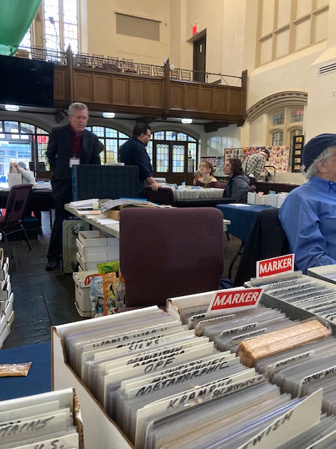
Pam’s Pictorama Post: Today I am taking a moment to revel in my postcard purchases, but also to celebrate the postcard show itself. To anyone who has been to the current incarnation of this sale this might seem a bit extreme as it is in a small church in the West Village and made up of about nine dealers.
The first reference to this show in my life dates back to college when one of my professors, collage artist Maureen McCabe (her site here), mentioned in passing that she loved to go to a postcard show in Manhattan. She would pick up vintage cards which she would use in her collage boxes. (She mentioned getting vintage paper dolls there which I have never seen!) Frankly, in my naivete I had never heard of or considered such a thing. Antique stores and flea markets were a part of my childhood but shows of such things for sale had never really occurred to me. And postcards no less. It set my brain mulling.
The art of Maureen McCabe. “Fate and Magic”, 2013, copyright of the artist. That could be a vintage paperdoll right there…
Fast forward a number of decades and somehow or other it came to my attention that there was a vintage postcard show (the Metropolitan postcard show) at a (then) old and tatty hotel on the far west end of 57th Street. In my memory at the time it was a Howard Johnson, it appears to be called the Watson Hotel now. (Another sliver of memory is that in my 20’s my then boyfriend, Kevin, and I would get day passes just for swimming pool access in hotels in Manhattan in the hottest of summer. This was one of those somewhat cheesy hotels.)
Who would have thought a room with nothing but postcards for sale would be of so much interest? In those years there was probably twice as many dealers and maybe even some ephemera that was beyond postcards. (How big was it when Maureen went?) If memory serves there were a few people of some note signing or roaming the space. I bought fewer cards and spent most of my time and money at a high flying dealer table groaning with Louis Wain cards.
Sadly, with Covid like some many things it shutdown and although I was on their mailing list it seemed to be a number of years before I caught up with them again. Now I find them in the West Village and reduced in size.
Oddly, for me it is perhaps a bit more manageable and I seem to come away with increasingly large scores and yesterday proves the point. It was a miserably rainy day which may have depressed attendance although business seemed reasonably brisk to me. Kim was with me and settled into a pile of photos of early actors and actresses and even made a few purchases and you will probably see those over time too.
View while digging through a box labeled “Cat”.
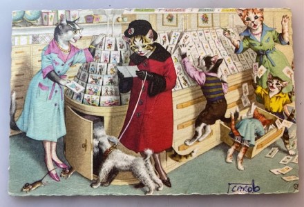
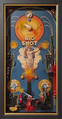
Today’s card was purchased by me early in the show as I made my way through each dealer; it is Mainzer at his best. I have written about Mainzer before (which can be read here and here) who is sort of the later heir to the Louis Wain throne. Mainzer, as a card producer, picks up that ball in 1938 and runs with it, arguably until at least 2005 when taking the reprints of the cards into consideration. Prior to 1955 the production address was 118 East 28th Street here in New York. (On a whim I did a Google Search on the address and it is worth a look, the Kaime Arcade building with a very interesting facade.) After 1955 it is just noted as Long Island City and that is what is printed on this card. Eugen Hartung was the artist.
While mama cat, dressed for a day of shopping with stockinged legs, heels, hat, gloves and fur trimmed coat, chooses between two postcards, her offspring are tearing the place apart – including I might add, her poodle on a leash! In case you are wondering, yes, each of the postcards has a tiny cat drawing on it. (The other prints on the walls appear to be flowers however.) Allow me to note some oddities about the store. It seems to stock not only postcards, prints and fancy wrap boxes, but oddly globes adorn the shelf too. Cut off at the top seem to be some written labels I cannot quite make out and appear to be written in Hartung’s native Swiss German.
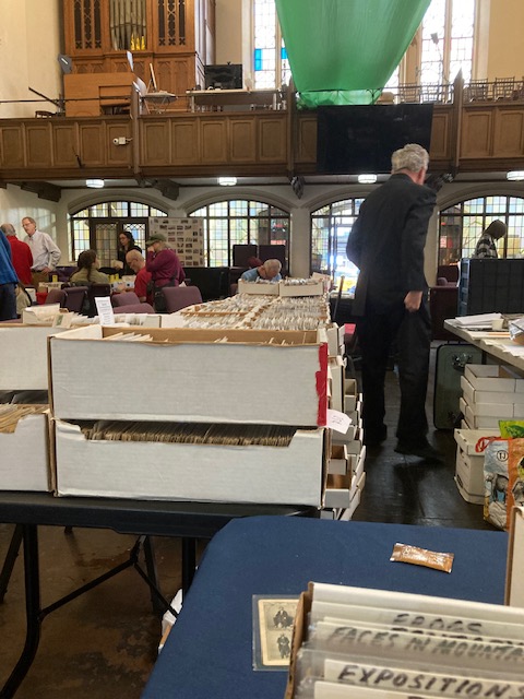
Another view of inside the church where the Metropolitan Postcard show now resides several times a year.
The well appointed shopkeepers are both in a uniform dress with matching necklaces. While the one with glasses focuses on Mrs. Cat, the other tries to contend with the kits. She has come running with a pen in hand, clearly interrupted in her clerical duties. The kittens, two boys and a girl, are well turned out but unlike mom and the salespeople do not wear shoes – bare paws all the better to climb with. Each magically has their tail come out from their clothing – including the little girls whose pantaloons we see. Mom’s tail, and that of the saleslady, appear from under their overclothes. (I’m always curious about how tails are worked into anthropomorphic cats.)
Several kinds of cat are represented for variety – Mrs. Cat is a tabby, the boys a tabby and a tuxie, little girls is a marmalade. The saleswomen are marmalade and lastly an odd mix like maybe she has some Siamese in her. One final curi-oddity is that the pooch, having opened the cabinet below, has released two large mice. No one, even the dog, is paying any attention to their escape. A pleasant mayhem is enjoyed by all.
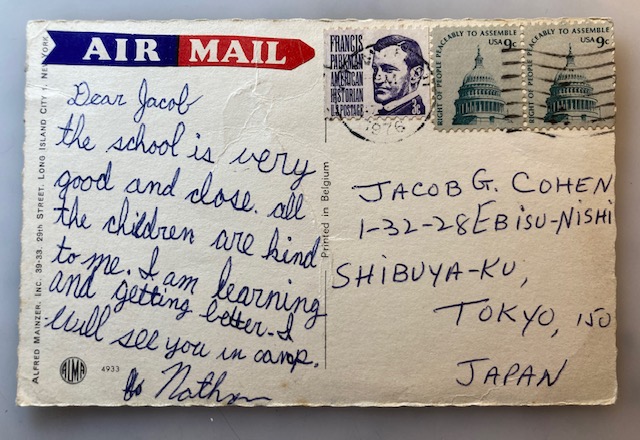
Back of card – how did it find its way back to the US I wonder.
Someone has penned card b at the bottom right. An addition mystery about this card is the back which shows that this was evidently mailed to Japan from an indeterminate place in 1976 and has, obviously, made its way back to the United States to ultimately be sold to me. It says in a neat childish scrawl, Dear Jacob, the school is very good and close. all the children are kind to me. I am learning and getting better. I will see you in camp. Nathan. It was sent to: Jacob G. Cohen, 1-32-28 Ebisu-nishi, Shibuya-Ku, Tokyo, 150 Japan. (And for your information, a postcard to Japan in 1976 cost twenty-one cents.)
Lastly (because I have clearly droned on a bit) may I just say that curiously this store reminds me very much of one I used to go to in New Jersey, near the house we now have. I cannot remember the name but was a true old fashioned stationary store and carried not only cards and assorted writing materials, but the more esoteric things a stationary store carried before the internet, such as form contracts like leases, which is what my mother used to go there for. It was long and narrow with windows all along one side. There were similar blond cabinets and perhaps more of a dusty business-like feel but something about this card nags at my brain with that memory. It is sadly now a Dunkin’ Donuts, just a few feet from the post office and grocery store we walk to frequently.
So there you have it – the postcard show and our first edition of the acquisitions.
Pam’s Pictorama Post: Today Kim and I are venturing off to the fall edition of the vintage postcard show down in the West Village so I hope to have a new stock of interesting bits to share. I hope to stop at the spice store I highlighted on a trip earlier this year (in a post about Washington Square Park here). If I make it there today my goal would be to buy some curry and related spices.
I have a whim to explore more entirely vegetarian recipes (less fish) and am curious to see what I can add to my arsenal. For those of you who follow that particular line of thought here at Pictorama I hope to share some recipes in the future. Tomorrow’s cooking adventure will be root vegetable stew topped with Bisquick dumplings. Last week was a pretty fair chickpea stew. It was filling but I suspect that the root veggies plus dumplings will be more so.
However, today’s topic is treats and while I will get to today’s tin in a moment, treats were just a topic in the apartment earlier. Yesterday I was lucky to have a chance to see Temple Grandin give a talk at work. (For those who don’t know her, she is a remarkable animal behaviorist who is also significantly autistic. She has written about both, but was addressing some of our vet techs at a conference I got to sneak into.)
Temple shared many thoughts about living with animals, largely focused on training them (both domestic and farm animals) to be less fearful. Much of the root of that seems to be treats! Associate new things with something good like treats – when introducing a new place or person, teaching them to be handled, etc. So today I am eyeing the cats and the Churu and wondering what inroads in behavior we might make.
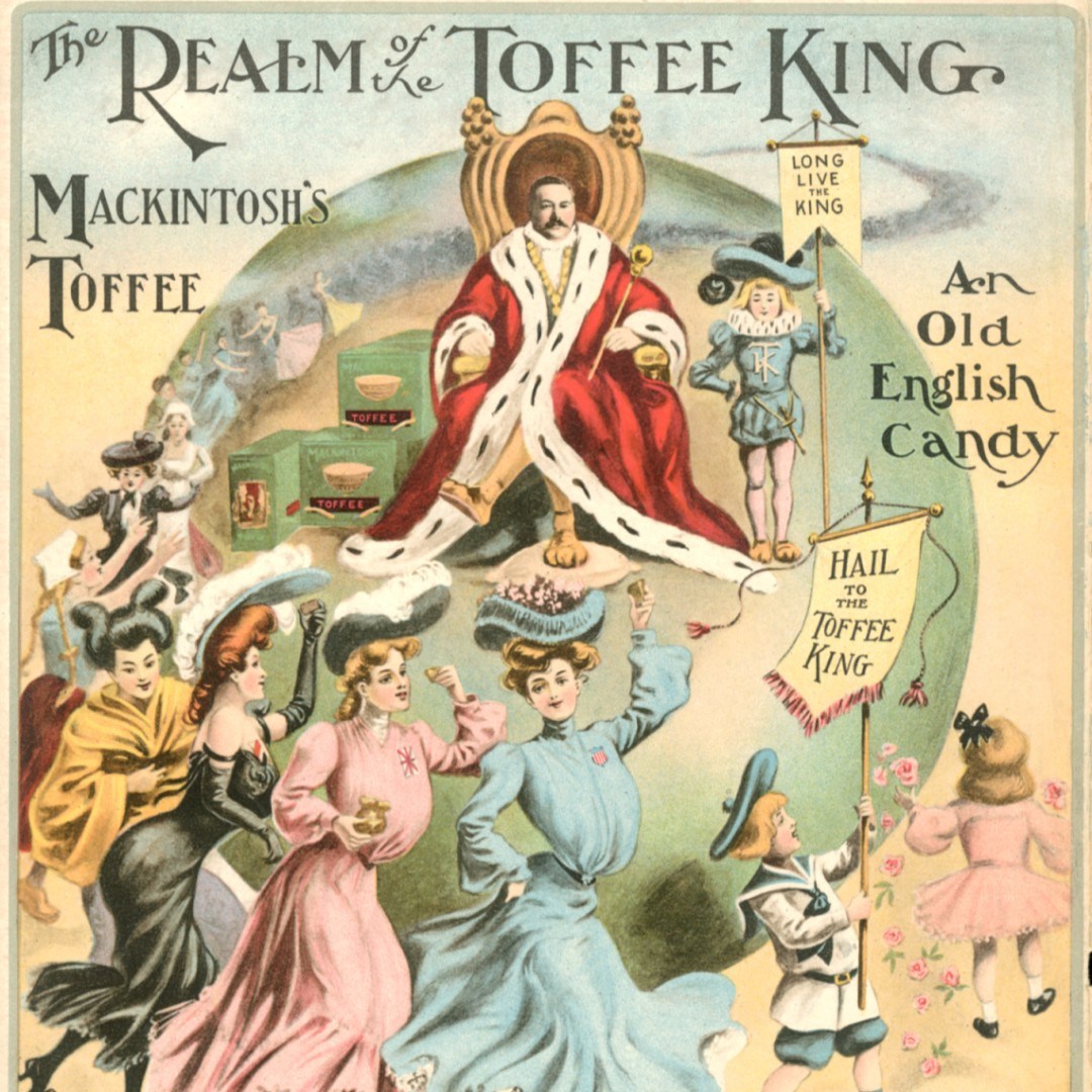
Found this online and wish it wasn’t cut off but who could resist, Hail to the Toffee King?
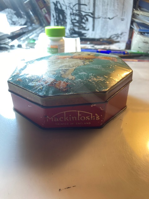
Back to today’s tin which came to me in a big haul in NJ this past summer. It held Mackintosh’s British candy. Their candy appears to have been toffee. I have a big soft spot for toffee – not a huge dessert eater but when I see salted toffee something I lose all control and quite simply must have it. I like it on its own too, although not sure my dentist would be pleased to know this and luckily it doesn’t get put to the test that often.
This for sale on eBay at the time of publication.Clearly from a period when they were producing toffee in New York.
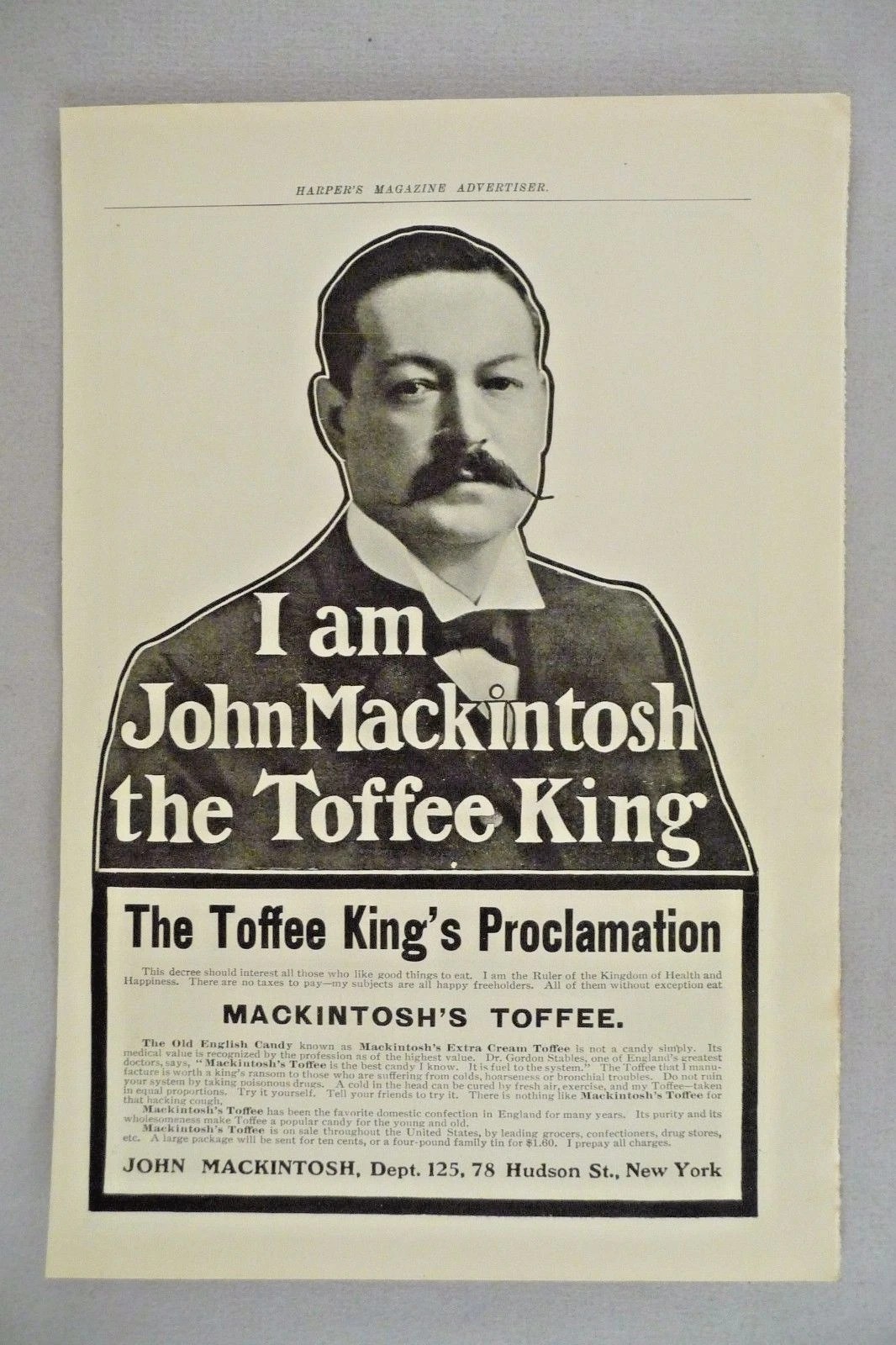
Mackintosh candy was founded by a husband and wife team in Yorkshire, England. They established it the year they married and while he continued to work a factory job she ran the shop. Violet, who had worked for a confectioner previously, must have done a good job because it grew like topsy. In fact, it was their product which changed the toffee from a generic for sweet to the chewy delight we think of today. John set out with an advertising campaign declaring himself, The King of All Toffee.
Expansion took place over time, first a warehouse and then a larger one. However, notably, in 1909 they opened their first overseas factory in Asbury Park, New Jersey of all places. It must have seemed like a good bet with the amusement pier there. (Is my tin one that kicked around from that nascent New Jersey period? It says Made in England so likely not.) Sadly the venture failed however. Not that this kept them down for long and the company continued to grow (with setback during World Wars, fires, etc.) and eventually merged with Rowntree in 1969 and exists in that form today.
The Asbury Park of the day they would have emerged into.
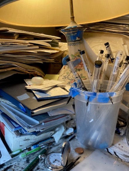
Meanwhile their tins proliferated and many are available. A quick search doesn’t turn up this particular one, but dogs were frequently on the tins which as useful items were saved. (This seemed to be part of their advertising strategy overall.) I purchased this one for the cheerful dog because readers know that I lead a pretty doggy existence for someone who is mom to seven cats! My thought is to take this fellow to work and keep some of the errant bits and pieces on my desk in it.
According to a Wikipedia entry about the candy today: The toffee is now sold in bags containing a random assortment of individual wrapped flavoured toffees. The flavours are (followed by wrapping colour): Malt (Blue), Harrogate (Yellow), Mint (Green), Egg & Cream (Orange), Coconut (Pink), and Toffee (Maroon). The maroon-wrapped toffees do not display a flavour on the wrapper. The product’s subtitle is “Toffee De Luxe” and its motto is “a tradition worth sharing” Egg & Cream?
Hopefully more tomorrow from the postcard show. Wish me luck!
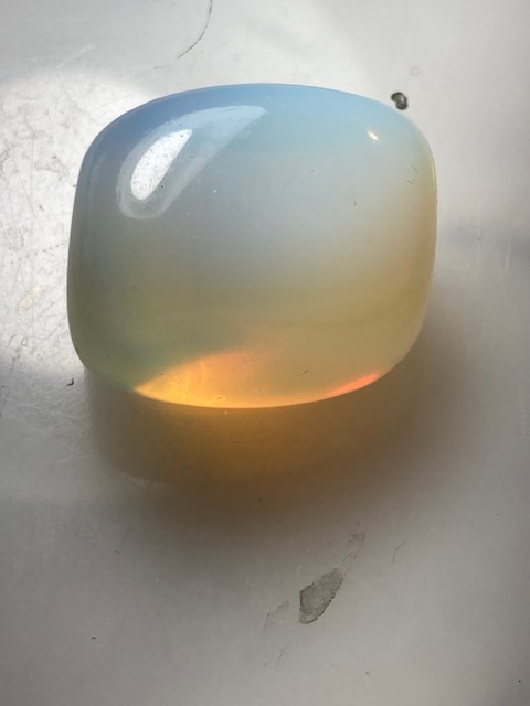
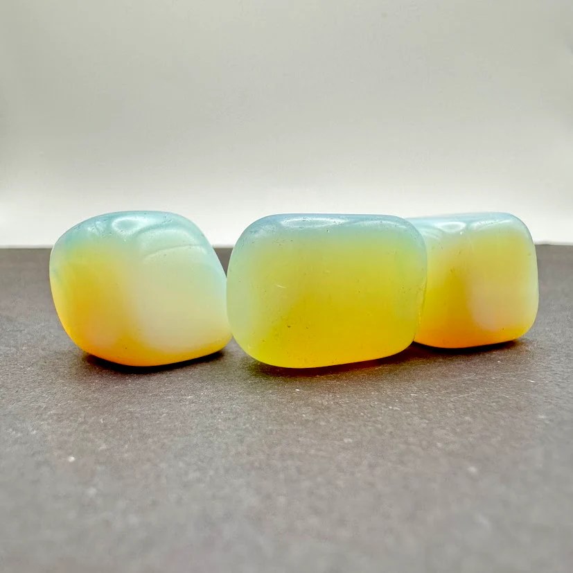
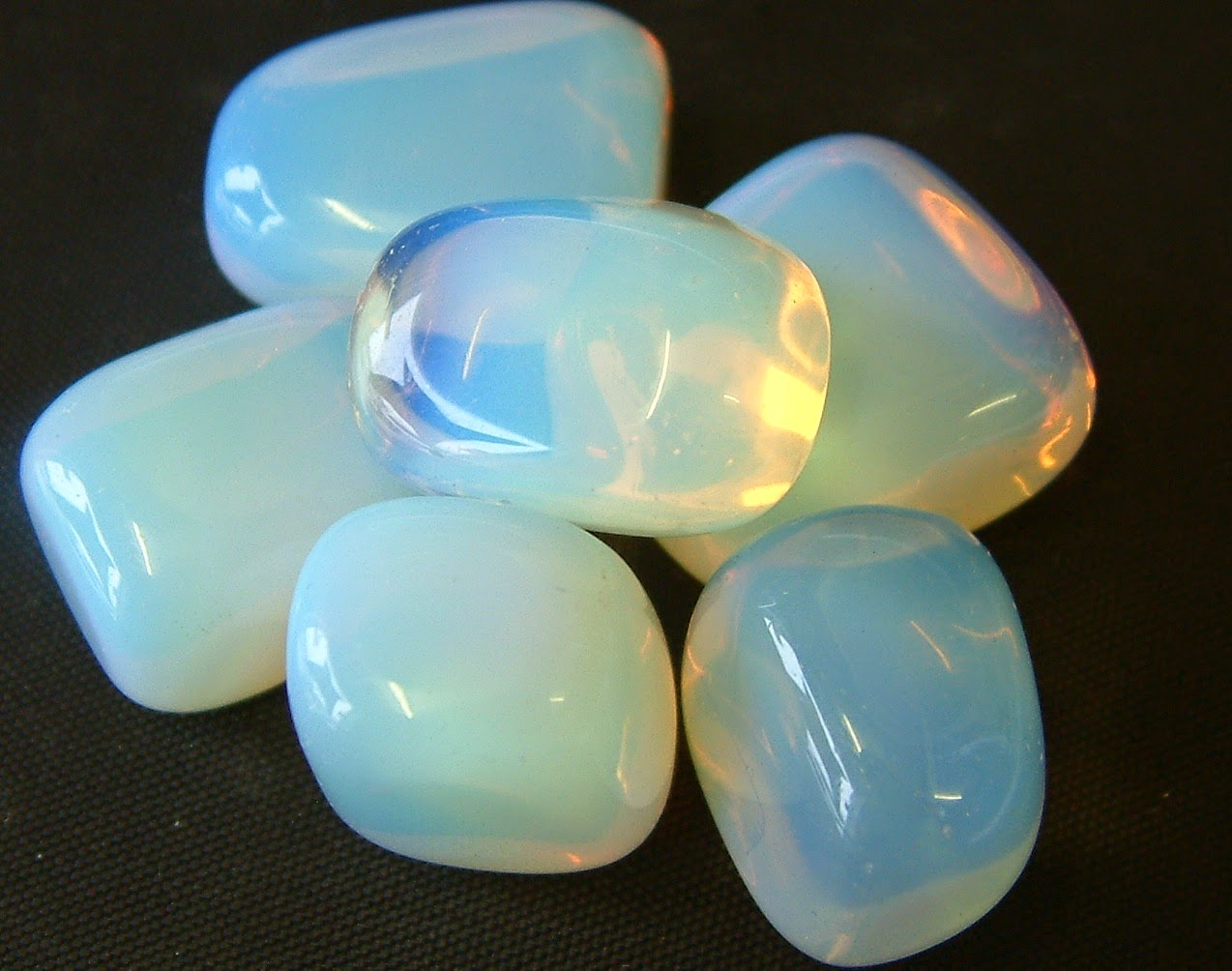
Pam’s Pictorama Post: Today is a companion piece to yesterday’s post about my love for all things opal in jewelry. However, the other side of that coin is opalite. Opalite is an opalescent manmade substance which is either glass or plastic. Like an opal it has the property of changing color based on light and the colors around it. Alternately called argenon, sea opal, opal moonstone or living under a bunch of similar names, it delivers much of the bang without the buck so to speak.
Shown up close here it is about a one inch long stone.
While I have likely run into it before (as a shiny object, opal and moonstone loving person) it wasn’t until it crossed our paths in the form of delightful square lumps on a trip to Red Bank on summer day in New Jersey that it rose into prominence for us.
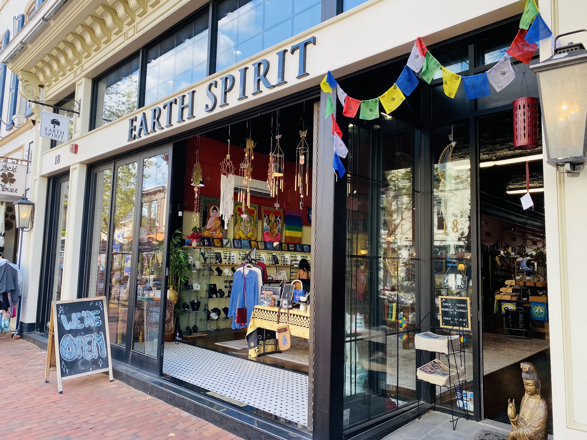
Kim and I had walked into town to peruse the comic book store and do a few other minor errands. We decided to have lunch at a pleasant outdoor cafe but were told we needed to wait about ten minutes for a table. We were in no rush so we gave them my cell number and decided to kill time in a store next door called Earth Spirit (online here if you are curious).
I like the way the whole store is just open to the street, alluring.
Unlike many establishments in Red Bank these days, this one has managed to hang on for quite a stint. It sells crystals and incense and well, stones. It wouldn’t be the one I would pick for longevity but somehow it has stuck around. They seem to specialize in different kinds of tarot card decks and part of a wall was devoted to those.
We had never been in and I was especially enamored of a sign advertising aura photographs and while I was investigating that Kim was picking through the glorious selection of “stones”. I wandered over to see what he was up to and I’m not sure which of us discovered the bowl of opalite first, but we immediately each grabbed one to purchase.
Our lunch reservation came up just as we were purchasing our stones. I never did get my aura photo taken but this was a good trade off.
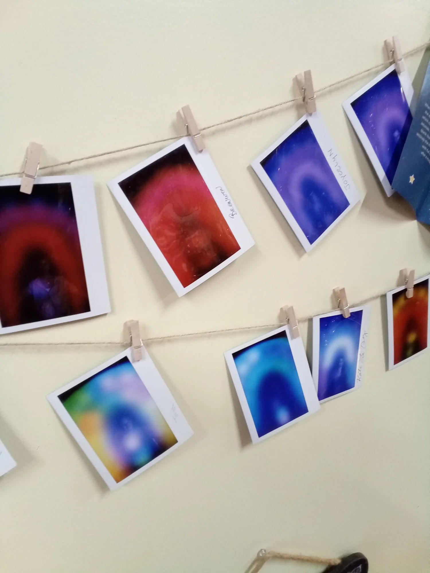
Aura photos on display. $25 to take one and $40 if you want a reading.
It promised us enhanced creativity and AI tells us it also used to support people through life transitions, foster inner peace…and deepen spiritual connection, especially during meditation. I am not going to be the detractor to question these qualities from a manmade substance so while I wonder I will not, um, throw stones. I took mine to work and Kim has his prominently displayed on his desk, shown above. He has lovingly embraced it and its properties, real or imagined.
Variations on opalite above.
Opalite evidently has no single inventor but it appears to have come on the market in the 1980’s. There is a fair amount of variety to the “stones”.
Evidently Taylor Swift has a new song with opalite in the lyrics which will perhaps boost it into greater prominence. It interests me a bit why you’d have an opalite sky rather than an opal one but in another way it makes sense. Opalite in all its forms appears to be a more coherent glow, as opposed to the sparking bits of fire in the different kinds of opal gemstones. Meanwhile, there is plenty of room in our heart for both.
Pam’s Pictorama Post: Today I am veering off my cat course to write about a recent jewelry purchase. October, the witchy month of fall, is a perfect time to write about opals as it is the birthstone for those born this month. I must be an October baby at heart because I never seem to get enough of them.
I write today with some trepidation because I know I will not be able to photograph these gems properly to give you a sense of the glorious fire and snapping color they sport when you see them in person and moving in the light. In fact, when I bought the necklace above on an auction site recently, I was taking a bit of a chance as their photos were lousy too. I admit up front that none of these photos do the beauty of these glittering changeable gems any justice.
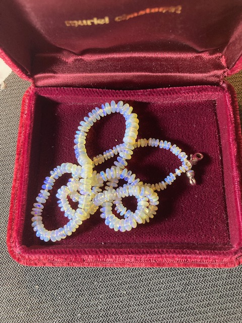
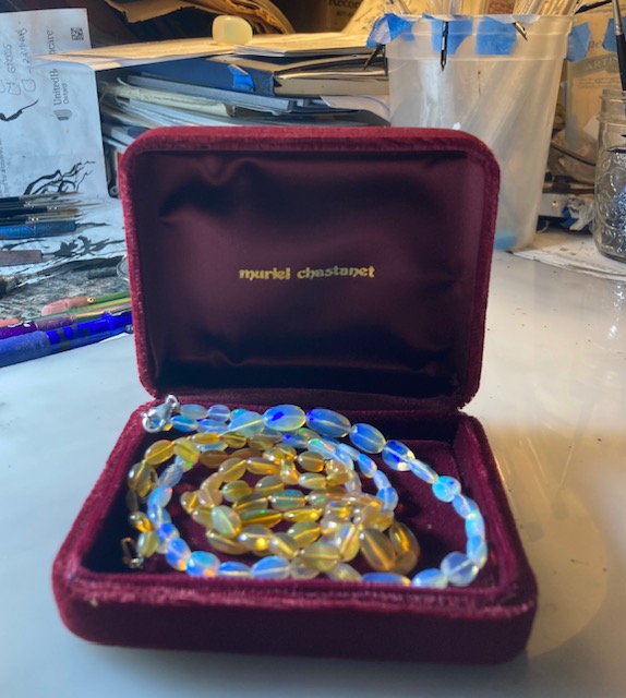
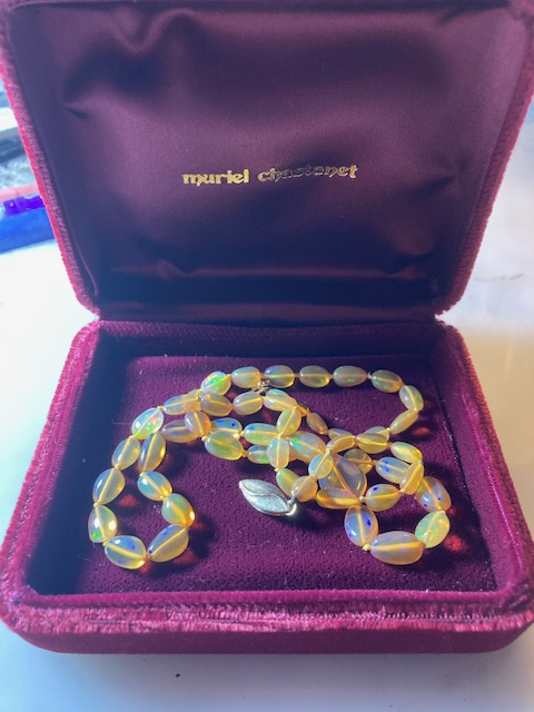
Pictorama readers may remember that I wrote about my love of opals quite extensively in posts that can be found here and here. Two opal rings were given to me as gifts, but I am not sure I can easily remember which was the first opal I purchased, although there are two necklaces I bought from my friend and jeweler (@murielchastanet_finejewelry) on the west coast many years ago. One is of opals from New Zealand and the other is made up of flat Ethiopian opals.
New Zealand opals cut in slices! This was the first necklace I purchased and I have never seen one like it since. This came to me via Muriel Chastanet’s store in Los Angeles.
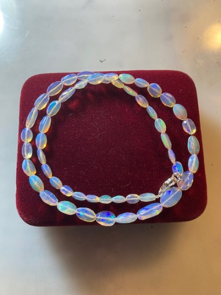
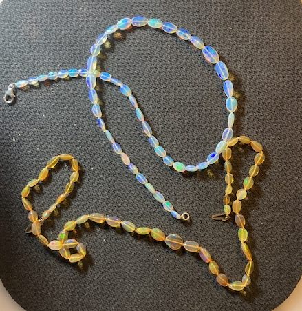
The necklace I just purchased is the sibling to that one – in blues instead of oranges but I believe they are Ethiopian opals. Because I owned that one I recognized this one right away and took a closer look. They looked interesting however there was no way I would pay nearly as much from an online auction as I had paid to a trusted jeweler. I can say that these could easily look like a meh string of overpriced beads.
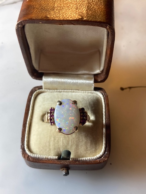
This necklace is the second opal I have bought from this auction site (I purchased a ring, shown below, more or less uncontested over the summer) and I think I keep looking because frankly opals don’t seem to sell well for them. Unlike strands of pearls and jewelry from contemporary designers opals, luckily for me, do not seem to be popular.
The yellow/orange beads came from the wonderful Muriel Chastanet establishment. I have tried to show them together although not a great pic!
So I gather that the premise of the auction house, called Everything but the House, is to essentially clean out houses and estates and sell every last thing of value via live auction on their site. A league of experts in different areas descend on you and voila – they put it all online and sell it. They had (have?) a television show devoted to it I saw a few years ago. I’m always curious what will turn up in such random slices of life and collections. However it never occurred to me to look at the auctions until good ole Instagram marketed it to me.
Yes, while other people are fretting about politics on social media, I am just spending money like a drunken sailor. It started during the pandemic and has burgeoned over time. Before that I largely confined myself to eBay and a few well known toy auctions. Not now – I’m making deals for things I spot in photos, have all sorts of obscure auctions on my calendar and the folks at Live Auctioneers totally have me in their clutches, emailing me reams of images daily they think I should see. (I seem to largely get outbid on that site as I am rarely there for the finish and true to their name a lot of action seems to happen in the final minutes.)
The other ring I bought from this auction house, shown in an antique ring box from my collection.
In the end I was not the only bidder on the necklace but I got it for very little. I did something I almost never do. When I saw an outbid email I went back and put another small increment on and won it.
My father’s mother went to auctions all the time and furnished her house and then some with her purchases. (For my dad it was estate auctions but more about that another time.) In her day those were of course in person and she would come into Manhattan from Westchester for them. She always said to set your limit and do not allow yourself to get chased above it. I’m sure she’d forgive me on this occasion however. (You can read more about Gertie, aka Tootsie, Butler here. I dearly wish I could have one afternoon as an adult talking to her about the auctions she went to!)
My orange “circus” beads in their original box.
Anyway, long story short I won the necklace and it arrived via Fedex the other day. Even at the price I paid (a true small fraction of what I paid for my other one) I was somewhat on pins and needles to see it. Oh man, I was not disappointed. It was sent unromantically but effectively wrapped in a bit of bubble wrap which I quickly sliced open.
A sort of side-by-side view.
I could see the changing color and fire in the stones immediately. Unlike my other necklace these are each faceted, unlike my other ones where are each smooth. The clasp and stringing is perhaps a bit inferior, although they still lay nicely on my neck where they have largely resided since I got them. It seems no matter what I wear they pick up the color and shoot it back differently! On the first day I wore a green top and it took on a slightly green blue hue, red makes them more blue as does black.
I always call my other strand my circus beads (oh to go to that carnival!) and now I have two. Lucky girl! I have not yet figured out if I can wear them together but I find them incredibly cheerful and intend to wear them often.