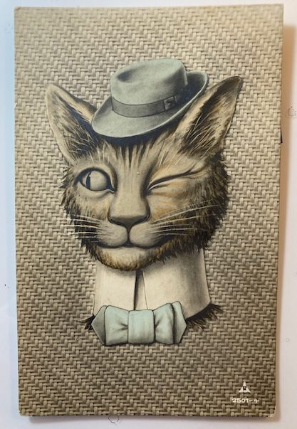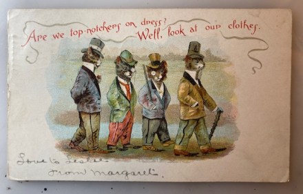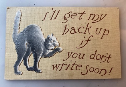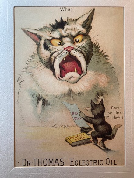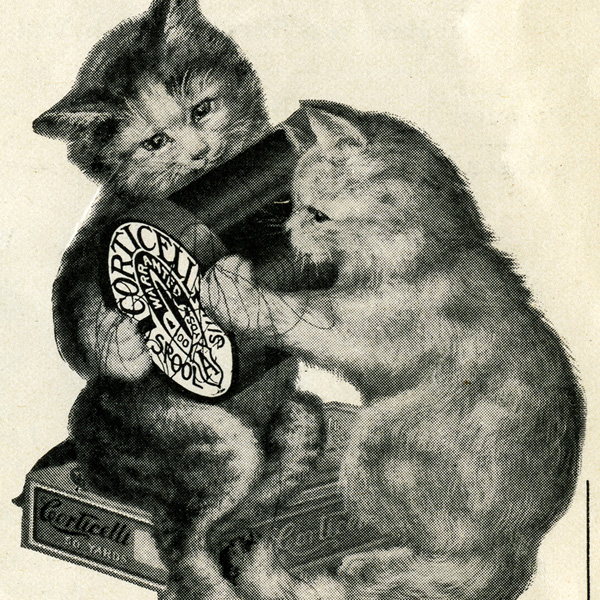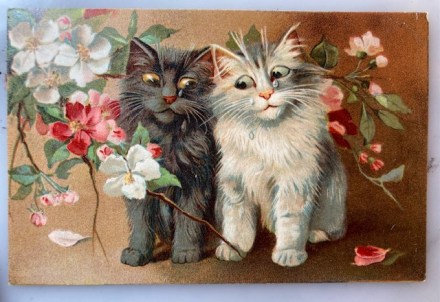
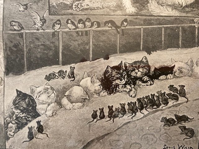
Pam’s Pictorama Post: I tossed this into a purchase pile recently as clearly somehow these are Wain or Wain-ish cats; however I would bet dollars to donuts that Louis never saw a payday for this one. However, having said that, I cannot easily locate another version of this image online, only one other copy of this card itself.
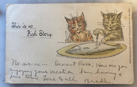
A few posts back I discussed the history of New York postcard producer Franz Huld and much to my surprise this morning, his credit runs along the side of the front of this card, Huld’s Correspondence Series No. 23 Franz Huld, Publisher, New York. (That post of an entertaining card about the Catskills, Hanging on the Moon, can be found here.)
Meanwhile, just yesterday Pictorama had a post about another innovative early postcard maker but in Germany. I think of that one as more of a high end (photomontages and trick photography) and our US friend Huld as sort of creatively low end if you will. (I am only on my first cup of coffee today so stay with me a bit.) Huld had a much briefer run in the business and never on a huge scale of production and maybe wasn’t above a bit of image thievery. Just a thought anyway because this card looks distinctly culled from something else and does not bear the Louis Wain signature nor credit however those are Wain cats.
This card was mailed but the postmark has been torn off therefore I cannot accurate date it. If I put it roughly at 1910, Huld is coming toward the end of his several years of production but still active and in upstate New York. However, the real smoking gun is that Wain was living and working in New York from 1907-1910, but only doing newspaper work. He was producing two newspaper strips, Cats About Town and Graymalkin. There is evidently no record of him producing postcards here. So my guess is that Huld lifted this image somehow from a newspaper illustration and craftily “repurposed” it.
On the card we have two grainy Wain cats, one yellow fellow attacking a meal of fish – his mouth in an “O” of expectation. I like the way his paws manage to hold the implements in a logical way which I would personally find challenging if I was drawing this. The orange, grumpy, cat looks on in expectation holding a three-prong fork and knife up like he might bang on the table with them. Next to them in script it reads in neat script, This is no Fish Story. Again, while maybe in the quirky style of Wain somehow perhaps misses the mark?
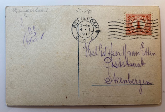
The sender of the card has underlined the above and written, No-sir-ee – Dearest Ross; How are you enjoying your vacation. I am having a fine time. Love to all, Bradley. It was mailed to Master Ross W. Guernsey, Schoharie, Scho, Co. New York. As I mentioned before, the stamp and cancellation has been torn off so no date and no point of origin for the card. (In sorting out the address a bit the internet told me that Ross W. Guernsey was a life-long resident of Schoharie, New York. I have no way of knowing if that seems true or AI just sort of winding me up.)
Our friend Mr. Huld was sadly certainly not the only one taking advantage of Louis Wain and liberating his work for his own purposes. This is perhaps though the most egregious and evident example I have run across. Still, I remain grateful for a snippet of Louis Wain I wouldn’t have seen otherwise. I intend to continue to sniff out some of this newspaper work in its original form.