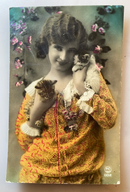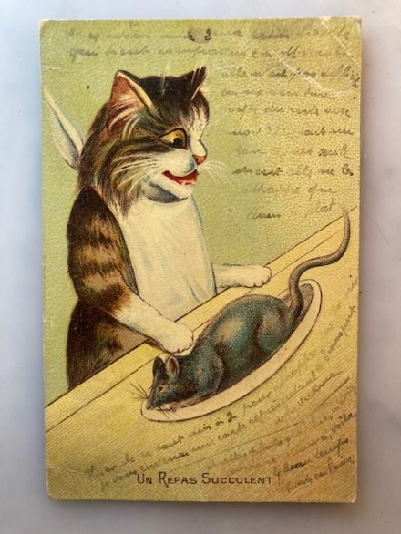
Pam’s Pictorama Photo Post: Today’s is a recently acquired photo postcard – it showed up in the mail last night as a matter of fact. I bought it off eBay on a whim and am more charmed by it in person. This photo today would probably be photo shopped or fully AI generated which makes its skill – and its imperfect bits – that much more endearing.
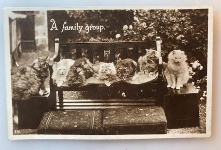
Seven cats are lined up here – several are looking at a spot in front of them and we assume the person behind the camera has something to capture their gaze that way. Almost all of them are very fluffy indeed, and the dark haired one on the left could almost make another cat with that enormous tail. It says a family group and I wonder if it is mom and dad on either end and this variety of kits betweenn. There is one tabby, third from the right who doesn’t fit the family fur, short-haired or so it would appear.
If we assume that mom and dad are on either end, there is a dead ringer for each of them in the pile – the white kit all the way left and the one next to it. The others are a bit more of a wild mix and I really like the one who wouldn’t sit and has his or her back up a bit. Dad just has an insane amount of fluff and both are well brushed and maintained.
Everyone is seated on a garden bench with painted some sort of boxes acting as end tables. There is a nice cushion on the bench being enjoyed byt the cats – no idea how they got the cats on the end to pose so perfectly. There are cusions on the ground in front of the bench, covered in a sort of oriental rug pattern. I wonder if those cushions are for the back of the bench but didn’t work for the photo. We can’t see much of a garden behind them but we get glimpse of the flowering shrubs behind them.
This card is undated and was never sent. It appears to be American made but there is no maker credit on the back.
As the mom of seven cats myself (the Jersey Five and NY kitties) I have to admit that I do not have a single photo of all of them in one frame. I actually only seem to have four of the Jersey Five together, let alone along with Cookie and Blackie. So hats off to this ambitious photographer and cat parents somewhere and back in time.