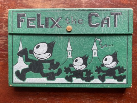
Pam’s Pictorama Post: Sometimes where my nose leads me surprises even me so I assume it must occasionally raise an eyebrow for my readers. While I have many tributaries I pursue on a regular basis, sometimes I am gob smacked by something I didn’t see coming or ever really think about before. I assume in a time before the internet I would have found my odd bits at flea markets and antique stores that have been pushed out or disappeared.
However, Ebay, Instagram and Etsy are among the places I buy from now, but Instagram is the one most likely to surprise me with something I didn’t know I needed. I will be scrolling through my rather perfectly delightful feed curated to present me with cats, kittens, antique jewelry and clothes, some antique toys, ephemera and furniture.
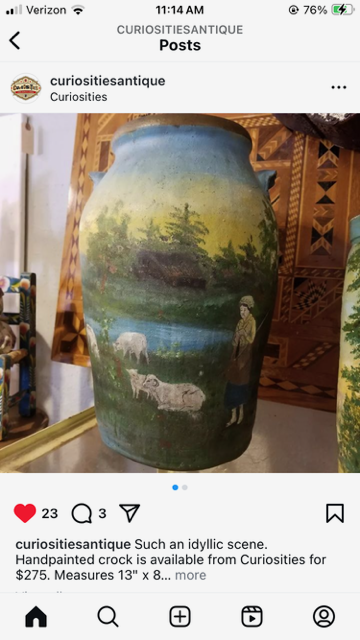
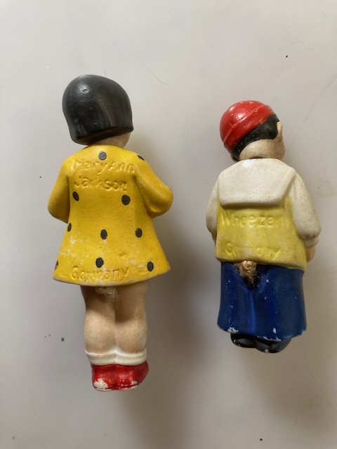
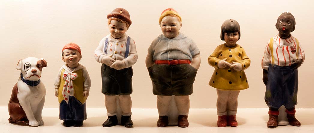
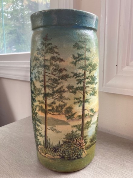
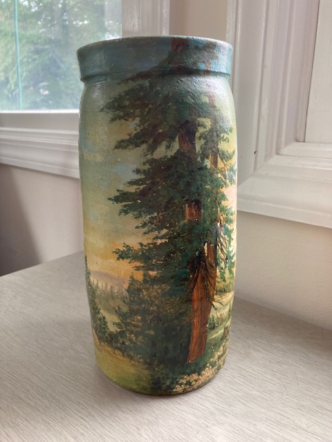
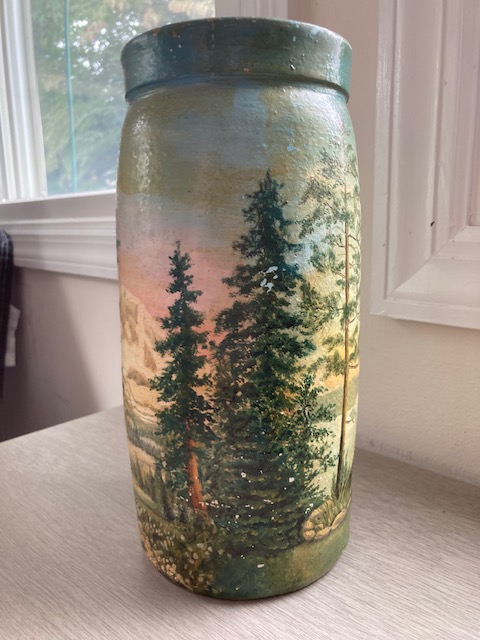
Once in a bit something like this vase strikes me and I think, Huh. I don’t know why, but I really want that. There was another, larger, one with figures on it that was the one really being offered, but I could see half of this one is the same photo so I asked about it. I only just stopped short of buying both, but size and cost made me decide to control myself.
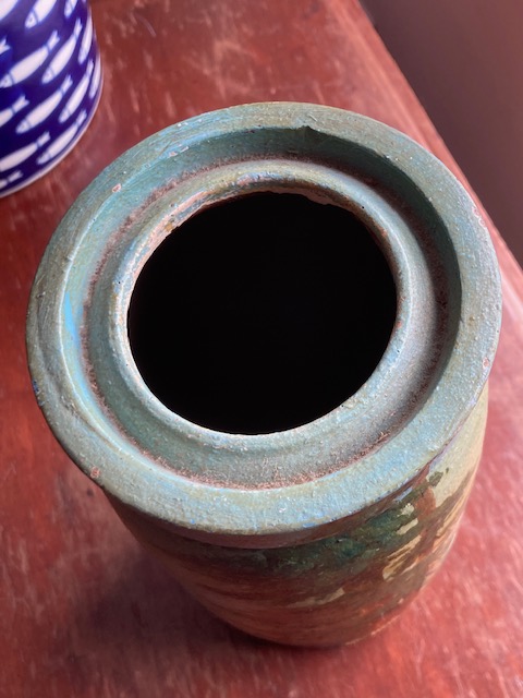
This vase is about 9 inches high and is ceramic with some tooth to it – bits of sand probably in the clay making it substantial and heavy. It appears to have been thrown on a wheel and then hand painted. Weirdly there is something about it which reminds me of the (admittedly much less impressive) pots I threw or hand built back in high school and college. I never would have thought to paint a scene like this on a pot though, although I did paint too.
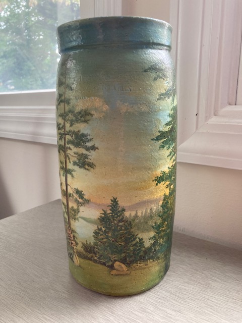
The style of the landscape reminds me a little of paintings by my great aunt Jennie. She was self-taught and at one time her paintings hung throughout our house. At some point they were offered to and taken by my cousins who were closer descendants. I always liked them and although it was hard to argue with the thought gesture I missed them.
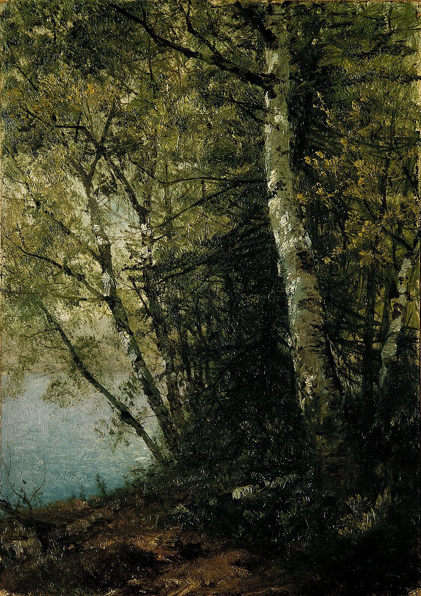
Many, if not all, were landscapes copied from the American Paintings galleries at the Metropolitan Museum. I was shocked when I first visited and saw them although it made perfect sense. Strange to know them so well for having lived with the copies all those years. I could see how much better the originals were but I missed hers. In particular there was one with a path between birch trees. I tried but failed to find it on the Met’s website. This Kensett below is in the same spirit.
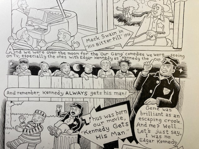
I have a distinct memory of showing her a package of plastic cowboys and Indians someone had given the tiny tot me to entertain me for a day at my grandparents. There was a garish sunset on the cardboard top where the bag was stapled together. She admired it and asked me if she could have it to make a painting from and I agreed. (Such an oddly distinct memory. As an aside, thinking back on it now it also seems odd that my parents purchased endless such bags of cowboys and Indians for us, and racing cars. I think soldiers seldom if ever. There never seemed to be a question about a little girl circa 1967 or so, routinely playing with cowboys and Indians. I’d like to say that this was a statement on the part of my parents, but it just wasn’t – unless the not thinking otherwise was a statement of its own!)
Having lived most of my adult life in a Manhattan apartment, the concept of cut flowers from my yard is a relatively new and very welcome phenomena. Suddenly it is as if I never really understood the full usefulness of vases. I mean the occasional bunch of posies from the bodega or gift of some extra thoughtful person and you need a place to put them. But the extreme pleasure of clipping a bit of what is blooming in the yard and having it in the house is a new one.
There sadly is some paint loss on one side. Shipping may have made it a bit worse. I am putting it in a quiet cat free space – to the extent that exists in this house.
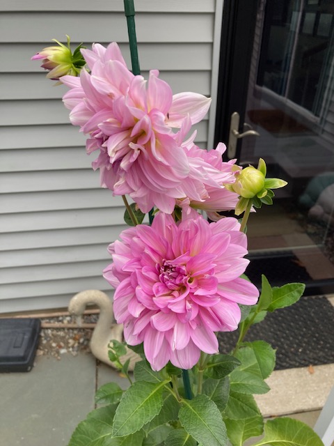
I deeply suspect that this vase is no longer water tight. There is a hairline crack in the bottom which makes me unlikely to try it. I can easily imagine how nice it would look with some nodding peonies or spring roses from the bushes in the yard might look. I am, however, quite content with this just as it is!