Buster Brown Bank

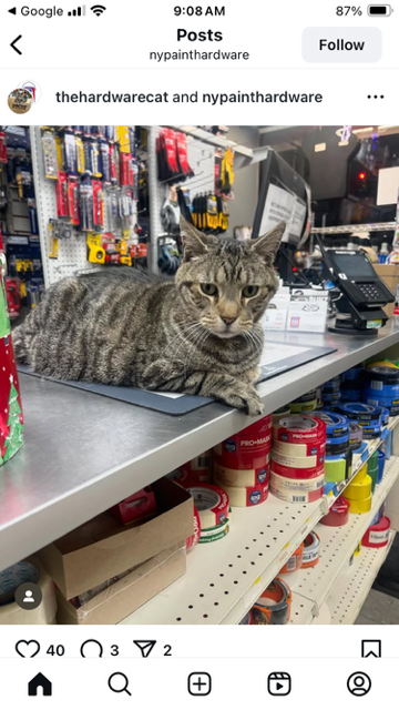
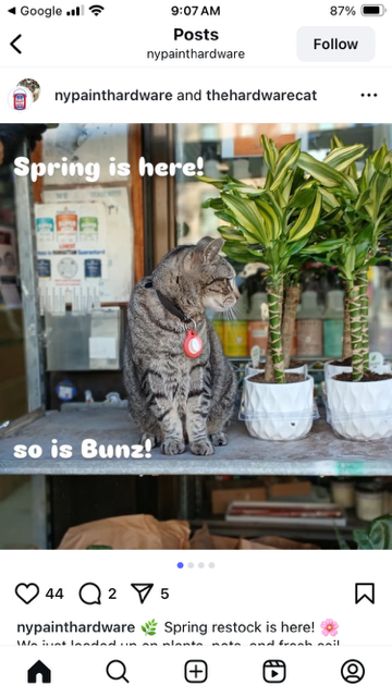
Pam’s Pictorama Post: I realize that there has been no reason to visit the history of Buster Brown in this blog. Today I will try to do him justice via this bank I purchased recently from my Texan friends, @curiositiesantique via Instagram.

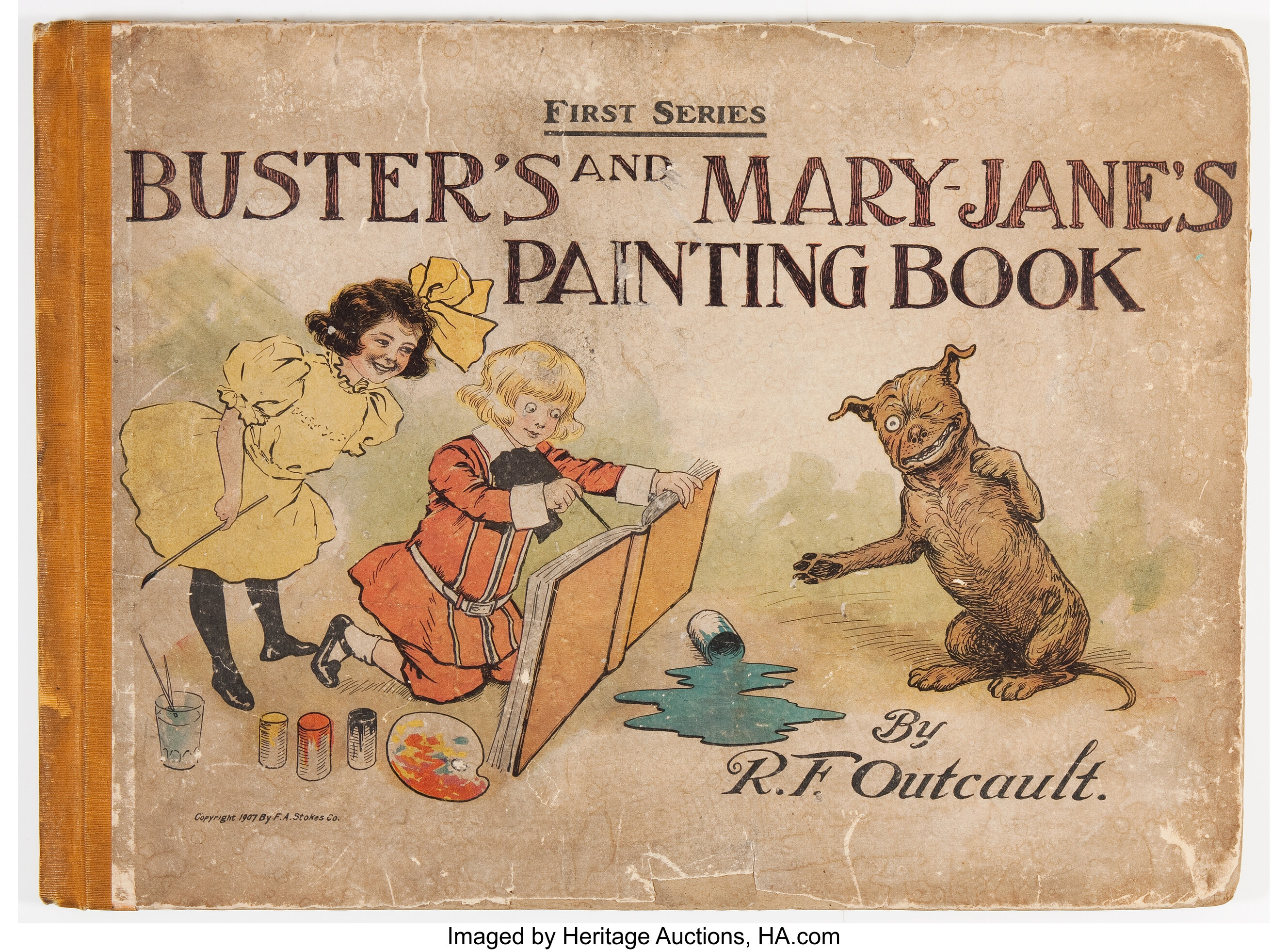
For those of you too young to have owned these shoes (I barely slip into that category with a dim memory of the advertising at the shoe store when I was a tiny tot) the brief history goes pretty much as follows. Back in 1904 in an early advertising coup the nascent Buster Brown shoe company purchased the rights to an existing comic strip character created by Richard Outcault of Yellow Kid fame. Outcault was on the market selling the character and pressed them to additionally purchase the rights to the Buster’s girlfriend which they did – more about her in a minute.

From a Heritage Auction. Not in Pictorama collection.

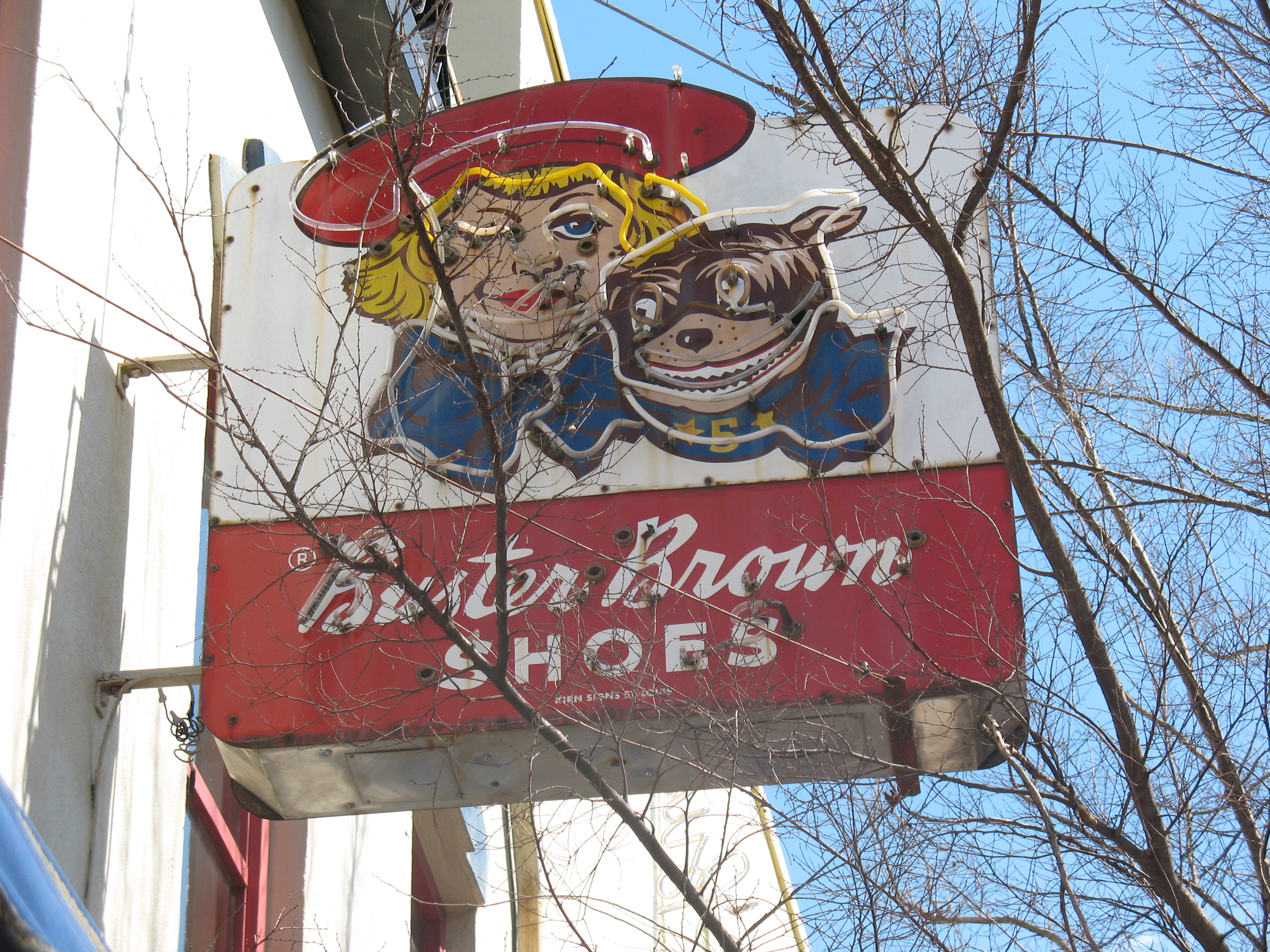
Interesting to me that Outcault sold the rights to 200 companies at the Louisiana Exposition which is where the shoe company picked it up. Therefore, presumably, there are Buster Brown items or more likely advertising that does not belong to the shoe company. Clearly however the shoe company made the most of their acquisition and a long history of Buster Brown shelling for shoes begins and runs well into the middle of the 20th century and Buster Brown is virtually synonymous with shoes now.

Meanwhile, it should be noted that the cartoonist Outcault was quite the business man when it came to licensing and in 1904 was making $75,000 a year on licenses and employed a small staff to manage them. (If Google is telling me the truth this means he was a millionaire in his day.)

Speciman 1908 hand colored Outcault Buster Brown strip.

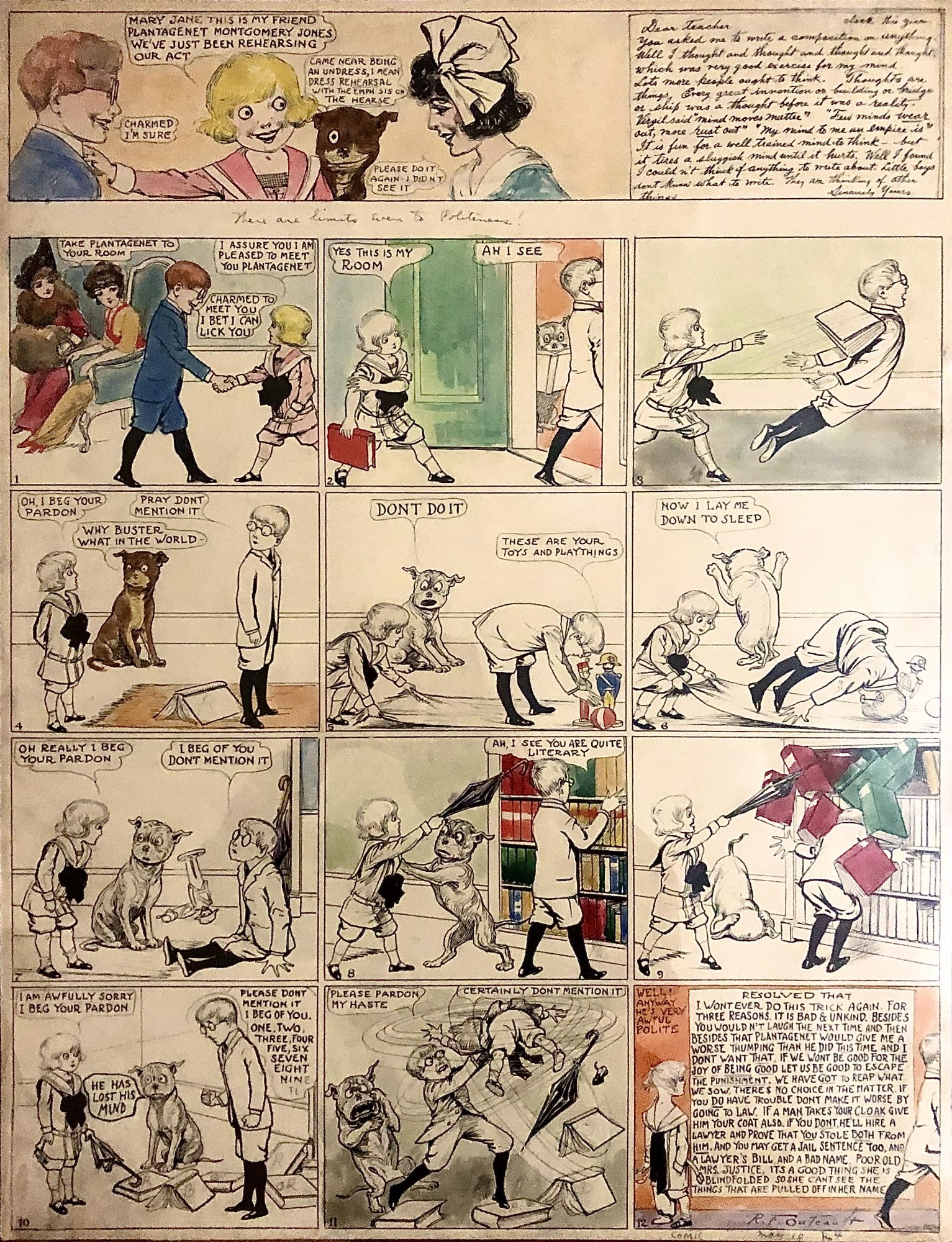
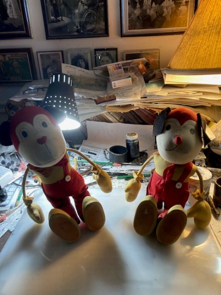
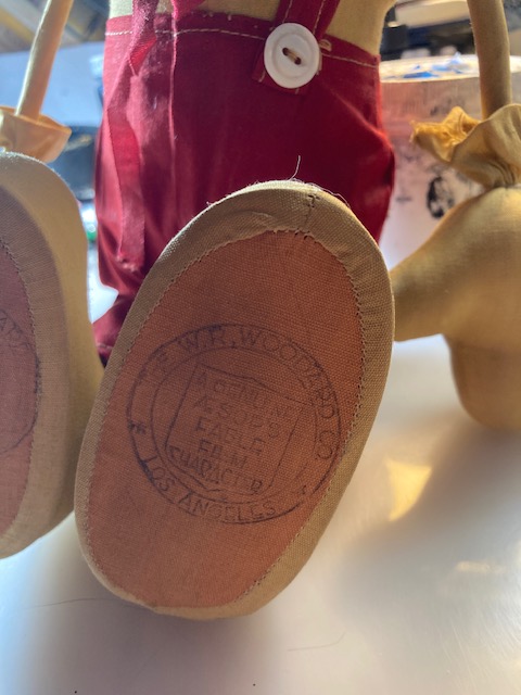
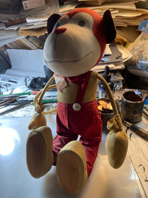
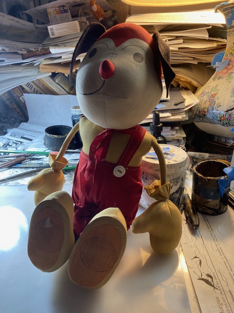
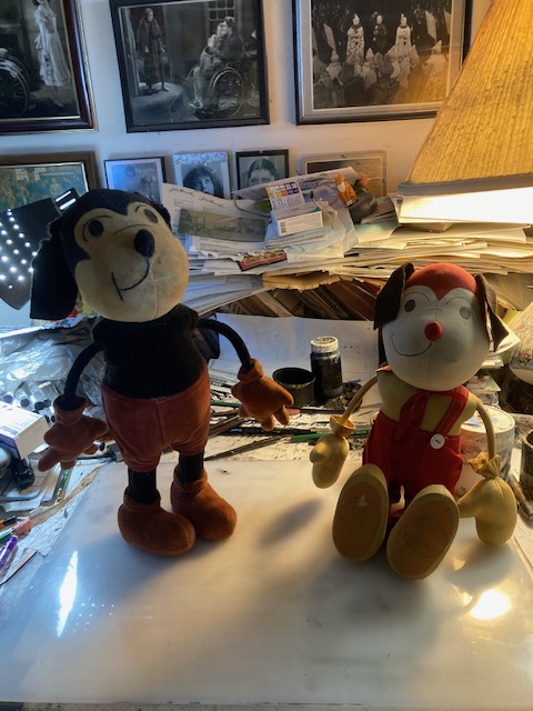
However, let’s get back to the shoes. The shoes were so popular that generically a kids shoes might be referred to as their Buster Browns. In addition to items like this bank there was reams of print advertising and purchase point items for stores. Midgets were employed to play Buster, in his unfortunate garb, with cheerful pit bulls enrolled to play his dog Tige. The merchandising for toys was glorious and I spied at least one stuffed Tige online that I covet already. By the time I wandered onto the shoe wearing scene in the 1960’s the merchandising boiled down to some balloons. (There is a vague memory that maybe there was something else, maybe a comic long reprinted but I don’t really remember.)

Buster Brown and Tige in front of a shoe store. The copy of this photo is credited to Mel Birnkrant’s collection although a few exist online.

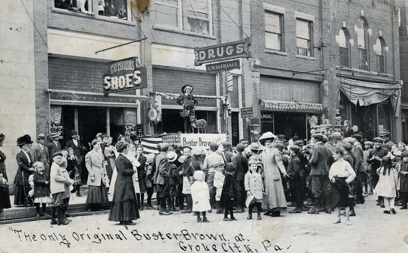
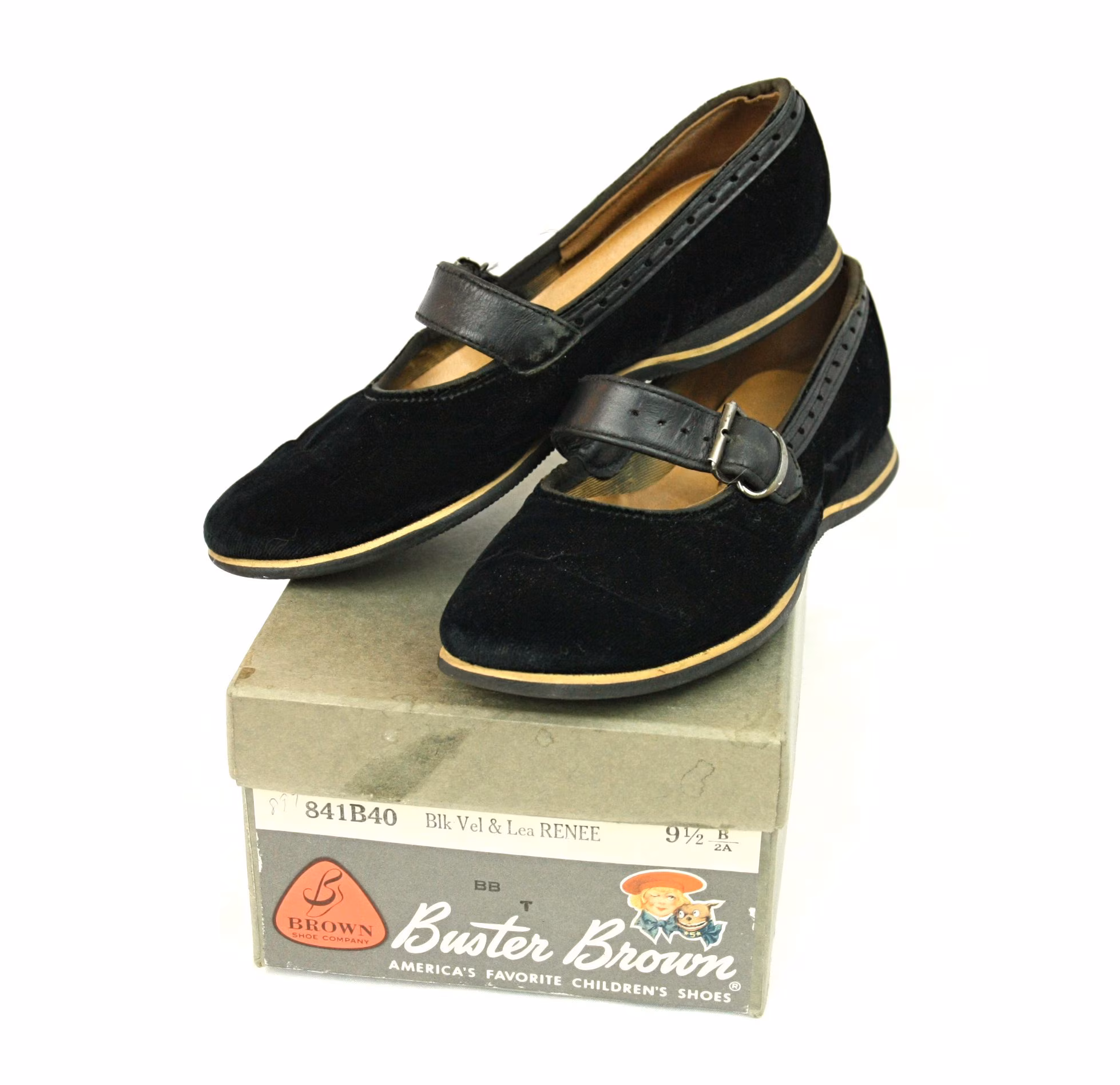
The shoes had Buster and Tige inside, under your heel and I remember the jingle from early tv in a high pitched voice, I’m Buster Brown and I live in a shoe, that’s my dog Tige and he lives there too.

Buster Brown Shoes sign located in Thomasville, Georgia. It can be found on North Broad Street.

So to my surprise, I learned today that as above Buster Brown had a girlfriend (huh), and her name was Mary Jane – and that is how women’s shoes with the single strap were named Mary Janes and are still known by that term today.

Real Buster Brown Mary Janes. Can be yours on Etsy at the time of publication.

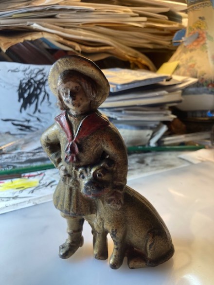
As for this bank, it stands at five or six inches. A trace of paint remains on the face and hands while the red tie remains fairly vivid. This seems to be the most common form of this bank although online I found versions in an overall green and one in red which I can’t decide if it is original or not. The face was the first to go and I can’t say I found it pristine on any of this design. Buster’s hair was painted a light brown and Tige’s mouth was also the vivid red and there were red circles around his eyes.

Back of the bank.

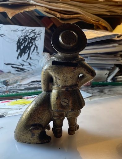
It is a simple bank with a screw in the bottom you would use to retrieve your saved coins. It is small so not like you were keeping a fortune in there. Kim starts to ruminate on restoring it as soon as he looks at it. Evidently it makes him itch to paint it although we know that he won’t – nor should he devote time to such projects when more creative work awaits him. (Although Kim’s next book is scheduled for release early next year he’s already deep into the one after it.)

So now that we have a first Buster Brown item we’ll see how long it is before the next wanders in the door. I am going to be looking sharp for that stuffed Tige.

Amazing! Aesop’s Additions

Pam’s Pictorama Post: Pictorama readers may have sussed out that there are strata to each of my areas of collecting. Photo postcards of people posing with Felix rate very high but people posing on giant black cats are a bit more due to rarity, a stuffed Felix that I have not seen is extremely rarified and I haven’t purchased one in years.

Yet somehow an Aesop Fable doll that is sufficiently unusual and requires purchase these days is a whole other thing. I don’t think I have purchased a doll since I scored one in a box back in 2018. And today I have not one but two, purchased together, and seem to be of a piece. While my longstanding lust for these toys has been documented back to 2014 and the early days of this blog, the most recent acquisition before this was a bit of ephemera, a piece of related stationary, in 2019 and can be found in a post here. A purchase of these is unusual indeed.

Unlike the off-model madness that was Felix production at one point in Great Britain, the production of these dolls was limited to, I believe, one company and a brief period of time. Therefore the survivors are decidedly more finite. As someone who has been purchasing them, and the occasional related item, for a few decades now, I rarely have the opportunity to make a significant purchase. (To be clear however, I am still searching for some of the cast including Milton Mouse should he make an appearance among others.) Notably though, the other morning, a listing for these showed up in my inbox and as seems to often be the case, with utter disregard for the well being of my bank account (Kim made a contribution), something had to be done about it immediately.

Before I get to the heart of this today’s story allow me to backtrack a bit further for anyone who is just entering the fray and encountering these toys for the first time. These items were made based on Paul Terry’s Aesop’s Fable cartoons of the 1920’s and early ’30’s – a delightful never ending saga of cartoon cats, mice, bears and other animals in a world dominated by them and the occasional visage of a human, often the frustrated Farmer Al Falfa. In some ways they represent my ideal of silent cartoons.

A sample of the cartoons can be found below.

However, if the scant information the internet provides about the W.R. Woodard toy company of Los Angeles is true, the production years of the dolls seems to be limited to the years of ’29 and ’30 – the years of the company’s existence. (A post about the company and an original box of one of the toys which helped me research it can be found here.) These recently purchased additions seem to clearly beg to tell a story as well.

As far as I have been able to tell, there was always a certain amount of variation among these dolls. For example the Princes (cat) toy seems to bear several versions of skirt. Sometimes other outfit swaps are made and maybe a bit of variation even on features. I have an especially prized possession which is a variation on the Princess made for a theater raffle. A post devoted to her can be found here.

The same standard company stamp that is found on the standard toys.

These two recently purchased dolls, both bearing the same W.R. Woodard stamp on the bottom of their feet as some of my others (not all are stamped) and both still have fragments of their original tags – Don the Dog and Mike the Monkey, which appear to be the same as the rare ones I have seen on other toys. While their red trousers, held up by a single strap, are similar in design to some of my other toys. The differences seem to mount up from there.

These two toys are a bit smaller than what I will call the standard toys. (The raffle doll is also a tad smaller than the standard ones but not as small as these and other than a special design on her skirt; a marker testifying to her as a theatrical raffle prize but otherwise is made the same as the standard toys.) Rather than standing, these are in a permanently seated position. Instead of a sort of velveteen fabric for the heads, feet and clothing, they are entirely made of a sort of cotton fabric. As a result they look newer than their counterparts.

Meanwhile, the features are printed onto the faces rather than being stitched on. Their hands do not have defined fingers (the standard ones have fully defined five finger hands), and even their sewn on noses are more of a piece of the fabric, rather than the (admittedly vulnerable) more defined and stitched on noses of the other dolls. shown together below, the standard version of Don has the same square ears and similar but not identical facial design and he does not sport the same single button overall style trousers. Where the feet join the legs seems to also be produced differently too.

Pams-Pictorama.com Collection. The variations on Don the Dog side-by-side.

In short, they appear to be a less expensive line of these dolls, either made contemporaneously or later than the others. Was it another promotional item which had to be less expensive? A last ditch effort to produce them for less? Or was it some later production under the company name and these designs – perhaps in conjunction with a revival of the cartoons? I don’t think we’ll likely get the answer any time soon if ever. In my decades of collecting these dolls (and looking at them – those I missed at auction!) I have never seen them but they have come now to live for a spell at Deitch Studio in the Pictorama collection.

Bunz, a Neighborhood Kitty

Pam’s Pictorama Post: Since cats, both real and cartoon, are more or less my gig I’m surprised that I am only now learning about Bunz, the hardware store tabby, who rules the roost a few blocks away here in our Yorkville neighborhood at a place simply called New York Paint and Hardware. However, it turns out that Bunz is quite the neighborhood celebrity and somehow I have missed him entirely. Kim has had a nodding acquaintance with him on his morning walks, but says that to date, Bunz is usually being petted while getting his morning air so Kim has not actually met to pet him either. Although this establishment is within my territory, I tend to walk by in the evening or run in late in the afternoon of a weekend, I have not seen him. I feel remiss.

The hardware store in question – there is a mural devoted to NYC on the side which is hard to see – more sincere than good. I do wonder if it is the same guy.

There is a strange quality about living in New York which we all accept, but rarely discuss and that is one generally has a set path from your apartment out into the world – an unofficial number of blocks where you shop and eat locally and often you are more devoted to one direction than the other. When running I would hit the tip of the eastern point of the neighborhood and then down the south side which I got to know and because of work, I spend a lot of time walking south on York and First and know it well, but we mostly don’t go south to eat, get take out or shop. (Having previously worked at the Metropolitan Museum I also know the path west intimately but oddly this is a north south thing, not an east west thing.) I speak to people who live on 85th and typically never go north of 86th and I don’t find that unusual.

I have on occasion documented aspects of Friday night take out stroll here at Deitch Studio. (See my pre-pandemic post which was an ode to local take out and a Mexican place we were fond of. Read it here.) This is our walk north most Fridays, often veering west to Second Avenue after a stroll up First. On First I generally like to stop and look in the window of the junk store there. (Some excellent finds from this store have been documented and can be found here and here.) Kim peers a bit at a newish thrift store nearby too. Sometimes the kitties need some food from the pet store on that block and we’ll pick it up on the way.

Me as model – thank you Kim for the pic!

We tend to fiercely embrace our corner of this Yorkville neighborhood. We mourn the tearing down of a brownstone building resulting in the loss of a nice plant store on the corner, the demise of a take out place. The pandemic made us hyper aware of our neighborhood since we rarely left it for a year, but since then and with the effects of the Q line which opened in 2017, the neighborhood has become more popular and shifted. However, generally speaking it is a good corner of the universe, these few blocks of Manhattan all the way over by the river.

Window of the nearby junk store from a prior post.

And, since cats are my thing, I like to think I know a bit about where they reside in the nabe – those who sit in apartment windows daily on my path (I’m talking about you Mr. Tuxedo on the first floor of this building), and a smattering of those felines we think of as bodega cats, the working kitties of the area. Interesting to note that, to my knowledge, the few I am thinking of are all tabbies. Perhaps the tiger stripe of cats is the unofficial mascot of the Yorkville working puss? The only one of the three I have met is a charming youngster on York Avenue who lives in a Deli. I’m not sure that his name is known but I did just find him on a Google search while looking for the cat who evidently patrols the Gristedes on York nightly. His pleasure includes a tree outside the deli where pigeons occasionally perch to tempt him.

I only know of the Gristedes cat because someone I used to work with walks his young lab pup there nightly and the dog became fascinated with the cat in the window after hours on late night strolls. They have a joyous spitty, barking, hissy moment nightly. Mark looked into it and evidently found evidence that the cat is identified as an employee on some paperwork he stumble across in a professional capacity (yes, odd, I agree), although when asked his existence is routinely denied. He is a mouser incognito if extraordinaire as technically he is not allowed to live there.

I came home to this corner on First and 86 being torn down a few months ago.

This past Friday night on our way to pick up dinner (from a new place with an extraordinarily large and diverse menu called Soup and Burger on Second), I noticed this t-shirt in the window of the hardware and paint store on the corner of 87th and First. I pointed it out to Kim and we agreed it is well done.

To backtrack a bit, I have lived in Yorkville long enough that I remember a few decades back (30 years evidently) when this store was the new kid on the block. Ostensibly a paint store with a bit of hardware it did not seem especially useful and I ignored it for a long time. It replaced, to my vague memory, an electronics store which repaired televisions and VCR’s and I had utilized that service. (Yep, seriously dating myself here although we actually still own a VCR/DVD player or two, or three.)

View of First Avenue from inside Taco Today, taken waiting for our Friday night order back in ’19.

Anyway, I don’t know that I darkened their door for years. Slowly however, the hardware aspect took over and it developed a less chain oriented more neighborhood vibe. They are now depended upon for our general local hardware needs (they are the last of several standing) and a look at their website earlier today reveals that I can get my knives sharpened there and I think I will pay them a visit for that. It is funny though how even a chain store can evolve into a neighborhood joint.

So evidently Bunz, this sprightly tabby, rules the roost over there. I suspect that hardware stores must keep some mouse friendly stock which requires the services of such a kitty – planting soil and whatnot. I know of a few Lowe’s and Home Depots that sport Instagram accounts for their flagship cat employees. (Notably there is Leo, another tabby, in a Home Depot in Mt. Laurel, NJ and Francine, a calico mix at a Lowe’s in North Carolina.) Garden supplies and a very old building in the case of our neighborhood store which probably makes it a mousy delight.

We didn’t stop on Friday night but I made a mental note to come back on the weekend so we went on Saturday and yes – they were selling the t-shirts and I realized that there was a big stack, organized by size, on a rack by the window. The Bunz tee cost $20 (Kim paid – thank you Kim!) and I got a large but they run a tad small. I asked about the artist and the young man waiting on me just said Shawn which makes me think maybe it is someone else who works there, a nascent illustrator.

It’s a bold design and has hardware cattitude going for it. Bunz sports workman’s overalls, hightops and shades – a cool cat. Both his overalls and his top (striped like him) have his name. Paws in pockets – he is all business. He appears to have a can of paint and brush in front of him and the sign for the store behind him – a decent rendition of the window looking in. Kim says he would personally have made more of the second color and I tend to agree, but these are artistic choices, right? I hoped that maybe their website or account would have his origin story and perhaps where his name came from but alas, currently not.

So finally I share photos of the real Bunz. He’s clearly a beloved member of the team there and what he might lack in a typical home life seems to be largely made up for by being a working cat with an appreciative following here in Yorkville. Long may he remain at the helm of New York Paint and Hardware.

Dustless

Pam’s Pictorama Post: I find it very hard to resist a good vintage tin box; I just cannot. They immediately stir my imagination and I am sure I have a million uses for them. Generally this is true as well, although occasionally one doesn’t take for some reason. I purchased this one at the antiques mall in NJ thinking it would go to my new office and it may still, although as I settle into that space I am still figuring out surface area and needs.

I have another, much larger, version of this tin which is kept in the bedroom in NJ, also pristine, long and narrow, housing night table odds and ends and keeping them away from prying pussycat paws – who would take great joy in gently knocking each thing onto the floor while I try to sleep. Maybe a future post on that tin, but it does make me reflect on the pristine condition of these crayon boxes in particular. Perhaps the dustless as advertised meant nice clean tins.

View from the new office.

I wonder if this tin contained crayons such as the much beloved Crayolas of my childhood or if this was a tin for something more like pastels or chalk. An-du-septic makes me think more like pastels or chalks. This was a term coined by Binney & Smith, the forefathers of Crayola in about 1902. It seems to sort of mean sort of anti-dust and clean.

The tin boasts, Gold Medal Crayons for Every Use as part of its trademark on the top. They liked their patent and trade mark info at Crayola and the side is devoted to it further with a Patent notice and Where color is required use a gold medal product.

In addition to identifying Binney & Smith Co. New York and it says one gross which seems like a heck of a lot as this box only measures about 3″x5″and 4″ deep.

I am a child of the large yellow and green Crayola era, the one with the built in sharpener. Despite a world of color choices there were always the ones the wore down quickest and those which sat largely little used. Not all crayons applied to paper equally well and even as a kid you also figure those things out. The sort of neon colors intrigued but could best only be used for highlighting. Gold and silver fascinated as well, but were only somewhat useful. I am having trouble remembering all the colors I thought were troublesome, but things like red and hot pink wore down quickly. Always very fond of a sort of aqua blue and was pretty popular.

This seems like the large flat box I received at one point.

As I write this Kim is at his desk, hard at work on my Valentine’s Day picture. (Prior Kim Valentine’s Day works can be found featured in posts here, here and here. It is an annual tradition that goes back many years to when we first started dating. Watch for that reveal in February!) He is using colored pencil and somewhat coincidentally, was talking about how much he disliked crayons even as a child because they never went on with any consistency. Even as a tiny tot this irritated the nascent Kim Deitch as artist! I know what he means though – you could layer on to get some consistency. (In the photos above taken on his desk you can see the colored pencils in use ready and waiting.)

For all of that, my research pretty much confirms that this box housed chalk sticks and that this particular box probably dates from about 1935.

At some point in my childhood someone gave me a much larger flat box of crayons which I have not seen before or since, about the size of a gameboard. It had more crayons and a sharpener within. I don’t believe it caught on however. I was fascinated to find the box, above, online when I looked.

The very traditional box of which I had many.

Meanwhile, Cray-pas were another whole kettle of fish and were almost too juicy to control. And I didn’t have the kind of childhood where there were opportunities to use chalk on a sidewalk or other pavement. I have documented some of the chalk drawings I used to encounter in the park running and so we know that chalk use is alive and well today by kids.

Where this tin ends up and what it holds remains to be seen. If you just have to have one you easily can – they are very available, many quite clean like this one, on various sites including eBay. I think I am still feeling it for my desk at work. Enjoy it for what it is – a pristine reminder of a beloved childhood favorite.

Hot Popcorn

Pam’s Pictorama Photo Post: It’s a crisp fall weekend here in New York City. Tomorrow will, in part, be devoted to a Halloween Howl dog parade over at Carl Schurz park. I will stop by the animal hospital’s table and visit my colleagues handing out animal care info. Costumed cuties will likely abound so keep a weather eye out for pics on Instagram.

Meanwhile, today’s photo is one of those odd one off purchases for me. Saw it, liked it and followed my nose to purchasing it. I can imagine this being a much loved family photo of this proud family business owner of yore.

It came to me via the Midwest (dealer of all things vintage @missmollystlantiques), but there are no identifiers as to location. Emanelo Fine Cigars are boasted and Camels proudly in large letters below it. The sign that reads Pharmacy is decidedly less prominent, at least for the purposes of this photo.

Clearly the pharmacy was also where you went for your cigars and cigarettes and there is a sign for something called Penetro, which a quick bit of research tells me was a medicated rub. Sort of like Vicks I assume. (That from my childhood – does it still exist? I haven’t heard of anyone using it for years.) There is a tiny advertisement for Kodak also on the far left.

Our fellow, I assume proprietor, stands proudly in front of the establishment and with this splendid popcorn machine which is labeled Hot Popcorn. This is not a photo postcard, but a photo and it shows evidence of having been glued into an album at one point. The Deco border dates it back to the early years of the 20th century, but for decade it is a bit timeless and hard to nail down.

Pictorama readers know that I have restaurants on one side of my family tree and a dry goods store on the other. I would love to have a photo like this of either establishment, but in some ways especially Butler Dry Goods which I retain a very dim memory of having been in. It is more a memory of light and smell and space than of the specifics of the interior.

I inherited a large number of photos which I am going through in New Jersey. I don’t know where they all were because there are many I never saw before. Of course now with mom gone I have largely lost my ability to have the family members identified.

Many of these photos are from my dad’s family and I’m not sure how many she would have known as these were long before her time too. Dad never knew. He seemed to remain somewhat willfully ignorant about his family history and passed almost no stories on. Mom held what tales we had, as told to her by Dad’s mother. I have a few cousins who might find them of interest and I should scan some for them. I imagine I will share the best of the pictures with you all too as future posts.

Kit Kat Klub Revue

Pam’s Pictorama Post: Today’s Pictorama tidbit comes via our good friend Bruce Simon. Bruce and his wife Jackie live on the other side of the country. My job used to bring me to their doorstep periodically and they have family this way and therefore not-quite-annual meet ups were possible. The Covid years resulted in several years where we were deprived of visits. This year we somehow managed a visit on each coast and we saw them earlier this summer and then a bonus round with Bruce a mere weeks later in San Diego when we flew in for Comic Con.

Kim and Bruce go way back to Kim’s west coast youth, but Bruce won my heart early on with splendid collections of early cartoons he sent. Krazy Kats, Aesop Fable cartoons – he has made a serious contribution to my cultural education. So it is a hats off to Bruce Simon for this post!

Much to my surprise Bruce brought me this splendid Felix tidbit found in his ramblings for the books he produces. (Some of those can be found on Amazon here and here.) This bit of a classified ad hails from The Muskogee Daily Phoenix and the Muskogee Times-Democrat. A quick look online reviews that this is an Oklahoma daily publication still in existence today. It was founded in 1888 so its had quite a run thus far.

This ad would appear to be an ad for the Classified Ad pages of the paper at the bottom while boasting this Kit Kat Klub Revue with the Krazy Kats of Rhythm. A nice swipe of Felix is chuckling in the lower left corner under On the Screen A Woman Rebels starring Katherine Hepburn. You could only see the Krazy Kats on Wednesdays and there is a balloon which informs us that this is A Wliburn Cushman Circuit Unit.

A replay of this pic of Bruce and Kim in San Diego where we had a lunch of waffles one day.

A snippet of another newspaper available online informs that this was a five piece band and Mr. Cholet was the singer and front man for the band. They played sweet hot and swing music. This was back in 1937 and 150 people had the opportunity to see it on a given Wednesday at the Ritz. If you read the fine print at the bottom it seems that putting an ad in the Classified Want Ad would get you one free ticket for the show.

Someone asked me recently how it felt to no longer work for an arts organization and I had to admit, I am missing the many hours of live music I have enjoyed in recent years. Radio Dismuke (I wrote about this rather wonderful online radio station as resource in a post here) helps fill the gap, but it is a big change, as was leaving the Met after many years of enjoying it – more or less like having all that art in your own living room.

Admittedly this ad puts me in the mood. However, it is an itch which is unlikely to get scratched soon as tomorrow I pack Kim and cats up and we head to the New Jersey camp for the remainder of the summer. So more on that annual bivouac tomorrow, stay tuned.

Open Sez Me: Part Two

Pam’s Pictorama Post: In yesterday’s postal post I went on a long tangent about my recent interactions with the post office. Today, I will focus a bit more on the advertising aspect of the other letter opener I purchased, one for Oneeda Biscuit.

I tend to think this one will be designated to go to the office although I am realizing that on my messy desk at home (as opposed to my messy desk at work) I might more easily located this one in order to use it, rather than the smaller Red Lodge Montana souvenir one I wrote about in my prior post. I used this one yesterday for the first time. I’ll have to give that some thought.

Pams-Pictorama.com Collection.

This letter opener only has the image on one side which I find disappointing although I guess the trouble to create art for the back of this little boy in his raincoat seemed unnecessary for a give away item like this. (I am pausing for a moment to reflect on the idea that this sort of give away doesn’t really exist any longer, does it? Sad for the future collectors of the universe.) Nonetheless, it was a tad disappointing.

Artwork from an undated Uneeda ad.

Having said that, The art on this is sort of splendid and although slightly chipped in places, in good condition overall. A quick look for these online shows everything from pristine to really ratty. If this makes your pulse quicken and you set your heart on owning one you have ample opportunity.

Uneeda Boy items proliferate with online.

Oneeda Biscuit, as many Pictorama readers may already know, was the forerunner to today’s enormous corporation Nabisco. Founded at the dawn of the 20th century, it played the food field with the likes of nascent Heinz, Kellogg, Hershey, Campbell Soup and Wrigley.

The early days Uneeda produced hard tack, crackers for seamen and soldiers that had a more or less infinite shelf life having figured out a way to ship and store crackers in something other than a barrel. However these folks ultimately brought us beloved snacks such as Oreos, Saltines, Ritz Crackers and Nilla wafers. Theirs is a fast paced history through the early growth of a US company through competition, war and peace. (The full history can be found on a site devoted to its history as touched on here.)

Animal Crackers packaged the way I remember, with the string for handy carrying and the animals in the cages – they have subsequently been “uncaged” evidently.

Enterprising rival companies tried to trade on the early version of the name and efforts to stamp out the likes of Uwanna Biscuit and Iwanna Biscuit were tracked down and eradicated. Uneeda cadets were sent out to ensure cracker freshness in the field as well as these copyright infringers.

As indicated above, Uneeda figured out the moisture proof packaging needed to deliver crackers in individual packages to consumers. The wax paper wrapper was the industrial breakthrough and this little fellow in his slicker is meant to illustrate the moisture proof nature of the packaging. (It took me a bit of research to figure that part out and I would say, at least in this day and age, it isn’t entirely self evident.)

From a popular 2021 post – this cracker tin sits on my home office desk.

This little fellow, Biscuit Boy, becomes the center of their national advertising campaign in 1901, two years after its founding. (Arguably the very first national advertising campaign ever.) Its forerunner was the slogan, Lest you forget, we say it yet, Uneeda Biscuit, but they decided they needed something more.

In addition to the treats already mentioned, they were the early creators of Animal Crackers – always a personal favorite. Later in the tale, Triscuits, a Deitch Studio favorite, were also created and added to the long-lived line up.

Is it possible that the name is meant to invoke the baked by electricity process?

Meanwhile, the Biscuit Boy himself was the nephew of the ad exec who created the campaign. His name was Gordon Stille and he was five in 1900 when he was photographed in a slicker and boots for this campaign. He was paid the princely sum of $100 for his services, but given the popularity of the image he ultimately felt he was undercompensated and sued, but died an elderly man without resolution. (All of this and more entertaining information about the history of the company can be found on this blog site devoted to food history here.)

From an eBay offering, the Morton Salt Girl in one of her numerous guises.

Kim and I both immediately began to wonder about how this Uneeda boy advertising might relate to the Morton Salt girl of our youth. She makes her debut a few years later in 1914 with the brilliant slogan of When it rains it pours, and one can’t help but wonder if they weren’t somewhat inspired by the trench coat kid when they designed her. (I remember studying this salt container as a child!) I can find no evidence of this however online, only statements that images like Morton Salt, Aunt Jemima, Fisk Tires, etc. became very much in vogue for advertising in the period. However, the idea that this jolly little girl (significantly less dour and damp looking than our friend from Uneeda) is also out in the rain to prove that Morton Salt would still pour in the rain – another triumph over humidity and the nature of food storage.

My hat’s off to my friend at Red’s Antiques (@reds_antiques or www.ebay.com/usr/reds_antiques) for supplying these two items which will be used daily as mail is still received here at Deitch Studio as well as, hopefully increasingly, at my office.

Open – Sez Me: Part One

Pam’s Pictorama Post: Not often, but occasionally my purchases are essentially practical and today’s purchase was one, although certainly some style here. Somehow in the most recent office move from my last job I failed to pack my letter opener which was of the most utilitarian variety although I had some fondness for it because of the sheer number of years (decades) it had been in my possession, however there was nothing notable about it.

I have been in the work force long enough to have gone through a period with a lot more physical mail than I currently receive. Early in my career I have distinct memories of opening piles of mail every day at the Met. In fact sometimes I worry that the mail at work has failed because we go so long with absolutely none. Physical mail is so seldom now that I had a staffer who didn’t seem to know where to place the stamp on a letter he was sending for me.

Meanwhile, as a fundraiser I was surprised that my current office had never used a business reply envelope. For those not in the know, that’s what those envelopes which allow you to respond for free are called. (There is a permit number on the return address and sometimes it says, A stamp here will save XYZ money.) The postage for each envelope received back is paid by the organization, but hey, if you are sending me money I’ll pay a dollar for your envelope back to me. It’s a good return on investment and removes at least one impediment from making a gift – having to find a stamp.

When I discovered this a few months ago I went down the specifically postal rabbit hole of applying for a permit. I never worked any place without a permit so this was all new to me, nor could I find anyone else who had to apply for one within my circle. After getting an old account out of the way (a ghost account which seemed rather romantic but, not surprisingly, didn’t seem to actually do anything) I spent a lot of time on the USPS website and on the phone with their service people. I, in fact on some bad advice, went to the Main (Farley) Post Office here in NYC. As some might know, the building was purchased by the city and space recently carved out under this grand building to create a new home for Penn Station.

The interior of the post office, the James A. Farley building, is beautiful and I couldn’t resist a few shots despite my disappointment.

It was my first (and likely my last) visit to this post office as they do absolutely nothing there. (Does this mean there is no main post office in NYC?) Yes, you can mail things and yes, you can evidently apply for a passport there, but even an attempt to buy stamps will send you online. As you can imagine, I was told that the administrative office I was seeking was now long gone. They did, to their credit, supply me with the number to phone for help.

I am here to report that, once you get through the red tape of an annoying phone system and get to the folks (all women in this case and I spoke to several) to help you they are a great, smart and helpful group. My hat goes off to Ana, Sabriya, and Arkeda. They know their stuff and they were dogged in their efforts to help me. They coached me through filling out arduous forms, filing them and then shepherding them through the various routing. They even told me when they would be on vacation and who I could work with during that time. I praised them unstintingly in a series of final surveys and thanked them profusely. Frankly, I would hire any of them in a heartbeat if I could.

But come on, they don’t even sell stamps?

It has left me with mixed feelings about the post office. At their instruction I went to the local post office to my job to file the forms with a check to cover the annual fee and open the account. The staff was rude and at one point stood around in a group talking about me in the third person and told me to shut up when I tried to speak. What’s more, I probably shouldn’t need someone to coach me through a labyrinth site and series of mystical forms. So although I give the women above the highest grades, I give the USPS a failing grade in general. My experience as it relates to this interaction is that these women are an island of competent help in a morass of sub par service. (With apologies to others at the USPS who are hard working and doing their job!)

This was the Plain Jane variety opener I had been using for decades.

Anyway, all this to say, if I have my way more mail will come to my office shortly, hopefully in the form of contribution checks. And, to bring us back to my recent purchase, I actually like to open envelopes neatly with a letter opener. When you are handling money coming into an office for various reasons the envelope can be important (proof of mailing date, return address) so better if you don’t end up tearing it to shreds to get it open. I have keenly felt the lost of my letter opener, but did decide that rather than purchase another ubiquitous one from Staples that I would look for something a bit more interesting.

Of course my mind turned first to cats and if I had been willing to invest some real money in a vintage letter opener I found on eBay I could have had a honey. For a variety of reasons this wasn’t a moment I was inclined to do that.

Top of a very nice cat letter opener I deemed to expensive to buy. Tempting though…

A week or so ago one of the dealers I purchase from on Instagram (@Reds_Antiques or via eBay at www.ebay.com/usr/reds_antiques) had a bunch of smalls he was selling and I picked out two advertising letter openers he had listed. I’ve bought some lamps, photos and other bits from Reds, he’s a dealer on the west coast and he lists some cabinets and tables I drool over but can’t see getting across the country to us. The vibe of his stock is a little masculine for me overall (think gas and oil signs, vintage tools and car related ephemera), but we align on certain things and he has a good eye.

Anyway, I figured one opener goes to the office and one stays here or goes to Jersey. That still leaves room in my life for a good cat one should I come across it.

Detail of the top of the letter opener.

As is clearly stated on the back it is solid copper and it is from Red Lodge Montana. The top boasts a somewhat cheesy scene of a teepee and two figures, one on a horse. A tiny banner declares Festival of Nations.

Back markings.

First of all, Red Lodge (for the ignorant like myself) is a town, not a lodge as such, found at the entrance to Yellowstone national park. The area, full of skiing and hiking, looks stunningly beautiful with a downtown full of period buildings that have been preserved. (For a post on the adventure Kim and I had at a whorehouse museum in Butte, Montana, go here.)

Starting in the 1950’s the Festival of Nations was launched as an annual festival to celebrate the various (European) cultures of the area which had never much mixed beyond some tentative cultural experiments such as a unified local band, all this according to a local historical society website. It seems to still run in August of each year.

I think this one is likely to stay in the apartment. Stay tuned for tomorrow’s post and the other one I purchased which will head to the office, reporting for envelope duty, next week. Could be a cat one in my future as well.

Still Life with Nick Carter

Pam’s Pictorama Photo Post: Today’s post is the first of a few highlighting things I gave Kim for his birthday this year, celebrated last week at the time of writing this. Kim doesn’t like a lot of fuss over his birthday, but I try to find something he’s either wanted or failing that, like this year, some original bits. (A past post of a birthday gift can be found here.)

Today’s photo is tiny, only sort of 2.25″x 2.75″ or so. I ran across it on my Instagram feed via @baleighfaucz and it whispered Kim! at me a bit so here we are. In addition to being small (smaller in fact than I anticipated) it has these two deep creases in it. These are of course unfortunate, but they do not rob me of any pleasure in getting a glimpse into a little world of long ago offered up here.

I cannot say I can identify everything in the image. The Nick Carter, Secret Agent Weekly, is from April 20, 1912 and cost 5 cents – seems like a princely sum actually. I think it was this that put me in the mind of Kim as he has passed through a few dime novel stages, although not to say he’s a fan of Nick Carter in particular. According to Wikipedia Detective Nick Carter leapt onto the scene in 1886 (Kim is telling me he and Sherlock Holmes hit the scene at roughly the same time), and had an extraordinary meandering run through more than a century beyond, hitting incarnations in various forms of popular media from dime novels to radio and beyond, with a most recent stop as a series of novels that were produced from 1964-1990.

This tiny image is the only color version I could find on the internet.

A pipe, cigarettes, cigar and a pocket watch are in the foreground although in front of them is some sort of small paper package I can’t identify and in the lower right corner something utterly lost on me. A decorative beer stein is perched on a well used Central Union Cut Plug tobacco tin. One site selling such a tin says they were often used as lunch pails once depleted. This one appears to still host tobacco.

Saw some pricey perfect versions for sale but at the time of writing you could have this one for $20 on eBay.

An odd illustration which is entitled simply Life in script at the top and appears to be of two men at a dinner table with a menu, one in evening cloths and a plumed hat and the other dressed as a woman is at the back. Can’t imagine the importance of it to the photographer although it serves as sort of a title for the image overall.

Looking at a few of these objects in color makes me wonder if he was disappointed with it in black and white. It is a dynamic little photo, but my guess is that the colors were pretty punchy in person.

I love to think of the photographer, maybe a young man back in the spring of 1912, setting up this photo. They were likely a nascent enthusiast as home photography was still just becoming popular. It is sort of sweet to think of a serious young fellow studiously putting this together, (why these particular things? smoking, reading, drinking) showing us a slice of his life that we can consider so many decades later.

Mack

Pam’s Pictorama Post: Truck and car parts are not generally within the usual Pictorama sphere of collectible, but I picked this up in Jersey last summer on one of our antique store junkets in Red Bank.

It has all the heft you would expect from a Mack truck hood ornament – as if it had a function and had to prove its worth. I guess it wouldn’t do for it to have been made skimpy and light of let’s say of aluminum.

Pams-Pictorama.com Collection.

Hood ornaments started out life with a function – not that I entirely understand it, but something to do with the radiator. Turns out that they stopped putting them on cars for two reasons. First, because they were frequently literally ripped off of cars and stolen. Second, they were found to be particularly injurious to passengers in accidents. It would seem they are even quasi-illegal in cars now – although I happen to know someone who has a custom one of a beaver on her car.

Hood ornaments are a significant category of collectible. The Rolls Royce Flying Lady or Spirit of Ecstasy is the zenith of that particular area of collecting. It has a hotsy totsy history which includes intrigue, affairs and sky high prices for the item now. (The story is told best and briefly here.)

One of the variations on the Spirit of Ecstasy hood ornament on a Rolls Royce.

Rolls Royce is the only car that still maintains a hood ornament and theirs has resolved the issue by automating it to tuck into the hood for safety. Trucks seem to enjoy a different status and a variation of this Mack bulldog is still on their trucks.

Painted version of the Le Jeune Felix hood ornament, not in the Pictorama collection, alas! From a Hake’s sale catalogue.

More in line with my interests and budget, there are some wonderful Felix ones that enjoyed great popularity in the hereafter of collectibles. Oddly, I do not own one and I may get around to rectifying that at some point. They need to be mounted however and I am not handy that way. I have written about them a bit in an earlier post found here and this photo is as close as I come to owning one at the time of writing this. My bulldog could also use mounting, but an easier design than Felix, just need to find something to tuck under his front paws.

Mack trucks were founded in Brooklyn in 1900 and was making vehicles for the British army in 1916 where they got their (English) bulldog nickname. The bulldog was first affixed to the side of the vehicle in 1922. The bulldog as hood ornament takes its place about ten years later.

At a glance this appears to be as rare as claimed, a heavy British doorstop of the Mack dog.

About the early design one blog sites: The design was a front view of an English bulldog tearing up a book, and on the book was printed the words “hauling costs.” By 1932, a bored Alfred F. Masury, Mack’s chief engineer, created the ornament. A medical issue had sidelined Masury, leaving him looking for something to do with his hands. The answer: a carved bulldog. That same year, the carved bulldog figure appeared on the front of the Mack AB, a lighter-duty version of the AC. (The entire post can be found here.)

The number tells us what period he is from.

Meanwhile, unlike whatever prohibition there now is for automobiles, Mack trucks continue to boast these dogs and variations on them today. One site claims that the symbol is meant to convey solidness, dependability, but also openness to the future and of course speed.

Perched on a small jewelry box here. Pams-Pictorama.com Collection.

The variation is largely the metal color of each, indicating different things about the vehicle which it is perched on. As I understand it the gold color is for vehicles which are 100% Mack parts and the chrome for lesser ones if you will. A recent addition appears to be a copper for electric vehicles. A bit of research shows that mine is a later dog, the numbers on his chest mean he was produced after 1986. I think his separate legs mean he was indeed a real hood ornament and not a decorative reproduction. He bears a studded collar with his name Mack and he stands ever ready for action.

There is something endearing about his chunky self, leaning forward on the prow of a truck, streamlined and somehow windblown he well exemplifies a bulldog, straining and pulling forward, a collar but no leash on this fellow.