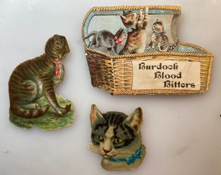
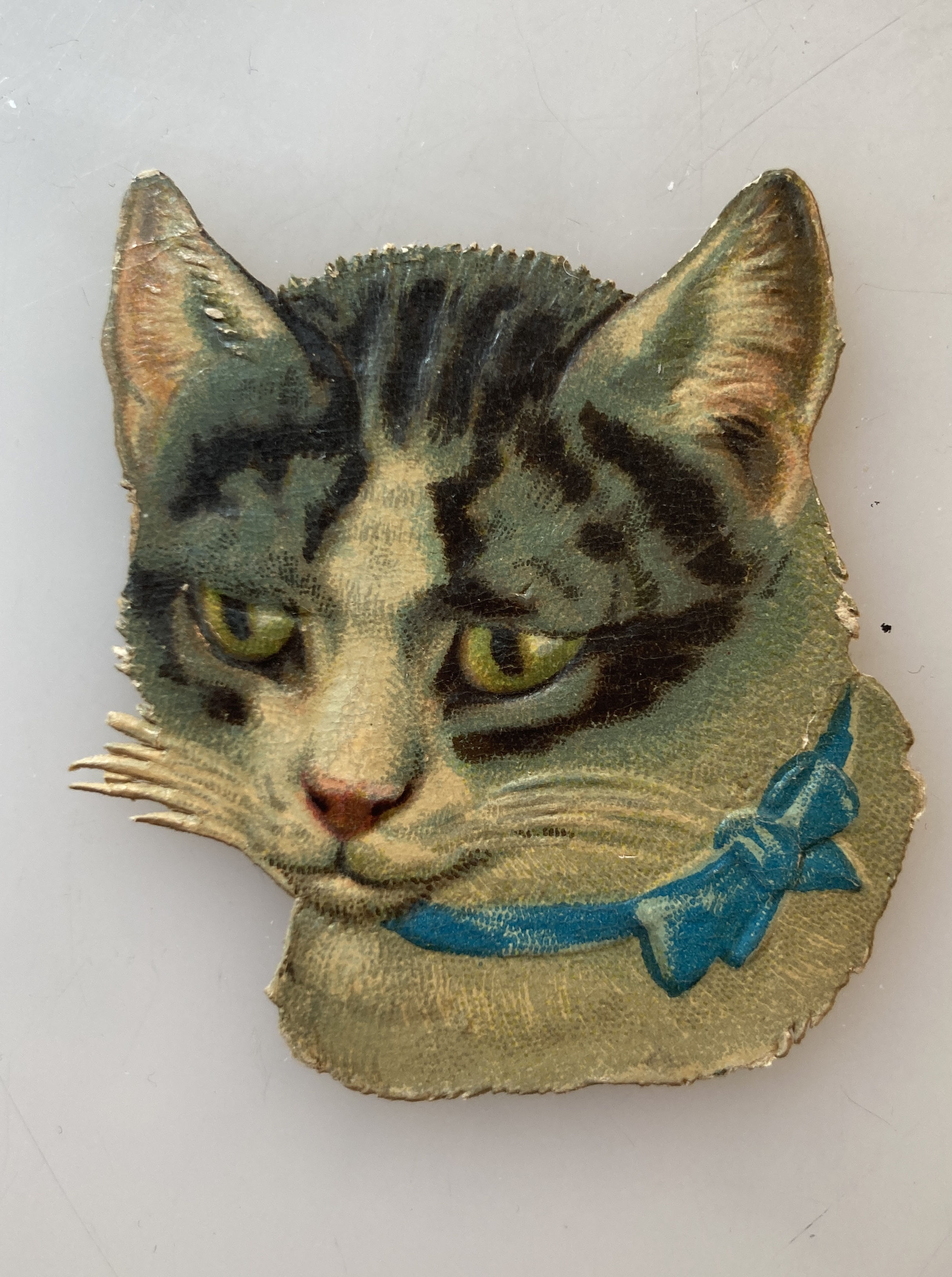
Pam’s Pictorama Post: These cat related bits wandered in together from Miss Molly (@missmollystlantiques) who said her mom found them. They are similar to a post I did a few months back with an interesting cat piece that Miss Molly sold me, but evidently not from the same point of origin. (That post, The Fish Eater can be found here.) My guess is that these did not relate to each other earlier in life either and the Burdock Blood Bitters and the cat head show evidence of having been hand trimmed. All show signs of having been pasted down so they came out of an album.
Pams-Pictorama.com Collection.
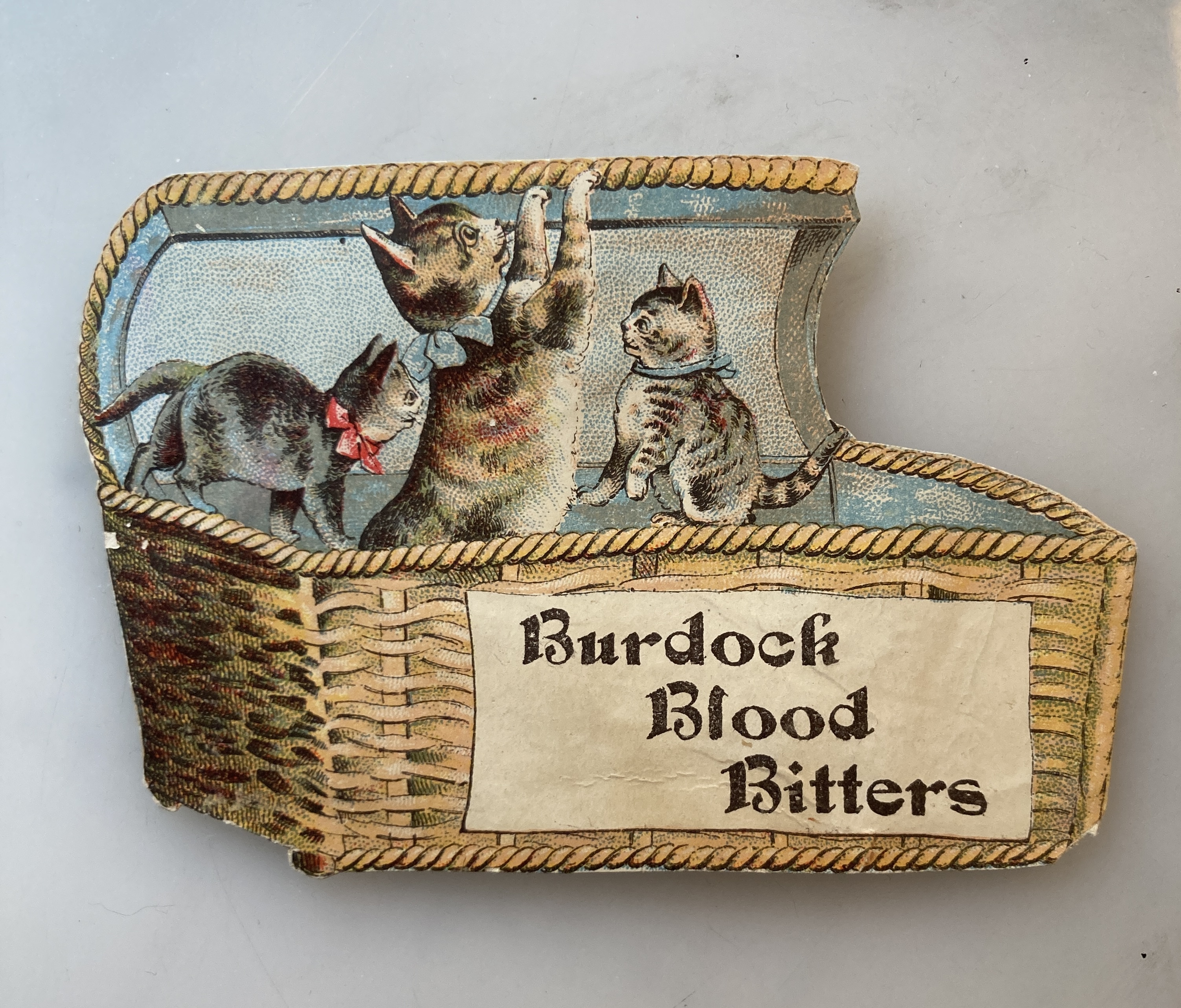
The Burdock piece was a trade card for a patent medicine. It still has some information about the product on the back, including that it hailed from the Foster, Milburn & Co., Buffalo, N.Y. Kittens seem like a benign if misleading representation of this particular stomach cure. These kittens also seem oddly placed in this basket – not really sitting on anything, floating. This piece is the heaviest, made of card stock. In a sort of sleepy state this morning (concert last night for work) I started down the rabbit hole of Burdock root and Burdock Blood Bitters online this morning.
Burdock, the real deal.
One entry tells me that an 1918 bottle of bitters that was tested contained zero burdock and excessive amounts of alcohol and lead. Although it was ostensibly most frequently used to settle stomach and digestive ailments (think constipation and liver and kidney problems), the company also claimed that it would work to purify your blood (whatever that means) and cure nervousness. The internet seems to be willing to grant that Burdock root is high in fiber and especially high antioxidant and something called pre-biotic qualities. Herbal remedies with it abound on the internet today.
Pams-Pictorama.com Collection.
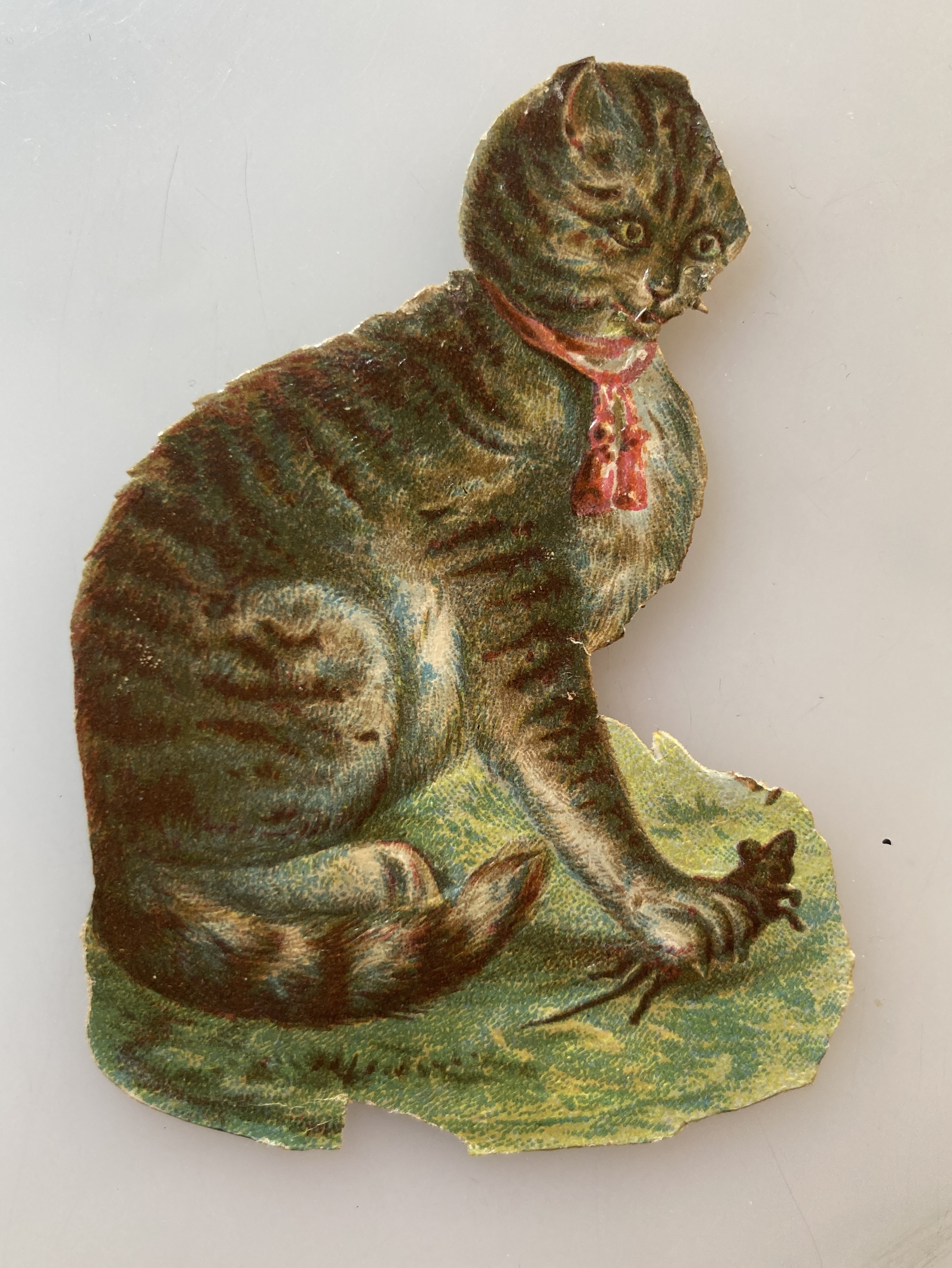
The seated kitty is holding a rat under one paw and whatever his origin, he is on very light paper, slightly embossed. You probably can’t see it, but he has a couple of fangy teeth bared. It presumably hails from some sort of rodent killing product ad. Although is bow is untied he looks otherwise unruffled, almost surprised that he is holding that ratty fellow.
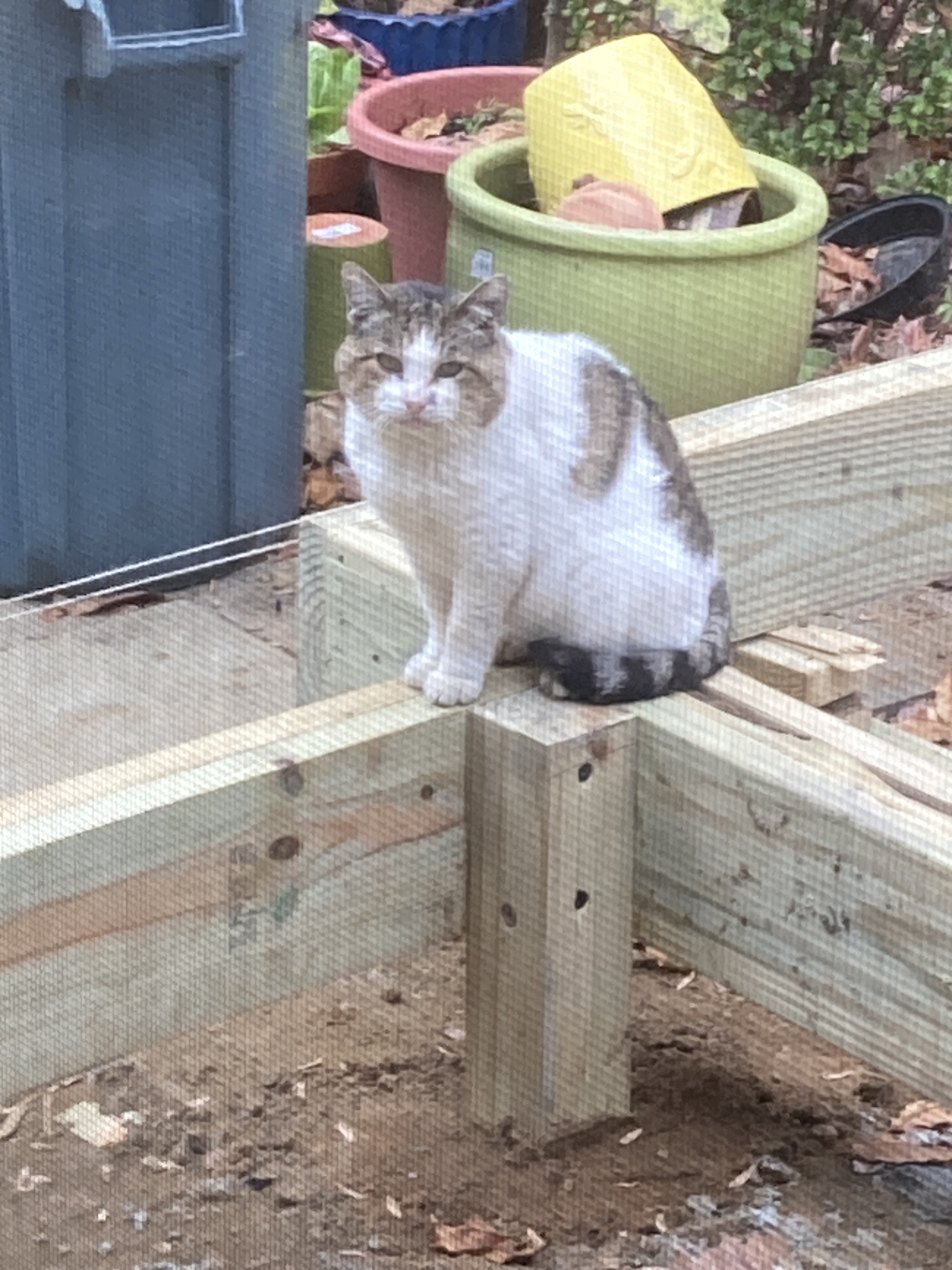
For the Hobo fans, I will pause and tell a recent tale. (For those who are just entering the story, Hobo is the tough old male stray who visits our backyard in New Jersey. I fed him and even tried to trap him at my mother’s behest, but he is wily and although he enjoys his handouts he will never get that close.)
A recent through the screen door pic of Hobo. King of outdoor cats.
Anyway, after mom died we continue to feed him and the other day the caretaker of cats and house, Winsome, because to her horror she stumbled across Hobo behind the bushes in the front yard munching (and crunching – she sent a video) on a rat. (Evidently he had left a mouse for her earlier in the day so she shouldn’t have felt so bad!) I told her he deserved a promotion.
Pams-Pictorama.com Collection.
Lastly there is a cat head, slightly embossed, which appears to be the only one that was constructed for pasting down. Hard to see but even the whiskers and the hairs are defined and it is professionally finished although it seems to fit all of a piece with these two more recycled bits.
I’m sorry the original page of this Victorian album arrangement no longer exists, but happy to welcome these small bits to the Pictorama collection.
Pam’s Pictorama Post: Today’s post is the last piece of the advertising haul from Britain I started posting about a few weeks ago. (That post and some great ads can be found here.) Persil, the subject of today’s post, is a British detergent which is still quite extant today. This ad is from an unknown publication, but dated May 24, 1924.
It was founded in 1907 and according to an internet article Persil claims to be the first first self-acting detergent. Its revolutionary formula that released oxygen during washing made strenuous rubbing of the laundry superfluous. According to another site it mixed a high oxygen soap with salt into the detergent which caused a chemical reaction that cleaned clothes without damaging or scrubbing. This is of course something we take for granted today, but quite revolutionary indeed when you think about it.
A couple of these clocks appear to survive in Germany. They are wonderful! I guess to remind you that Persil would save you time?
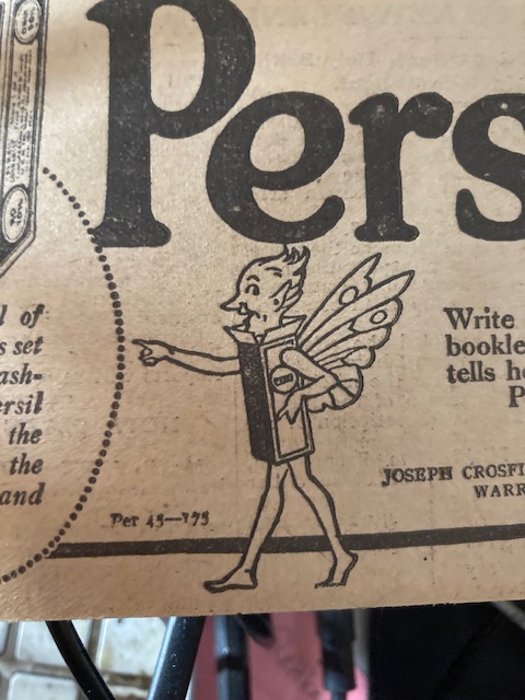
Persil got its name from its original ingredients: Per from Perborate and Sil from Silicate. Originally the Persil powder had to be stirred into a paste before use. At the bottom of this ad it announces that you can write for a free booklet which tells how to use Persil. At first I wondered why you would need a booklet with instructions confused me at first, but after the outline above I realized it was perhaps a bit complicated.
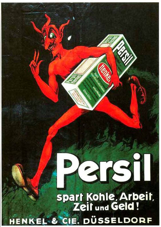
A slightly earlier German advertisement with an even more Devilish mascot from 1914. The copy roughly translates to saves coal, labor, time and money!
The tie-in to Felix is a somewhat elliptical one – Time for the pictures on wash-day. Felix is perhaps a bit more off-model than usual, mouse dangling in hand and the writing on the film poster, beyond his name, is gibberish. The little girl looks at him joyfully while a well dressed (and well-heeled) mom pays for the tickets to someone who is barely part of a face behind the ticket counter. The jolly jacketed usher has his back to us.
The copy reads, Time for the pictures on wash-day – Of course there is. She wouldn’t miss Felix for worlds. So she hands over the washing to Persil. That means five minutes for getting things ready, and thirty minutes for Persil to do the work. Out come the clothes, clean, fresh, white and undamaged, and off she goes with a clear conscience and a clear day.
Detail of ad.
Persil’s mascot, the early ’20’s version, is down at the bottom, odd little fairy made of a box with wings – less sly than the Devil above. He’s barefoot and is all pointy ears, nose and hair. Oddly, and it may be my own inferior search skills, I cannot find any information on his history or why he was composed this way.
The advertising I have supplied here was the most notable I could find on the internet so Persil didn’t go in for a lot of premiums or campaigns, that survive anyway. The green box shown here held by the friendly Devil was their persistent look into the mid-twentieth century when they eventually morphed to a plastic jug and presumably stopped being a powder.
I assume that Felix picked up his paycheck for this and kept it moving. Lastly, for another real eyeball kick, check out my other Felix advertising post from a few weeks ago – a rare, entire short comic for Sportex shirts – which can be found here. Enjoy!
Pam’s Pictorama Post: A colleague I am very fond of said that she believes that all Aquarians like to celebrate their birthday. I generally believe that Susan knows best about just about everything, but I am not sure about this. The secret about me and birthdays is that by nature I actually do not like them, however early on I decided that it was better to put some effort into turning that around and finding the best way to enjoy them.
Over time I have found a number of methods for cheering the sometimes bleak days of February – mostly filling the days with seeing friends and especially other Aquarian celebrants of my acquaintance. The pandemic made that a bit harder although there was at least one birthday dinner outside in the snow in February of ’21. At the height of this practice I think I had five or six folks I would see for lunch, drinks or most often dinner.
Coconut and pineapple birthday cake!
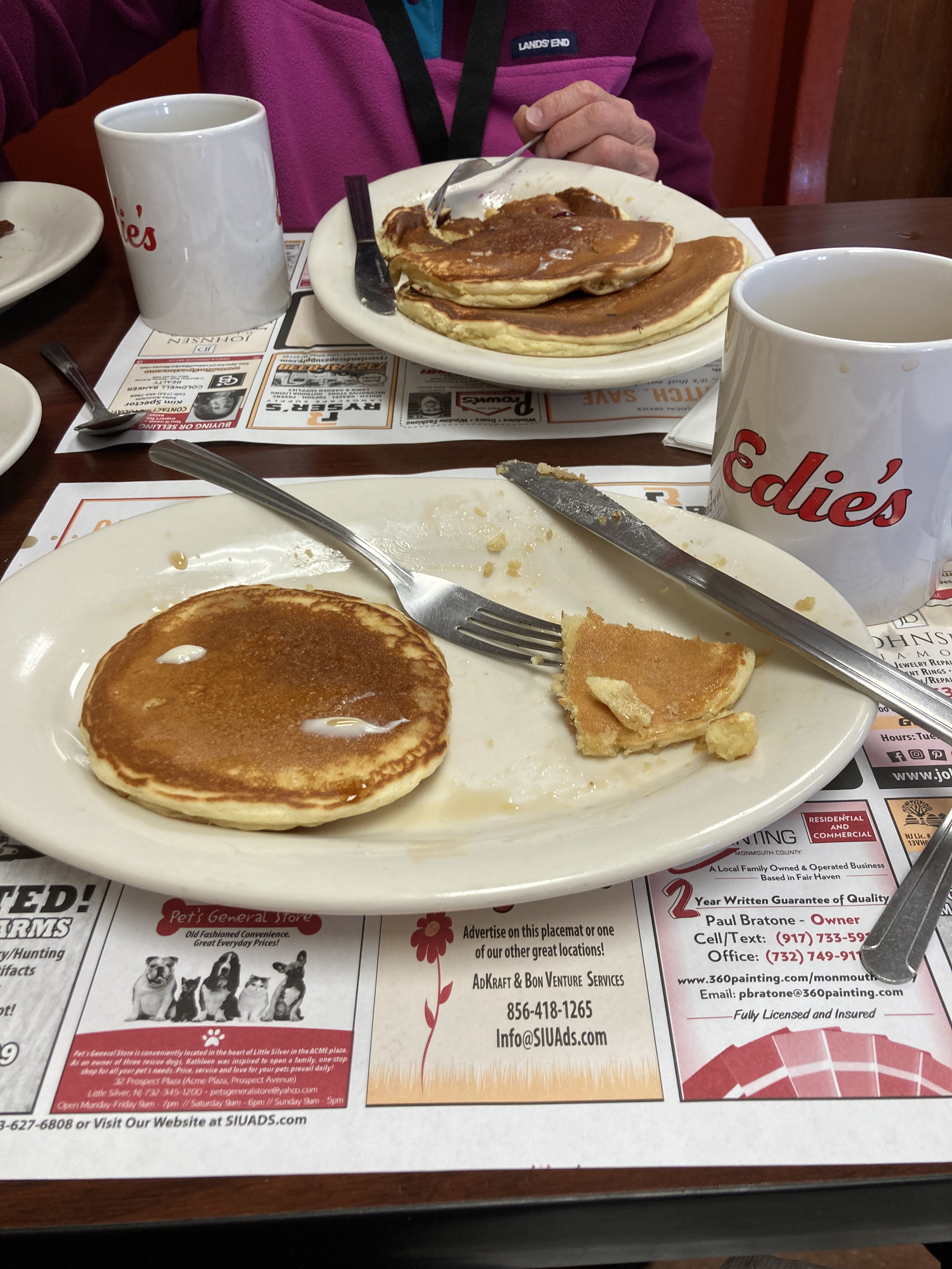
This year mom had a glorious coconut cake with pineapple filling made for the occasion. Luckily there were many folks on hand in New Jersey to help consume it, although I will admit to having made a few meals more or less of it myself. Mmmm! As you can see above – we had munched half of it before I thought to take a photo. (I did manage a piece home for Kim to try.) Also, there was breakfast at Edie’s Luncheonette (which I wrote about previously here) with a friend which also kicked the birthday week off right.
Breakfast at Edie’s Luncheonette is always a treat!
Yesterday on my birthday on an unseasonably warm day, I caught up with one of my favorite fellow Aquarians, Eileen Travell, and she joined Kim and I on a Manhattan mini-adventure to The Grolier Club. Founded in 1884 this club is an institution devoted to all things library, books and paper. It has had several New York homes over its long life and currently resides tucked neatly in a beautiful building on 60th Street between Park and Madison. (More information on it and these exhibitions below can be found here.)
From the Decorated Paper exhibit at the Grolier Club. Catch it before it closes in April!
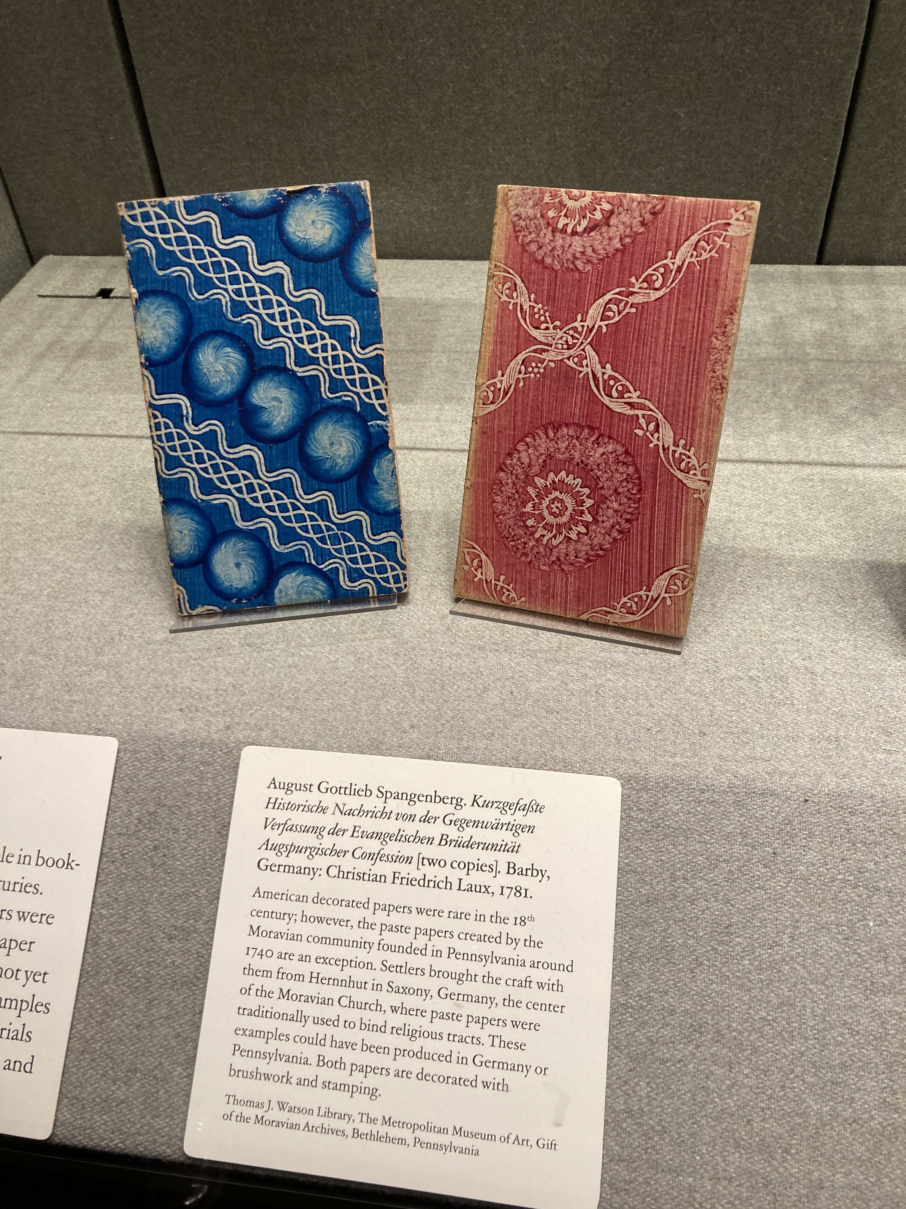
As it happens two exhibitions I was interested in aligned and we were able to enjoy both, Pattern & Flow: A Golden Age of American Decorated Paper, 1960s to 2000s and Animated Advertising: 200 Years of Premiums, Promos, and Pop-ups. The decorated paper exhibition was based on the collection of the Met Museum’s Thomas Watson Library and curated by a former colleague, Mindy Dubansky. She did a splendid job and the exhibit is full of wonderful papers, but also tools of the trade and other fascinating bits. For you in New York or passing through, it is around until early April and I highly recommend it.
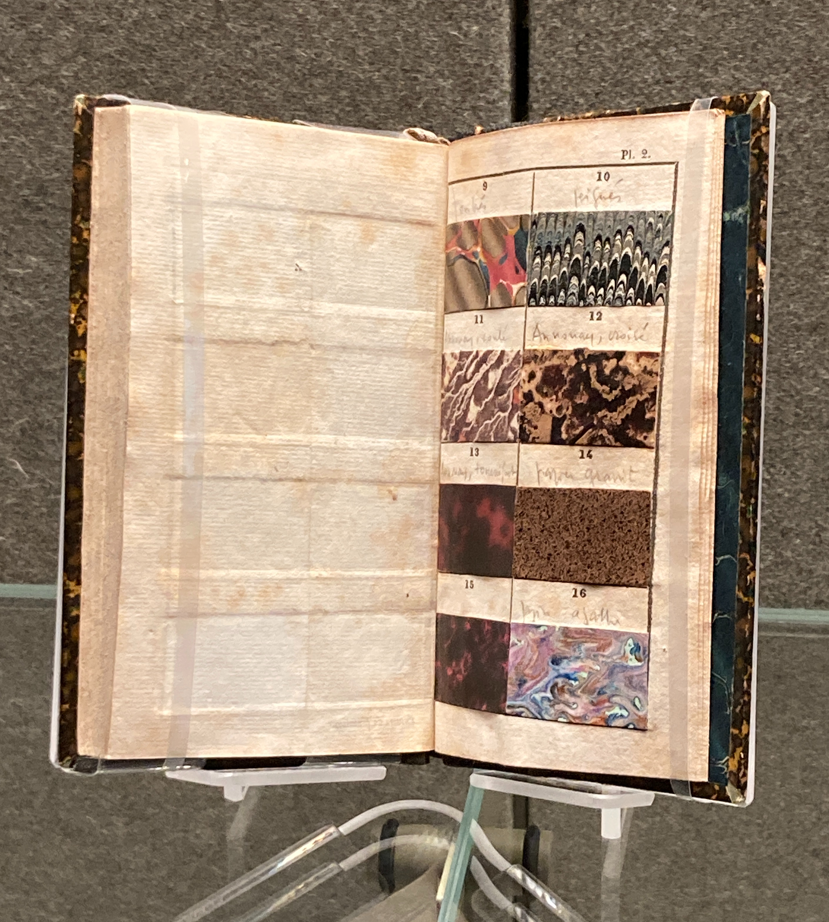
An early sample book from the decorative paper exhibit.
Oddly, these beautiful hand-painted papers seem to end up being used for very pedestrian ends – a familiar Kleenex box design, a box for a liquor. Kim and I agreed that somehow they have not yet really been employed in a way that fulfills their promise.
This exhibit reminded me of one years ago at the Cooper Hewitt on wallpaper. Kim and I started discussing that and while I could not find exactly what I was looking for I did find this post from them, based on their collection, and can be found at Wallcoverings. Fascinating!
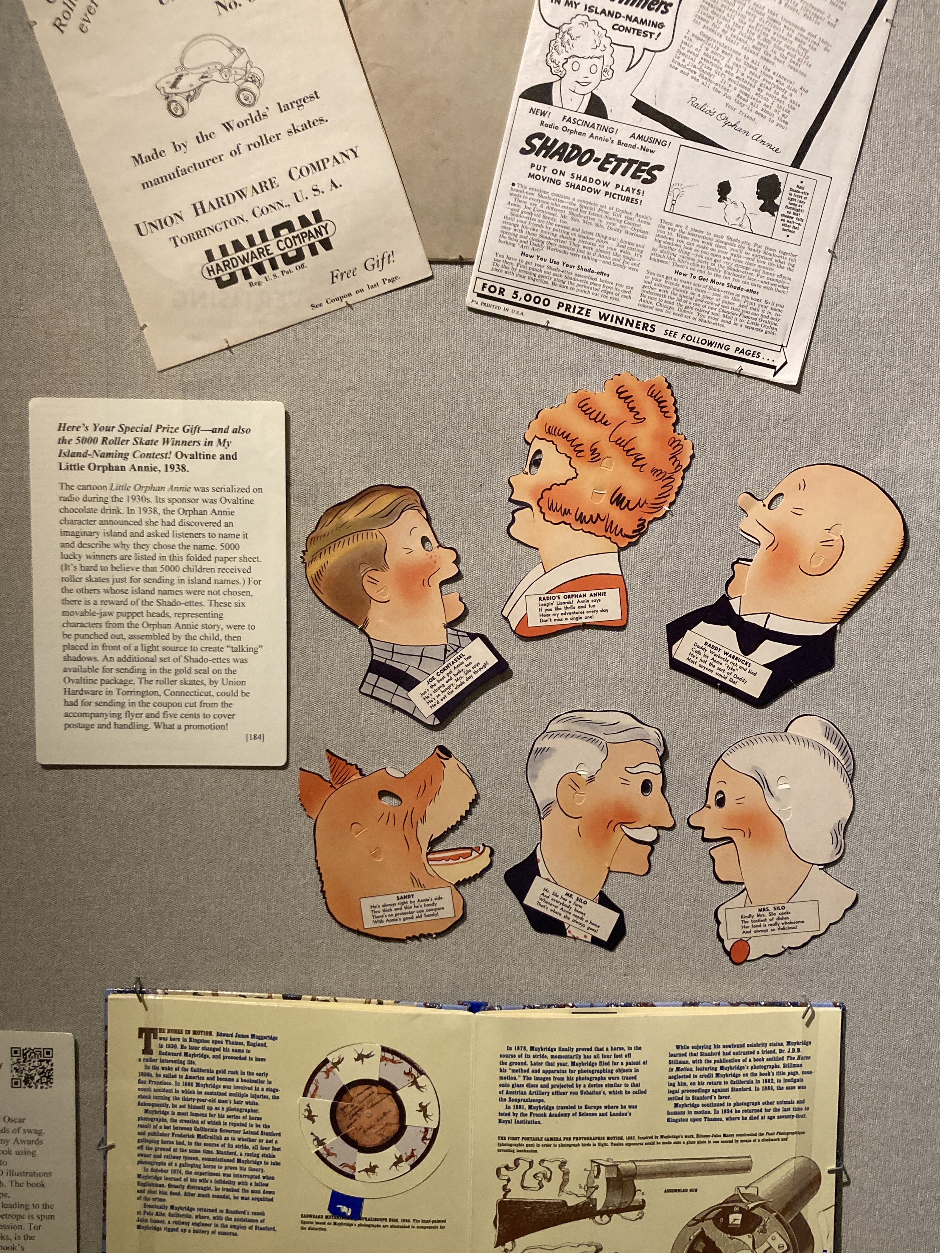
This Little Orphan Annie premium was a favorite. I bet she has a deep collection of these premiums with so many great ones!
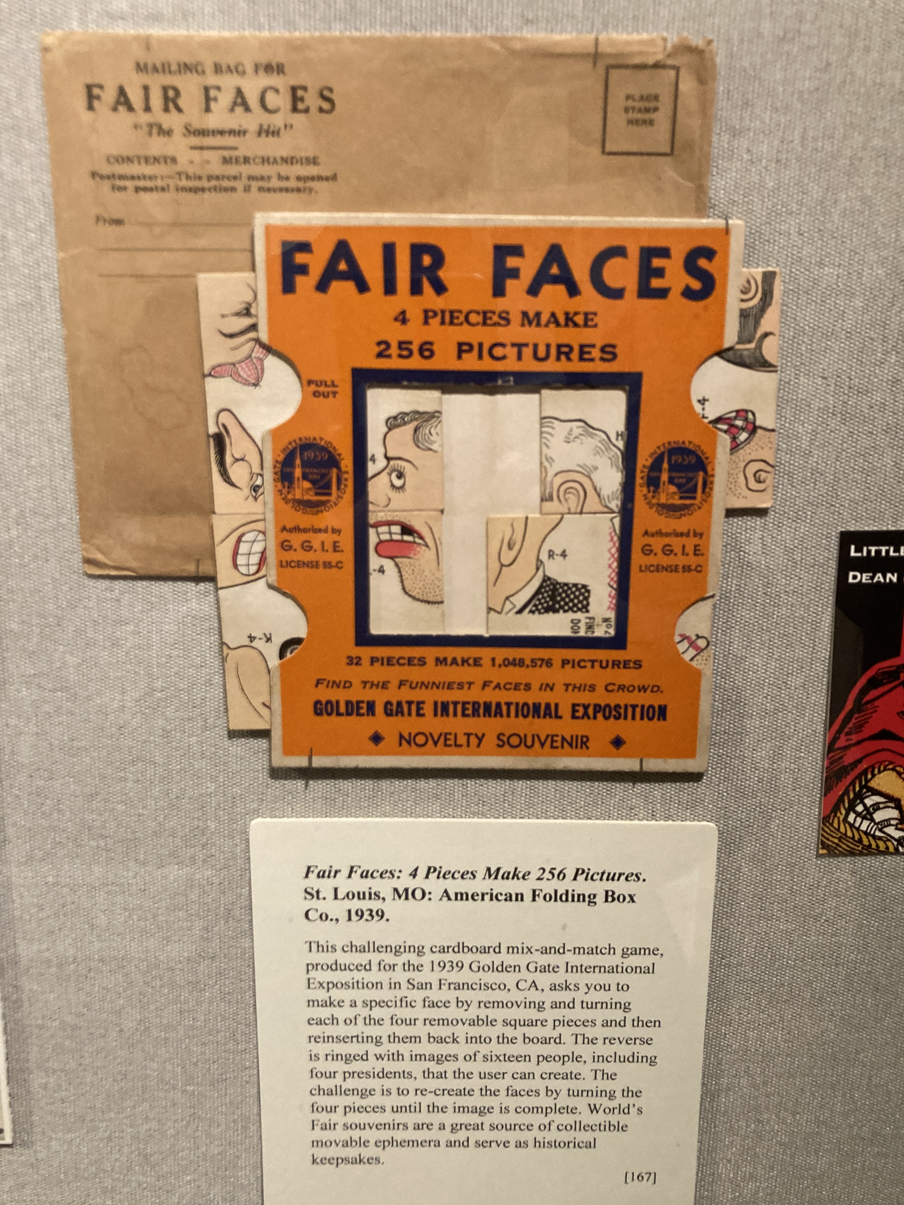
Next up was pop-up advertising exhibit. Featuring a portion of Ellen K. G. Rubin’s collection, a note online about the exhibition had caught my eye just in time as Saturday was its final day and it was fairly crowded as a result. I gather that Ms. Rubin is interested in all things pop-up and an online search reveals that her collection has somewhere between 9,000-10,000 pieces – so this was a small and select slice. The objects covered in the exhibition ranged over 200 hundred years, although it seems she has items that are far older in her collection.
You can see this one in action, flipping through NYC sites on the website devoted to the exhibit.
While the exhibition has closed it is still available by catalogue (which Kim purchased for me and represents the exhibition well), but also on their website. The nice aspect of the website version is that it also shows some of the objects moving as intended. This was also available in the exhibit by QR code but somehow watching the tiny image on my phone in the gallery was a bit frustrating.
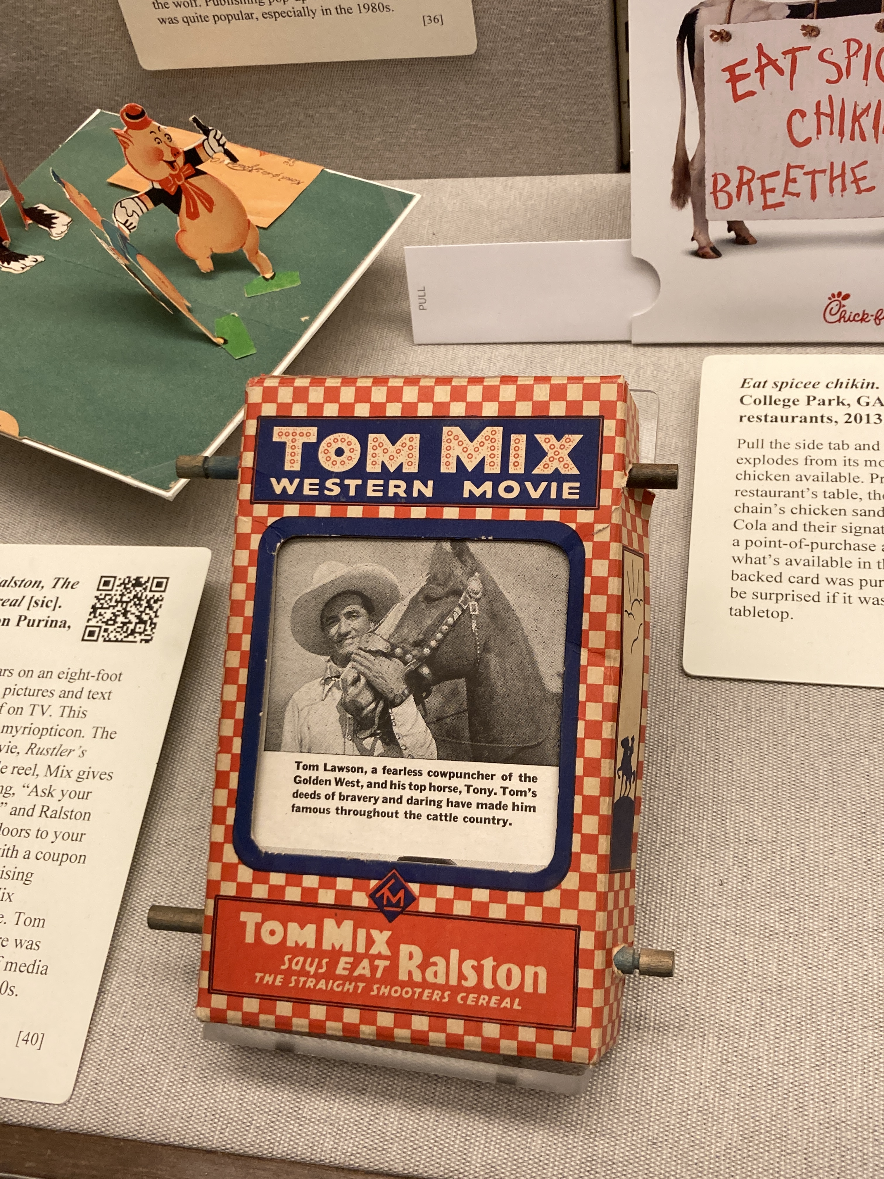
I would have loved to see this Tom Mix Western Movie premium in action!
Finally, we were super intrigued by their shelves of Grolier Club publications for sale. Kim dug in and spent some time examining the lot. Not surprisingly considering their mission, their publications are expertly executed and an interesting lot and although not inexpensive, we may be returning for some of them.
For the record, I gave Eileen an Edie’s mug and she gave me a stunning daguerreotype which I will attempt to photograph and share at a future time – photographing dags is notoriously hard. This a a lovely image of a young girl.
The day wrapped with a trip down to 24th Street to nose around the flea market a bit. A few purchases were made (we did not purchase the photograph above, nor the bird statue behind it which was really calling Kim’s name), but more about that perhaps in a future post too. Eileen headed home and Kim and I settled down for a late lunch before heading back uptown, home to Deitch Studio, the cats and naps.
Pam’s Pictorama Post: Those of us on the East coast are enjoying a massive snow storm, perhaps even blizzard, this last Saturday in January. If you read last week’s post about the January-ness of this particular year (it can be found here if you missed it) you know that my attitude toward this month in general is to usher it out the door as expeditiously as possible. Still, it is January in New York and it is a time to expect some snow and here it is. Meanwhile, there is almost always snow on the ground for my birthday in February, and so the year opens.
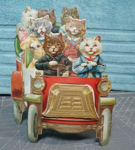
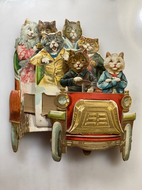
I thought we could all use an especially jolly post today to help kick January out the door and this bit of kitty advertising did not disappoint in this regard when it wandered into Deitch Studio earlier this week. It is simply identified on the back with Drink and Enjoy KENNY’S Coffee and Teas.
I was surprised by how quickly I was able to locate a bit of history on Kenny’s coffee empire. Kenny liked a good premium and a handful of mostly ceramic ones are still extant. I cannot say I find the aesthetic of most of these nearly as entertaining as this wacky carload of kitties however. This card is as if Louis Wain did a stint wandering into an otherwise rather staid establishment. Kenny seemed partial to generally less colorful, more sedate and somewhat pedestrian premium. Some of the more jolly however, snatched off current sales on eBay below.
For a quick history on Kenny I got the scoop primarily from an article in the Baltimore Sun published back in 1999. Kenny was C.D. (Cornelius David) Kenny who arrived in Baltimore from Rochester in 1872. He quickly established his first coffee and tea emporium and rapidly expanded his business across several nearby states. The retail stores were shuttered in the early thirties as a result of the Depression remaining solely as a wholesale operation until it was eventually swallowed into anonymousness by one of the enormous food conglomerates.
Onto the kitties. My previous posts about Victorian advertising cards (one can be found here) proved out that generally they were produced en masse with the intention of personalizing the card for a given vendor, not designed for them. So in theory this card could exist with advertising for another vendor printed on the back. For the record though, I have never seen this card before and my nascent searches for information did not turn up other examples.
Our driver kit is on the right side of this sort of Stanley Steamer-type auto, as photos confirm they actually did. He looks a bit nervous about being in charge, but I especially like the white fellow with his paw arms folded across his chest! Indeed! The two boys in the middle section appear to be have a grand time of it and look full of beans – especially the one in the yellow jacket. Faster, faster he cries!
Card as it sits flat. Pams-Pictorama.com collection.
In the back of the car a cat couple canoodles while their chaperon looks nervously on. Ha! She has no bandwidth for the thrills of the ride and instead is burdened with her responsibility for fluffy white girl kitty in pink who is holding paws with her dapper boyfriend.
I think you will agree that’s a whole lot of card fun to devote to a bit of advertising which isn’t even a display featuring the company on the front. The card is ingenious in design and how it folds out into three dimensions, creating a great effect; solidly constructing which is why it remains in good shape 100 years later. Even the grill of the card is affixed in such a way as to create another layer. Just splendid!
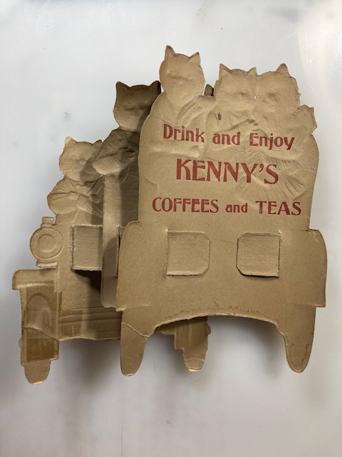
Back of card. Sturdy despite the age and a few dinks.
While I am tempted to try to find a way of keeping this one on display it resists remaining in the unfolded position and although in very good shape is certainly a bit fragile so perhaps it needs to live tucked into the Pictorama archive.
Meanwhile, the snow continues to pour down and sweep wildly by the window of our 16th floor apartment, piling up on the sill, so I may follow the example set by Cookie and Blackie and, figuratively at least, tuck my nose under my paws and have a snooze filled day.
10:00 am view outside our window.A bit calmer than what I see now!
Pam’s Pictorama Felix Post: As promised, today we have a very Felix day! These two sheets were a long time coming to Pictorama. First they sat on eBay for a long time while I was distracted by other things, and then I finally purchased them and then it took several weeks for them to arrive. I tend to hesitate before committing to very fragile paper items, but in the end I claimed them as mine. I am spying a spot at the top row above Kim’s desk, a bit hard to access, but not too much light. Could be just right. They are great. Here we have Felix at the zenith of his come hither appeal plying his trade to good use.
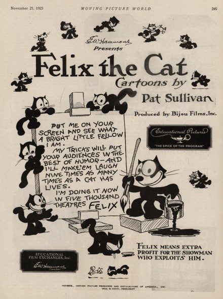
Both of these sheets of advertising are from Moving Picture World magazines and I will admit that I find the cutting up of these journals to sell for separate pieces distressing, although I understand some are likely worth more for their parts individually. These are fascinating journals in their entirety and I have purchased many a copy of the ancient periodical for Kim, mostly from the ‘teens, and I believe there is even a bound volume of them in the house, that I dimly remember picking up as a gift for Kim, out of an apartment somewhere in Chelsea. These pages have been carefully removed by the staple being taken out of one and a clean cut on the other. The one emblazoned, Felix the Cat Cartoons is from November 21, 1925 and the other is from July 7, 1927.
In the first Felix shows all his moods, like an actor auditioning for a part: thinking, musical, angry, worried and intellectual. He is shown horizontal on all fours (in what I think of as a catty pose) and even chasing a mouse at the bottom. Although he might be going through his paces for this ad, he was already at the height of his fame and auditions were hardly necessary. Here he proclaims, Put me on your screen and see what a bright little fellow I am. My tricks will put your audiences in the best of humor – and I’ll make ’em laugh nine times as many times as a cat has lives. I’m doing it now in five thousand theatres. Felix And below that the added encouragement, Felix means extra profit for the showman who exploits him.
Felix had recently made the jump to Educational Films (the spice of the program) which is mentioned here prominently at mid-page, as is a produced by credit for Bijou Films, Inc. EW Hammond is presenting up at the top (President of Bijou Films) and of course Pat Sullivan gets a huge credit with Cartoons by right next to a Felix running right at it. (That’s a lot of credits for one animated cat, even one as big as Felix. Not surprising, but sadly of course, no mention of Otto Messmer, Felix’s true progenitor.) Felix made 20 cartoons in ’25 by my count via Wikipedia’s filmography (about half before switching to Educational Films for distribution that year), and more than 20 the year before alone so production was in full tilt and there was plenty to watch.
One real gem from 1925 that I uncovered while doing some light research on that year was a nifty full length cartoon made for Mazda Lamps, The Cat and the Kit. It is 98% cartoon with only a smidge of commercial and is definitely worth the watch below. The story follows Felix on his wedding day and the drama around the headlights on his car (called lamps at the time and were much more like lamps than the headlights we have now) which keep going out. He is forced to buy inferior replacements and those don’t focus – requiring Felix to resort to snatching the moon out of the sky – only to be told by a policeman that there is no driving with moonshine in the car!
I can’t resist detouring over to Mazda Lamps for a moment, I’m sure Kim and I are not the only ones still shaking our heads over the beautiful Mazda Lamp display uncovered awhile back on the television show, American Pickers. One is shown below from a site called Design is Fine. History is Mine.
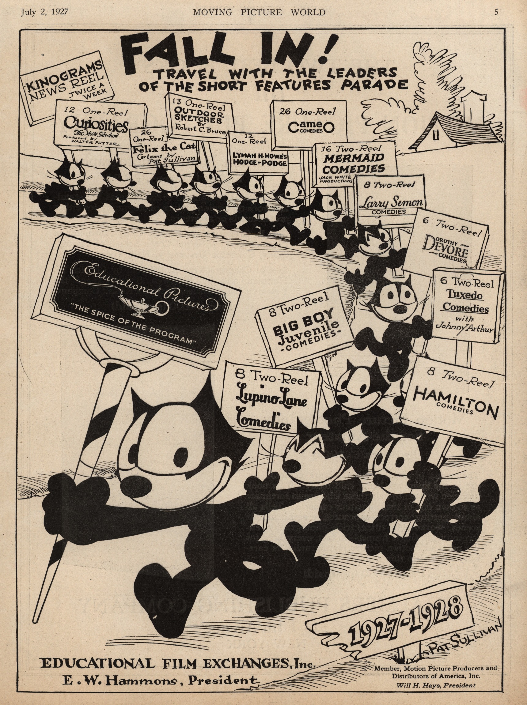
The second sheet, from ’27, shows a parade of Felix-es bringing us all the short features Educational Film Exchanges had to offer. As an avid fan of silent shorts I recognize some – Larry Semon and Lupino Lane. (Kim knows more of them and reminds me that John Arthur was Darla’s father of Little Rascals fame. Remember, Feed ’em and Weep, featuring Mr. Hood on his birthday trying to eat his celebratory meal?) Some are a loss to me such as Tuxedo Comedies or Mermaid – evidently series of comedies that folks, such as Snub Pollard and Lloyd Hamilton, would have come and gone through.
Felix’s own shorts are listed at the top and the large sign he holds up front, mounted on a striped pole, is for Educational Pictures. Meanwhile, I especially like the sign which is pointing toward 1927 and ’28 at the bottom. Pat Sullivan only gets a signature credit here (as if he had drawn it). I see 26 films listed in 1927 for Felix so he was certainly going full steam. I include one below in order to give equal time to 1927, Whys and Other Whys, which kicks off with a soused Felix leaving a nightclub. Watch these while you can – these links to Youtube don’t seem to last forever! (Although a quick search may turn up another source if these have disappeared.)
We are invited to Fall In! and Travel with the leaders of the short features parade. The art on this advertising sheet is hotsy-totsy – it is always a favorite moment of mine within the cartoons to see a virtually never-ending cycle parade of Felix. If studied carefully, two Felix-es on the sheet have been a tad mangled, you can note that the second largest (holding the Lupino Lane placard) and one about mid-page (with the Larry Semon ad) have had a bit of what looks like ham-handed revisions around the eyes. Not sure what anyone was thinking to improve upon Otto Messmer’s genius. (Just a note as well that some of these Felix’es only sport whiskers on one side of their face.)
The back of the ’25 sheet sports an article entitled, The Bar-G Mystery, New Western Patheserial Now in Production (Kim checking that one out in a book now), and ad for the Charlie Chaplin release of A Dog’s Life to be released on November 22, and a rather terrifying ad for Buster Brown with Buster and Tige looming large. Short pieces appear on the recovery of Walter Hiers from an injury sustained during filming which almost cost him his hand according to the article, and announcing Clyde Cook to appear in a new comedy. The verso of the ’27 sheet is an add for volumes on photography by the folks at Motion Picture Photography – one for professionals and the other for amateurs.
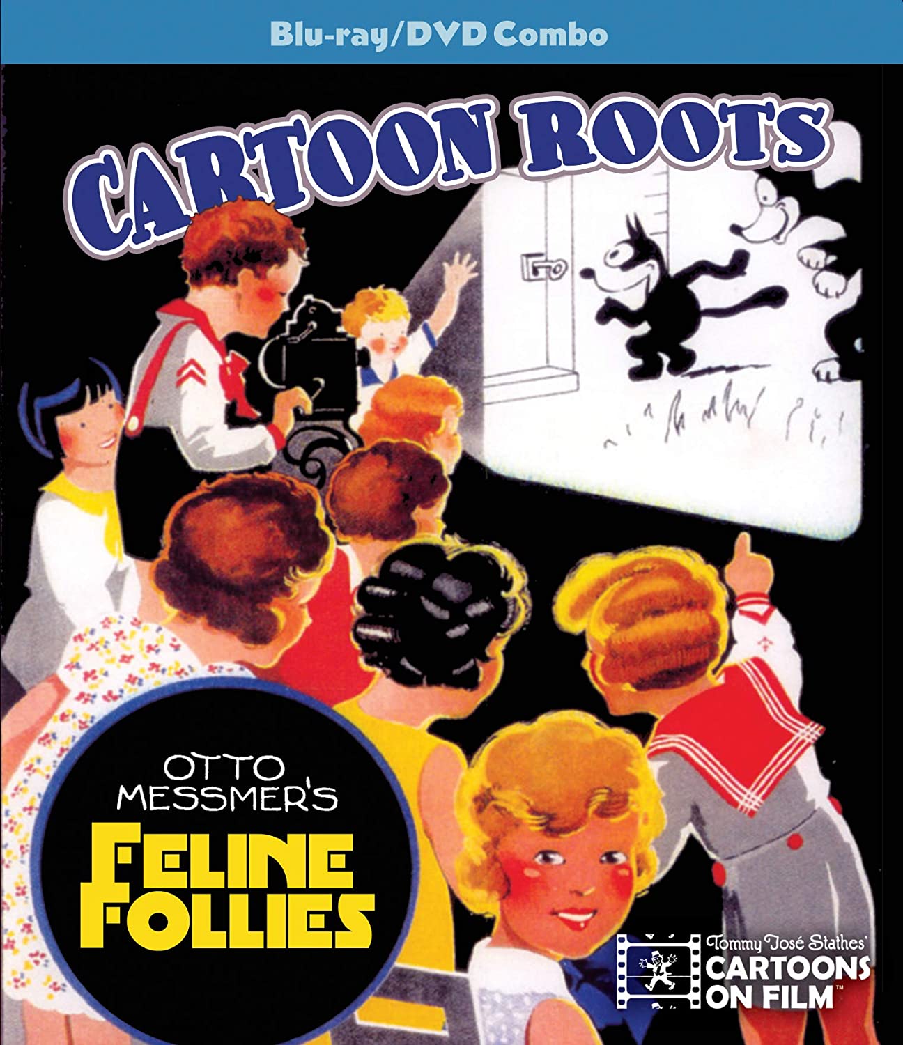
Tommy José Stathes (@tomatitojose) has just released the latest in a series of brilliant Cartoon Roots DVD’s featuring some new restorations of rare early Felix cartoons! It can be purchased on Amazon here. I am on the edge of my seat waiting for mine to arrive. His earlier DVD’s are also being re-released and can be purchased here. A bit of a review of one of those earlier DVD’s can be found in a prior Pictorama post here. And on that note I believe I have kicked off the year of ’21 as a Felix friendly one – enjoy!
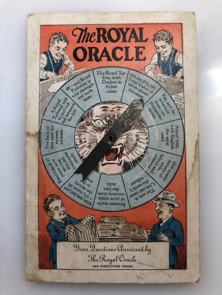
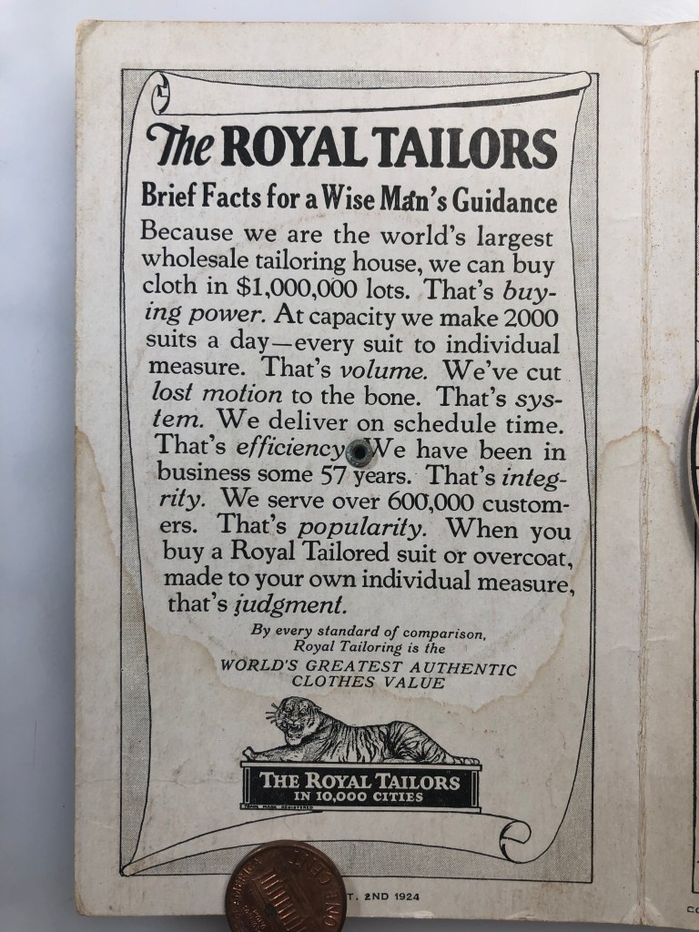
Pam’s Pictorama Post: Although I generally keep my advertising purchases to cat related items, I tossed this onto a photo order I made on Instagram over the summer. This is an odd little bit of advertising lore which has evidently long outlasted the company. (I was unable to find any reference to the Royal Tailors online, despite their more than 57 years in business, as per the brag of this card, and an obvious love of robust advertising.)
No city of origin is mentioned in this pamphlet which might have helped as it is a phrase which brings up a lot about a Korean serial drama of the same name. Very nominal references seem to exist for it in the 1920’s out of Chicago and New York, although they boast about a presence in cities all over the country. As printed on the back, this particular item seems to have been handed out by Carl Mee, 104 E. Rockwood Avenue, Rockwood – this may be Rockwood, PA according to Ms. Google.
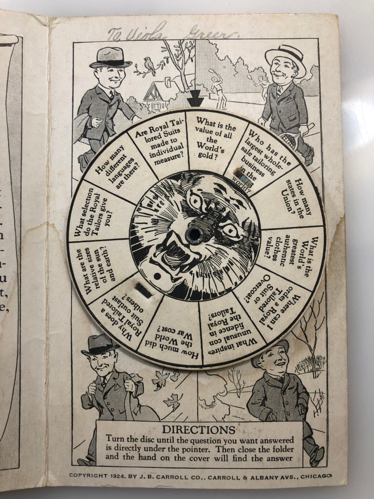
On the cover slightly dwarfish men labor over the handmade suits, one at the bottom presents some fabric options to a well-dressed customer. The spinner on the front lands on a variety of oracle answers which are interspersed with gems like Yes, on schedule and no disappointments and Royal Tailor suit to individual measure for $30. They claimed to be in 10,000 cities and given their advertising flair I am surprised not to find traces of old advertising for them aside from this. Perhaps someone could search it better than I have.
The idea is that you choose a question inside and then spin the arrow on the outside to have it answered. (Kim says it almost works and I would say that it is a surprisingly accurate description.) I find the sheer amount of imagination and effort wonderful. Inside we get four jolly and sartorially impressive gents going on about their well-dressed business throughout the four seasons – sporting a tennis racket for summer, an overcoat in winter and just some blowing leaves and a bird on a branch to suggest the remaining two. On the back, a less dwarfish (and less interesting) man appears to admire himself in his Royal Tailor suit.
I will also point out that inside, in a childish hand, To Viola Green is written in pencil. On the back in the same scrawl it says, Walter Heerd. A gift from Walter to Viola? As a kid I would have thought it a pretty nifty one, I admit Walter might have gotten over on me this way. Was it Viola who kept it these many years?
For me the world is a less interesting one without advertising efforts such as these, although perhaps I am just not the target audience for what does exist. As a tot my dad would bring me light up trucks from Hess Gas to my delight – dishes, mugs and whatnot wandered in the door from all sorts of vendors clamoring for our attention. Banks not only offered lollipops (a practice I would like to lobby them to consider a return to), but all sorts of enticements for opening savings accounts, checking, or (my favorite) the Christmas Club savings accounts which helped you put money away for holiday gift buying. I seem to remember getting some nice little version of a special holiday passbook for that. (Despite the seemingly political incorrectness of Christmas Clubs they evidently still exist today – online versions, but still under a Christmas moniker.)
From the same lot I will return to some cat advertising in a near future post. If you cannot wait a past cat post can be found by clicking on: Crinkle Cat.
Something given as a reward, prize, or incentive…Early 17th century (in the sense ‘reward, prize’): from Latin praemium ‘booty, reward’, from prae ‘before’ + emere ‘buy, take’. From the Oxford English Dictionary.
Pam’s Pictorama: For me one of the amazing and tantalizing pleasures of existing in the moment of time and space that I do is the relative availability of various premiums from the past. These items, only obtainable previously through either luck (think Cracker Jack) or by dint of labor (collecting cereal box tops shall we say), the products of early, crafty advertisers, are available now to us for examination and purchase more or less at will. It’s hard for me to describe how entertaining I find this to be – booty is the perfect word indeed, treasure! To a large degree, just being able to actually see them is enough, but yes of course, sometimes I find myself with a hankering to possess them as well.
I first became aware of this particular bounty while working my way through a Hake’s auction catalogue. On the festive occasion that those folks sends me one of their fat color catalogues I like nothing better than to curl up in bed and read every page, pointing out the best stuff to Kim. (If the folks from Hake’s are paying attention I would like to point out that I rarely disappoint them on the occasion of receiving their missive and have made many a purchase I may have not discovered online. I wrote a little ode to the Hake’s catalogue once which can be found here.) In the process of this, I have discovered things I never knew existed that deeply interest me. Among these are strange political buttons of elections long past and a wide variety of premiums – give aways from everything, cereal to radio program tie-ins. Most with origins I am at least passingly familiar with, although some dimly at best.
Therefore it is fair to say my fascination with these items is not linked to a particular affiliation with the origin. I can deeply enjoy perusing Lone Ranger premiums (silver bullet ring anyone?) while being only passingly familiar or interested in the lore of the Lone Ranger, his comrades and their adventures, having personally only ever been exposed to the television show as fodder for Sunday afternoons in my childhood. The rings alone – those that might decode, magnify, signal or contain a bit of mythical meteorite – tempt. Truly I would like to own them all and have only barely contained myself, limited by space, money and time.
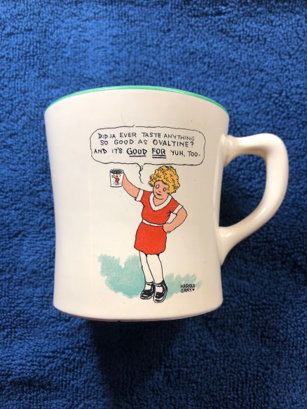
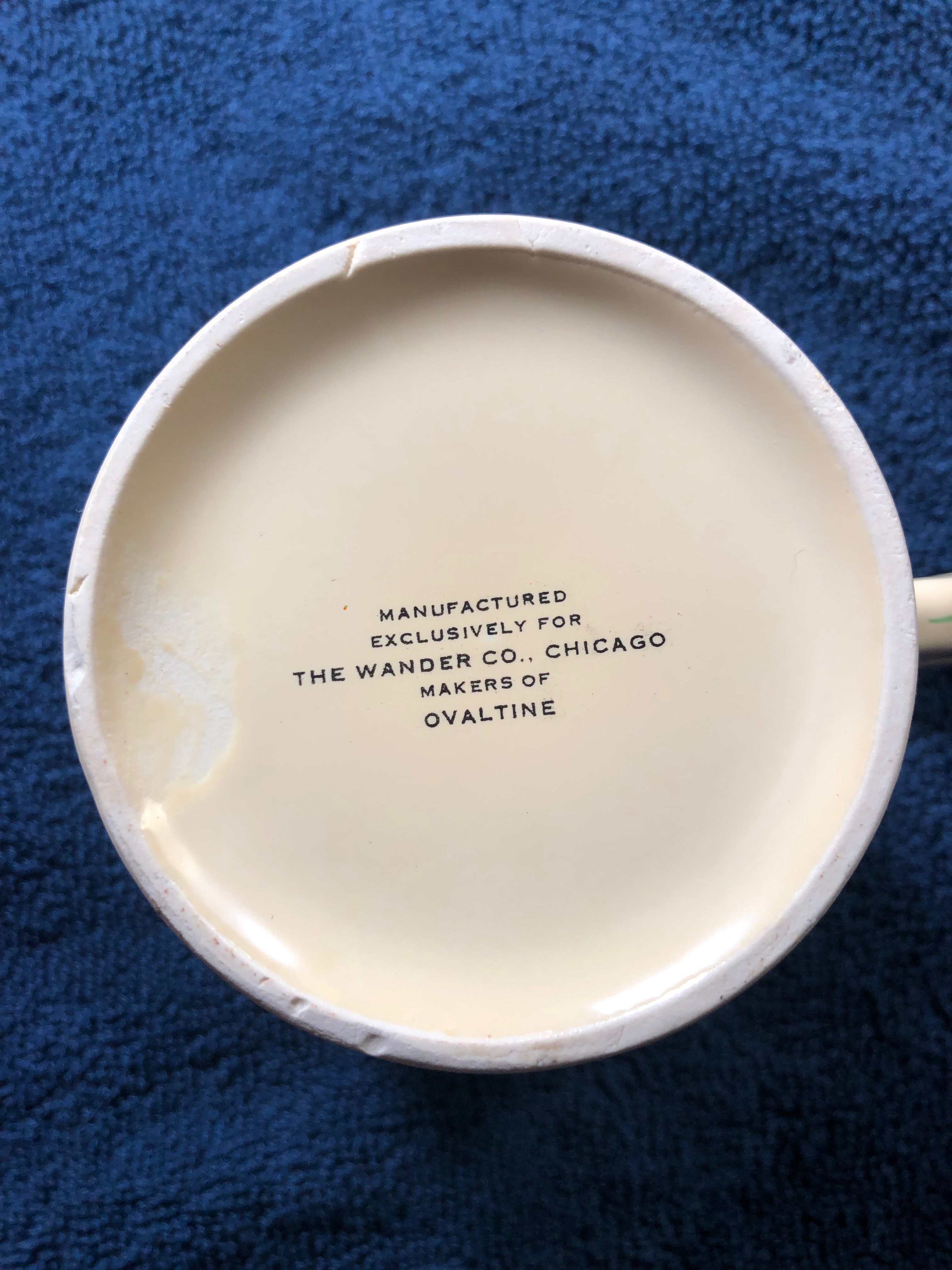
Obviously where advertising and premiums intersect with felines I have made acquisitions (for example I opine on some splendid pin trays which sit happily on my dresser in my post Corbin Canadian Cats which can be found here), however I do wander astray occasionally however and give into something. Today’s item, this wonderful Little Orphan Annie Ovaltine mug purchased for me by Kim, is an example I am especially pleased with. It was easily obtained – I imagine the bar for acquiring it set purposely low and therefor in a sense still is – and you can all have one if you want. We paid a nominal amount for this very pristine example. I believed that it came in this cream color or a white version when I bought it. I purchased a cream colored one – but I now realize as I photograph it that the cream reads white – maybe all are cream colored? Ultimately I chose this one because of it’s utterly unworn state. It looks like it just came out of the box.
These mugs, manufactured exclusively for The Wander Co., Chicago makers of Ovaltine (as per the bottom of the mug) were evidently a tie in with the Little Orphan Annie radio broadcast, sponsored by Ovaltine from 1931-1940. I gather this was an extraordinarily effective tie in and, in the day, one rarely thought of the radio program without also thinking of Ovaltine.
I have only a passing experience with Ovaltine from my own childhood. It wasn’t a favorite by any means but wander through it did. In my mind it was a lesser cocoa additive than the Nestle or Hershey scoop-able brown powders or (best of all) syrup that was preferred. My memory is that I sort of liked that it was more granular than powder which made it more interesting to dispense. I am not sure that the concept of it being more of a malted drink than a chocolate one was entirely coherent to me although my tastebuds knew it and preferred chocolate. I gather there was a nominal component of it being nutritious?
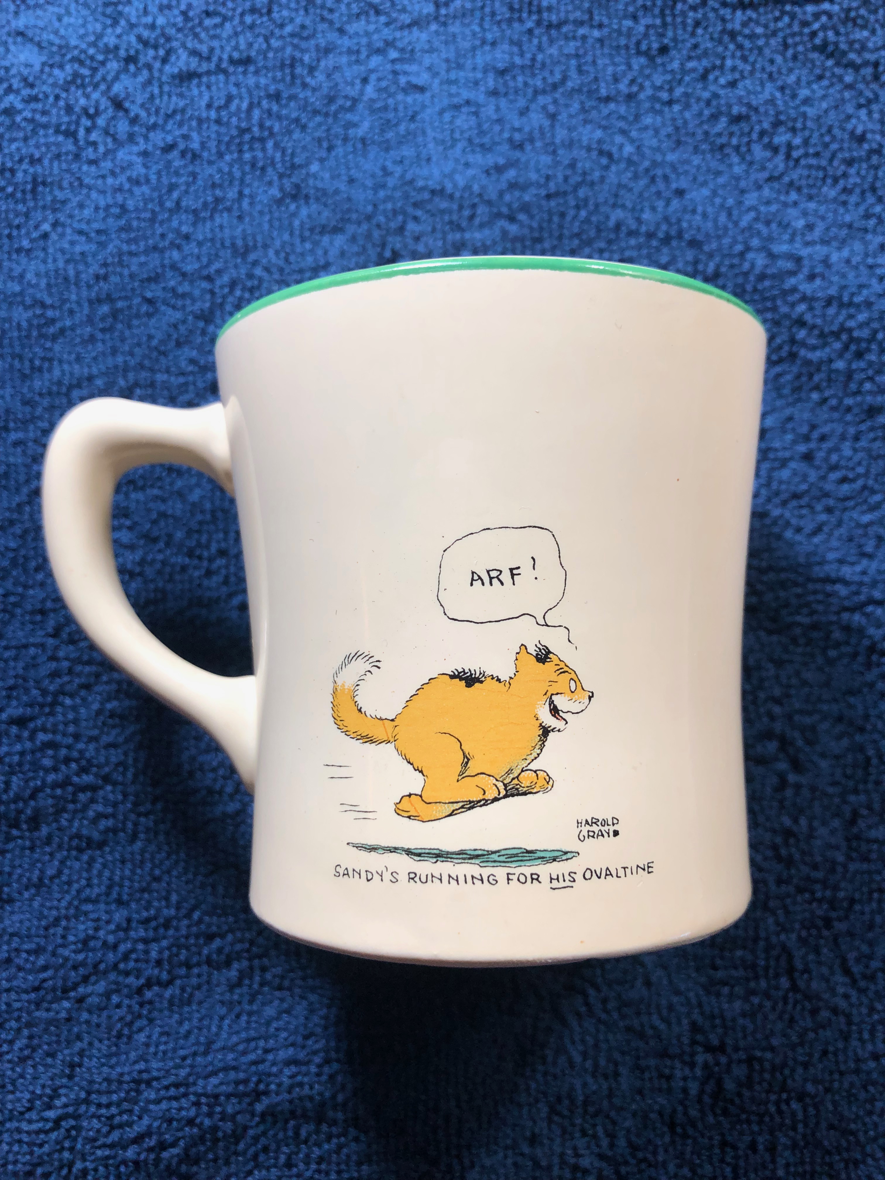
This mug surprised me by being somewhat child-sized, not tiny, but as an adult more appropriate for expresso than your morning cup of joe, which means I will not be using it for that end. I dearly love the image of Sandy on the back. I deeply regret that I have never found a Sandy toy that seems to entirely capture his mercurial charm. I continue to search. I am very enamored of the one I wrote about in my post Sandy Finds a Home which can be read here, but cuddly he is not. I would like to find a nice mohair version, something you can imagine a child taking to bed at night.
Sandy, Pams-Pictorama.com collection
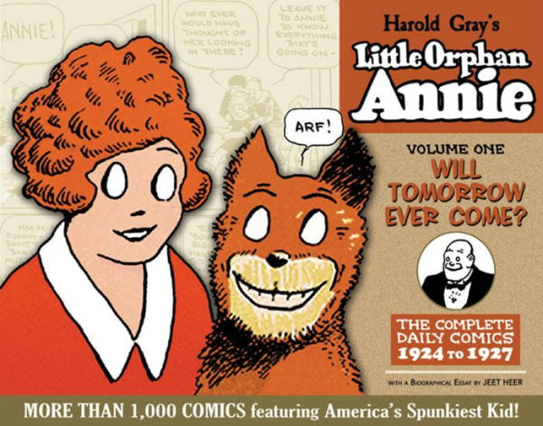
Little Orphan Annie is enjoying a prolonged vogue in our home. Kim is reading his way through the series, via the IDW volumes for the most part, and is currently enjoying and very involved in 1935. I read one of the volumes several years ago and intend to get back to it now that they are all in the house or will be. For now he recounts highlights and occasionally points out whole strips for my delectation. Weekend mornings are his primary comic strip reading time – while I work on these posts as a matter of fact.
The siren call of premiums has started to take hold of me however and I think Pictorama readers can anticipate a trend here. The lure of these items, hard won and carefully hoarded for us future generations, is one I cannot seem to resist.
Pam’s Pictorama Post: We at Pictorama and Deitch Studio interrupt this blog for an advertisement – and a Kim Deitch beaut no less, always a cause for celebration. I unveil for you my new Pictorama business card, appropriately drawn and penned by Mr. Deitch himself.
Yesterday I went looking for an early post and was reminded that the blog is now more than four years old, and with little exception, has published a minimum of two posts a week, Saturday and Sunday, every week since August 2014. Today’s post is number 499! Therefore, and considering we are on the cusp of Halloween (a black cat favorite holiday here at Pictorama) it seems like an auspicious time to post this.
Truthfully, I never did find what I was looking for yesterday, but was charmed anew by many of the photos and toys. As Kim once said, if he saw the stuff in his storage unit, he’d buy it all over again – I feel the same about my photos and the blog was originally conceived as a way of organizing them and easily sharing them. (I surpassed our ability to display the photos in our tiny apartment long ago, although the toys are generally on view and enjoyed daily.) Clearly I haven’t done so well on the organizing aspect or I would have found the post I was looking for – but I have had a lot more fun with the writing aspect of this than I originally considered.
Over time I have found myself talking about Pictorama to folks and decided that what I needed was a business card so they could find their way here more easily – although I do appear to be the only Pam’s Pictorama when Googled. However, increasing our readership is a part of our mandate – spreading entertaining early photos of cats, jolly antique toys and tales to as many folks as possible.
So I put in my request for a card with Mr. Deitch back in the spring, realizing that it would have to wait until after Reincarnation Stories, the new book, was completed and scanned. (No preferential treatment for the staff or wives here please know. We wait our turn.) As it happened, my card was deferred until after a Twink album cover – and even awaited a new story for the next book made its way into roughs before it was complete. I share it first with you, dear readers, today. And it was well worth waiting for – a big, jolly Halloween kitty, dancing kitties and Waldo behind the camera! Kitty is based on one of my earliest toy acquisitions of a stuffed Halloween cat, one that I found a purchased a matching partner to shortly after. I immortalized them in a Halloween post back in 2015 called Two of a Kind which can be found here. The card captures the spirit of Pictorama perfectly.
This week I will find my way to a printer and hopefully the next time you meet me in person I will be able to share one of these splendid cards with you. It is my plan to venture into the world well supplied with them henceforth.
Pam’s Pictorama Photo Post: Sometimes I believe I manage to score certain postcards because they are hard to actually see on eBay. Then I realize, alas, that maybe I am the only person who actually thinks this is incredibly cool! Nonetheless, for that handful of you who share my aesthetic ecstasy over smiling black cat advertising, I present this gem today. I have announced my deep affection for the fine advertisings of Black Cat Hosiery in a prior recent post, Time Out for Our Sponsor, and also Black Cat Town. Pictorama readers know that this company adopted the grinning black kitty as their visual moniker.
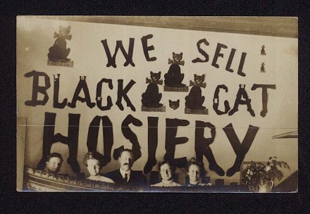
In today’s card, they seem to be executing an advertising campaign which was the early 20th century version of stadium advertising – although this would be in some sort of theater. My guess is a vaudeville theater and these folks seem to be peering over a box seat balcony or loge of sorts. Oddly, a sad looking vase of flowers is perched in the lower right. It is a hoot that the words of this sign appear to be made up of actual socks and hose – if you look carefully tags punctuate the letters. They have pasted up a bunch of their great black cat signage of various sizes – it is very homemade, if charming, indeed. Lastly, I do wonder – a theater where they were selling socks and hose somewhere? Were they supplying the can-can dancers with their run resistant stockings in early product placement?
In a neat script on the back a little ditty carefully penned reads as follows: This picture isn’t very good/But “By the By,” perchance I should/In justice to the artist add/The subject to were pretty bad. There’s evidence that it spent time in a photo album, but was never mailed. I am not sure why, but I feel like it was written by the man in the middle of the group. I put on my photographer’s hat for a moment, and also opine that in all fairness the light had to have been quite low, inside a theater, for taking a photo with the equipment of the day. (A tip ‘o the hat to Kim for darkening this before I presented it.) Therefore, this jolly group should probably be pleased with the results they managed to achieve. For my part, I am of course, quite glad that the photographer did not sacrifice any of this splendid sign in his or her attempt to record the night out enjoyed by these folks.
By way of enticement and illustration, I offer a full color photo of my small Black Cat Hosiery advertising, featured in Time Out for Our Sponsor as mentioned above.
Featured in Pams-Pictorama.com post, Time Out From Our Sponsor.
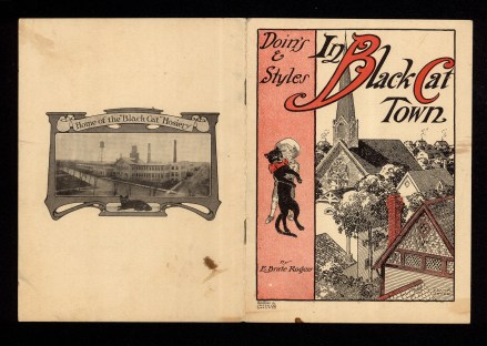
Pam’s Pictorama Post: You can imagine my happiness at finding this little gem, while searching for tax documents, tucked away in our flat files a few weeks ago, Doin’s and Styles In Black Cat Town. Have to love that! I remember buying it (I believe I paid up for this one), but a long time ago. While it isn’t terribly fragile, it is hard to display and so I tucked it away until now. I have given you select highlights above, not the entire booklet. While the ribald and wonderful early Black Cat Hosiery advertising items are extant and sought after today, much to my surprise it was not so easy to find a history or timeline of the company online.
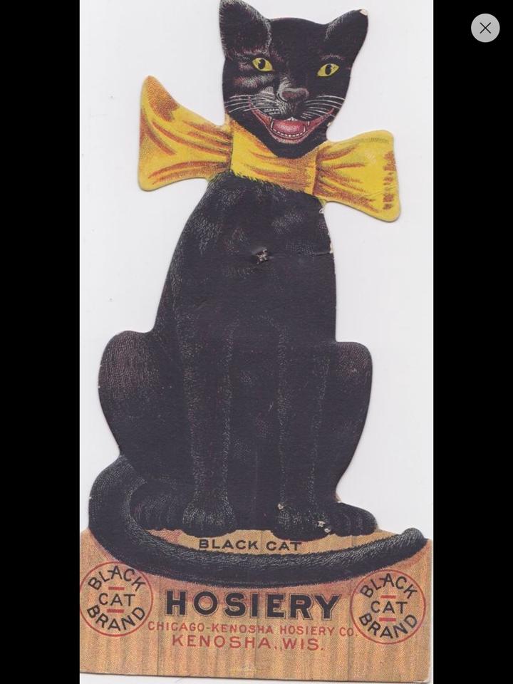
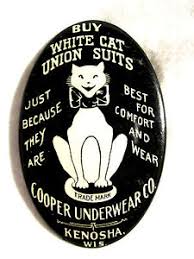
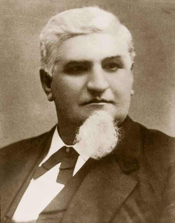
What follows is what I have pieced together. However we here at Pictorama are prepared to stand corrected by the more knowledgable of you out there in Readership Land. It appears that the Black Cat Hosiery Company of Chicago-Kenosha, Wisconsin was founded in the 1897 by Samuel T. Cooper. (He’s interesting enough in appearance that I have snatched up and included his photo below as well.) Its black cat icon became an immediate favorite. (See my version of the stand alone cat advertising at bottom – this item was previously featured in the post found here – Time Out for Our Sponsor.) It was beloved and exploited to maximum effect, such as this 1906 booklet. I believe the use of it, to a greater or lesser degree, continued at least into the 1920’s, although I could not find any confirmation of that. In addition, if I understand correctly, this company started manufacturing underwear (union suits) in 1901 under the name White Cat. Their white kitty mascot never caught on or became as fleshed out as the toothy and wonderful black kitty fellow. I show White Kitty and Mr. Cooper below. Ultimately, the company eventually evolves into Jockey underwear of today.
White Cat Union Suit advertising, not in Pictorama collection
Samuel T. Cooper
Our amazing little booklet has credits for both author, E. Brate Rogers, and artist, Frank Swick. A search on Mr. Rogers turns up a fairly entertaining letter he wrote to a trade journal called The Inland Printer in 1902, where he complains about copywriting correspondence courses – how these rogues cannot even put together a sentence and want to charge $30 to teach people how to copy write. As per this letter, Mr. Rogers outlines how he was well experienced writing about socks, hose and other mercantile endeavors, and therefore was already vastly experienced when he penned the verses for this booklet in 1906. Meanwhile, Swick seems to have been a popular illustrator of the day churning out work for magazines like Collier’s, posters, prints and advertising work such as this. I don’t know if he is responsible for the iconic smiling Black Cat or/and the more straightforward White Cat, but he does not stint on his illustrations and goes to town here, as does Mr. Rogers. This booklet was designed to go straight to the consumer and the back pages assure, If your dealer does not handle ‘Black Cat’ Hosiery, note the styles and following prices, and send to us with price, stating style and sizes desired, and we will forward them free of charge. (An early free shipping campaign.)
The entire booklet is written in verse and closes with, Mothers dear, just lend an ear – Stockings, none to mend! Black Cat Brand the games withstand, When children tear and rend. Peep! Peep! Fast asleep: Stockings right in sight: ‘Bless my soul! Not a hole!’ Ho-o, um!…good folks…Good night! I especially love the back cover, shown at top, with a photo of the factory (too small to see if it is decorated with black cats – I assume it must be!) and best of all, this photo of one of Blackie’s ancestors, curled up in front!
Black Cat Hosiery Display card, Pams-Pictorama.com