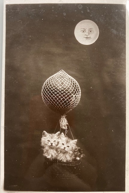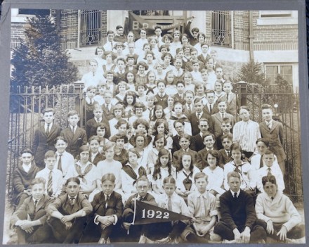
Pam’s Pictorama Post: This item came my way via a rather splendid if small used bookstore in San Diego called Blustocking Books. I was just about to check out when this photo caught my eye. I added it to the purchase pile having given it only a passing look.
Since my discovery of a clutch of yard long photos I am keeping a collector’s weather eye out for group photos like this and especially from the early decades of the 20th Century. I have a theoretical parameter of beach related or New Jersey related images, however rules are made to be broken, right? However, when I went to look for B.C. Gregory elementary school you can imagine my surprise that the first and most persistent results are for my mother’s hometown here in New Jersey, Long Branch. I can’t help but wonder if I went all the way to California to find a photograph of a local Jersey grade school. perhaps even one that my mother went to, although this one well before her grade school days.
The landscape gives us no definitive clues, the long fir tree and scant foliage could belong to either coast. The children’s clothes provide no indication either.
Youngest children in front and the oldest in the back looking a bit older than the sort of eighth grade or so that elementary schools generally age out at. While not in uniform, the have clearly been requested to dress within some guidelines with their white shirts, mostly dark ties on the fellows, a smattering of suits. The girls are largely in white blouses, but right in the center are two girls in plaid dresses, on atop of the other.
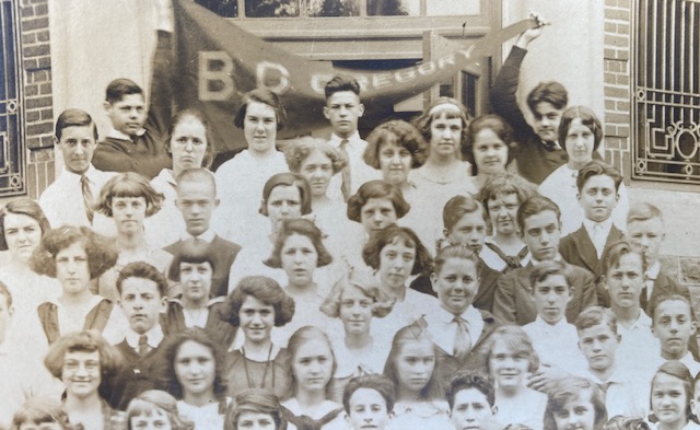
As is always the case and especially with a longer exposure in the day, there are a few blurred heads of those who could not sit still. The banner with the year is front and center by some of our youngest participants and the school name is on a banner at the back held up two young gentleman who do not look like they enjoy their assignment.
While we are all familiar with school photos of this kind it is interesting that this was such a small school – the entire elementary school is shown here and in my day would have maybe been a single grade. I am wondering if in this very house I have some of my dutiful class photos. I know I have several years of grammar school somewhere. (Those did not turn up before posting sadly, another day to see me in my grade school days.)
Perhaps it is the longish exposure (or just school!), but this is not a group where many are attempting to smile. The third row from the front is the most smiling I see. It has that charmed moment in time quality. Those in front anticipating moving up the steps further each year, those at the top ready to move on to high school and beyond.