All Wet

Pam’s Pictorama Post: This March Sunday, a much yearned for spring thaw let alone summer, seems quite far away still. This Manhattan morning can’t quite make up its mind if it is going to be gray all day or not, but the temperatures will hover in the low forties – not unreasonable for March but we can’t help but yearn for the halcyon promise of summer. So for my part it seems that the least I can do is immerse us in a swimming cat card today.

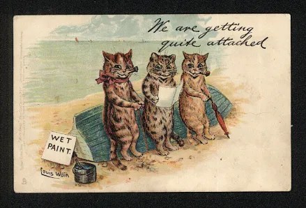
It appears to me that in the early days of the 20th century, the Tuck company put all their eggs in the cat card basket it would seem – and emerged victorious. Churning out first Louis Wain cards, then these Boulanger ones and eventually making their way to Felix ones a few years later. (Examples from prior posts and a bit about Tuck can be found in posts here and one of the Felix Christmas cards here.) Clearly cats helped build the Tuck empire. By the time Felix rolled around they were card publishers to the King and Queen and I can’t help but wonder if that means that maybe George V was mailing Felix holiday cards?

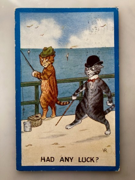
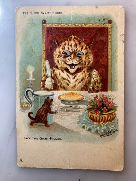
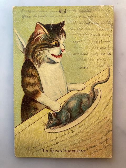
This card is credited to Maurice Boulanger – the not-quite-Wain – whose cat antics are of a slightly less sardonic variety than those by Mr. Wain. (Albeit he is usually less pointedly ironic, this card as below which I posted about recently where Mr. Cat is preparing a rat feast!)

Pams-Pictorama.com Collection. A post a few weeks ago.

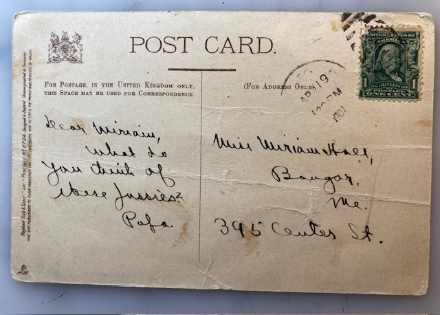
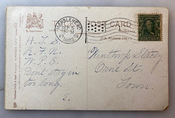
Today’s card is from the earlier days of Raphael Tuck, before royal recognition it would seem. It was sent in 1908 with a sloppy postmark (marring the front a bit) on September 5 from Marblehead, Massachusetts – a lovely beachy place. (I have visited a childhood friend there and it is a wonderful seaside area not far from Boston.) This card was mailed to Winthrop Stacey and then simply Orne St. Town. On the message side it says simply, H.T.S. R.F.N. W.P.S. Don’t stay in too long. E.

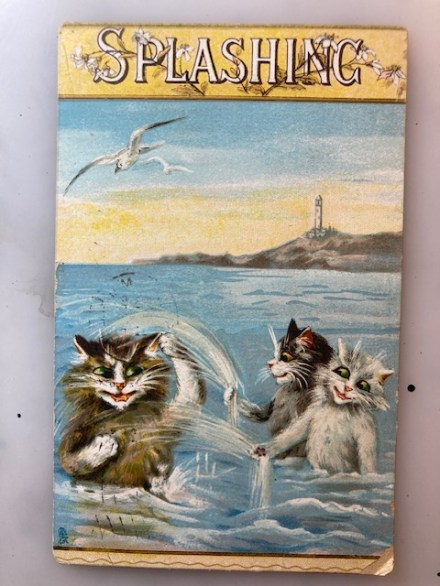
This is sort of a pitch perfect message to go with this image of happily splashing cats, adult and two kits. (Splashing is printed at the top with lovely little flowering plants winding through it and a nice decorative frame top and bottom.)

The execution of the splashing cracks me up, a bit primitive but gets the idea across. The kittens are splashing dad (or is it mom?) and little white caps indicate some movement in the water. Two seagulls wheel in the sky above them unnoticed. Their catness does not extend to that at the moment – they pay them no mind. And of course traditionally cats eschew water so in that regard these are anthropomorphic kits too.

View coming into the Sandy Hook Bay recently on the ferry.

A lighthouse is perched on land in the distance – it reminds me of the Sandy Hook bay where I land when I take the ferry to New Jersey. (And really quite near where I myself learned to swim as a tiny tot.) As mentioned above, an errant postmark registration lightly mars the front of this image over the grown up cat on the left but doesn’t take away from the overall card. The yellow in the sky indicates either sunrise or sunset – I vote for the latter – and of course picks up at the top of the card.

Summer will arrive here as suddenly as winter did I suspect. The Farmer’s Almanac says that it will be a hot spring season and while I am not a fan of heat and humidity I look very much forward to evenings on our deck under twinkle lights and the hummingbirds and bees feasting on the dahlias and strawberry plants. Here’s for contemplating summer days!

Easter Greetings, 1908

Pam’s Pictorama Photo Post: As we head toward the Easter season, this is one of a few seasonally appropriate items I have. The odd image doesn’t necessarily scream Easter, but there it is at the bottom of the card, Easter Greetings 1908 and the photographer’s name front and center although barely legible, G. Butney. It also says, Novato.

It would seem that Mr. Butney was a well-known (in the day) photographer in the early days of the 20th century, evidently headquartered in Novato, California. In July 1908, presumably several months after this card was created, he took a series of photos of a train wreck in Novato and turned them into photo postcards which he became best known for. (If, like me, you aren’t familiar with Novato, it is north of San Francisco.) It seems somewhat odd that photo postcards of a train wreck would be so popular.

For all of his sort of ten minutes of fame with this series of photos, there isn’t much left about Mr. Butney – no biography available, nor is his first name even evident.

Wreck on N.W.P. at Novato July 3 ’08. From the train wreck series that brought G. Butney brief local fame. Image via University of California.

It is a bit hard to see the connection between the train wreck photo and mine, but there you are. I assume mine was made as some sort of advertisement for his services and distributed earlier that same year. As an advertisement the difficulty reading his name at the bottom probably did not work in his favor – however, this very clever and eye-catching photo probably did. There is nothing on the back and it was never sent.

On close examination, it appears that each of these children really did pose with their head poking through this large homemade flower sort of collar. At first I thought it was photos collaged into the flowers, but I think not. It would appear that each flower is a separate photo or more likely negative, printed together into this image. It is quite a funny design and had to be more than a little work to execute. A careful examination shows some slight differences in exposure and printing – further contributing to my idea that they were each shot and printed individually.

There is an array of boys and girls, some smiling, others not – especially among the boys, although really, frowning might be evenly distributed. There is a range of age as well from toddler to a woman just to the right of Novato who appears to be an adult – his wife I wonder? Did he have a studio where he collected these over time as he took photos (Oh and just one more thing before you and Junior go…) or was there just a day or two of madness when he had a pile of kids come in? There are 26 (I think) separate images.

My other Easter treats are a bit less unique however I thought I’d share this one today, a tribute to the Ides of March and the spring season to come.

Kitten Card

Pam’s Pictorama Photo Post: Today I have plucked this hand-colored card out of the pile. It was used as a birthday card and it certainly is cheerful enough to make a good one. Kitten pictures are like dopamine hits and during stressful times if I can, I find watching videos of them or looking at pictures of them very soothing. Given the feline nature of Pictorama this is probably not surprising.

Meanwhile, I have seven cats, no shortage here, and yet looking at more cats still appeals to me, although I do recognize that I do not need to acquire any at the moment. (I’m not sure I documented the sudden acquisition of five cats when my mother died, although longstanding readers probably figured it out. For new readers, that is how I went from always having two to having seven more or less overnight. It’s a lot of cats.) All that to say I am cheerfully contributing to your dopamine acquisition online today, a bit of cat fluff to cheer your weekend, (another) rainy one if you are in Manhattan. (Not to mention to help get with the time change – that certainly snuck up on me.)

This young woman might be from the early 1920’s to as late as the 1930’s when we take her clothes and hair (careful marcel wave) into account. She holds two very likely little suspects, a tabby (always a good look on those) with his small paws wrapped around her arm, and fluffy white one with spots, the true color of which is hard to peg.

The kittens are small enough to be easily subdued by the young woman holding them. Her dress has a wild print and has been painted in this interesting orange, red stripe running down the front and a sort of Keith Haring-esque pattern. She sports a bracelet which appears to be silver and has a charm hanging off of it. Her ruffled cuffs and collar have been left a bright white. There are some sort of illegible decorations down the front of her dress and artificial looking ropes of flowers are color sketched in behind her. If she wasn’t such a pretty woman, she would recede behind all this visual noise, however she holds her own.

Inked on the back in neat script is says, Dear Kathie, Wishing you many happy returns of the day. From Lily & John. However, there is no postmark, it must have been handed to her or on gift perhaps.

Given my affection for such antique missives, it probably isn’t surprising that I am still a sender of cards. Although the circle is smaller than it used to be, physical cards still go out for birthdays and for some, Valentines, Easter and for a large group (as you have seen) Christmas. Are the best of my cards being saved to turn up in the future? It’s hard to say, but I believe the folks I send them to seem to appreciate the physical reminder that I am thinking of them and have chosen a card for them. (And who doesn’t love a bit of unexpected mail that isn’t a bill?) However, it is undeniably an anachronism, albeit one I hold dear. So this is a cat card for all of you today – I will say that personally I needed a cat pic today and this one has done just fine.

Any Luck?

Pam’s Pictorama Post: It’s a Wain wannabe card again today. While Mainzer has the most Pictorama posts (one of those can be read here) dedicated to his pursuit of the Louis Wain feline illustrator fame, today’s card is a very fair competitor in this race.

This card reminds me of where I used to go running along the river here in Manhattan and where often in the warmer seasons there would be folks fishing – some looking quite business like about it and others more at their leisure. Although I haven’t done a lot of it myself, I grew up around fishing and long-time Pictorama readers might remember that my maternal grandfather repaired outboard motors and made lead sinkers – weights for bottom fishing. There was a time when I would clean fresh caught fish in the backyard – making me very popular with the cats – and although I guess muscle memory would take over I have no desire to gut fish these days.

It’s a sunny day in the cat neighborhood here and our protagonists are an orange striped fellow wearing a sporty sort of huntsman’s hat and City kitty, tricked out in a bowler, bowtie and carrying walking stick. Fishing cat has a tin of bait and a straw bag to hold his catch; his line is bobbing in the water and the look he gives the other kitty distinctly lacks welcome – annoyed that his fishing is being interrupted.

Tiny boats are way off in the distance on the water, including way that appears to be steaming along at the very tip of the horizon. Gulls have been sketched in, wheeling above in a sky with puffy clouds and there is some pretense at water current. A cheerful blue border puts the finishing touch on this as a summery scene.

Meanwhile, our town puss has a genial look with his white collar and paws that could almost pass for white cuffs too. He is clearly the one inquiring, Had any luck? His hat is set straight on his head (no wise guy this one) and I like the way he fills the space – it is a dynamic composition even if a bit awkward. His stick points one way and the fishing pole another. It might be fair to say that neither of these cats is very firmly installed on the ground below him – they both float a bit in space despite a light shadow cast by each.

The image is signed VR and a quick search turns up Cornelis Van Vredenburgh as a Dutch cat card artist with that signature. Clearly riding the wave of Wain and active during part of the same early 20th century period Van Vredenburgh has a less ironic and sometimes sweeter attitude. Nor does he find his way into the psychedelic realm of Wain’s latter period. I show a Wain beach scene from my collection for comparison. (The post can be read here.)

Pam-Pictorama.com Collection from a 2018 post.

Evidently cat cards were a sideline for VR who signed his full name to his Impressionist landscape oil paintings (example below) for which he is perhaps better known although these cards are sought after today as well.

Landscape by Cornelis Van Vredenburgh – found online. It is possible to buy prints of some of his non-feline work.

This card was mailed from Luzern, Switzerland in 1913, not sure how to read the month and the day. In a light blue ink it reads, Luzern, Aug 1 I leave for Mayence then a boat ride down the River Rine, EGA and mailed to Master Jamie Thayer, Farmington, New Hampshire, USA. In pencil and likely a more contemporary note, it says in caps, VIOLET ROBERTS. The publisher is The Photochrom Co., L1D, London, Tunbridge Wells and it is the Celesque Series. Photochrom was a significant publisher of postcards (they started with Christmas cards) which were characterized but a tri-color Swiss photochrom process.

Verso of card.

It is snowing – yet again – as I close this post. Luckily I think today we will get away without any real accumulation. However, not a wonder as this snowing winter makes its way into March that I needed to pull a sunny summer’s day card out of the pile this morning.

In the Mood for Love?

Pam’s Pictorama Photo Post: I have a Pre-Valentine’s Day post today to get us all in the high mystic mood for next week – when I will have a super great Deitch Valentine reveal this year. I don’t think I am spoiling the surprise when I say it is the height of hotsy totsy this year.

I admit to having accidentally left Kim to open his Valentine’s Day gift which arrived early last week! It was an early hardcover edition of a book called Lefty of the Big League by Burt L. Standish of the Merriwell book fame. I saw it in a Flat Lay Friday group photo of objects for sale on Instagram and grabbed it up on a whim for Valentine’s Day. Kim is a Merriwell fan and miraculously it seems he has not read this other book by Standish. I was performing well until I handed him the package to open! Alas, timing is everything but the love and the thought were there nonetheless.

Not Kim’s copy but this edition.

Meanwhile, today’s card, purchased back in the fall, is wonderful and wild. This woman is a “spider” who has cast her love net and scored this man who is now quite literally her puppet! He looks to be a well-heeled sort of the day, a watch chain stretching across pronounced ample girth, top hat, glasses rather than monocle although they sit atop his head in a jaunty fashion. He wears a print waistcoat, bow tie and jacket with some sort of other print on his fat legs ending in tiny, shiny shoes.

This fellow is smiling and I might point out that he also has a bottle of champagne in one hand and a full glass in the other – if the strings that bind him are obvious, may I say he does not appear to mind in the least.

The hand-colored beauty who is the woman-in-charge sports a green top, trimmed in red hearts (!) and stripes that really make this card for me. (Can I just say, oh to find such an item at a vintage sale and snatch it up!) A slight blush is added to her cheeks, skin and her curly hair which is highlighted brown – all adding to her winsome appeal and, shall we say, allure.

Our manipulating maiden emerges from this spider’s web (tiny tear to her left so maybe it isn’t the first rodeo for this photo set) with fat cloth hearts pinned on in a circle around her. Aside from the green label of his champagne bottle (borrowed from her shirt) and a bit in the top of his champagne glass, our puppet man is left in black and white, aforementioned strings top and bottom quite visible.

I can only really confirm that this card was sent in 1907 – there are three cancellations, two overlapping and European and I cannot verify the month or day although it might be August. This card (which the internet attributes to being Russian maker – again the cancellations make it a bit hard to see) was sent to a Mademoiselle L. Guilloim… on the Avenue de la Gare, Vielsalm, Luxembourg.

Thanks to several readers I now know I can put the image of the note into Google and get a (very) rough translation:

It is a pleasure, my dear,
for the good wishes you sent me. Like a verse, I thank you for it, and I think of it often. For short nights, I will be accused afterwards. I slept very well, a big thank you that the present during your trip? Please reply. Best regards to all your team
.

Maria

Sort of interesting to chose such an extraordinary card with no mention of the image, but it seems Maria had other things on her mind.

Whoever Mademoiselle G. was, I am very glad she saw fit to keep this card in fairly pristine condition for me to share with you today and wishing you a romantic week leading up to next Saturday.

Dear Louise

Pam’s Pictorama Post: Here at Pictorama we’re in lucky black cat territory today. When I reflect on the difference between the British who honor their black cats with being lucky and our own culture’s tendency to assign them bad luck, I think I may have been born on the wrong side of that big pond. This is an English published postcard, never used postally so hard to get a date on it. The image is a fairly common one and I would say this postcard could be from any time from the ‘teens to the forties.

Although the phrase on the card, I will meet you in the evening dear Louise, seems to bounce around (I found it on at least one other, albeit mundane, postcard) I cannot find the precise origin of it. However, one can imagine this sharp looking little fella being a popular image on a postcard. Red bow, tongue out, looking over to the side with huge eyes, he is perched atop a brick wall, rooftops and pipes in the distance with a huge yellow moon rising from the mist. I can see it being just the right cheeky card to send to your loved one for an assignation of sorts.

I have written about the roots of British black cat good fortune before. On the maritime side, they believed that a black cat on board a boat was good luck (perhaps not for the cat although maybe a mousie and rat filled paradise of sorts), and my favorite tradition of giving a bride a black cat on her wedding day – what a very nice wedding gift that would be!

Blackie on the bed in NYC in a recent photo.

As mom to two black cats, Blackie and Beau, I often profess to their particular good nature. I remember that my mother wanted to adopt Beau especially because he was an all black cat and I gather they are less likely to be adopted. There seems to be some truth in that but meanwhile certainly she found herself the most devoted little friend ever. Beauregard would sit on her lap happily for hours if allowed and there is not enough petting in all the world for that cat. He is a great companion.

Beau possessively on my lap one morning in NJ recently.

When his weight became too much for her as she grew more frail, he shifted first to next to her and eventually to the chair next to her where he kept persistent watch over her – really of his own accord and understanding. He did not need to be reminded after he first realized it. At times it would be my job to move him to another room – doctor coming etc. and at first it was difficult. As experienced as I am with cats he wasn’t used to being picked up and carried and he is, frankly, an enormous cat. He allowed it and over time he accepted me as one of his spare humans while mom was the unquestionable primary.

With mom gone more than two years now I am the closest thing to her and when I spend time in NJ he claims as much lap time as he can get. His preference is still sitting in my mom’s recliner chair, and I like to think my way of petting, learned at her knee, is somewhat reminiscent of hers.

Milty, who is actually a small cat, looking like an evil genius in a recent photo.

At times I have felt bad about not trying to bring Beau to New York with us, but he rules the house and the other cats in New Jersey, and I am not convinced that displacing him would make him happier. It was my mother’s wish that they would all continue to live in the house and I promised to at least try and it has worked for the past few years. Beau, Gus and the two girls (Stormy and Peaches) are quite young cats, only Milty is a senior citizen (of slightly indeterminate age – late teens, early 20’s) and he is quite tenacious. Therefore, the Jersey Five remain intact at the house there.

Yum! Un Repas Succulent

Pam’s Pictorama Post: Today’s card is a favorite that has been in my pile clamoring for attention. This by the artist Maurice Boulanger who was one of the heirs apparent to the Louis Wain throne. (I wrote about another one in my collection recently and that post can be found here.) Here we have not the chef kitty, but instead a bibbed-up consumer cat served up this very large rodent, albeit unadorned by trimmings, on a platter. Mr. Rodent hardly looks deceased, but we will assume he is. Kitty is toothy and anxious to dive right in it seems.

Boulanger cats have a Wain-esque tendency toward an anthropomorphic wackiness, but they seem to not to be as sly and are less of a commentary on human nature, more feline in a way. This grinning fellow clearly has a ferocious appetite and can’t wait to dive into munching on this rat on display atop this dish, from whiskers to the tip of the tail. He stands on two feet and wears a bib (which probably covers a white bib of tabby design fur no less) but only his paws are in evidence – we imagine just teeth and claws in play. No human utensils for him. Below this dish at the bottom it declares, Un Repas SucculentA Delicious Meal. Or in my mind the more descriptive, a succulent repast!

Obviously, this is a French postcard for all intents and purposes as I believe that the writing across the front and the back is in French – although the postcard actually appears to have Eastern European produced. (If anyone wants to take a stab at translating the message I would love to have a sense of what is written here.) And as is often the case, the neat scribble on the front adds to the decorative element. It was mailed to an address in Paris in March of 1906, but I can’t read much else from the cancellation. Again, the small, neat writing on the back escapes my rudimentary translation skills.

Reverse side of card – can anyone out there read and translate this?

For those of you in the same neck of the woods as us at Deitch Studio, you know that at the time of writing this it is the end of another frigid week of weather in New York City. Although I can think of several equally impressive snowstorms, I cannot remember one where it stayed so cold that that snow just didn’t go anywhere and here we reside a week later in piles that are still knee high, garbage piling up even higher where trucks cannot get it. (Speaking of rats!) The City makes attempts to dispose of the snow manually while Mother Nature continues to deliver a bit more here and there.

Clearly, we will have one of those spring thaws where things long buried will emerge on the streets. The temperature in the early morning and the nights hovers in the single digits and dips well below zero with the wind. The (blissful) heat in the apartment runs constantly and despite being 1.5 small rooms I expect the bill to be high. The cost of heating the house in New Jersey, even without us there, is a bit staggering this year. Meanwhile, the heat in my office is oddly mercurial and reduced substantially by an ill-conceived wall of windows so it has been a very chilly week indeed and I hunker down with a mug of hot coffee to write this.

All this to set the stage to talk about the wonders that hot food can manifest in this weather. Recent weeks has seen me doubling down on soups and stews. (I shared a miso based soup recipe recently – you can find the post here.) We don’t eat meat, so pots of bubbling beans and tofu make up the stews along with whatever greens or leftovers in the fridge need cooking up. Each one tends to come out different for that reason – black beans seem to be the winner recently, although the chickpea curries are gaining ground. There is a simply wonderful spicy chili crisp tofu recipe that I retrieved from the New York Times (it can be found here at the time of writing) which has become a bit of a staple.

Last week I had a yen for a brothier soup after lots of thick ones and threw together one I will make again. Roughly it was ginger, garlic, onion, and carrots to start with two containers of vegetable broth, some miso, a small can of diced tomatoes and flat leaf parsley and finished with a package of cheese tortellini added at the end. I let it simmer all afternoon on the stove and really, it was heavenly! This week I am experimenting with a simple potato leek soup a friend makes but boy – last week’s soup will go into a regular rotation.

Soup and stew, hot food in general, the ability to make it, afford it and eat it, is a blessing especially in the cold weather. As I mentioned a few weeks ago, the very act of making it calms and reassures me. Hot meals for the cold week ahead. Lower perhaps in pure protein than this feline repast but will fill us up and keep us going nonetheless.

New Brunswick, NJ

Pam’s Pictorama Post: I grabbed this up as soon as I saw this little collaged beauty. I am not sure that I immediately digested the weirdness of it entirely but being a Jersey girl at heart I thought it was pretty hotsy totsy. Like many recent posts it came from the postcard show last fall and it went into a pile I am only recently digging into.

Born and bred in the Garden State I admit that I may never have so much as driven through New Brunswick. Looking at the map of the state I must have (may have?) as it is nestled in the crook of the state, just above Monmouth County, heading north and a smidge west. This sounds a bit odd but we didn’t drive west all that often growing up. North of course took you to New York but generally we went up the coast. South brought you to Freehold which seemed to be required occasionally; Princeton where my sister went to school, and ultimately Philadelphia on occasion – we had a cousin there. I rarely made it to the bottom corner of the state, probably not until college and after.

For those of you who don’t have the map of the state handy in your head.

The northwest of the state was a rare event. Flemington is up there (I have a friend who moved there recently – hey Hope!), where I can remember going only a few times – it felt exotic. Even our forays into Pennsylvania were usually made by going more south or directly across the state. Years ago I spent some time hiking with a friend along the beautiful Delaware water gap. Christine grew up in that area and knew it well but it was the first time I spent much time there. All this to say that New Brunswick always sat slightly north and west of where I had my formative years and somehow I never much got there or maybe knew if I did. It belongs in a vague category of North Jersey that I would have used when I lived there.

This card is hometown proud indeed. A rendering of a pansy has a collaged-on head and shoulders of a woman in turn-of-the-century finery, wearing a be-ribboned or flower covered hat. She wears the pansy petals like a dress and on each petal is a local building of note shown as actual postcards of significant sites on each petal. They are: Washington public school, Livingstone Avenue High School, St. Peters Parochial School, Carnegie Library, and the Post Office. Clearly they thought highly of their educational institutions.

New Brunswick Carnegie Public Library, in a contemporary but undated photo.

The Carnegie Library, shown above, seems to be the only one that is definitely unaltered. I’m on the fence about the post office, shown below, which could be the same building from another angle and with different things around it obviously. The schools have long been replaced (or in the case of the parochial school possibly disappeared) by newer structures. (My own high school in Rumson still exists intact with its old building but a certain amount of building on has happened. You can still see the bones of it however.)

The Post Office in New Brunswick – I believe it is the one shown in the postcard. The windows are the same.

Someone has written the initials JHB in the lower right, under Greetings from New Brunswick, NJ. On the back, also written in pencil it says Miss Ethel Hardy, 5 John Street, City. However, it was never mailed and it is incomplete. Another version of the card I found online was mailed in 1908 according to a cancellation mark.

The card was published by Hammel Bros., New Brunswick, NJ. It was made (printed) in Austria however. Hammel Brothers, not surprisingly, seemed to special in cards of a local nature in New Brunswick, NJ, although I do wonder how they would have made a business out of that bit of limited fame and for how long. They have not left many tracks and mostly there are references to a brewery of a similar name and time in New Mexico.

As you read this I will be packing up and heading to New Jersey this morning. As per yesterday’s post, there is snow on the ground (more overnight and a fair amount coming down now) and still a bit more throughout the day, hopefully in a desultory sort of way. Anyway, a tip of the hat to my home state and the undiscovered treasure of New Brunswick from a time passed.

Jack and the Giant Kitty

Pam’s Pictorama Post: It seems only fair to launch 2026 with Pictorama’s best foot forward so today I share a tatty but wonderful Louis Wain card to help set the tone.

As always, it is impossible to entirely follow Wain’s train of thought. While we all know Jack and the Beanstalk, what might have possessed him on a given day to make a one off cat version? Hard to say, however I will share that frequently as Kim and I go through the world, he pops with one-off ideas that could be one or two page comic strips but because of the nature of his work (long, complex stories) he will likely never use. We might blow them out a bit while we’re walking but know they are unlikely to ever go anywhere. For example I pointed out the other day (we were discussing the idea of a short piece about the orderly way he tends to eat food – I call him a largely linear eater) and he took it down the line a bit of how it could be a comic. That would be if he had a weekly deadline, like back in the days of papers like New York Press, and then he’d be using them all.

Anyway, I imagine Louis Wain, at least at one protracted point in his career, was just grasping at every single idea and utilizing it. Either that or his brain just overflowed with them. Hard to say. (I have happily embraced writing about Louis Wain, his life and work, via a number of items which can be found here, here and most recently here for starters.)

Wain is in his full glory in this card. His humanoid-ish giant cat wields a bread knife with a small potpie in front of him and an oversized mug (stein?) which tiny (rat-sized) sword wielding kitty hides behind. (Would the giant be less dangerous if he had a larger pot pie? Just asking.) The giant has a three-prong fork grasped (awkwardly) in his other fat, white tipped paw. It is a formal table setting and another fork and spoon are in front of his pie. There is a lit candle and, sort of funny, a salt cellar and pepper shaker to his right, our left. A potted plant on a doily is on the other side which is sort of a funny middle-class household look. You can almost imagine Wain added that touch from his own tabletop.

Early Wain post from ’18. Pams-Pictorama.com collection.

The giant and Jack are both brown tabbies – a coloring I am not sure is prevalent in the real world of cats. (Putting Bengals aside as I don’t think they were known at that time.) Giant bully kitty has his ears back (same color as the tapestry design covering the back of his substantial throne-like chair so they blend a bit) in a very real annoyed feline fashion. His fangy toothies show in his whiskered grin, but it is the look of merry mayhem in his eyes that tell the tale! Yep, he sees Jack and he’s thinking a bit of extra protein on the run for today.

Meanwhile, we only see Jack from the back, tiny sword in hand. As noted, he is a slightly darker odd brown version of a similar tabby stripe. He’s sort of portly (hang-y kitty tummy) to be our hero – usually portrayed as a kid or in this case kitten. At the top right it just says, The “Louis Wain” Series. Bottom left says, Jack the Giant Killer and Louis Wain. This card is a bit grimy and found its way to me with some folds – there are indentations (although not holes) which might mean it displayed somewhere – hence the grime but also the survival.

The back sports a somewhat illegible postmark but I can make out April 19 and 1907. This was sent in the United States (most I have seen were sent in Britain) and addressed to Miss Miriam Hall, Bangor, ME 395 Center Street. He writes, Dear Miriam, What do to you think of these Pussies? Papa. I think that’s what it says – Pussies looks more like Jussies though. (However, to go off on a bit of a sidebar – have any of you seen the articles about how the post office is no longer saying that mail will be postmarked on the day it is picked up? It is now going to sorting centers where it will be postmarked before distribution, hence days later. So much for a world where there were AM and PM postmarks!)

Back of card.

Despite the card having been mailed in the United States, it was printed in Great Britain by the ever popular Raphael Tuck & Sons company of Wain fame. The card, it is noted, was designed in Britain and chromographed in Germany. It also bears the indicia that Tuck was the fine art publisher to their majesties the King and Queen, and to TRH the Prince and Princess of Wales.

This jolly card joins a growing subset of Wain cards in my collection. Whatever else that can be said about Mr. Wain, more than 100 years later, he always puts a smile on my face.

Carrots for the New Year?

Pam’s Pictorama Post: This odd little postcard was among the ones I picked up at the big sale earlier in the fall. I don’t know why but in my mind I identified these as turnips but they do indeed seem to be carrots.

In a house full of cats (quite literally at the moment) I am here to say I rarely find one playing with a carrot or two, but here are these two kittens, be-ribboned, showing real interest in two. A while ago there was an online meme of cats being afraid of bananas (incidentally, the New York cats do not seem to be performing to type on that) and the internet tells me it is both the smell and because they recognize the shape as a snake and instinct kicks in. I have always doubted that the New York duo have much in the way of survival instinct and perhaps this goes to prove it. I gather it applies to cucumbers too and I could test the Jersey Five – I suspect Peaches will attack it with vigor. Her instincts seem perfectly intact.

Meanwhile, the internet is a bit vague on the point of carrots as a symbol of the New Year (turnips actually fare a bit better) on that score. In other cultures (Jewish New Year, Chinese) carrots seem to be a symbol but not really for January 1. However, this was indeed mailed on December 31, 1906 so no question of the intention there. There are allusions to slices of carrots looking like coins and bringing good fortune. l assume these tabby kittens know something we do not. It’s a bit hard to understand what the creator of the card was thinking – let’s do kittens and carrots he said to himself.

The kits have a carrot each, large and small, as well as bows and bells. The one seems to be tackling the large one. The other one, more timid, just looks on. Below them A Happy New Year. The company that produced the card appears to be J.P. Belle, just identified as Belle in the lower right corner here. Founded in Paddington in 1881 it produced cards until 1939. The official name of the company was J.P. Beagles.

This postcard was addressed to: Madam Donshea, 22 East 21st St. New York City. It was mailed from Jersey City at 3:30 on December 31, just under the wire I would say.

It has me contemplating what I might cook up today and I have promised a friend this recipe so I thought I would share it with you as well. It is a good vegetarian base I use as a jumping off point for all kinds of soups to use up whatever is in the house at the moment. I do it by instinct now so I hope I have given complete instructions. Feel free to ask questions! Happy and healthy New Year to you all!

A photo of the soup taken a while back but you get the idea. this version may have had spinach in it.

Miso Soup Recipe:

Ingredients:

  • 1 heaping tablespoon miso paste (dissolve in a small bowl of water
  • 2 carrots, sliced thin
  • 3 cloves of garlic minced
  • 1 tablespoon gingerroot, chopped
  • Salt, pepper, bay (2 leaves), dried basil and oregano to taste. (I like Maresh red pepper which is a mild red pepper, but you can use black pepper.)
  • half a large red onion
  • 2 containers of vegetable stock
  • 1 container extra firm tofu (shrimp could be substituted)
  • Small bowl dried mushrooms (soaked in water – reserve the water for the broth)
  • Green beans (frozen or fresh) trimmed to bite sized
  • Fresh mushrooms, chopped, optional.
  • Half a cup wine or sherry to deglaze
  • 3 chopped scallions
  • Italian flatleaf parsley
  • Frozen dumplings or pantry gnocchi as desired
  • Also optional: sesame oil, rice wine vinegar, mirin and balsamic vinegar. If you want this spicy jalapeno peppers can also be added.

Instructions:

Start the miso softening in water, mushrooms in a separate bowl.
Chop the onion, carrots, green beans, gingerroot and garlic and soften in olive oil. (If you are using shrimp add them after.) Add salt and pepper. Chop the parsley and set aside. Cut the tofu in bite size pieces and put aside.
Deglaze the pan with the wine or sherry. Add the dried mushrooms and liquid and then the broth and then the tofu. Bring to a boil and add the parsley, scallions and tofu.
Season to taste and add the optional seasoning now. Keep at a boil for a few minutes and then simmer and continue to adjust seasoning – I almost always need salt at this stage.
If using dumplings add them at the end, if frozen when the soup is at a boil, but just before serving or they will fall apart.
This essential base is a good vegetarian option for a number of soups – sometimes I add beans instead of tofu, or shrimp. Any number of vegetables can be added, corn is a favorite, diced tomato and sometimes I use creamed corn to thicken the soup as well – but potatoes can be used to thicken it too.