Quite Pleasant

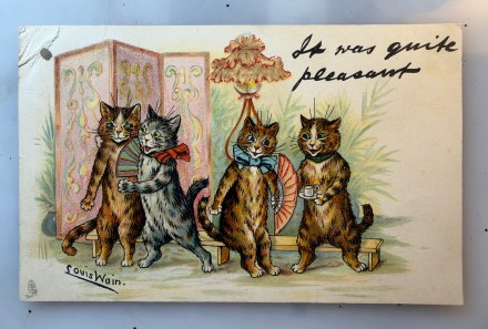
Pam’s Pictorama Post: Today is a Louis Wain card I picked up the other day, a bargain due to the small hole and damage in the upper left corner. I imagine it hung on a wall maybe? Odd spot for just one hole. Nonetheless, it is fine for our enjoyment here at Pictorama.

Regular readers know I have a bit of a fascination with what it would be like to be using and receiving such cards on a daily basis. Maybe after a dinner party or gathering you might receive this one with a note on the back as a thank you. (Don’t even get me started on the dearth of thank you notes written now – I mean I would take them by email but gosh! Saying thank you is a dying art.)

It was quite pleasant is in script at the top, the sort of note Wain seemed to favor on this series of cards. I wonder how he did it – it appears to be his handwriting but somehow, I don’t think it was on the original art for example. (For similar Louis Wain cat cards you can find posts here and here for starters.) Two very different cat couples are enjoying themselves in a gently festive atmosphere. An odd sort of fluffy standing lamp almost looks like a hat on this lady cat, sporting a big blue bow and holding a pink fan in her paw hand.

She and the gent bringing a hot drink are making eye contact. He has more sort of collar on, green. His green eyes match and her blue eyes match her bow. The whiskers and eyebrows of all the cats stand out very straight. All four are brown tabbies, three browns and a gray. The pair smiles at each other and they both have white spots on their chest and tummies as well as sort of a white star in their faces. They are a sweet next-door-neighbor kind of couple.

There is a long bench they are all seated in front of and sort of potted ferns as a background behind them. The other cat couple is where things get a bit more Wain. There is something a bit racier about that gray striped girl with the big red bow slightly askew. Her nose and mouth a bit redder than the others, yellow eyes. She (somehow) holds a fan in a paw we cannot see while Mr. Brown Tabby appears to have an arm around her. She looks like a party girl! Meanwhile, Mr. Brown Tabby has a bit of a leer, like he is having some thoughts that would not bear sharing. His smirk and sideways look at her say it all.

Fair to say a good time, if a somewhat different time, was had by all. One thing I find a bit odd is that the gray girl and boy with the cup and saucer both have oddly short tails – I assume this was a sort of foreshortening but there is something a bit off about it. In addition to the ferns, there is a decorative screen of the type I think might have been popular at the time. There is a sort of screwy abstract design in the pink, yellow and blue found elsewhere in the card.

This card was never sent so we are left to just imagine what parties it might have thanked hosts for in that long ago Victorian time. Louis Wain on the other hand, remains timeless.
Catskill

Pam’s Pictorama Post: It is a crisp fall morning here in New York City and my mind is wandering to trees changing and the particular joys of this season on the east coast. I feel like trees have not really started to change yet in the city although maybe a stroll through Central Park will tell me differently. I remarked in New Jersey a few weekends ago on the absence of any leaf color yet. Having once worked for Central Park I know the variables required for the changing color of leaves is a specific rubric of cold air, snow the prior winter and rain since. Tricky business as to when and how much.

I have always loved the changing color of leaves in the fall (as does Kim who collects particularly interesting specimens on the streets of New York to share with me), but until I went to college I had not given much thought to people who had never lived with it. A friend from the west coast was fascinated by the leaves changing in Connecticut that first year which brought it home to me how special it is. Living in London a few years later I missed it. The leaves change there, but I guess but it didn’t feel the same, maybe living in a city for the first time. However, I made a quick trip to Berlin by happenstance and I remember that the leaves were turning and the yellow fall light was more like home. (It brought my grandparent’s home in Westchester to mind in particular for some reason.)

All this makes me daydream about a day trip upstate – pumpkins and fresh apple cider on tap. I doubt we will do it this year, various responsibilities tie us to Manhattan right now. And I should note that this card actually shows a summer vacation there. Nonetheless, it is bringing an autumn trip to my mind.

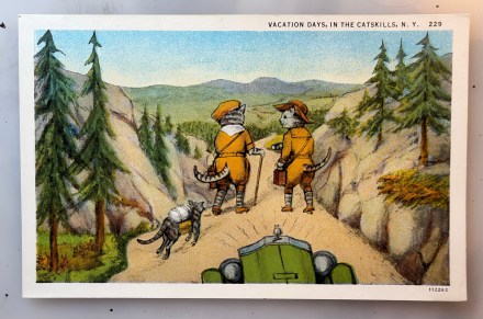
This card was purchased at an earlier iteration of the postcard show – maybe back last year. A vendor there specializes in Catskill cat cards, and I have bought several from her. (A few other Catskill postcard posts can be found here and here.) This one, sporting these two vacationeers in their jaunty outfits, made me laugh. I especially like that their hiking attire allows for tail visibility and maximum mobility – and that their sort of gaiters or hiking socks are perhaps that or more likely just the stripes of their tabby legs. Jaunty caps allow for expressive pointy ear movement as well. One cat gentleman has a walking stick and the other maybe binoculars, it is a bit indistinct. The one with the stick has a kerchief tied around his neck, while the other displays a sort of button down top – both are nice, belted jackets over walking length shorts or gaiters. This is some serious hiking attire for the early part of the 20th century.

Oddest of all though is this little pack cat trailing behind them. Although each of the anthropomorphic cats is carrying a case (which may be strapped across them?), this poor, smaller tabby kit has a pack and perhaps also a case strapped to his back. His paws somehow don’t quite touch the ground (was the artist thinking of horses and all feet off the ground at some point running?) giving him the appearance of floating or maybe hopping along behind them.

The front of a very early car pokes into sight at the bottom, a bright green. It has lines emanating from it which might mean it is a bit overheated – it doesn’t seem like those old round headlights are emitting the rays. Best of all however, there is a tiny mouse perched on the front of the car as hood ornament, a small comical detail.

Our gentleman cat hikers are on a path surrounded by evergreens which appear somewhat dwarfed to fit this scene. More green trees and mountains entice from the distance. At the top of the card it reads, Vacation Days, in the Catskills, N.Y. 229. This card was never mailed and the maker on the back is, C. W. Hughes & Co. Inc., Mechanicville, N.Y. and C. T. American Art Colored. No artist is credited. C.W. Hughes appears to have had a several decade but somewhat unimpressive run from about 1900 into the 1930’s. A local New York company as shown, not much notable is found about them.

I leave you with the October nip in the air and a desire for pumpkins, gourds, apples and the like. I will see how best I might scratch this particular itch before fall descends into the holidays and then winter. For those of you craving more, I share a link from a prior post trip up to Cold Spring a few years ago. It can be found here.

Cat and Mouse

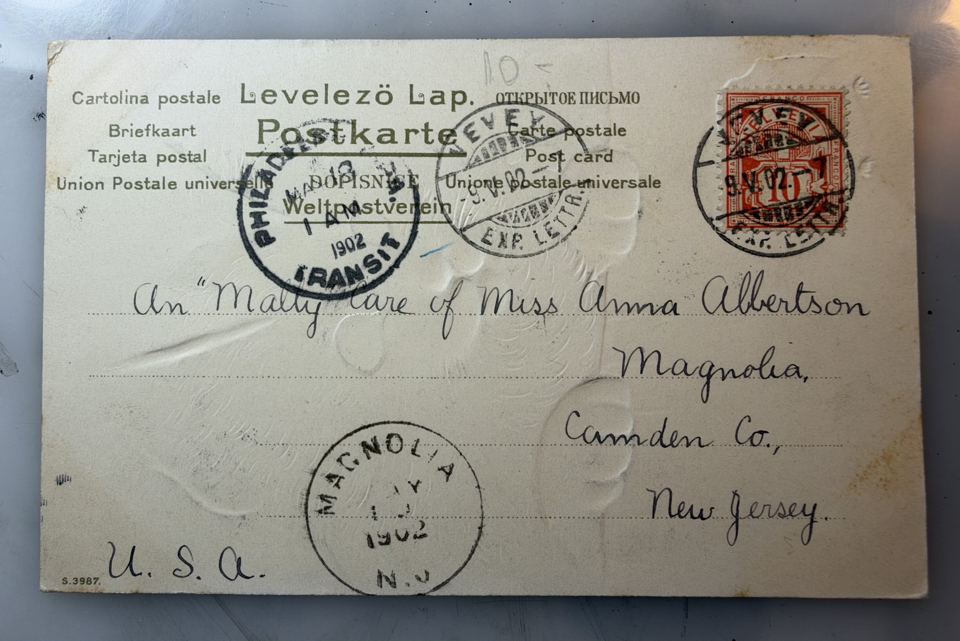
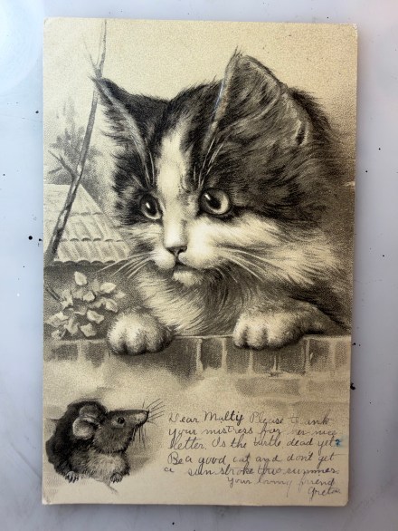
Pam’s Pictorama Post: On the front the sender wrote, Dear Mally, Please thank your mistress for her nice letter. Is the turtle dead yet? Be a good cat and don’t get a sun stroke this summer. Your loving friend. Greta.

It was this brief missive on the front which nudged me toward buying this card yesterday. It was mailed to, An “Mally” Care of Miss Anna Albertson, Magnolia, Camden Co., New Jersey. It is postmarked four (!) times, from Philadelphia at 1 AM, March 18, 1902; as an Exp. Letter with the markings Vevey, -9.V.02 -7, Exp. Lettr. (that one is repeated); and Magnolia, NJ and 1902 the rest is illegible. It is a good thing she didn’t try to do more than address the back of this card. The card was produced in Eastern Europe with maker’s information in several languages.

The card is lightly embossed in places – the cat’s eyes and paws and the mouse emerging. The drawing is nicely rendered and there is a house, a branch with some leaves, and a tree, peeping out behind the cat. This is a soft and friendly looking cat with a gentle glow in its eyes- who I might add isn’t actually really looking at the mouse and certainly not threatening it. The mouse looks equally congenial.

Cats can be funny about mice – and rodents in general, thinking rats here. In my life I have seen them eat dry cat food out of a bag side by side and I have also seen cats hunt rats and deliver a series of dead mice, moles and voles, to our doorstep growing up. One of the Jersey Five killed a mouse recently and left it near the front door – warning or gift. (It is hard to understand a mouse stupid enough to enter that house, yet we have visitors occasionally.) Our outside cat visitor, Hobo, was found eating a rat once.

Back of the card with four cancellations.

Much like humans, it is hard to understand the cat motivation and why they can be unpredictable this way. I attribute the recently deceased mouse at the house to Miss Peaches without having a way to know for sure. Female cats are often the hunters and she is quite feral. Still, virtually all of them lived on the street at one point and presumably it is one way they managed to eat. I always wonder when I see cats and rodents living together if someone shouldn’t be concerned that on a bad day the cat will just munch it?

Alas, meanwhile I wonder what was wrong with the poor turtle and its ultimate fate! Mally the cat must have liked to sunbathe in the extreme heat, hence the warning about sun stroke. This was written in March and so maybe dreaming a bit of summer days and a visit to come or one passed. Even the scene on the card looks a bit wintery. Camden and Philadelphia are not too far apart although I assume in 1902 getting from one to the other was a bit of an event and conceivably it was less urban than Philadelphia at the time.

So there you have the first of the haul from yesterday’s postcard show. Kim was a patient co-conspirator and helped me do some of the searching. It was not one of my most comprehensive purchases but a few gems to come.

Falling: A New Leaf

Pam’s Pictorama Photo Post: I am taking some liberty today in sharing this New Year’s card. However, autumn has always been my mental New Year in many ways. I am one of those people who never left the back-to-school mentality and as the leaves change and the chill comes, I start to think of starting anew rather than of a year dying.

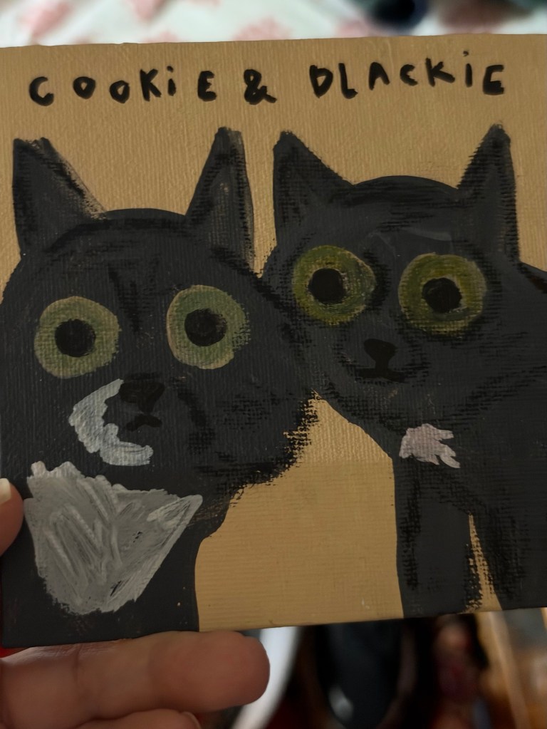
Fall this year has been spent at many work related events and I share a portrait of Cookie and Blackie below from an event we held this week. The artist, Andrea Cáceres (@andrecaceresg or hello@andreacaceres.com), was employed for a full evening of pet portraits which she mostly did from photos, although the live pooches in the room were many too.

Pet portrait by Andrea Cáceres.

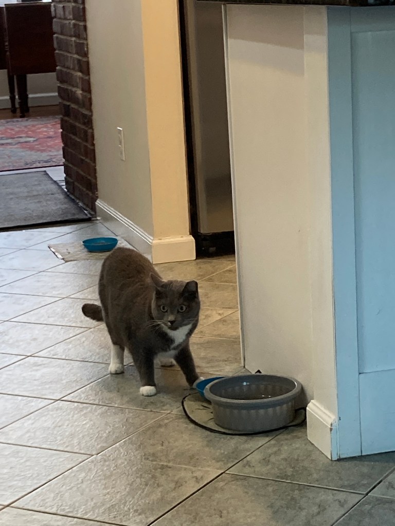
And across the room was a pet psychic, Phoebe Hoffman (info@phoevehoffman.com or PhoebeHoffman.com). I spent about 10 minutes with her talking about NJ cat resident, Stormy. I have always wondered about her past – she is a gentle but extremely fearful stray who was still very young when Mom found her. She seemed to know what a house and people were all about however.

Phoebe said that Stormy had indeed had a home, but she was largely neglected, was either left or lost. Stormy is a sweet little thing, gray tabby, but even over several years will not quite let you touch her.

She also told me that Stormy is living a very happy life (no surprise there), but while she appreciates her cat family, they annoy her sometimes – the other four of the Jersey Five, three are bro’s. (I am afraid they do pick on her a bit.) Stormy seeks alone time and finds corners of the house to be left in peace. Evidently, she “needs to be herself and has some sass in her” and will likely come around to being petted in her own time, but she likes that we don’t push her. She was fond of my mother, who was not mobile at the end of her life (we would joke that Stormy liked that she could never go after her) and Stormy would come and visit Mom in the middle of the night sometimes.

Our Miss Stormy. She does love to eat but she is scaredy cat.

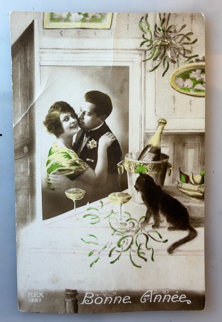
Meanwhile, I’m not entirely sure that I rise entirely to the celebration (albeit gentle) of this card, however I am considering how best to renew myself for the coming year and live my best life. Of course, it is the black cat that does it for me on this card. He looks like he might just start drinking the champagne if these two are heading out of the room – which perhaps they are. It is his interest and annoyed cat urgency (pay attention to me) that makes the card fun.

It is a photo-collage, with the couple dropped into a drawing of a room and New Year’s celebration. (I wonder if the drawing is also somehow from a photo but I can’t quite figure that out.) There are interesting patterns on the tablecloth – streamers fallen from above for this private midnight celebration? Looking up that seems to be the case. The pattern on the woman’s dress picks up the green of the streamers, the pattern on the champagne bucket, some pears and a few paintings on the wall. Our lady is looking out at the viewer while the gentleman’s attention is entirely on her. A private party launch into the new year – home alone with kitty and champagne.

The card was never used and so I have no precise information about a date. It says, Bonne Annee at the bottom so we know it is French. The maker appears to be REX and there is a serial number. All I can find is that they were, not surprisingly, makers of this type of card in the early 20th century and presumably French.

Pictorama readers may remember that October is our anniversary which rings in later this week at 26 years. I love that our anniversary is this time of the year. While the actual day was unseasonably warm, the crisp fall brings it to mind. Kim and I have never been much on celebrating our anniversary, however I wouldn’t be surprised if my gift for him shows up in a future post. It is small but interesting. Not saying any more about it for now. But I will let this card be our celebration placeholder for now.

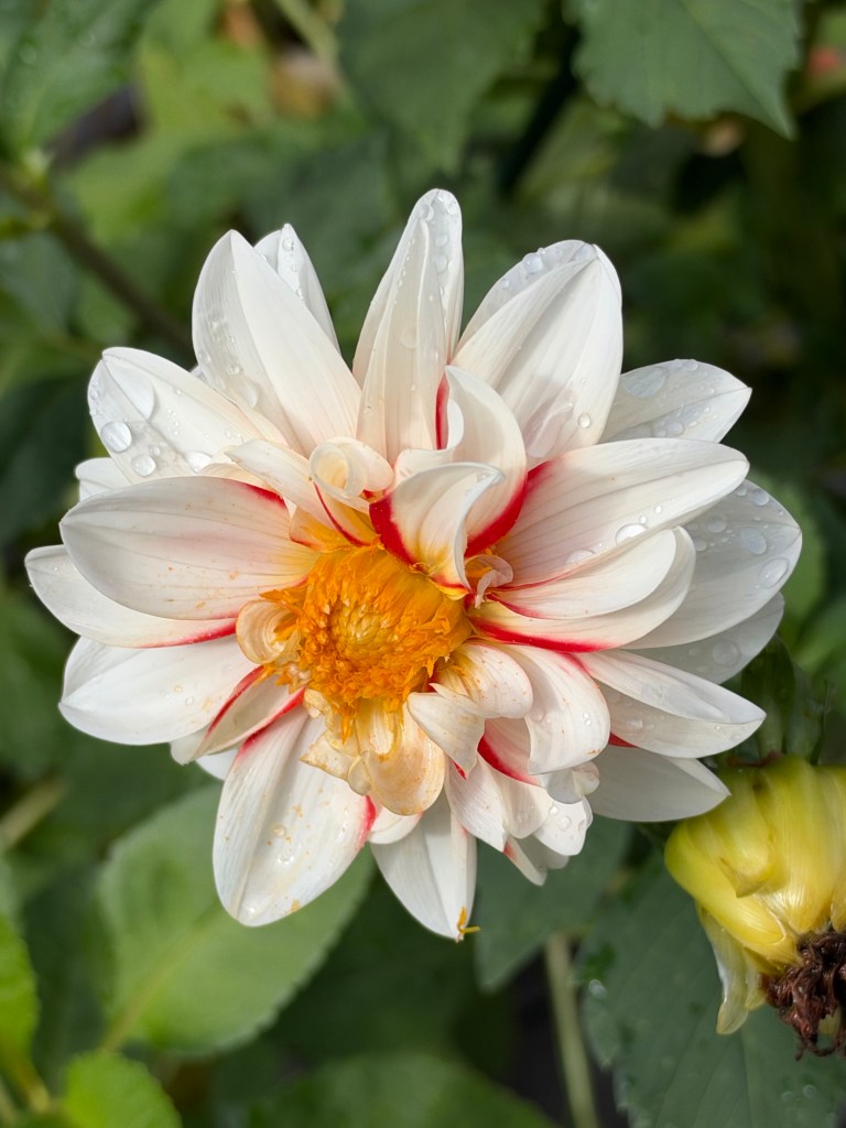
One of my dahlias last week when I was in NJ – no reason, just because I can share!

In the real world Kim is escorting me to the postcard show in Greenwich Village today and that and lunch out will likely count for our annual observance of the anniversary. More to come in future posts.

However, a shot across the bow and know that change is coming to the denizens of Deitch Studio and Pictorama. I am not exactly sure of our precise course, but we seem to be headed on the path. I generally find change abhorrent (I am indeed cat-like in this way, love my routine), but deep down I know that all will be even better when the dust settles. Stay tuned.

Hercules

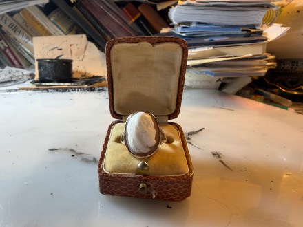
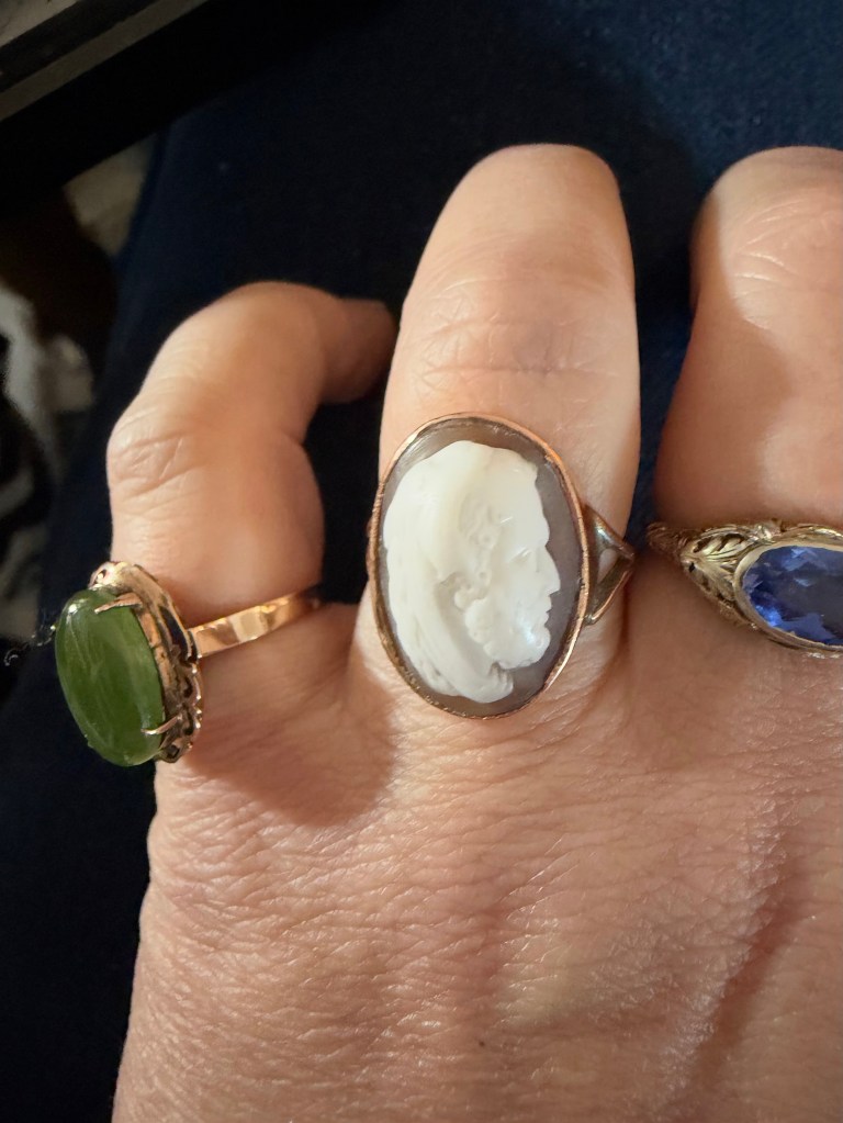
Pam’s Pictorama Post: It has been a while since I have written a jewelry post. It has not been because I haven’t acquired any, I must say. (Meanwhile, one of those other purchase posts can be found here.) I purchased Hercules from a British dealer I have done a fair amount of business with; he was on sale. (@LostOwljewelry or online here.) A simple resizing ran into some issues, and I waited for him quite a while. Ultimately, he showed and I was not disappointed. He has a sloppy bit of solder I am thinking as a result, only noticeable to the person wearing it and because it he is set in rose gold and it shows more against it.

Made in 1880 and of 9 ct gold (typical for a British, Victorian piece) it is hallmarked GG with something else I cannot read even with a loupe. I wrote about another cameo recently (that can be read here and shown below) but what I didn’t say is how I especially like the way these particular rings sit on my hand. They are very comfortable and easy to wear and although are delicate you don’t have that sense wearing them.

Another cameo that tells a story and delights me daily.

Meanwhile, cameos have a very long history, dating back to the 5th century BC. While the internet informs me that the term includes early glass carvings, I generally think of them as carved from shell or stones with contrasting layers to create the low relief image. This ring is a Victorian example of a typical shell cameo.

I am a fan of cameos, if somewhat selectively. One of my very favorite rings is the horse cameo shown here which was also one of my first significant jewelry purchases as an adult. I own not one but two small black stone ones of a woman I can only wear on my pinky – one a long-ago gift from my mother and the other an online Covid purchase. I have a classic pin of a woman my father gave me and another my sister did – I am less of a pin person so sadly they don’t get much play.

Cat cameo, Pams-Pictorama.com jewelry box collection.

One post, a year or so ago, was devoted to a cat cameo I found in my mother’s file cabinet. What could be more appropriate for me. It is a modern piece from Italy my father appears to have bought for her. That post can be found here.

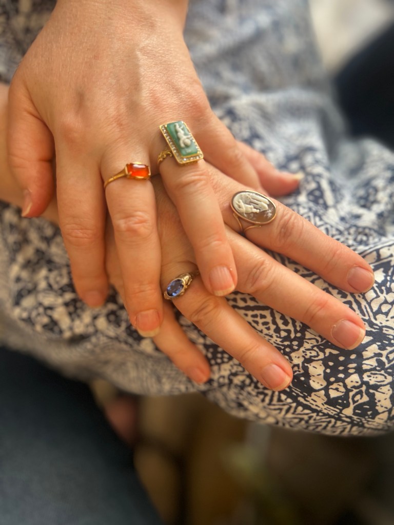
My friend Deva took this photo of me and my rings on a given day for some reason. I am without Hercules here however, but yep, I like a handful of rings!

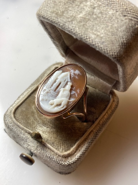
In reflecting on Hercules, it is his grit I admire. To the extent I wear my rings for encouragement (I certainly do) I especially chose Hercules for that. Depicted on my ring later in life, he seems to be working his way through or has completed his 12 terrible tasks, already sporting the skin of the lion he killed with his bare hands as his first deed. These acts were performed as atonement for the horrible act of slaying of his family while afflicted with madness induced by Hera (jealous and wrathful lover, to say the least, of Zeus) who had it out for Hercules from birth. Still, it was his to atone for and he owns up.

A close up!

This desire to atone and his labors through the 12 labors (originally 7 labors but as they will, it grew to 12) appealed to me as a reminder that we all have various difficult and seemingly impossible tasks to work through. I wear him on the days I anticipate being the most difficult. He is not good luck so much as a reminder that hard work will ultimately win the day; a good reminder when onerous and impossible seeming tasks multiply.

Throughout my day, I can look down at my hands and see stories, gifts from loved ones, rings that belonged to them first or just beauty. I do have to resist the temptation to continuously add to them – it is very addictive, but every day I construct new messages to myself for the day and of course just enjoy them too.

Krazy Cuppa

Pam’s Pictorama Post: This tiny treat came to me via our good friends Pete Poplaski and his partner Rika Deryckere. We had the great pleasure of a visit with them recently when they hit New York City on an East coast sort of blitz. About a week later, this lovely little item arrived in the mail – they had brought it for me and forgotten to give it to me.

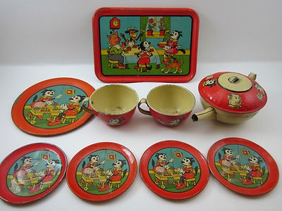
I have long lusted a bit over these tin toy tea sets. Made by J. Chein & Co. in the 1930’s, the full set was sold in different sizes from a five piece to, I think, 22 pieces. Tantalizingly AI tells me there is a tea set of cartoon cats which are neither Felix nor Krazy Kat but refuses to show me images of such. Personally, my guess is that the internet has it wrong and this is the only Chein set of this kind, and the image is randomly identified as Felix, Krazy or not quite either of the above. I see no evidence otherwise.

The red version – check out the teapot and tray!

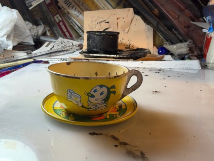
This little cup and saucer are from the more popular yellow version of the set. There is, evidently, a red version as well. The tray in particular would be a nice addition to this cup and saucer. The teapot is a very unusual shape and leaves me wondering what they were smoking over in the design den of Chein in the day, very Alladin-esque. I have tried to give you a sense of scale in my photo. This is a mighty tiny cup of tea!

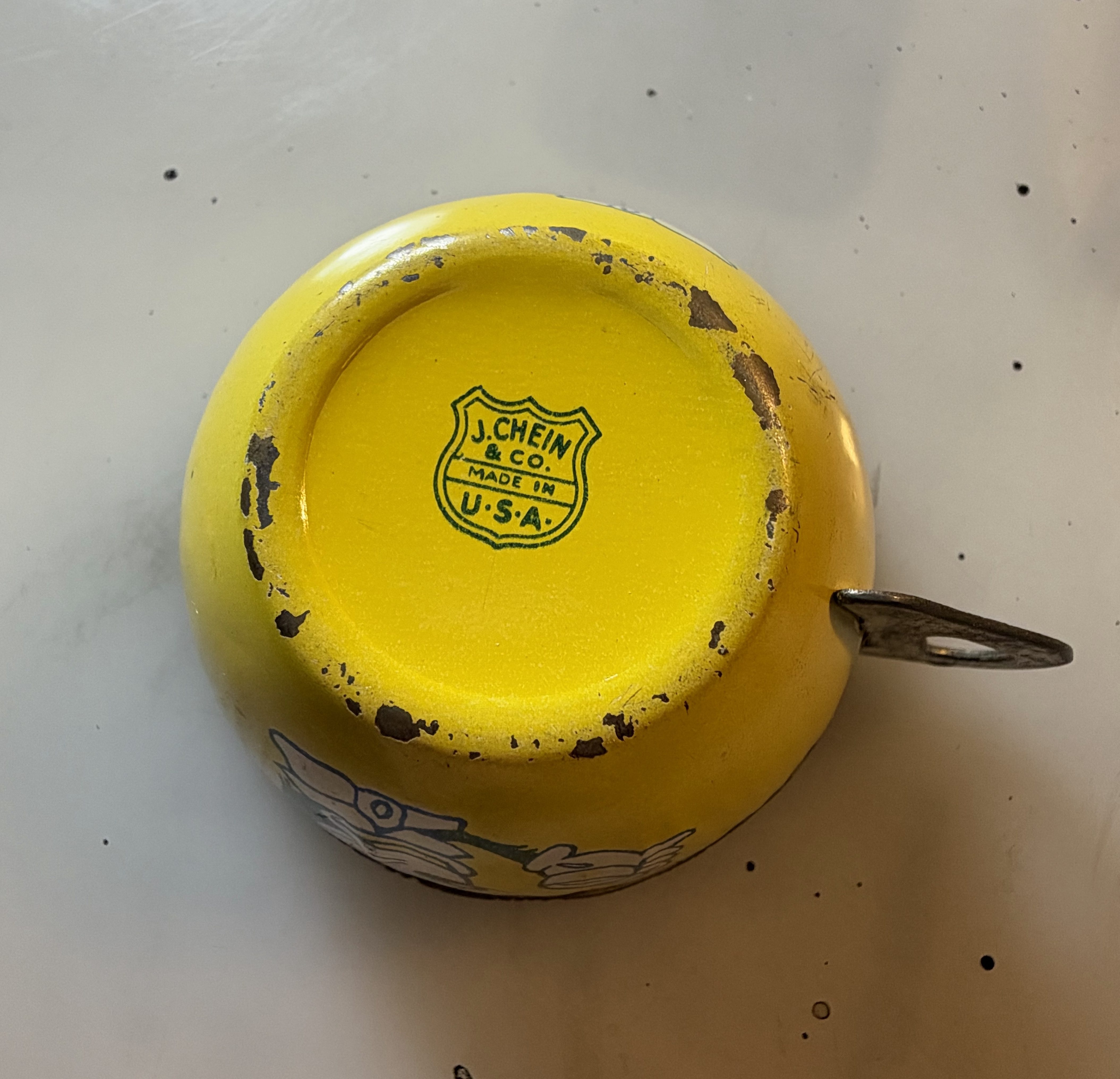
Mark on the bottom of the cup.

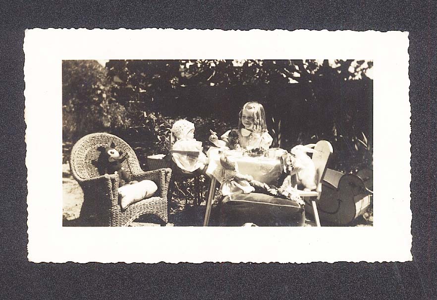
These tea sets generally show evidence of having been given hard use and the extant ones reflect it. They were fairly indestructible however and although they might fade or rust a bit it is easy to see how and why generations of children must have played with these sets. One can imagine the dolls, teddy bears and playmates and parents that were served via them. A photo post of the teatime image below can be found in a very early post here. That one has Krazy as an actual guest among others.

Pams-Pictorama.com Collection.

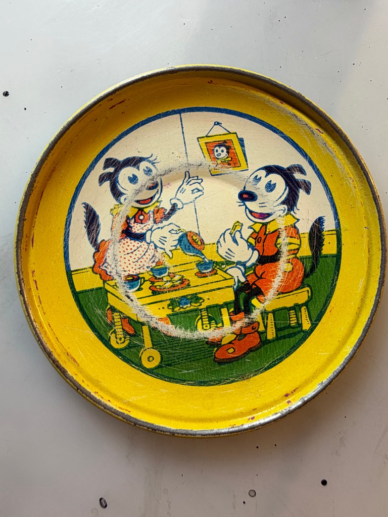
The cup has an image of Krazy on each side and sports a cheerful metal handle to the teacup. The bottom has the maker’s mark, J. Chein & Co, Made in the USA, on the bottom. The saucer has a cheerful domestic scene of a Mr. and Mrs. Krazy enjoying tea on a rolling cart, her service and him seated. Each has gloved (five fingered) hands. There is a portrait on the wall – I am going to say it is of a junior Krazy kid. Outside of the sort of general look this of course has nothing to do with Harriman’s depiction of Krazy but is a reasonable representation of the later animated cartoons. It is a lot to fit on such a little saucer. There is no mark on the bottom of it.

This saucer packs a whole domestic scent onto its scant 2.5″ surface.

For someone for whom space is a premium, this lovely gift might be the perfect sampling from this set. Although if the tray or the teapot came my way they would be welcome additions too. For now a very special shout out to Rika and Pete for thinking of me and Pictorama!