Comfort in Cats

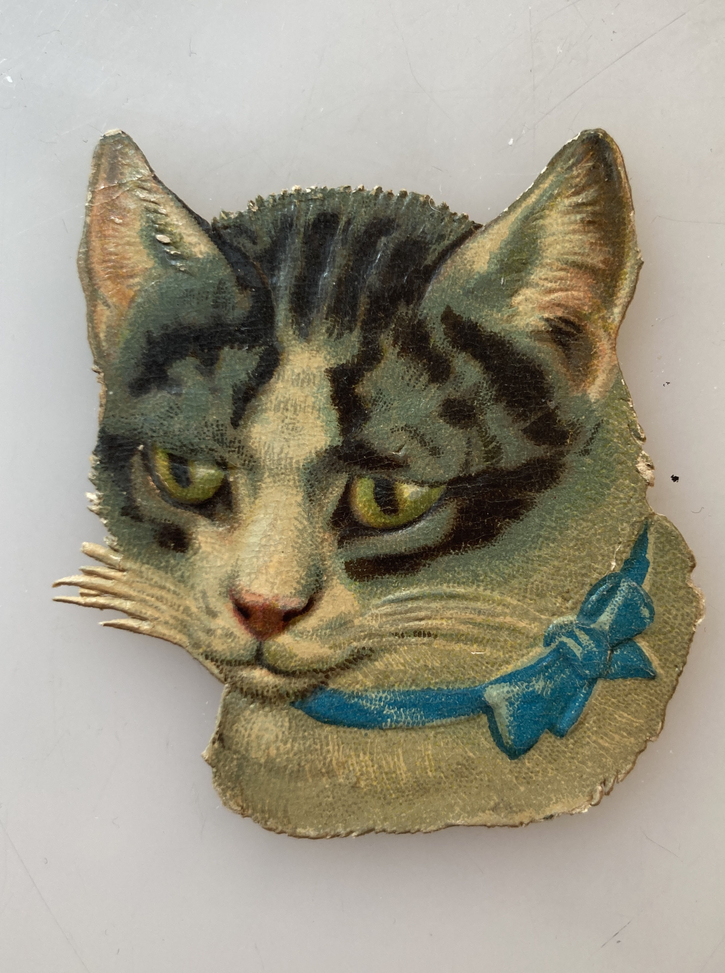
Pam’s Pictorama Post: Just coming off the Louis Wain Catland bio (I posted about that last week and it can be found here) I am self-consciously thoughtful suddenly about how the public sentiment about cats has shifted over the past 100+ years since humans just started finding their sea legs with them as domestic beloveds.

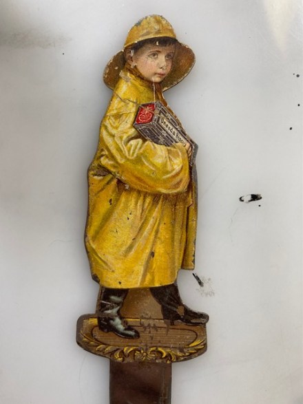
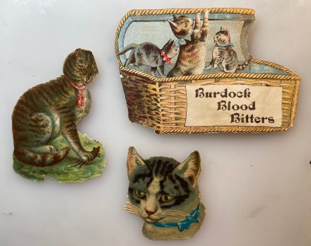
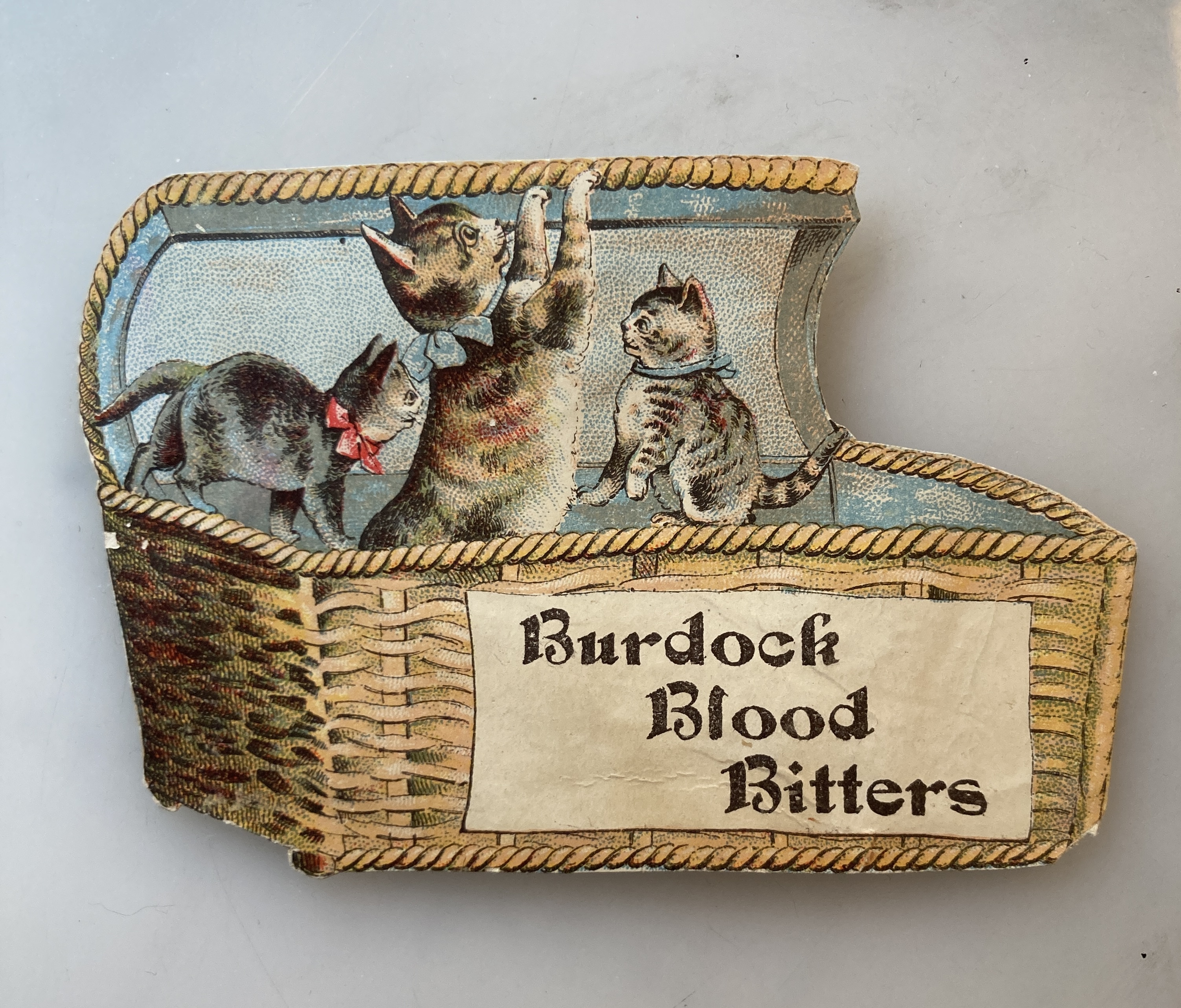
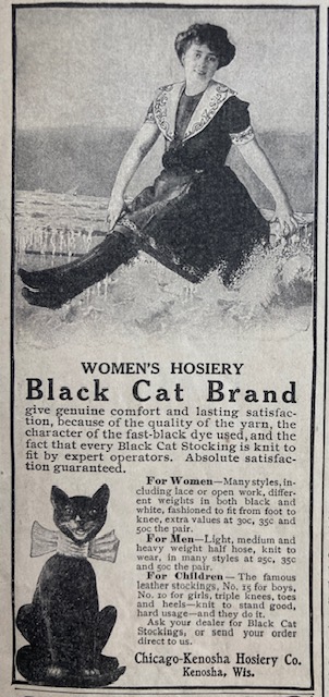
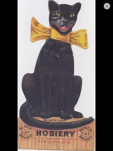
It wasn’t long after the Victorian period that cats were taken up in popular advertising at the dawn of the 20th century. This grinning black kit with the yellow bow was the longstanding spokes-cat for the Black Cat Hosiery company and was so popular for decades that the advertising items from it remain in high demand and often is quite pricey today. (This bit of an ad with thanks to Sandi Outland, via @curiositiesantique who sent it several months back – the the sea, my desk has spit it up from the depths for today’s consideration and helped inspire this post.)

I have written about the company on other occasions so if you want more info on the company you can find it in a post here – and more here. The above ad is from a July, 1907 McCalls magazine and other ads on the page are for, most fascinatingly, H&H Pneumatic Bust Forms (yes, like stuffing your bra – no one will know) and Modene hair removal for face, neck and arms – it cannot fail! Our black cat was in good company.

Pams-Pictorama.com Collection.

So in a mere few decades cats began to morph into the area they would command for many decades to come. However, I think it is fair to say that with the part of our lives that are now lived online some of us have taken our interest in cats to a much more highly developed level.

A photo of a young Betty Butler, holding our cat Snoopy back in the 1960’s from a Mother’s Day post this year.

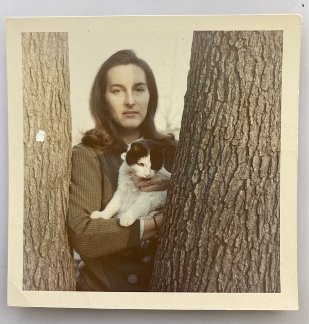
Speaking for myself, my interest in cats began as a small child. Pictorama readers know that I have written numerous times about my childhood cat friends, Snoopy, a white cat with black cow spots with whom I shared many important childish conversations. But there was also Pumpkin who came to me as a tiny kitten ball of orange fluff and grew into an enormous faded-orange tabby who followed me around with dog-like devotion. As I got older my cat Winkie, a tiny tortie polydactyl with huge toed front paws like mitts, was my particular confidant. As a young adult Otto Dix (Miss Otto Dix), a tuxie from a corn farm in New Jersey, became my constant companion and closest friend, a very special cat especially smart cat who I still miss to this day.

However, until relatively recent years, my love and interest in cats (other than what I collect of course) was limited largely to those I knew – mostly my own or those of my mother. I suppose it started even before the pandemic, but certainly during those long days and nights that following cats online became a habit. First there was Maru the Japanese cat (to be precise, a Scottish Straight cat who lives in Japan) who can’t resist box and likes to get into boxes, some that are way too small for him. There was the somewhat neurotic French cat, Henri, a long haired tuxie who has Existential angst. The French also brought us cats playing Paddy Cake which never fails to make me laugh and for some reason is only funny to me in the French – there is an English version.

Still, those were occasional and one-off entertainment. I believe for me that cats as a form of online entertainment and escapism was born of the darkest period of the pandemic, fueled by late nights of waking up and worrying about work. Unable to sleep, I would read Judy Bolton novels (the first in a lot of early series books I read and I wrote about Judy Bolton here) and take a spin through Instagram, sometimes buying the odd item, but also entering the world of cats online and sometimes following even their most daily routines.

I’m probably skipping ahead a bit but Sadie and Dottie (@sadieanddottie), a tuxie and a white kit with cow spots, and who appear to live in Queens, brightened many a dark day when I realized a new post or story had been posted. These largely consist of these two cats growing up, but mostly doing cat stuff like watching birds and napping. Yes, I can watch my own cats do that (although Deitch Studio is situated a little high for birds out the window) and I do, but it turns out I like to watch other cats do it too.

A screen grab of this little video of Sadie.

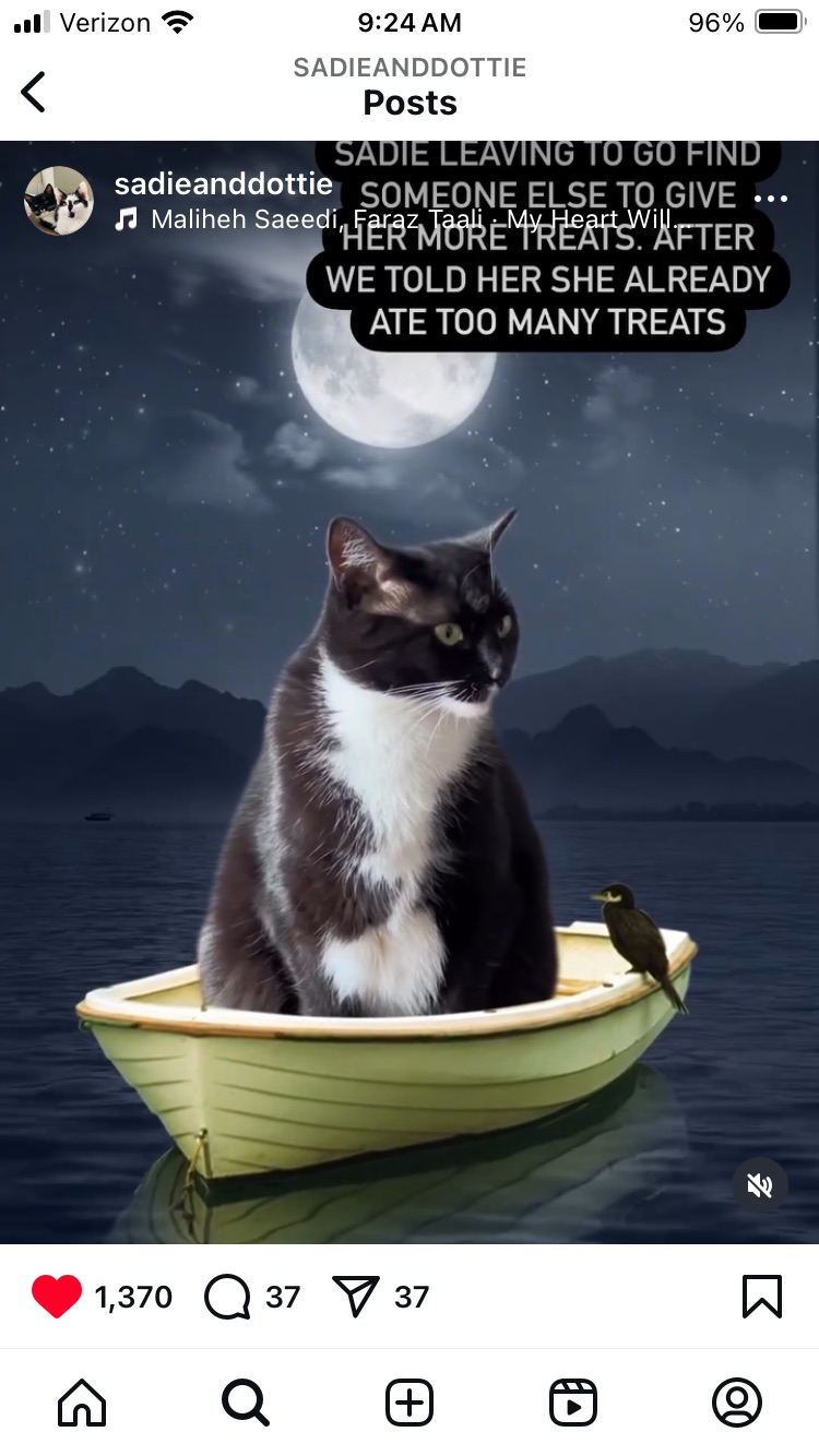
With almost 14,000 viewers cat mom Lauren Grummel and cat dad Chas Reynolds, Jr. appear to have their hands full supplying frequent doses of their kitties going through their daily paces. A favorite post is an imaginative one of Sadie (the tux) sailing away on a boat at night in search of parents who will give her more treats instead of telling her she’s had enough. (Find it here.)

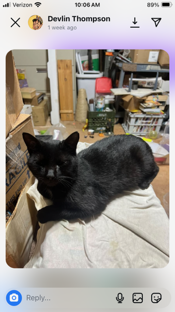
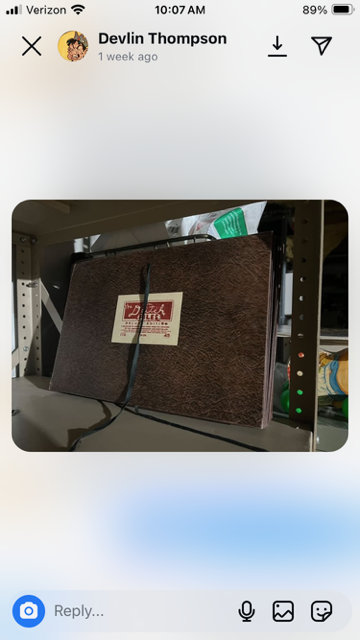
There is @Fatfink (aka Devlin Thompson) who I first got to know on Facebook, but now is an Instagram constant. His record of the comings and goings of his small menagerie of four cats, (these days Clawford, Kookie, Mr. Biscuits and Miss Rupert), which includes some recent rescues and things like his daily fight over his dinner with them or other such tidbits, are interspersed with an aligned interest in comics – but it is really over the kits that we bond. He sends me great cat videos too which I often find first thing in the morning and cheer my day.

A friend on the west coast started supplying me with both funny and moving video snippets of cats during the difficult period of caring for my mother although she continues to send them since I like them so much. These videos, many from The Dodo are chock-a-block full of cats paired with a myriad of other odd animals as friends (deer, dogs, cows) or doing un-catlike activities like motorcycle riding or boating. It is especially lovely and a real kindness as she herself isn’t especially fond of cats so she seeks them out just for me.

Most recently I have fallen hard for team Penny and Felix on Instagram. Penny (@pennythegingercat) is a somewhat sardonic and absolutely adorable orange tabby female (yes, a rarity) and Felix (@felixthepalegingercat) her younger brother, a lean and lanky light orange fellow. (Penny alone has upwards of 650,000 followers!)

The antics of these two (two accounts means twice the fun) include but are not limited to: Felix’s impatience over getting his breakfast in the morning, Penny’s preference of Dad over Mom, Penny sleeping as a face down loaf and the like. These have cheered me endlessly over the past year. Highlights have included Penny entering the Olympics this year as a gold medal winning cat loaf champion and I credit the duo for having invented the term skippity pap (or at least made it enter my personal lexicon) – which is accompanied by a sort of whoosh-smack sound effect that is especially satisfying. It is among the few accounts I turn my sound on for routinely.

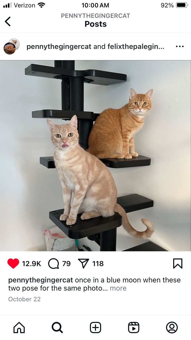
The dynamic cat duo’s mom and dad (mom is the voice over for the most part) do a brilliant job of editing, voice over – they are top pros at it and I bless them daily for these inventive missives that come over my transom, brightening all days. Quite simply I cannot recommend them enough for a cat dopamine daily dose.

Four out of the NJ Five here – Gus missing.
Blackie and Cookie peevishly sharing the bed with each other and of course Kim recently.

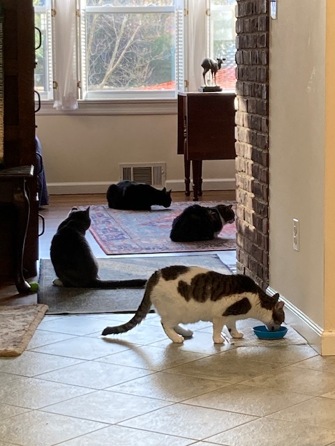
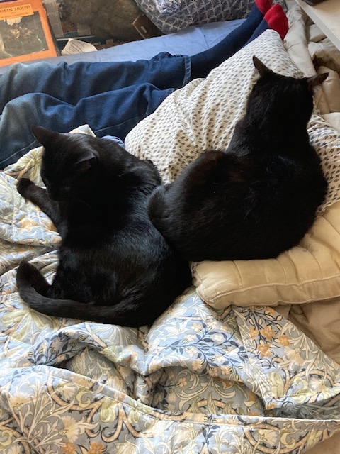
I have written before about social media and my belief that if content is carefully chosen and tended it can be a rabbit hole of blissful escapism. During the brutal hustle and full-on assault of our shifting political world I have found myself diving deeply into this somewhat alternate universe of cats. As the mother of the NYC duo Cookie and Blackie, and the Jersey Five (Beau, Milty, Gus, Peaches and Stormy) and the head of fundraising for a major emergency animal hospital – you’d think I would get enough daily dose of the kitty world, but simply, no – quite simply, I prefer even more.

I started subscribing to a daily newspaper in high school and have more or less read one daily every since, butI lately find my ability to read above the fold reduced to a nervous skittering across headlines as I head down the page to stories about things like a research study on puppy kindergarten – the super socializing of puppies to see if they make better service animals (NYT and can be found here). So today I pay tribute to those folks online who may not inform my politics, nor deliver my news, but who are vital community which cheers my daily existence.

Kit Kat Klub Revue

Pam’s Pictorama Post: Today’s Pictorama tidbit comes via our good friend Bruce Simon. Bruce and his wife Jackie live on the other side of the country. My job used to bring me to their doorstep periodically and they have family this way and therefore not-quite-annual meet ups were possible. The Covid years resulted in several years where we were deprived of visits. This year we somehow managed a visit on each coast and we saw them earlier this summer and then a bonus round with Bruce a mere weeks later in San Diego when we flew in for Comic Con.

Kim and Bruce go way back to Kim’s west coast youth, but Bruce won my heart early on with splendid collections of early cartoons he sent. Krazy Kats, Aesop Fable cartoons – he has made a serious contribution to my cultural education. So it is a hats off to Bruce Simon for this post!

Much to my surprise Bruce brought me this splendid Felix tidbit found in his ramblings for the books he produces. (Some of those can be found on Amazon here and here.) This bit of a classified ad hails from The Muskogee Daily Phoenix and the Muskogee Times-Democrat. A quick look online reviews that this is an Oklahoma daily publication still in existence today. It was founded in 1888 so its had quite a run thus far.

This ad would appear to be an ad for the Classified Ad pages of the paper at the bottom while boasting this Kit Kat Klub Revue with the Krazy Kats of Rhythm. A nice swipe of Felix is chuckling in the lower left corner under On the Screen A Woman Rebels starring Katherine Hepburn. You could only see the Krazy Kats on Wednesdays and there is a balloon which informs us that this is A Wliburn Cushman Circuit Unit.

A replay of this pic of Bruce and Kim in San Diego where we had a lunch of waffles one day.

A snippet of another newspaper available online informs that this was a five piece band and Mr. Cholet was the singer and front man for the band. They played sweet hot and swing music. This was back in 1937 and 150 people had the opportunity to see it on a given Wednesday at the Ritz. If you read the fine print at the bottom it seems that putting an ad in the Classified Want Ad would get you one free ticket for the show.

Someone asked me recently how it felt to no longer work for an arts organization and I had to admit, I am missing the many hours of live music I have enjoyed in recent years. Radio Dismuke (I wrote about this rather wonderful online radio station as resource in a post here) helps fill the gap, but it is a big change, as was leaving the Met after many years of enjoying it – more or less like having all that art in your own living room.

Admittedly this ad puts me in the mood. However, it is an itch which is unlikely to get scratched soon as tomorrow I pack Kim and cats up and we head to the New Jersey camp for the remainder of the summer. So more on that annual bivouac tomorrow, stay tuned.

Open Sez Me: Part Two

Pam’s Pictorama Post: In yesterday’s postal post I went on a long tangent about my recent interactions with the post office. Today, I will focus a bit more on the advertising aspect of the other letter opener I purchased, one for Oneeda Biscuit.

I tend to think this one will be designated to go to the office although I am realizing that on my messy desk at home (as opposed to my messy desk at work) I might more easily located this one in order to use it, rather than the smaller Red Lodge Montana souvenir one I wrote about in my prior post. I used this one yesterday for the first time. I’ll have to give that some thought.

Pams-Pictorama.com Collection.

This letter opener only has the image on one side which I find disappointing although I guess the trouble to create art for the back of this little boy in his raincoat seemed unnecessary for a give away item like this. (I am pausing for a moment to reflect on the idea that this sort of give away doesn’t really exist any longer, does it? Sad for the future collectors of the universe.) Nonetheless, it was a tad disappointing.

Artwork from an undated Uneeda ad.

Having said that, The art on this is sort of splendid and although slightly chipped in places, in good condition overall. A quick look for these online shows everything from pristine to really ratty. If this makes your pulse quicken and you set your heart on owning one you have ample opportunity.

Uneeda Boy items proliferate with online.

Oneeda Biscuit, as many Pictorama readers may already know, was the forerunner to today’s enormous corporation Nabisco. Founded at the dawn of the 20th century, it played the food field with the likes of nascent Heinz, Kellogg, Hershey, Campbell Soup and Wrigley.

The early days Uneeda produced hard tack, crackers for seamen and soldiers that had a more or less infinite shelf life having figured out a way to ship and store crackers in something other than a barrel. However these folks ultimately brought us beloved snacks such as Oreos, Saltines, Ritz Crackers and Nilla wafers. Theirs is a fast paced history through the early growth of a US company through competition, war and peace. (The full history can be found on a site devoted to its history as touched on here.)

Animal Crackers packaged the way I remember, with the string for handy carrying and the animals in the cages – they have subsequently been “uncaged” evidently.

Enterprising rival companies tried to trade on the early version of the name and efforts to stamp out the likes of Uwanna Biscuit and Iwanna Biscuit were tracked down and eradicated. Uneeda cadets were sent out to ensure cracker freshness in the field as well as these copyright infringers.

As indicated above, Uneeda figured out the moisture proof packaging needed to deliver crackers in individual packages to consumers. The wax paper wrapper was the industrial breakthrough and this little fellow in his slicker is meant to illustrate the moisture proof nature of the packaging. (It took me a bit of research to figure that part out and I would say, at least in this day and age, it isn’t entirely self evident.)

From a popular 2021 post – this cracker tin sits on my home office desk.

This little fellow, Biscuit Boy, becomes the center of their national advertising campaign in 1901, two years after its founding. (Arguably the very first national advertising campaign ever.) Its forerunner was the slogan, Lest you forget, we say it yet, Uneeda Biscuit, but they decided they needed something more.

In addition to the treats already mentioned, they were the early creators of Animal Crackers – always a personal favorite. Later in the tale, Triscuits, a Deitch Studio favorite, were also created and added to the long-lived line up.

Is it possible that the name is meant to invoke the baked by electricity process?

Meanwhile, the Biscuit Boy himself was the nephew of the ad exec who created the campaign. His name was Gordon Stille and he was five in 1900 when he was photographed in a slicker and boots for this campaign. He was paid the princely sum of $100 for his services, but given the popularity of the image he ultimately felt he was undercompensated and sued, but died an elderly man without resolution. (All of this and more entertaining information about the history of the company can be found on this blog site devoted to food history here.)

From an eBay offering, the Morton Salt Girl in one of her numerous guises.

Kim and I both immediately began to wonder about how this Uneeda boy advertising might relate to the Morton Salt girl of our youth. She makes her debut a few years later in 1914 with the brilliant slogan of When it rains it pours, and one can’t help but wonder if they weren’t somewhat inspired by the trench coat kid when they designed her. (I remember studying this salt container as a child!) I can find no evidence of this however online, only statements that images like Morton Salt, Aunt Jemima, Fisk Tires, etc. became very much in vogue for advertising in the period. However, the idea that this jolly little girl (significantly less dour and damp looking than our friend from Uneeda) is also out in the rain to prove that Morton Salt would still pour in the rain – another triumph over humidity and the nature of food storage.

My hat’s off to my friend at Red’s Antiques (@reds_antiques or www.ebay.com/usr/reds_antiques) for supplying these two items which will be used daily as mail is still received here at Deitch Studio as well as, hopefully increasingly, at my office.

Open – Sez Me: Part One

Pam’s Pictorama Post: Not often, but occasionally my purchases are essentially practical and today’s purchase was one, although certainly some style here. Somehow in the most recent office move from my last job I failed to pack my letter opener which was of the most utilitarian variety although I had some fondness for it because of the sheer number of years (decades) it had been in my possession, however there was nothing notable about it.

I have been in the work force long enough to have gone through a period with a lot more physical mail than I currently receive. Early in my career I have distinct memories of opening piles of mail every day at the Met. In fact sometimes I worry that the mail at work has failed because we go so long with absolutely none. Physical mail is so seldom now that I had a staffer who didn’t seem to know where to place the stamp on a letter he was sending for me.

Meanwhile, as a fundraiser I was surprised that my current office had never used a business reply envelope. For those not in the know, that’s what those envelopes which allow you to respond for free are called. (There is a permit number on the return address and sometimes it says, A stamp here will save XYZ money.) The postage for each envelope received back is paid by the organization, but hey, if you are sending me money I’ll pay a dollar for your envelope back to me. It’s a good return on investment and removes at least one impediment from making a gift – having to find a stamp.

When I discovered this a few months ago I went down the specifically postal rabbit hole of applying for a permit. I never worked any place without a permit so this was all new to me, nor could I find anyone else who had to apply for one within my circle. After getting an old account out of the way (a ghost account which seemed rather romantic but, not surprisingly, didn’t seem to actually do anything) I spent a lot of time on the USPS website and on the phone with their service people. I, in fact on some bad advice, went to the Main (Farley) Post Office here in NYC. As some might know, the building was purchased by the city and space recently carved out under this grand building to create a new home for Penn Station.

The interior of the post office, the James A. Farley building, is beautiful and I couldn’t resist a few shots despite my disappointment.

It was my first (and likely my last) visit to this post office as they do absolutely nothing there. (Does this mean there is no main post office in NYC?) Yes, you can mail things and yes, you can evidently apply for a passport there, but even an attempt to buy stamps will send you online. As you can imagine, I was told that the administrative office I was seeking was now long gone. They did, to their credit, supply me with the number to phone for help.

I am here to report that, once you get through the red tape of an annoying phone system and get to the folks (all women in this case and I spoke to several) to help you they are a great, smart and helpful group. My hat goes off to Ana, Sabriya, and Arkeda. They know their stuff and they were dogged in their efforts to help me. They coached me through filling out arduous forms, filing them and then shepherding them through the various routing. They even told me when they would be on vacation and who I could work with during that time. I praised them unstintingly in a series of final surveys and thanked them profusely. Frankly, I would hire any of them in a heartbeat if I could.

But come on, they don’t even sell stamps?

It has left me with mixed feelings about the post office. At their instruction I went to the local post office to my job to file the forms with a check to cover the annual fee and open the account. The staff was rude and at one point stood around in a group talking about me in the third person and told me to shut up when I tried to speak. What’s more, I probably shouldn’t need someone to coach me through a labyrinth site and series of mystical forms. So although I give the women above the highest grades, I give the USPS a failing grade in general. My experience as it relates to this interaction is that these women are an island of competent help in a morass of sub par service. (With apologies to others at the USPS who are hard working and doing their job!)

This was the Plain Jane variety opener I had been using for decades.

Anyway, all this to say, if I have my way more mail will come to my office shortly, hopefully in the form of contribution checks. And, to bring us back to my recent purchase, I actually like to open envelopes neatly with a letter opener. When you are handling money coming into an office for various reasons the envelope can be important (proof of mailing date, return address) so better if you don’t end up tearing it to shreds to get it open. I have keenly felt the lost of my letter opener, but did decide that rather than purchase another ubiquitous one from Staples that I would look for something a bit more interesting.

Of course my mind turned first to cats and if I had been willing to invest some real money in a vintage letter opener I found on eBay I could have had a honey. For a variety of reasons this wasn’t a moment I was inclined to do that.

Top of a very nice cat letter opener I deemed to expensive to buy. Tempting though…

A week or so ago one of the dealers I purchase from on Instagram (@Reds_Antiques or via eBay at www.ebay.com/usr/reds_antiques) had a bunch of smalls he was selling and I picked out two advertising letter openers he had listed. I’ve bought some lamps, photos and other bits from Reds, he’s a dealer on the west coast and he lists some cabinets and tables I drool over but can’t see getting across the country to us. The vibe of his stock is a little masculine for me overall (think gas and oil signs, vintage tools and car related ephemera), but we align on certain things and he has a good eye.

Anyway, I figured one opener goes to the office and one stays here or goes to Jersey. That still leaves room in my life for a good cat one should I come across it.

Detail of the top of the letter opener.

As is clearly stated on the back it is solid copper and it is from Red Lodge Montana. The top boasts a somewhat cheesy scene of a teepee and two figures, one on a horse. A tiny banner declares Festival of Nations.

Back markings.

First of all, Red Lodge (for the ignorant like myself) is a town, not a lodge as such, found at the entrance to Yellowstone national park. The area, full of skiing and hiking, looks stunningly beautiful with a downtown full of period buildings that have been preserved. (For a post on the adventure Kim and I had at a whorehouse museum in Butte, Montana, go here.)

Starting in the 1950’s the Festival of Nations was launched as an annual festival to celebrate the various (European) cultures of the area which had never much mixed beyond some tentative cultural experiments such as a unified local band, all this according to a local historical society website. It seems to still run in August of each year.

I think this one is likely to stay in the apartment. Stay tuned for tomorrow’s post and the other one I purchased which will head to the office, reporting for envelope duty, next week. Could be a cat one in my future as well.

Still Life with Nick Carter

Pam’s Pictorama Photo Post: Today’s post is the first of a few highlighting things I gave Kim for his birthday this year, celebrated last week at the time of writing this. Kim doesn’t like a lot of fuss over his birthday, but I try to find something he’s either wanted or failing that, like this year, some original bits. (A past post of a birthday gift can be found here.)

Today’s photo is tiny, only sort of 2.25″x 2.75″ or so. I ran across it on my Instagram feed via @baleighfaucz and it whispered Kim! at me a bit so here we are. In addition to being small (smaller in fact than I anticipated) it has these two deep creases in it. These are of course unfortunate, but they do not rob me of any pleasure in getting a glimpse into a little world of long ago offered up here.

I cannot say I can identify everything in the image. The Nick Carter, Secret Agent Weekly, is from April 20, 1912 and cost 5 cents – seems like a princely sum actually. I think it was this that put me in the mind of Kim as he has passed through a few dime novel stages, although not to say he’s a fan of Nick Carter in particular. According to Wikipedia Detective Nick Carter leapt onto the scene in 1886 (Kim is telling me he and Sherlock Holmes hit the scene at roughly the same time), and had an extraordinary meandering run through more than a century beyond, hitting incarnations in various forms of popular media from dime novels to radio and beyond, with a most recent stop as a series of novels that were produced from 1964-1990.

This tiny image is the only color version I could find on the internet.

A pipe, cigarettes, cigar and a pocket watch are in the foreground although in front of them is some sort of small paper package I can’t identify and in the lower right corner something utterly lost on me. A decorative beer stein is perched on a well used Central Union Cut Plug tobacco tin. One site selling such a tin says they were often used as lunch pails once depleted. This one appears to still host tobacco.

Saw some pricey perfect versions for sale but at the time of writing you could have this one for $20 on eBay.

An odd illustration which is entitled simply Life in script at the top and appears to be of two men at a dinner table with a menu, one in evening cloths and a plumed hat and the other dressed as a woman is at the back. Can’t imagine the importance of it to the photographer although it serves as sort of a title for the image overall.

Looking at a few of these objects in color makes me wonder if he was disappointed with it in black and white. It is a dynamic little photo, but my guess is that the colors were pretty punchy in person.

I love to think of the photographer, maybe a young man back in the spring of 1912, setting up this photo. They were likely a nascent enthusiast as home photography was still just becoming popular. It is sort of sweet to think of a serious young fellow studiously putting this together, (why these particular things? smoking, reading, drinking) showing us a slice of his life that we can consider so many decades later.

Mack

Pam’s Pictorama Post: Truck and car parts are not generally within the usual Pictorama sphere of collectible, but I picked this up in Jersey last summer on one of our antique store junkets in Red Bank.

It has all the heft you would expect from a Mack truck hood ornament – as if it had a function and had to prove its worth. I guess it wouldn’t do for it to have been made skimpy and light of let’s say of aluminum.

Pams-Pictorama.com Collection.

Hood ornaments started out life with a function – not that I entirely understand it, but something to do with the radiator. Turns out that they stopped putting them on cars for two reasons. First, because they were frequently literally ripped off of cars and stolen. Second, they were found to be particularly injurious to passengers in accidents. It would seem they are even quasi-illegal in cars now – although I happen to know someone who has a custom one of a beaver on her car.

Hood ornaments are a significant category of collectible. The Rolls Royce Flying Lady or Spirit of Ecstasy is the zenith of that particular area of collecting. It has a hotsy totsy history which includes intrigue, affairs and sky high prices for the item now. (The story is told best and briefly here.)

One of the variations on the Spirit of Ecstasy hood ornament on a Rolls Royce.

Rolls Royce is the only car that still maintains a hood ornament and theirs has resolved the issue by automating it to tuck into the hood for safety. Trucks seem to enjoy a different status and a variation of this Mack bulldog is still on their trucks.

Painted version of the Le Jeune Felix hood ornament, not in the Pictorama collection, alas! From a Hake’s sale catalogue.

More in line with my interests and budget, there are some wonderful Felix ones that enjoyed great popularity in the hereafter of collectibles. Oddly, I do not own one and I may get around to rectifying that at some point. They need to be mounted however and I am not handy that way. I have written about them a bit in an earlier post found here and this photo is as close as I come to owning one at the time of writing this. My bulldog could also use mounting, but an easier design than Felix, just need to find something to tuck under his front paws.

Mack trucks were founded in Brooklyn in 1900 and was making vehicles for the British army in 1916 where they got their (English) bulldog nickname. The bulldog was first affixed to the side of the vehicle in 1922. The bulldog as hood ornament takes its place about ten years later.

At a glance this appears to be as rare as claimed, a heavy British doorstop of the Mack dog.

About the early design one blog sites: The design was a front view of an English bulldog tearing up a book, and on the book was printed the words “hauling costs.” By 1932, a bored Alfred F. Masury, Mack’s chief engineer, created the ornament. A medical issue had sidelined Masury, leaving him looking for something to do with his hands. The answer: a carved bulldog. That same year, the carved bulldog figure appeared on the front of the Mack AB, a lighter-duty version of the AC. (The entire post can be found here.)

The number tells us what period he is from.

Meanwhile, unlike whatever prohibition there now is for automobiles, Mack trucks continue to boast these dogs and variations on them today. One site claims that the symbol is meant to convey solidness, dependability, but also openness to the future and of course speed.

Perched on a small jewelry box here. Pams-Pictorama.com Collection.

The variation is largely the metal color of each, indicating different things about the vehicle which it is perched on. As I understand it the gold color is for vehicles which are 100% Mack parts and the chrome for lesser ones if you will. A recent addition appears to be a copper for electric vehicles. A bit of research shows that mine is a later dog, the numbers on his chest mean he was produced after 1986. I think his separate legs mean he was indeed a real hood ornament and not a decorative reproduction. He bears a studded collar with his name Mack and he stands ever ready for action.

There is something endearing about his chunky self, leaning forward on the prow of a truck, streamlined and somehow windblown he well exemplifies a bulldog, straining and pulling forward, a collar but no leash on this fellow.

Within

Pam’s Pictorama Post: This is a tiny post – at least in that it refers to two petit specimens that arrived in the mail recently, about 30% smaller than I had estimated. These boxes are however still so charming that I am taken with them despite not knowing what use I can put them to. They appeared on my Instagram feed (via @marsh.and.meadow) and on a whim I bought them.

Some of you readers already know I can’t resist a box. I have opined on my love of them before in posts here and here. There is something endlessly comforting about containers – those which promise to hold things, give them a place, put them away appropriately. (In all honesty, it isn’t like I actually always employ them for these rarified purposes once I have them, but it is the thought that counts.)

My original inspirations was that the larger of the two could hold the unruly pushpins on my desk in my office. The fact is that my office is such a mess these days I can’t begin to imagine how I could have focused on pushpins.

Due to construction at our main building I work in a mostly residential high rise tower about a block away. There is a hallway which houses a disparate bunch of us – my fellow fundraisers, various administrative staff, a clutch of doctors and a few data scientists who have recently joined the ranks. My office is spacious enough if remarkably blue in color – I am talking walls. (It lends a certain Smurfness to my Zoom encounters.) We only have partial walls so remarks are occasionally tossed over the wall to the pathologist on one side or the educator on the other – while we simultaneously pretend we can’t hear everyone’s conversations. My job requires a lot of talking, on the phone and with staff, so I am sorry for them as I know I have destroyed any peace and quiet.

The undeniably jolly Rescue container. I have less stress just playing with it!

However, the main point about my office is that it leaks terribly. Skylights that are river facing and given rain and wind coming off the river water pours into my office. The landlord does not seem able or inclined to fix it so this week I packed up the whole thing and we rearranged the cabinets and furniture so my desk is no longer under the leak. I lost about a day of work and am still not unpacked, but I have the additional advantage of being in a sunnier spot under said skylights and my weekends and evenings will be calmer not thinking about whether or not I remembered to stick a plastic kitty litter bin under the leak.

However, somehow in all of that I managed to have a moment to be annoyed that the pushpins for the bulletin board were in an ugly plastic container that tends to spill. This was my solution. And, in all fairness, the larger of the two would probably hold sufficient pushpins for daily desktop needs, even if a tad smaller than planned.

The larger of the two is emblazoned with Pastilles Halda and some related prose which roughly translates to being the best for mouth and throat irritations, larynx and bronchial affections (infections?). Pastilles, melt in your mouth sugar pills, were for various maladies having made their first appearance in France in 1825. Those appear to have been for stomach trouble.

Surprise! Found inside the larger container.

Both boxes are of a hard cardboard, but it is still a bit amazing that they reached down decades to us intact. I will try to be good stewards of them. The sides of each is brightly patterned making them attractive and festive which likely contributed to their longevity.

When I opened the blue one, there was this lovely tiny photo below saying hello. Thank you @marsh.and.meadow! That was a wonderful little surprise. I could do a whole post on this amazing little girl in a huge hat. More or less a one inch square she peers out from under the huge brim, a mass of curls falling behind her. Her attention has been caught looking off to the side where someone was clearly trying to induce her to smile – in the end I think they got the best photo anyway.

Pams-Pictorama.com Collection.

Meanwhile, pastilles remain with us today – cough drops and the like. They have slid toward gummies more than hard confections. I’m a fan of a good gummie (am devoted to Rescue Remedy ones that have melatonin to help me sleep), but to soothe a sore throat I like a hard, cherry Ludens myself.

This larger of these two sport eucalyptus and menthol as ingredients. It brings childhood to mind and the various types of cough drops I was plied with. There were the honey and menthol ones that were the most serious, the soft Smith Brothers ones that also came in a honey flavor and then the cherry Ludens which, although I liked them best, were probably lowest on the scale for effectiveness but the most like candy.

These days I reach for Riccola when I need a serious cough drop. They appeared late in my childhood, closer to young adulthood. I usually keep a few on hand in case a fit of coughing overcomes me or a guest in my office. I still lean toward cherry, but they are very no nonsense it doesn’t really matter.

The Ludens box of my youth.

My friends over at Bach, who make the Rescue products as mentioned above, serve up their line of stress reducing pastilles in a most charming yellow tin with a very satisfying and clever pop top. It is worth having one around just to play with the tin. Sadly the aforementioned melatonin gummies come in a very average bottle, and are in fact too large for this jolly receptacle.

The smaller box appears to have held saffron from Belgium – not medicinal at all. Saffron, which is a notoriously expensive spice, generally comes in tiny receptacles (glass mostly these days, not much bigger than a pill casing) and is of course bright orange. There is no sign of this on the interior of the box so the saffron must have been further wrapped.

Neither of the companies associated with these boxes appear to exist today, although there is a Valda rather than Halda French pastille company that seems to have a fair amount of market share. I could not find a history for it so I don’t know if these are the roots of same or not.

Perhaps once everything is once again put away at work I will share photos of the new office rearranged. I think it could use a few more photos and maybe another toy or two before it is really home away from home however.

Tee-d Up

Pam’s Pictorama Post: T-shirts are yet another sub-genre of Pictorama. I never made a conscious decision to add them to the collection, but I find I occasionally snap one up.

I generally eschew the older used ones – not that I have anything against used clothes; I have bought from thrift stores and vintage for years. However, there is a convention on eBay where, oddly (at least to me), people sell old t-shirts (or attempt to) for vast sums. I guess there are some super rare Felix t-shirts out there that fetch those sums, but I have a sort of a mental cap on what I think a used t-shirt should cost, no matter what is on it. Anyway, despite all of this, a slow trickle of t-shirts are archived here. (A few of those posts – including some vintage Kim Deitch designed t-shirts – can be found here, here and here.)

I say archived and that is not entirely accurate either. Some are archived and others find their way into favored wardrobe. There was a post about an especially Waldo looking cat on a baseball shirt I bought from a company in Japan – after a considerable international exchange! (That post can be found here.) I purchased two (by accident) and I wear them all the time. They are among my favorite shirts.

Poshmark was selling it black recently.

Baseball shirts are preferred – love the three quarter sleeve for running. Actual t-shirts are of less interest for wear. I run in sweat wicking fabrics because I don’t like a soggy cotton shirt and my preference for wearing has always been sleeveless. I find short sleeves constricting. I have been known to cut the sleeves out of my t-shirts, but am not especially inclined to do that to these purchases of somewhat rarified tees. Another option is sleeping in them (atop of my beloved elephant toile pj’s which I memorialized here – I am wearing a new flannel version even now as I type!) although I am a bit partial to v-necks for that purpose. (Yes, I cut the necks out sometimes too!)

Therefore, somewhat unconsciously, these items are more collected and kept than purchased for consumption. Today’s acquisition is an older and considerably worn item, but it wasn’t much money and I liked his faux Felix self. His body is the bike and rider with wheels added. He has claw paws which grip the wheels and his mouth is pursed in a whistle – to alert folks that he is streaking by. Sweat is flying off him and his butt fur is a bit ragged with effort. Someone did a fairly splendid job drawing this.

Both shop photos from the Men’s Journal article below.

Close attention made me realize that he sports a little cap that says GSC and he has what could be considered a tattoo on his arm which says LA. This t-shirt originated at the Golden Saddle Cycle shop which was founded in 2011, but appears to have closed in 2022 due to the loss of its building at 1618 Lucille Avenue in Los Angeles. It was, according to online testimony, a much beloved repair and sales shop owned by Kyle Kelly that carried some of their own line of merchandise. Described in an online Men’s Journal article as part shop and part clubhouse it was a place where bike enthusiasts might show up for a part and find themselves instead whiling away an afternoon.

If the thought of riding a bike on the streets of Manhattan fills me with some trepidation the idea of riding one on the streets of Los Angeles really sets off warning sirens, but I am not fearless that way. I will stay trotting along slowly on my two feet, although I may reconsider doing it in this nifty shirt.

Getting to the Root of Burdock Blood Bitters

Pam’s Pictorama Post: These cat related bits wandered in together from Miss Molly (@missmollystlantiques) who said her mom found them. They are similar to a post I did a few months back with an interesting cat piece that Miss Molly sold me, but evidently not from the same point of origin. (That post, The Fish Eater can be found here.) My guess is that these did not relate to each other earlier in life either and the Burdock Blood Bitters and the cat head show evidence of having been hand trimmed. All show signs of having been pasted down so they came out of an album.

Pams-Pictorama.com Collection.

The Burdock piece was a trade card for a patent medicine. It still has some information about the product on the back, including that it hailed from the Foster, Milburn & Co., Buffalo, N.Y. Kittens seem like a benign if misleading representation of this particular stomach cure. These kittens also seem oddly placed in this basket – not really sitting on anything, floating. This piece is the heaviest, made of card stock. In a sort of sleepy state this morning (concert last night for work) I started down the rabbit hole of Burdock root and Burdock Blood Bitters online this morning.

Burdock, the real deal.

One entry tells me that an 1918 bottle of bitters that was tested contained zero burdock and excessive amounts of alcohol and lead. Although it was ostensibly most frequently used to settle stomach and digestive ailments (think constipation and liver and kidney problems), the company also claimed that it would work to purify your blood (whatever that means) and cure nervousness. The internet seems to be willing to grant that Burdock root is high in fiber and especially high antioxidant and something called pre-biotic qualities. Herbal remedies with it abound on the internet today.

Pams-Pictorama.com Collection.

The seated kitty is holding a rat under one paw and whatever his origin, he is on very light paper, slightly embossed. You probably can’t see it, but he has a couple of fangy teeth bared. It presumably hails from some sort of rodent killing product ad. Although is bow is untied he looks otherwise unruffled, almost surprised that he is holding that ratty fellow.

For the Hobo fans, I will pause and tell a recent tale. (For those who are just entering the story, Hobo is the tough old male stray who visits our backyard in New Jersey. I fed him and even tried to trap him at my mother’s behest, but he is wily and although he enjoys his handouts he will never get that close.)

A recent through the screen door pic of Hobo. King of outdoor cats.

Anyway, after mom died we continue to feed him and the other day the caretaker of cats and house, Winsome, because to her horror she stumbled across Hobo behind the bushes in the front yard munching (and crunching – she sent a video) on a rat. (Evidently he had left a mouse for her earlier in the day so she shouldn’t have felt so bad!) I told her he deserved a promotion.

Pams-Pictorama.com Collection.

Lastly there is a cat head, slightly embossed, which appears to be the only one that was constructed for pasting down. Hard to see but even the whiskers and the hairs are defined and it is professionally finished although it seems to fit all of a piece with these two more recycled bits.

I’m sorry the original page of this Victorian album arrangement no longer exists, but happy to welcome these small bits to the Pictorama collection.

In the Bag…

Pam’s Pictorama Post: This Felix bag was new old stock and offered with several other identical ones. The Felix is a jolly round slightly off-model version and, with oversized mitts for hands, he holds a sign bearing tidings from Felix’s Viroqua, Wis. He stands in what appears to be a puddle and the black mid-century token design is reminiscent of my 1960’s era childhood.

It is the sort of small flat bag that cards, a bit of stationary or bauble might have gone into when purchased. These ubiquitous paper bags eventually gave way to a plastic version. Now that we live in a bag eliminating society perhaps they will disappear altogether although, as a frequent buyer of cards I am still often offered one at the point of sale. It is perhaps too small to have converted to a lunch bag. (In a sea of precisely purchased lunch bags, my mother was an early adopter of the random bag for our lunches as children. I speculate that the waste of purchasing lunch bags once we grew out of lunch boxes must have annoyed her.)

Much to my surprise, when I ran the name on Google this morning the story of Felix’s poured out of the computer. It turns out that Viroqua, Wisconsin is a small town of perhaps declining fortune which is home to about 4,500. (I checked and the small town in NJ we call second home clocks in at a population of about 2,000 more.)

And they had a great neon sign!

Felix’s closed its doors in 2007 after 101 years of being a local mainstay. The eponymous enterprise was founded by Max Felix who arrived in Wisconsin in 1905 and joined a wave of Jewish immigrants, like my own grandfather, who carved out a mercantile living with what was called dry goods or general store, in this case across the midwest. These stores sold everything from stationary to socks and catered broadly to the needs of their community.

Over the decades Felix’s was evidently handed from Max to his brothers, then to their children and to a final generation. The general store model morphed into a clothing store over time and that is what it is remembered for in the community.

The story of its closure seems to be inevitably wrapped in the broader tale of a town with a shrinking local economy, big box stores pushing out the long-standing, smaller and privately owned retail. There are articles and online posts about the demise of numerous other local retail establishments at the same time and concern for the future of the town.

Viroqua is described online as sparsely suburban which could certainly be viewed as damning with faint praise in several different ways. However, the schools are noted to be above average and the community heavily populated with retirees; it runs conservative politically. The town was founded with the name Bad Axe (certainly evocative) and did a stint as Farwell before the settled on Viroqua.

Beautiful indeed!

Viroqua appears to be known for something called the Driftless Region. For a description of what that seems to be, I share directly from the internet and close with this topological tidbit: The area is one of the only parts of America consistently missed by advancing glaciers over the millennia, hence the name “Driftless or Unglaciated Region”. This has preserved the unique topography of the region. The famous bluffs, coulees and small winding streams are mesmerizing. Fascinating!